Wp-calypso: Help: improve landing page layout hierarchy and clarity
Currently:
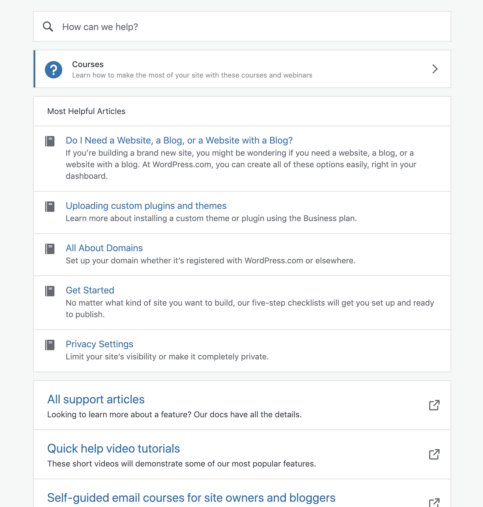
The help page is a bit of a mess.
It includes:
- Search (which is lost kind of due to all the things below)
- Courses (using a banner component instead of a more standard navigation pattern)
- Most helpful articles (these were intended to be related to search, but the introduction of Courses dislocated them)
- All support articles (external link to en.support.wordpress.com, somewhat redundant from search and most helpful articles)
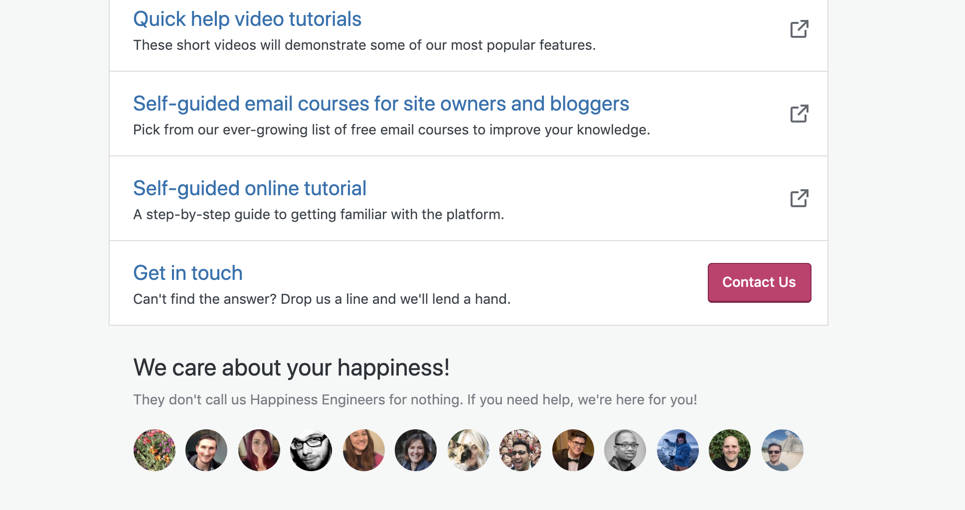
- Quick help video tutorials (also external link to support site)
- Self-guided email course (external link to blogging U)
- Self-guided online tutorial (external link to learn.wordpress.com)
- Get in touch (link to contact form)
A lot of that serves the same purpose, but without much hierarchy it becomes very overwhelming to understand which option is the 'right one'.
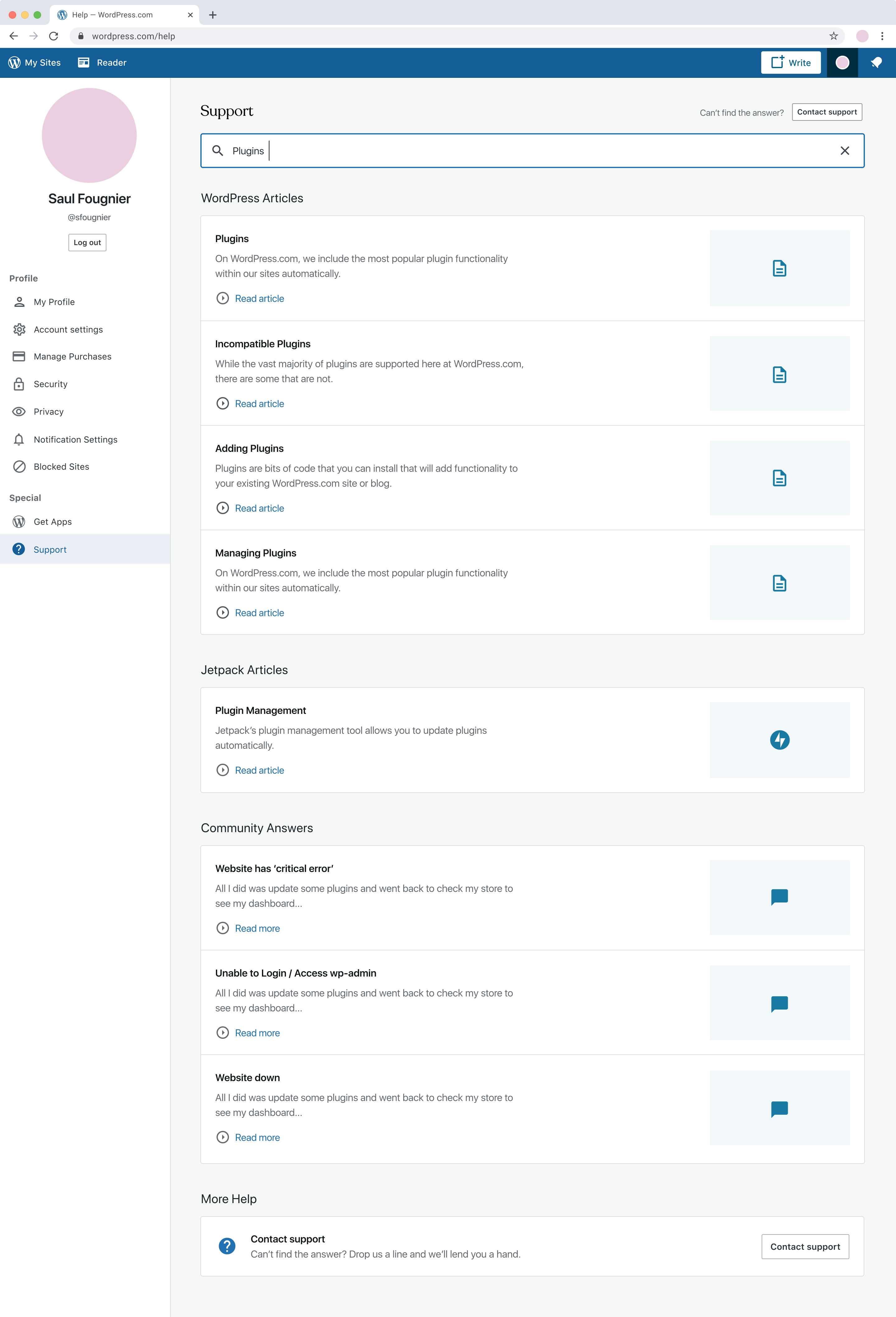
Another layer to this is the support search results. Results are pulled in from support articles, forums, and jetpack support articles. Their display is identical to the most helpful articles, making it unclear that results were even returned.
The structure of this page has evolved over time as we've learned from data (what people are most often looking for) and as more resources have been created to help customers. This is at cross-purposes, however, to giving people a clear single pathway to find their answer or get help.
There are low-hanging design details we can improve to help make this page more useful, and with a larger investment we can improve the page through structure and content.
 rickybanister
All 7 comments
Current direction:
- Improve usability and consistency via css and some simple layout fixes. No backend dev support needed.
- Explore how to standardize and simplify search results across the Support widget and the Help page.
cc: @rickybanister @lcollette @davemart-in
 olesyabrk
on 15 Jul 2020
olesyabrk
on 15 Jul 2020
As a bonus, and since there's already so much stuff on the /help screen I think it'd be nice to include a promo for buying a quick start session.
rickybanister
on 16 Jul 2020
@rickybanister that upsell in the Help section makes a lot of sense. But I also want to see if we can either restructure the page or remove some of the sections, too much going on currently.
olesyabrk
on 16 Jul 2020
@sfougnier shared the latest designs on p2: pbAPfg-Qu
 lcollette
on 2 Oct 2020
lcollette
on 2 Oct 2020
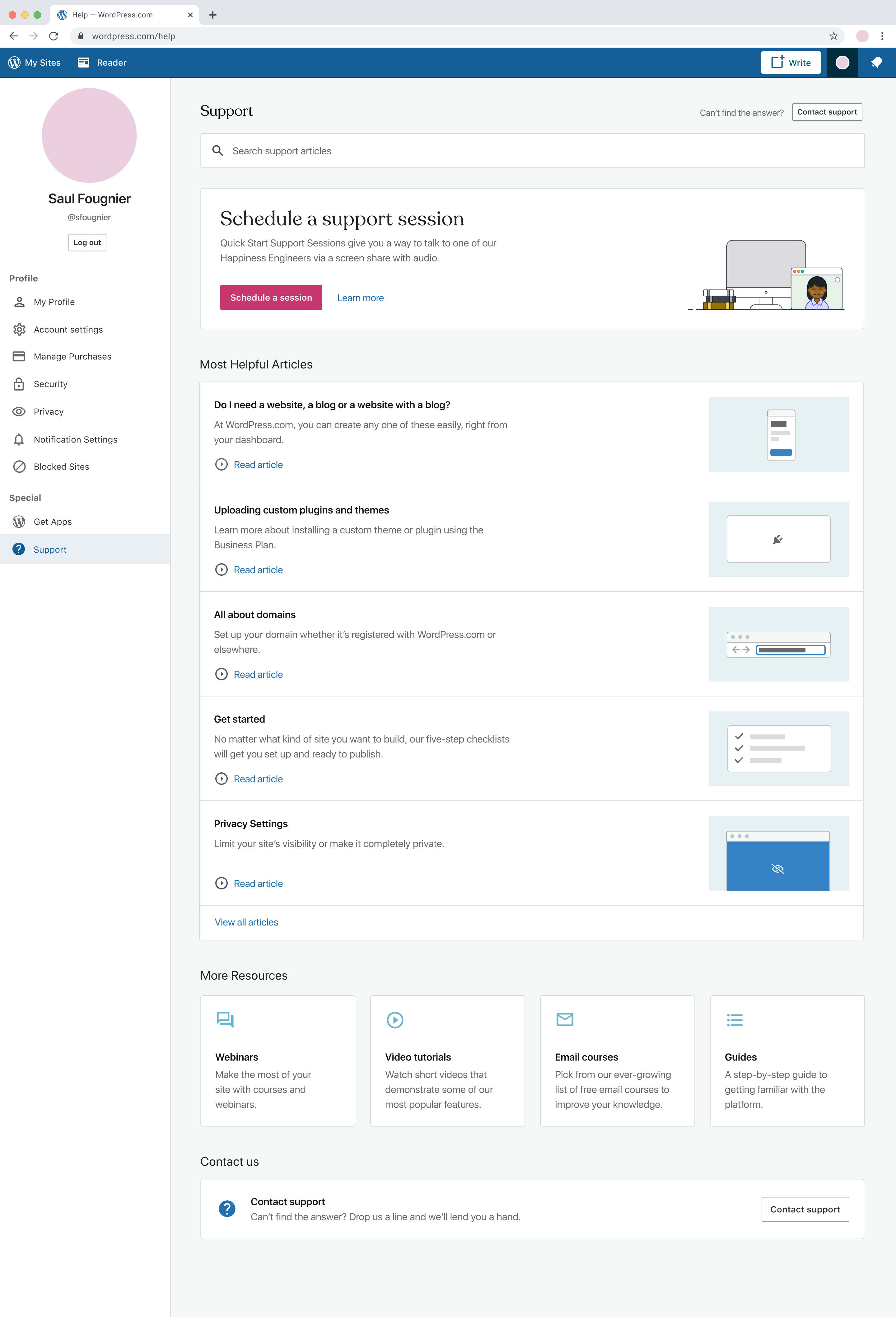
Design updates:
- Made some adjustments to the order of the elements on the page, pushing "Most Helpful Articles" further up the page and moving guides and webinars down in order to show relevant help topics sooner.
- Added a CTA for contacting support into the page header so that it's not buried down at the bottom of the page.
- Looked at making article lists more visual by adding illustrations to "Most Helpful Links" that can be more curated and correspond with the handful of links surfaced here. Took a pass at how this could work in the search results too, but also don't mind going without visuals either.
- Took a look at implementing upsell banners for lower-tiered plans on landing instead of surfacing the Quick Start Session CTA. Not 100% sold on it - wondering if we should show/hide Quick Start Sessions based on your plan/whether you have any available or tailor the "Most Helpful Articles" surfaced to specific plans (if relevant).
Landing
Search Results
 sfougnier
on 16 Oct 2020
sfougnier
on 16 Oct 2020
I left a quick comment on the weekly updates thread saying something similar, but looking more closely I have perhaps an additional idea. If we could simply highlight your search term in the search results (in this case 'plugin) either with a background color or bold text that might provide enough of an affordance that you're still viewing search results vs default suggestions.
rickybanister
on 20 Oct 2020
I'd roll this out over multiple smaller PRs, in rough order:
- [ ] Add the support session card at the top
- [ ] Update the More Resources section
- [ ] Update the Most Helpful Articles section and search results
- [ ] We need more information from Happiness before we bring the "Contact support" button to the top of the page; I'm not sure if it's strategically low in the hierarchy. Leaving this for last until we get confirmation.
 sixhours
on 5 Nov 2020
sixhours
on 5 Nov 2020
Related issues
 BrookeDot
·
3Comments
BrookeDot
·
3Comments
 kellychoffman
·
3Comments
kellychoffman
·
3Comments
 jeherve
·
3Comments
jeherve
·
3Comments
 ghost
·
3Comments
ghost
·
3Comments
 spen
·
3Comments
spen
·
3Comments