Wp-calypso: Navigation: Transition from full-screen Gutenberg to Manage
With the W button landing in WP 5.4 (https://github.com/WordPress/gutenberg/pull/20603), we need to define how to transition from the editing to managing experience.
All 18 comments
@lcollette @gwwar Could you clarify the goal of the first iteration here? Is it just to create more consistency between the manage and edit experience? Is this meant to be a relatively quick turnaround or are we going deeper in terms of how the masterbar and sidebar behave?
I looked at how the current interaction and transition behaves:
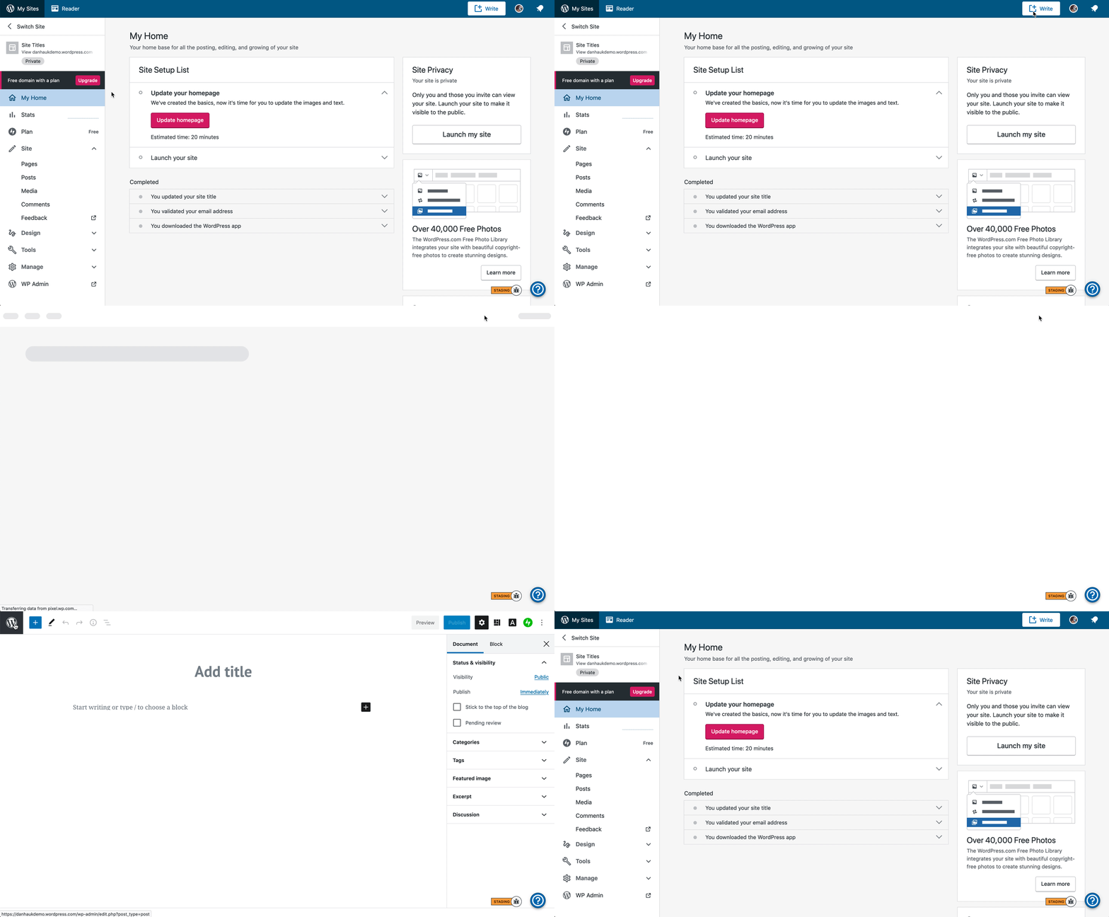
Some inconsistencies I see are:
- Varying heights between the masterbar and top Gutenberg bar
- Logo sizes and style (core vs. WordPress.com)
- The (W) button takes me back to the previous screen but the tooltip says "View Posts"
I think @mtias wanted us to investigate further iterations where we might display a sidebar slide out, similar to the image in the following comment, and how this would behave in WordPress.com
https://github.com/WordPress/gutenberg/issues/20579#issuecomment-593578009
@danhauk @lcollette heads up that behavior may be changing soon in https://github.com/WordPress/gutenberg/pull/21121
If that PR lands before 7.9 is released next week, we'll need to figure out a plan for dotcom before updating... Not sure how straightforward it will be to work around the new behavior :)
Can we help in pr to make overriding easier? It looks to rely heavily on
wp-admin DOM elements now. :-/
On Thu, 9 Apr 2020, 23:09 Noah Allen, notifications@github.com wrote:
If that PR lands before 7.9 is released next week, we'll need to figure
out a plan for dotcom before updating... Not sure how straightforward it
will be to work around the new behavior :)—
You are receiving this because you are subscribed to this thread.
Reply to this email directly, view it on GitHub
https://github.com/Automattic/wp-calypso/issues/40065#issuecomment-611728976,
or unsubscribe
https://github.com/notifications/unsubscribe-auth/AAAVJAG36DSMCMYJGQJAOM3RLYTPPANCNFSM4LF4GWLQ
.
probably, it is definitely part of the overarching issue to allow the button to be override-able to an extent
@johnHackworth would it make sense if we let create take the lead on this one? Seems like y'all would be more tied to changes with Gutenboarding/Plugin updates.
It makes sense for me that we take over on this, it feels part of our overall line of work. But let me ask @rickybanister and @olaolusoga if it also makes sense from their design work point of view
Here's the latest update on where I landed so far with regards to the sidebar slideout.
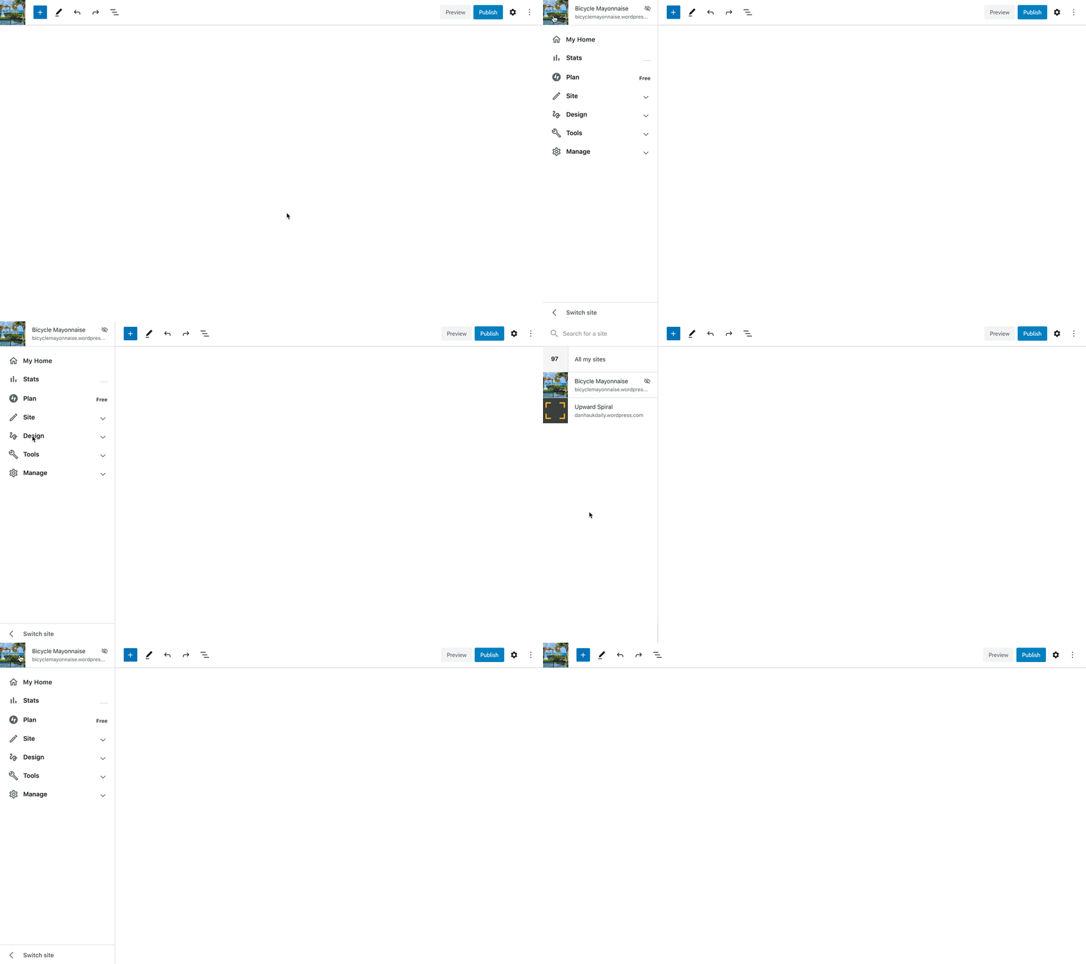
- I'm using the site icon in place of the (W) as per the improvements suggested in https://github.com/WordPress/gutenberg/issues/20929.
- Top of the slideout menu is a tweaked version of the site card.
- We remove the site card from the Calypso menu and any extraneous things (looking at you, nudge upsells) to keep it streamlined.
- Site switcher is moved to the bottom. I envision this being a change in the normal Calypso sidebar as well. It cleans up the top of the sidebar and I don't think it warrants top placement anyway. It's not as findable here, but having more sites is more of a power user feature so they're likely to find it.
Up next, @shaunandrews and I will work together to explore and reach a solution to allow you to quickly choose a post or page to load in the editor without leaving.
I'm not sure why I put this on the maintenance board -- the design scope looks broader than what the maintenance team can handle ;)
@noahtallen For sure. Check out p9Jlb4-1qA-p2 for more details.
It makes sense for me that we take over on this, it feels part of our overall line of work. But let me ask @rickybanister and @olaolusoga if it also makes sense from their design work point of view
It makes sense. Like @danhauk mentioned above he and @shaunandrews (create design DRI for this) will be collaborating on a solution for dotcom.
Here's where I'm at with exposing the Calypso sidebar within the block editor:
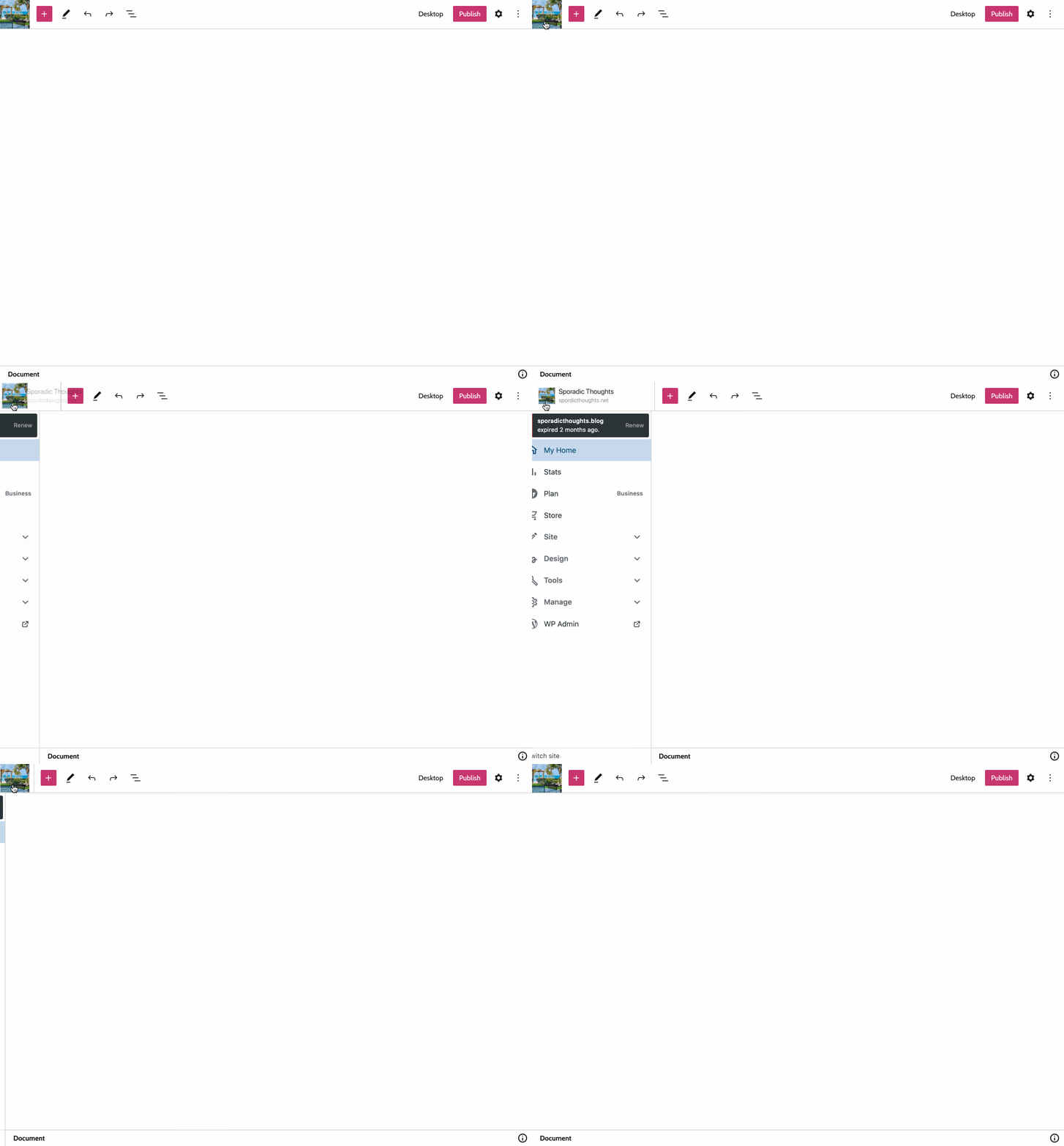
This moves the site switcher to the bottom (https://github.com/Automattic/wp-calypso/issues/41340) and adds a transition to the size of the site icon.
I like the site icon transition @shaunandrews.
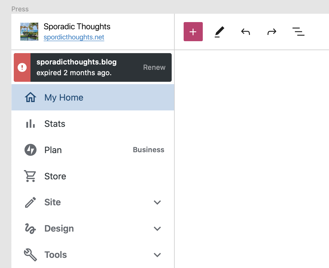
The only thing I noticed was that by moving the site card up into the top bar it will act as the toggle and not a link to preview/view the site.
Maybe we need to add back an explicit 'view site' link in the sidebar to compensate.
Maybe we need to add back an explicit 'view site' link in the sidebar to compensate.
Ah yea. I actually removed the "View " preview on the site's URL, which we currently show in the Calypso sidebar specifically because this area now triggers the toggle.
There's also been a few requests in Core to have a "view site" or "view post/page/document", which exists in the top adminbar outside of fullscreen mode.
One hesitation here is that the canvas _is_ the site, and maybe we don't _need_ a way to view the site outside of the editor. Alternatively, I know established users really love to see their "real" site, so a "view site/document" button would be nice.
--
One solution would be to have only the site icon trigger the toggle action, and keep the text (site title and domain) as a way to view the site:
What if we made this sidebar adapt to the editor? That is, if you're editing a post, maybe this sidebar could show you a list of your site's posts; If you're editing a page, the sidebar could show a list of pages. Maybe it could also serve as a way to create a new post or page. Here's a design exploration looking at that:
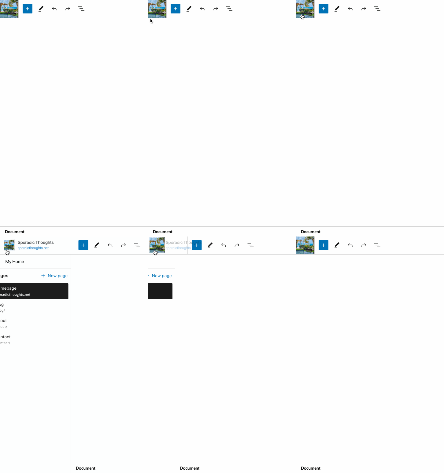
- This forgoes all the links in the normal "My Site" sidebar, with the exception of the "My Home" link — this now serves as the primary way to exit the editor.
- Clicking on "My Home" would exit the editor and load the My Home Calypso section.
- If you're editing a page, then there would be a list of your sites pages. If you're editing a post it would show all your posts.
- Clicking one of the items in the list would trigger an auto-save, close the sidebar, and load the selected document into the editor.
- Clicking the 'New
post_type' button would auto-save the current document, close the sidebar, and then open a blank editor showing the page layout selector. - It would be nice to incorporate a search and pagination into this UI, but for a first try I think we can limit the list to 20 items and worry about search later.
@shaunandrews do you think it would be confusing for a user seeing two different sidebars with mostly different layouts, but like a kinda similar design and feel?
Most helpful comment
What if we made this sidebar adapt to the editor? That is, if you're editing a post, maybe this sidebar could show you a list of your site's posts; If you're editing a page, the sidebar could show a list of pages. Maybe it could also serve as a way to create a new post or page. Here's a design exploration looking at that:
post_type' button would auto-save the current document, close the sidebar, and then open a blank editor showing the page layout selector.