Wp-calypso: (8P) Masterbar: Unequal spacing between masterbar icons on first mobile page load
Steps to reproduce
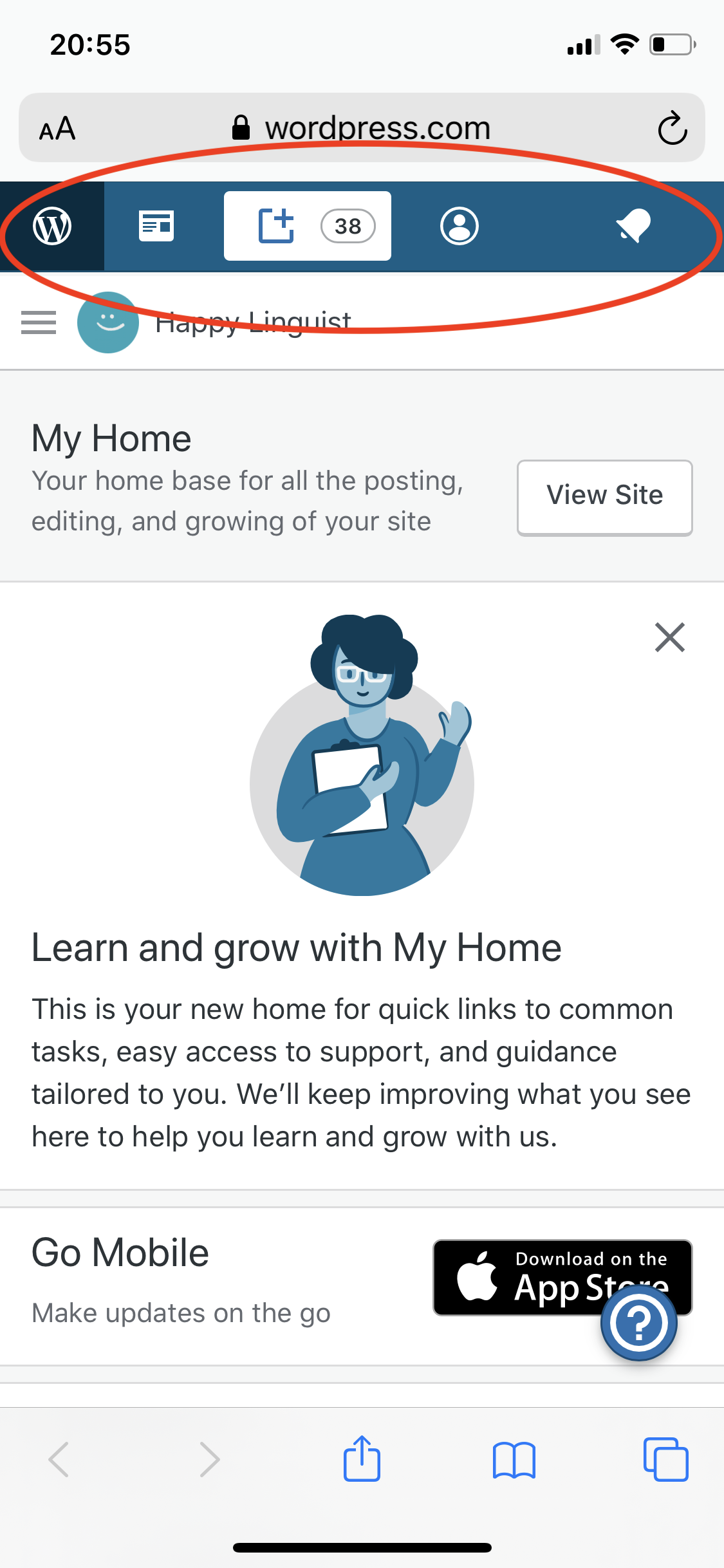
- Starting on a mobile device, open WordPress.com while logged in: https://wordpress.com/
- Notice that the space between the Me and Notifications icon is greater than between other icons.
- Navigate around Calypso and notice that eventually (e.g. after opening the Reader) the icon spacing fixes itself.
What I expected
I expect the icons to always be equally spaced.
What happened instead
On first page load on a mobile device, the icons have unequal spacing.
Browser / OS version
Safari / iPhone XS, iOS 13.3.1
Screenshot / Video
Context / Source
dogfooding
 rachelmcr
All 18 comments
Good eye, thanks for reporting.
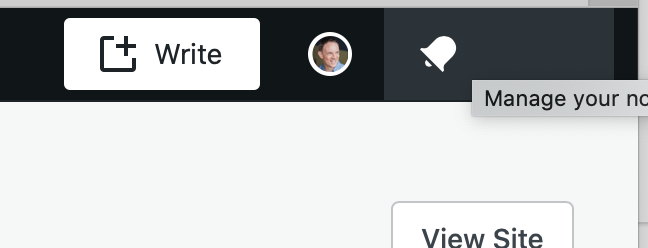
I'm seeing a weird spacing issue in desktop web with the notifications toolbar icon — it seems too wide now (Safari on macOS):
 lancewillett
on 12 Mar 2020
lancewillett
on 12 Mar 2020
I can repeat the mobile web issue on first load, iPhone XS with mobile Safari.
- First load, weird spacing
- Click on Reader icon in toolbar, it fixes itself
lancewillett
on 12 Mar 2020
I can also see the issue you saw in Safari desktop web, although it seems to correct itself once the page finishes loading. (I see the issue at first, but I see additional network requests e.g. for more CSS files after which the spacing is fixed.)
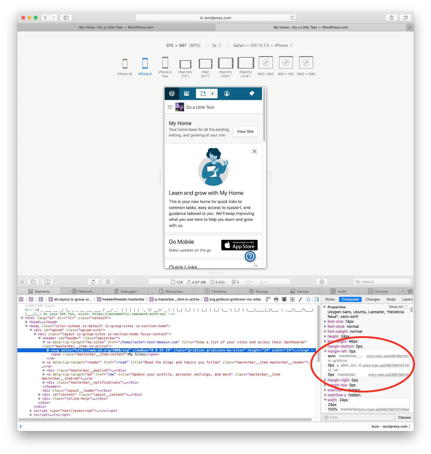
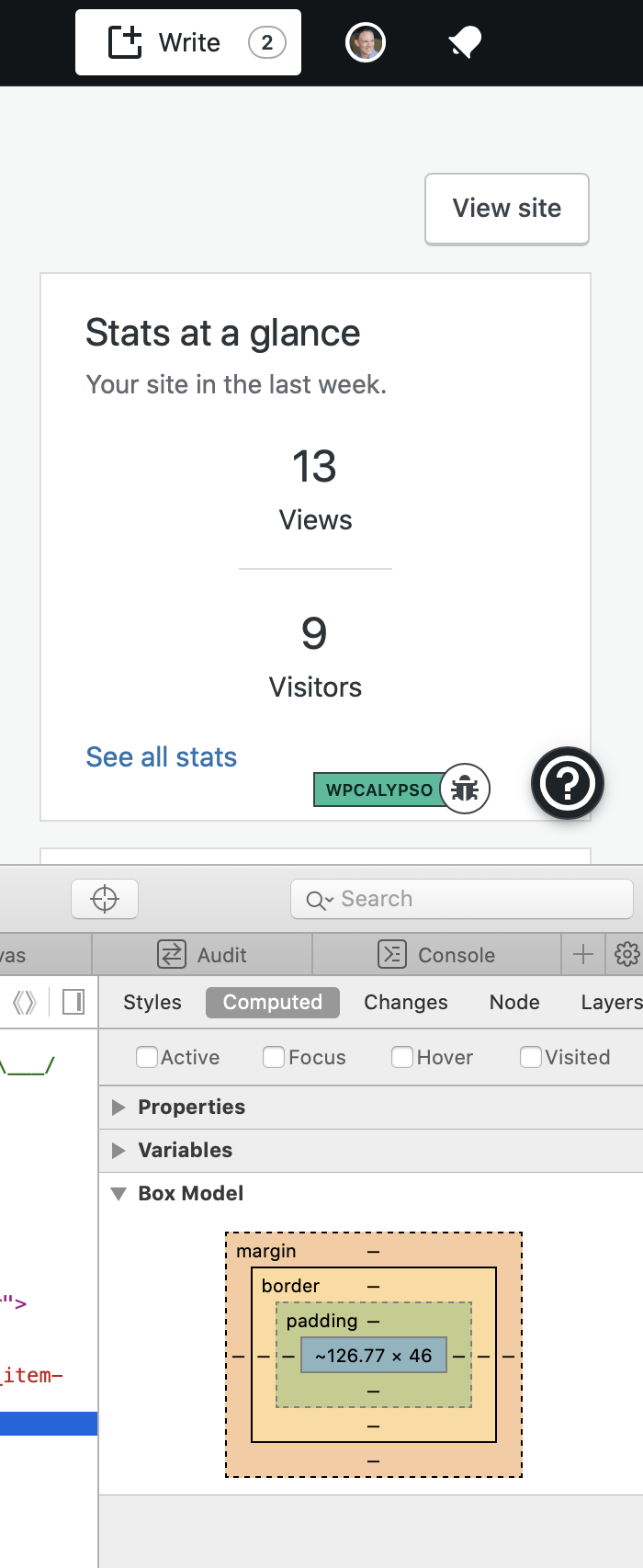
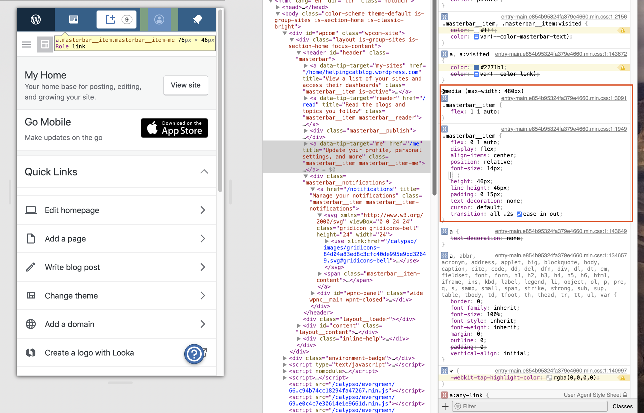
I took a closer look at the mobile web issue with Safari's responsive design mode, and as far as I can tell it's an issue with flexbox and the auto margin calculations on the masterbar icons. On first page load, the right/left margins for all icons except notifications are 0px:
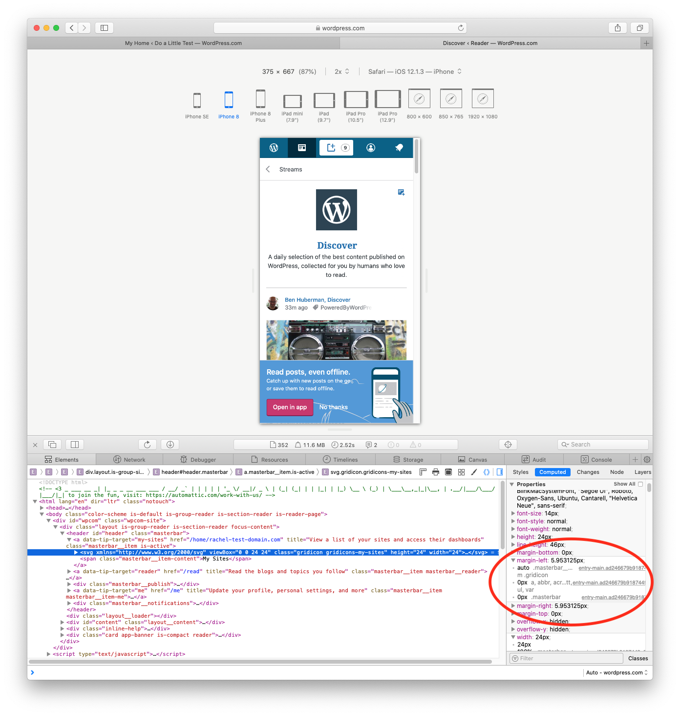
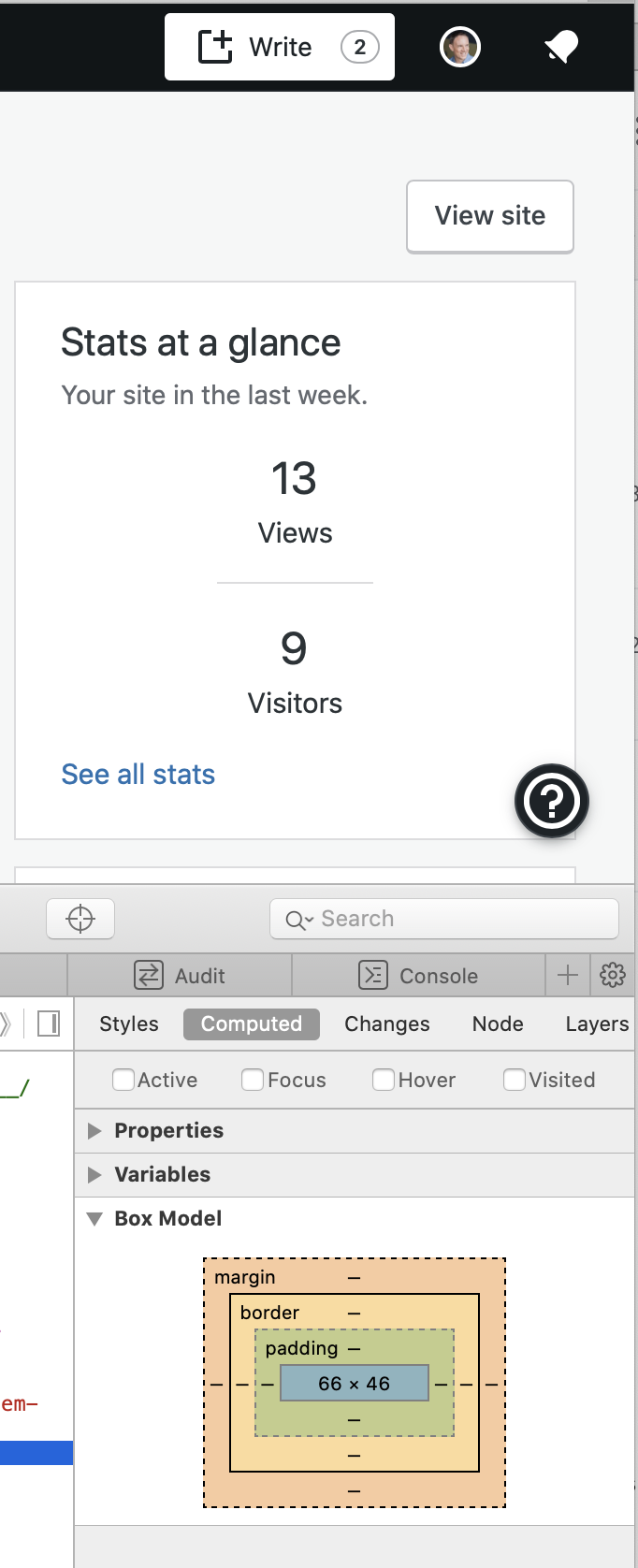
After navigating e.g. to the Reader, the right/left margins are recalculated and are equal for all the icons (including notifications):
I can also force the issue to reappear on a mobile screen size by disabling this CSS:
@media (max-width: 480px)
.masterbar__item {
flex: 1 1 auto;
}
Adding to Manage team board for consideration — cc @sixhours as this feels like a Caro sweet spot. ⭐️
lancewillett
on 12 Mar 2020
We may need to investigate on a native device I couldn't reproduce in Chrome browser emulator.
 gwwar
on 23 Mar 2020
gwwar
on 23 Mar 2020
I'm still seeing this happen each day in desktop Safari (v 13.0.5 on macOS Catalina 10.15.3).
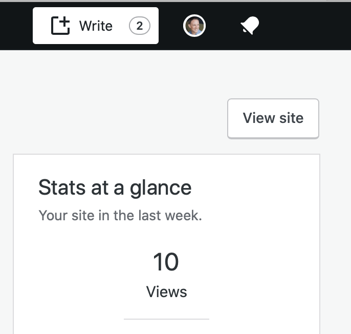
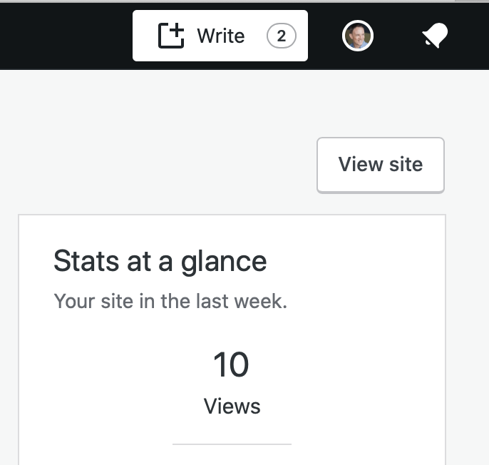
It only appears from a cold start, such as first time in the day I load https://wpcalypso.wordpress.com/ — the notifications "bell" section is wider than it should be.
Before | After
|------------ | -------------|
| |
|  |
|
lancewillett
on 23 Mar 2020
So far, I'm not able to reproduce either of these in the following environments:
- Chrome, iPhone 11 Pro Max, iOS 13.3.1
Safari, iPhone 11 Pro Max, iOS 13.3.1
Chrome 80, Mac OS 10.15.3
- Safari 13.0.5, Mac OS 10.15.3
- Firefox 74, Mac OS 10.15.3
@lancewillett when this happens on desktop, does the Network tab of the inspector show anything stalled, any 404's? Does the console show any errors?
@rachelmcr Are you still seeing the alignment issue on mobile devices? I did find some interesting anecdotal evidence to suggest that child items with auto margins and a flexbox parent could behave oddly in Safari, but it was from 2 years ago and seems to have been fixed since then.
 sixhours
on 24 Mar 2020
sixhours
on 24 Mar 2020
No errors in console or 404s. It looks more like a calculation error in the width of the element.
Note in the first screenshot the Safari inspector gives the width value an estimate with ~126.77 (broken). I've never seen that before...
In the correct version, second screenshot — the width is 66.
I'm able to trigger most successfully using wpcalypso instead of production.
lancewillett
on 24 Mar 2020
Aha! I was able to reproduce this on wpcalypso when I switched my primary site to a site that has My Home (my normal primary site is a Jetpack site, so My Home isn't available, and I land on the Stats page). This points to something about My Home, specifically.
sixhours
on 25 Mar 2020
TIL about cmd+option+R for the mobile previews on Safari!
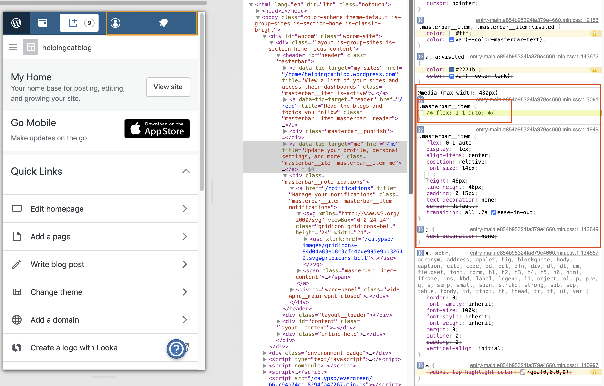
Overall, I think it's the flex rule on .masterbar__item that @rachelmcr noted above. The media query might need to be updated. Or we need to bump CSS specificity if this isn't being defined in the same file. Media Queries don't add on any specificity, so it'd be last rule winning.
One option would be to invert the default, eg make the media query for desktop esp if we're seeing pop-in issues on slower devices.
| Flex: 0 1 auto | Flex: 1 1 auto |
| ------------- | ------------- |
|  |
|  |
|
@sixhours do you want to give this a try? I don't have an iPhone :D
gwwar
on 9 Apr 2020
I don't have an iPhone :D
One technique I use to test iOS devices "natively" is the Xcode Simulator.app — you can test on any Apple device.
lancewillett
on 9 Apr 2020
Some bugs can only be reproduced on a native device, and xcode wasn't cooperating today
gwwar
on 9 Apr 2020
@davemart-in In backlog grooming the question came up if this one would be a good fit for the Manage Janitorial Board?
 obenland
on 4 Jun 2020
obenland
on 4 Jun 2020
I don't think so. I suspect that due largely to the testing that is going to be required that this is going to turn into more than just a tiny little fix.
 davemart-in
on 5 Jun 2020
davemart-in
on 5 Jun 2020
I am trying to reproduce this bug without success. I have tried (Catalina 10.15.5):
Safari (13.1.1): both on desktop and responsive view
Simulator: iPhone SE 2 & iPhone 11 Pro
I also made sure to land on Home page of my site as @sixhours suggests. Apart from that, I cannot spot the code that could potentially cause these issues (in the current codebase).
I assumed that a network delay could potentially cause this issue but the css in question client/layout/masterbar/style.scss is among the first assets loaded. Also, it would not explain the reload needed so that it is fixed. That said, I also don't believe that moving
```
@include breakpoint-deprecated( '<480px' ) {
flex: 1 1 auto;
}
before
.masterbar__item {
flex: 0 1 auto;
```
is the solution.
So, to move on:
1) @lancewillett Does this still reproduce?
2) is anyone (affected) willing to have a zoom live debug session anytime in the 06:00 - 14:00 UTC window?
 cpapazoglou
on 30 Jun 2020
cpapazoglou
on 30 Jun 2020
I can no longer reproduce this behavior on my phone (Safari on iPhone XS, iOS 13.5.1) or on my laptop (Safari 13.1.1 on macOS 10.15.5, desktop and responsive view).
I see some unequal spacing as the page loads, but unlike the original report the spacing ends up equal once the page finishes loading.
From my end it looks like this is resolved but I'll wait for @lancewillett to confirm on his end.
rachelmcr
on 1 Jul 2020
I can't reproduce it either. Tried loading the stats page of a jetpack site (no My Home), loading My Home on a simple site, loading the reader, on wpcalypso, horizon, and production wp.com.
obenland
on 1 Jul 2020
Thanks for the confirmation. Let's go ahead and close this issue, and @lancewillett can reopen if it's persisting for him.
rachelmcr
on 2 Jul 2020
Related issues
 ehg
·
3Comments
ehg
·
3Comments
 lamosty
·
3Comments
lamosty
·
3Comments
 rickybanister
·
3Comments
rickybanister
·
3Comments
 samouri
·
3Comments
samouri
·
3Comments
 apeatling
·
3Comments
apeatling
·
3Comments
Most helpful comment
I'm still seeing this happen each day in desktop Safari (v 13.0.5 on macOS Catalina 10.15.3).
It only appears from a cold start, such as first time in the day I load https://wpcalypso.wordpress.com/ — the notifications "bell" section is wider than it should be.
Before | After |
|  |
|
|------------ | -------------|
|