Wp-calypso: Media: Cropped square thumbnails makes it difficult to choose image
I'm pretty sure this has been come up before, but the cropped thumbnail has become a really frustrating part of editing experience now that we provide the user with pre-built page layouts that the images on them are meant to be replaced by them.
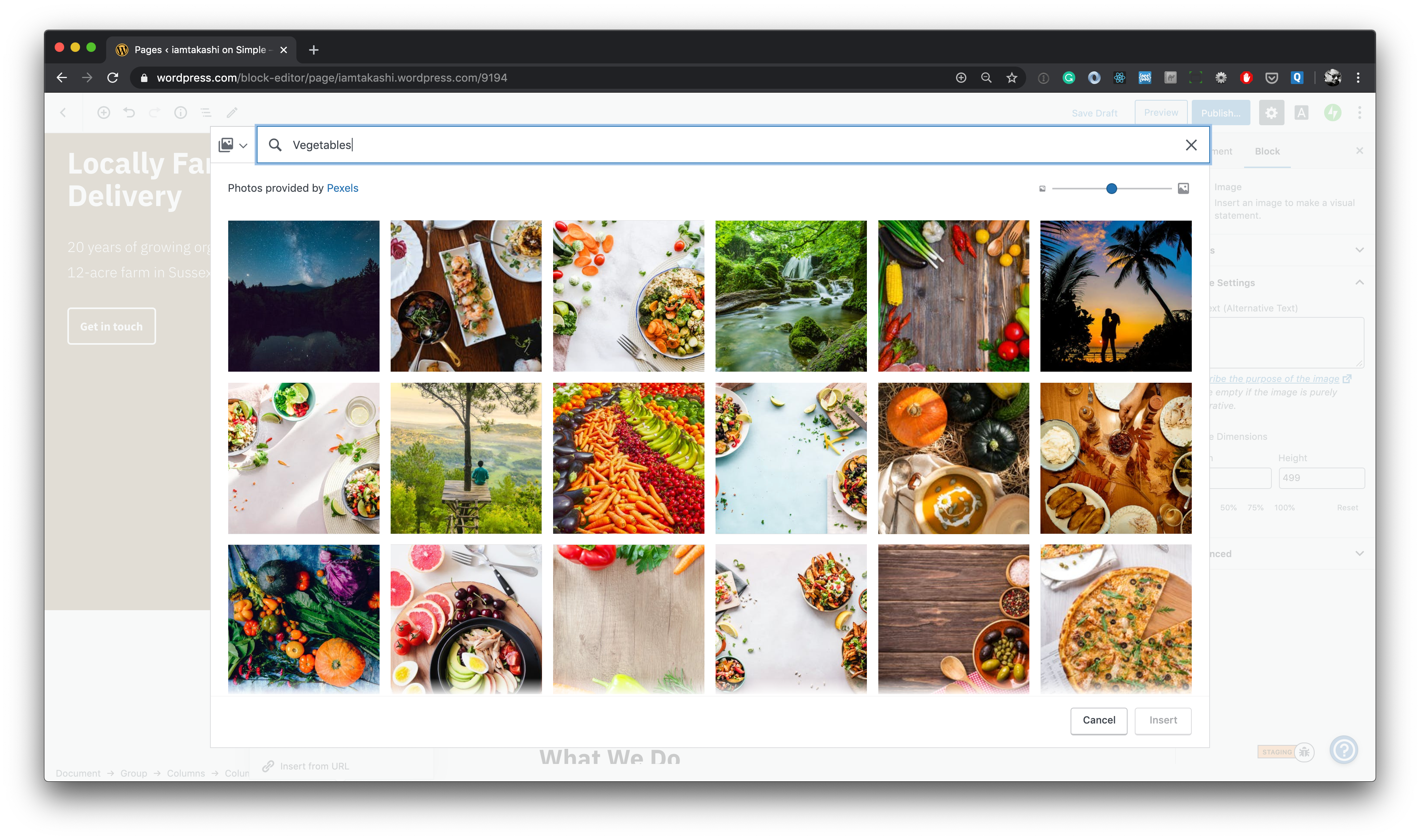
For example, you want to replace the three images on a layout that you chose.
In most cases, the pattern would look better if all the three images are the same orientation. But with the cropped thumbnail you can't tell if the image in the library is portrait or landscape until you add to the page, and you could easily end up with like this:
This is a very frustrating experience for the user. We can provide a much better experience by showing uncropped images so that the user can choose an image that will fit with the pattern and the layout suggest.
 iamtakashi
All 9 comments
cc @johnHackworth @olaolusoga @shaunandrews
iamtakashi
on 15 Jan 2020
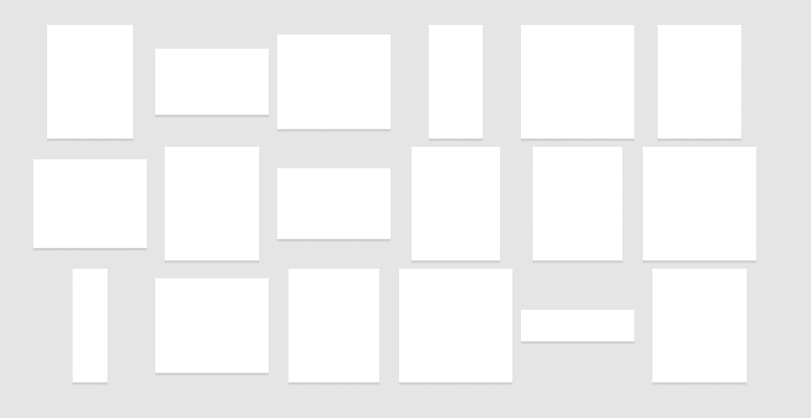
Yes! This has bugged me for years on WPcom and Core. I've never understood the need to forcefully crop the thumbnails to a square. It makes it incredibly difficult to scan images and see the different aspect ratios between similar images.
A long (long, long) time ago I suggested we _just_ resize the images while keeping their aspect ratio intact. We could still _display_ the images in a square-grid:
 shaunandrews
on 15 Jan 2020
shaunandrews
on 15 Jan 2020
I'd like to take this up i'm new can someone help
 aadarsh-as
on 16 Jan 2020
aadarsh-as
on 16 Jan 2020
@shaunandrews Yes! That's what I imagine, like Apple's Photos pattern 👍
iamtakashi
on 16 Jan 2020
Apple Photos just started cropping. :D
 apeatling
on 17 Jan 2020
apeatling
on 17 Jan 2020
Apple Photos just started cropping. :D
Ha! It doesn't seem crop in the search view though. Anyway, it doesn't change my opinion about a cropped thumbnail is a real pain to find an appropriate image to replace the image on a layout :D

iamtakashi
on 17 Jan 2020
@aadarsh-as Howdy. 👋🏻 What do you need for help getting started? We have some background info on Calypso that points to some pointers available.
 ianstewart
on 17 Jan 2020
ianstewart
on 17 Jan 2020
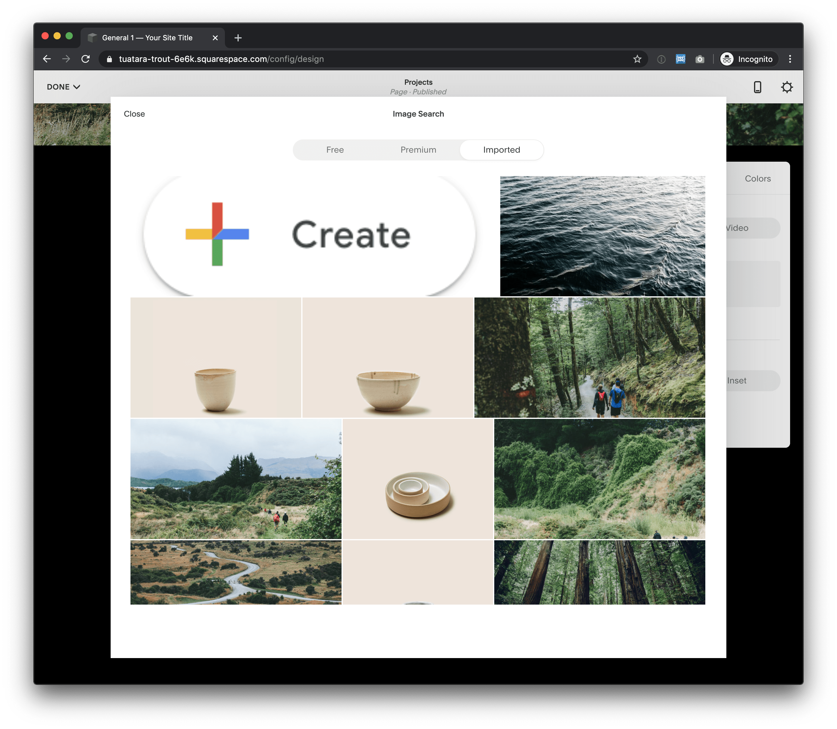
FYI: Squarespace takes the Google Photos approach — the same height. This looks neater, but if an image is small it will be stretched and look bad, so I think we should avoid this pattern.
iamtakashi
on 27 Jan 2020
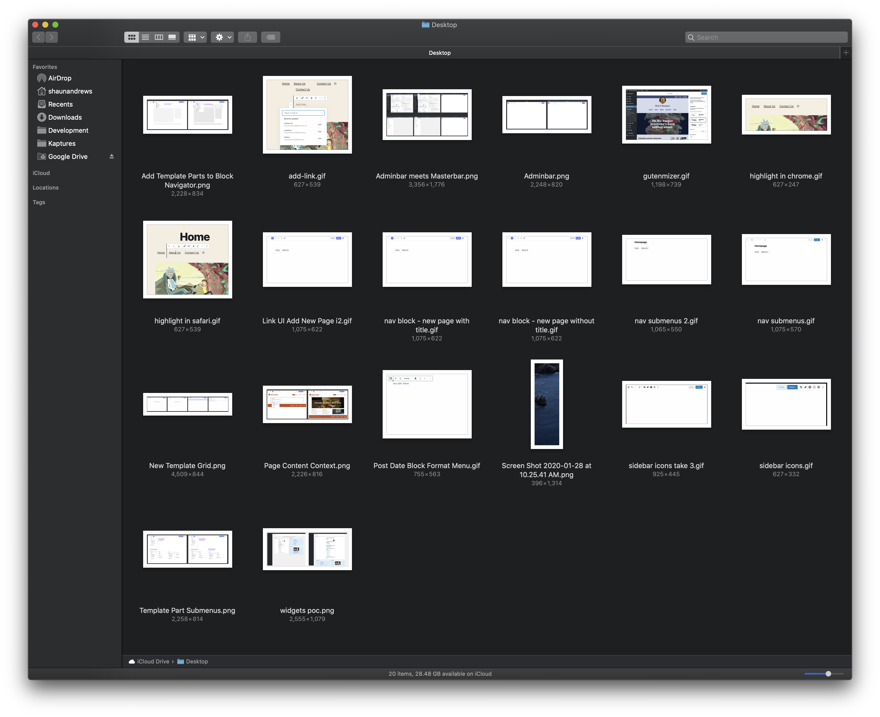
OS X's Finder app is a great example of using a grid while keeping the aspect ratio:
shaunandrews
on 28 Jan 2020
Related issues
 lamosty
·
3Comments
lamosty
·
3Comments
 ehg
·
3Comments
ehg
·
3Comments
 hoverduck
·
3Comments
hoverduck
·
3Comments
 spen
·
3Comments
spen
·
3Comments
 ghost
·
3Comments
ghost
·
3Comments
Most helpful comment
OS X's Finder app is a great example of using a grid while keeping the aspect ratio: