Wp-calypso: Improve page layout preview to display layout as close as possible
I've seen many visual differences between what the preview shows and what the user gets after selecting with the same theme and the same viewport. The preview doesn't seem display the layout accurately for some reason.
I didn't have time to check all of the layouts, but the process that I took was:
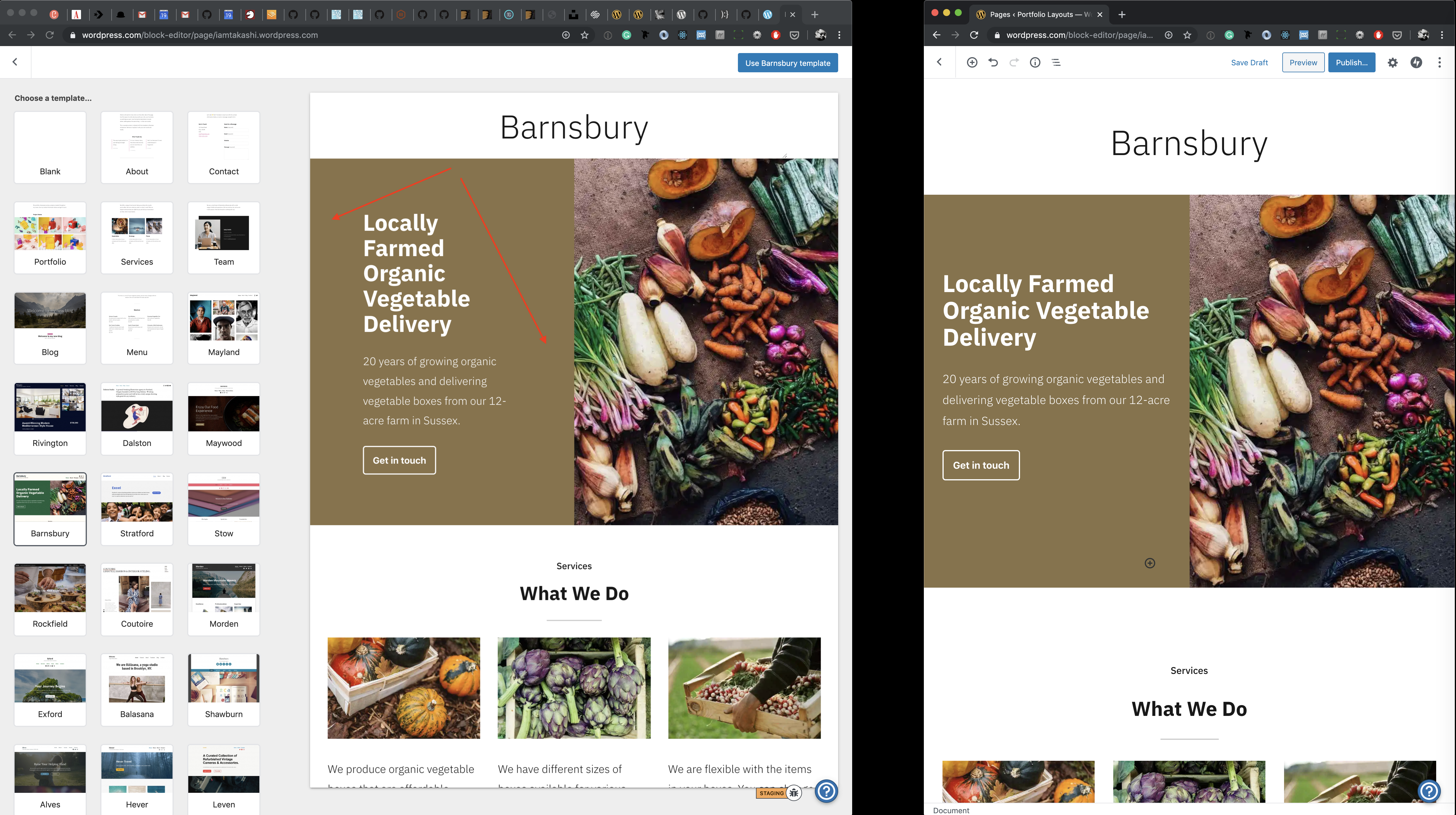
- Activate Maywood theme on a test site.
- Open the page layout selector in two windows side by side. If you have a large monitor it'll be easier — Change one window's viewport around 1430px so that the preview is nice and big. And change another window's viewport to the same size as the preview in the larger window.
- Preview a layout in the larger window.
- In another smaller window, pick the same layout and add it in the editor by clicking "Use x template"
- Compare both designs.
Some of the stuff I've noticed, but there are more. So I'd encourage to test more layouts following the process above. The preview should be as accurate as possible.
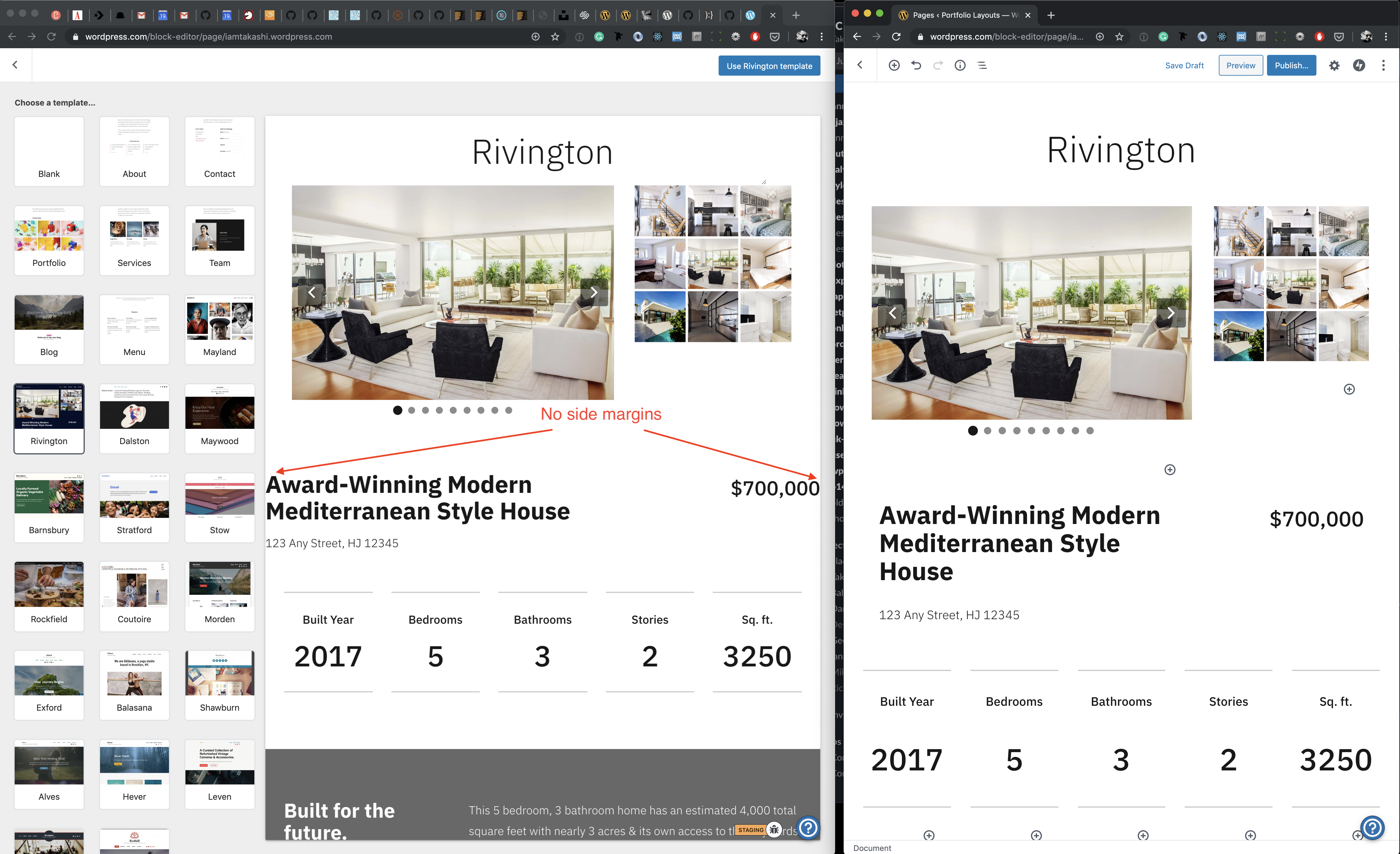
I've seen this visual bugs where the side margins are missing in some templates.
--
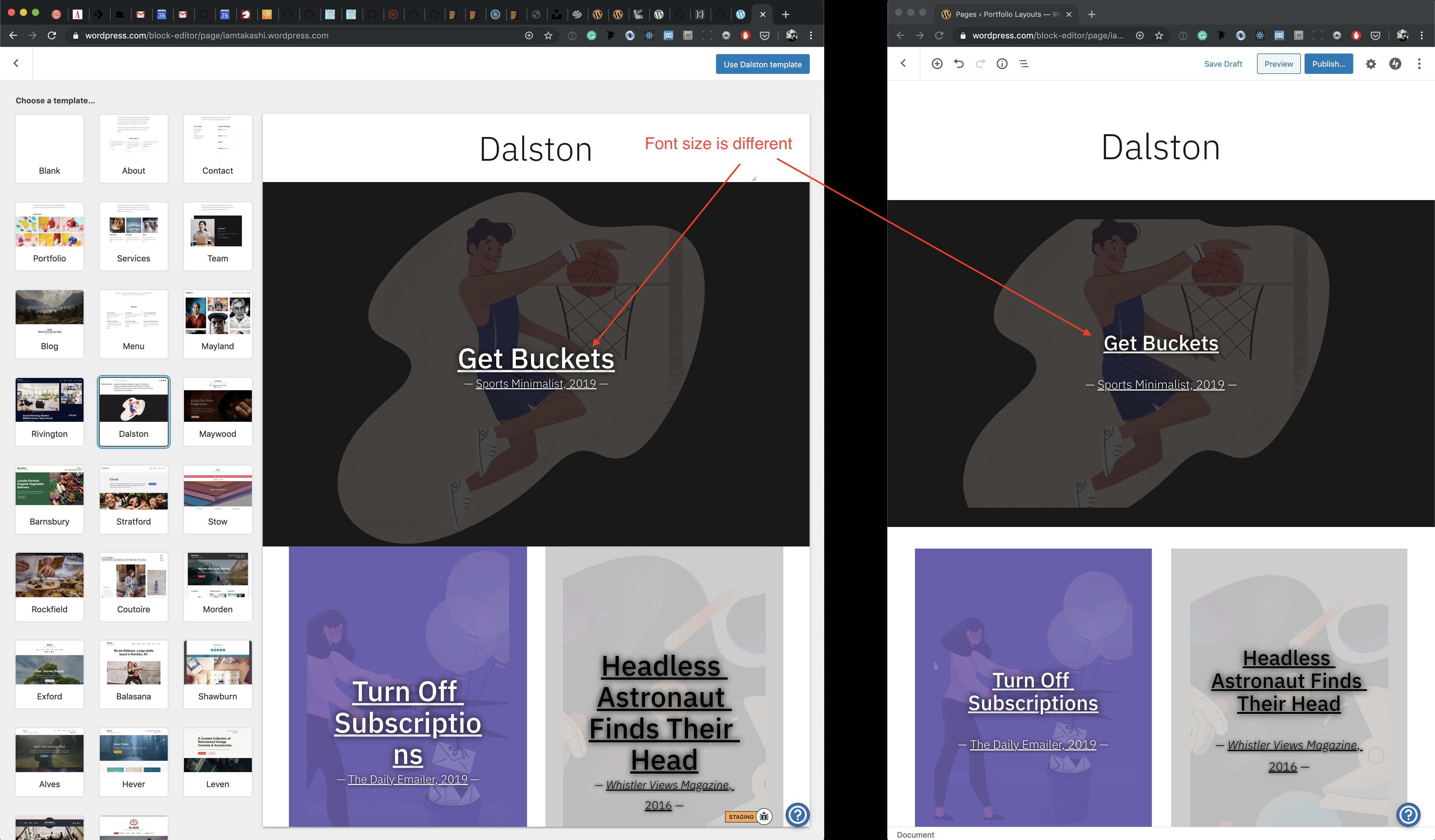
Font sizes don't match. I've seen a few instances of this issue and it's providing a different impression.
--
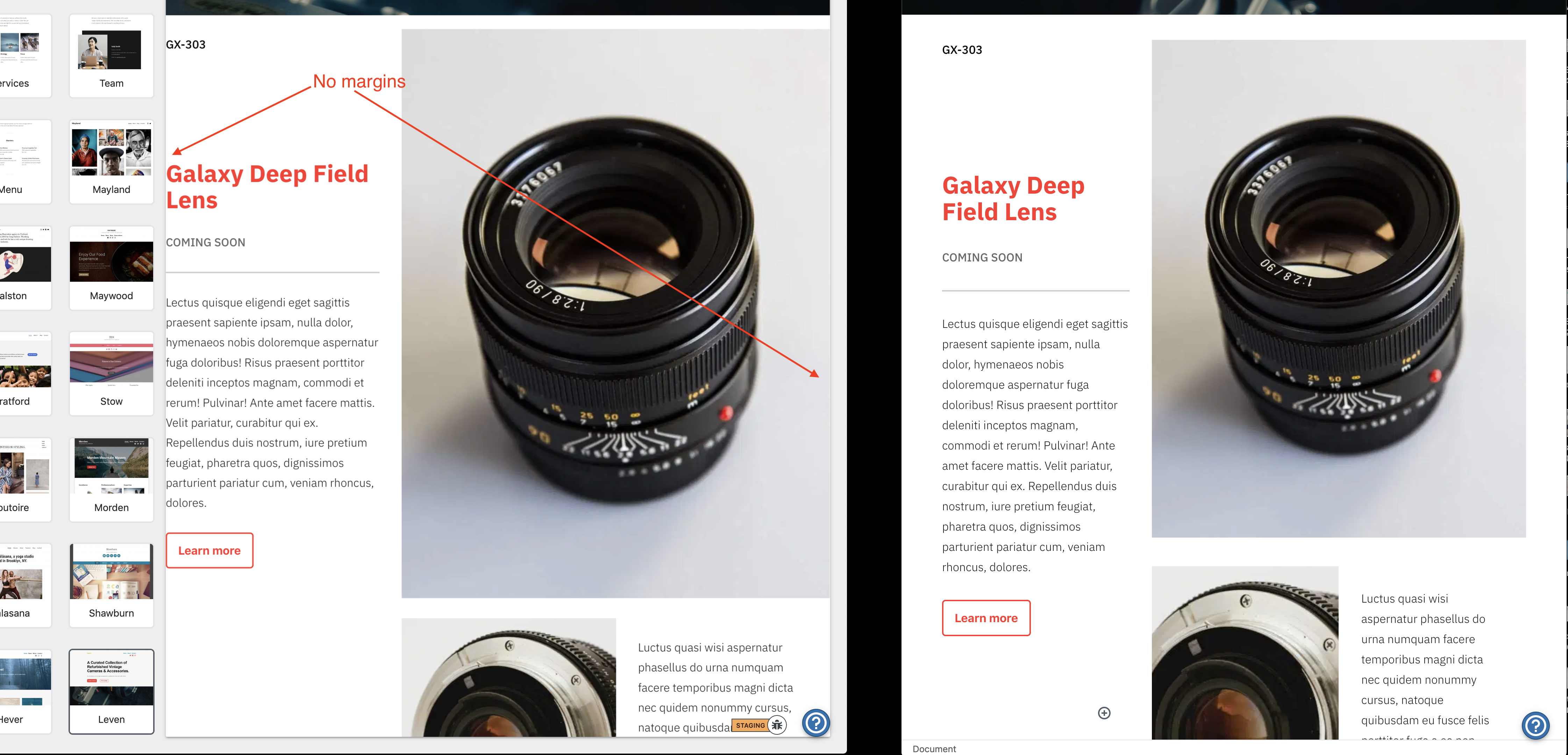
Extra side paddings can be seen in some templates.
 iamtakashi
All 17 comments
The internal preview padding might be straightforward enough to fix, but the size should be caused by the fact that the preview does not just resize, but also scales.
Basically, the preview has a max width of 960px, and then scales down instead of just being responsive to the width. (See the Core BlockPreview component used)
In other words, the font size is (or should be) correct, but then it's scaled down and looks smaller.
The last screen, with larger paddings in the media text block: that's weird! 🤔
 Copons
on 20 Nov 2019
Copons
on 20 Nov 2019
@Copons Is it realistic to expect you or someone on Cylon to tackle this in the current milestone, as well as all the theme conversions?
 apeatling
on 22 Nov 2019
apeatling
on 22 Nov 2019
@Copons Is it realistic to expect you or someone on Cylon to tackle this in the current milestone, as well as all the theme conversions?
I don't think so.
We're already late on the themes because of some unexpected issues we had to fix (such as Gutenberg changing the layout structure, the usual back button whack-a-mole, last minute FSE fixes for last week's test session, etc.).
This is not a hard one per se, but might require a bit of careful sleuthing to avoid fixing one layout and breaking others.
Copons
on 25 Nov 2019
That's what I thought, let's move this one to milestone 3.
apeatling
on 25 Nov 2019
Is it worth also noting that the thumbnails are not accurate here either? Rivington is the most obvious example. Compare the thumbnail of the Rivington theme with the large preview, note the difference in background colour.
 ianstewart
on 27 Nov 2019
ianstewart
on 27 Nov 2019
I think this is in a better state right now (testing on the https://github.com/Automattic/wp-calypso/pull/38065 branch).
Nested blocks margins and font sizes look more consistent, for example.
There still are issues with the preview wrapper padding, which I think are more complicated to fix, though.
Compare the thumbnail of the Rivington theme with the large preview, note the difference in background colour.
@ianstewart There's not much we can do with that.
The thumbnail is a static image generated (manually or otherwise, I'm not sure) from the homepage of a site with its "correct" theme active, while the preview renders actual blocks with the current active theme.
E.g.
- Rivington theme has a blue background, while Maywood theme a white background.
If you render the Rivington layout with the Maywood theme it will have a white background. - Barnsbury theme has a green primary color, while in Maywood theme it's golden.
If you render the Barnsbury layout with the Maywood theme, all blocks that use the theme palette primary color will be golden instead of green.
A solution might be to render the actual blocks in the thumbnails too, but I expect it will be _very_ performance intensive.
Copons
on 12 Dec 2019
The thumbnail is a static image generated (manually or otherwise, I'm not sure) from the homepage of a site with its "correct" theme active, while the preview renders actual blocks with the current active theme.
One potential solution @WunderBart and I were discussing earlier is to decouple the idea of these layouts as "Homepage" layouts based on themes, and have them rather as just "Layouts" (or a different name) that were independent of any theme or homepage.
Since they're a collection of predefined blocks rendered with the current active theme (not related to the homepage or the theme options themselves), calling it "Homepage Layouts" feels like it's trying to make connections between the themes and the FSE that are causing more confusion than if we named them more generically (not based on a theme and theme image).
 jeryj
on 17 Dec 2019
jeryj
on 17 Dec 2019
A solution might be to render the actual blocks in the thumbnails too, but I expect it will be very performance intensive.
It is and @Automattic/ajax have already attempted this. @retrofox did a lot of the investigation here.
That said, the current situation of having static thumbnails that don't look at all like the current Theme is not a good UX.
 getdave
on 18 Dec 2019
getdave
on 18 Dec 2019
Are there other solutions? Perhaps rendering the screenshots for various themes in an automated fashion daily? Or whenever a change is made to a template? Or by using mShots and demo sites? They really only need to be dynamic _once_. That is, whenever a new template or theme is introduced.
ianstewart
on 18 Dec 2019
@ianstewart I was just typing up the exact same thing. I think I read something about how that may be how the theme images are generated already? Something about a stickered blog that when it gets updated a new preview image gets generated?
jeryj
on 18 Dec 2019
Perhaps rendering the screenshots for various themes in an automated fashion daily?
I wanted to ask about the theme-layout relation. Correct me if I'm wrong, but each layout in the SPT can be applied for any template which leads to many broken combinations because a lot of themes are not FSE-ready. Do you think we could address this issue by, e.g. offering only layouts that are supported for the current theme, and only then start generating the screenshots in an automated fashion?
 WunderBart
on 18 Dec 2019
WunderBart
on 18 Dec 2019
Do you think we could address this issue by, e.g. offering only layouts that are supported for the current theme
I _think_ there's only a shortlist of themes that support the page template selector? It seems to be only our most recent ones that were launched this year. When I test adding a new page with older themes I don't see the template selector.
If there are page templates that aren't working correctly in one of those themes … we should probably be fixing them. :D I suppose that issue could be mitigated by not offering a template in a particular theme but people will always be able to apply a template and it's content in one theme and then switch later. I think it's probably better to just retire or remove templates or layouts that are problematic. And address the issues that led to incompatibility in future templates/layouts.
ianstewart
on 18 Dec 2019
I have bad news, the template selector is available with every theme that doesn't register its own legacy page templates. And I just petitioned @apeatling to make them available to every theme, to make it less confusing why the selector shows up with some but not with other themes.
 obenland
on 18 Dec 2019
obenland
on 18 Dec 2019
What we're proposing should make it look nearly identical in every theme if the preview image generated is being created by a basically blank theme, rather than the homepage theme screenshot.
What we're fixing for:
- decoupling "Themes" from layouts
Why
- the preview images don't match what gets generated since it's a homepage snapshot of a them
- conflating Theme/Homepage with the generated layout is confusing.
Here's a sample summary of how this could look:
- Rename "Homepage Layouts" to ____? Starter Layouts?
- Have a master install of some kind (likely at the a8ctm1 source site) that we can define various block layouts and query them for their layouts, names, and screenshots. This install should have a blank theme so all screenshots are just a white background.
- Whenever a layout is updated, (1) a screenshot gets generated and (2) a
.jsonfile gets regenerated for FSE to query off of. - FSE now has the latest layout updates from the master blog and allows for easily adding/removing/editing layouts to FSE.
jeryj
on 18 Dec 2019
And I just petitioned @apeatling to make them available to every theme, to make it less confusing why the selector shows up with some but not with other themes.
@obenland: not all themes enqueue even the basic Gutenberg block style support. Without those, these layouts will probably be pretty broken. There's a showcase tag for Gutenberg style support: https://wordpress.com/themes/filter/block-editor-styles
Here's a sample summary of how this could look:
@jeryj: some of what you're proposing can be solved with the template site (a8ctm1). I mentioned a similar workflow over here.
 michaeldcain
on 18 Dec 2019
michaeldcain
on 18 Dec 2019
@michaeldcain Thanks for pointing that out! I figured I wasn't the first to mention this as a possibility :)
jeryj
on 18 Dec 2019
Closing this one as per discussion with @iamtakashi.
 davipontesblog
on 11 Mar 2020
davipontesblog
on 11 Mar 2020
Related issues
 spen
·
3Comments
spen
·
3Comments
 ehg
·
3Comments
ehg
·
3Comments
 hoverduck
·
3Comments
hoverduck
·
3Comments
 vparkhere
·
3Comments
vparkhere
·
3Comments
 BrookeDot
·
3Comments
BrookeDot
·
3Comments
Most helpful comment
@obenland: not all themes enqueue even the basic Gutenberg block style support. Without those, these layouts will probably be pretty broken. There's a showcase tag for Gutenberg style support: https://wordpress.com/themes/filter/block-editor-styles
@jeryj: some of what you're proposing can be solved with the template site (a8ctm1). I mentioned a similar workflow over here.