Wp-calypso: Checkout: Improve the visibility of the domain text at the top of the checkout screen
Please watch the "Paying for a Domain and Plan" testing video on this post: p58i-8d4-p2
“I got confused here yesterday”. He notices the text saying that he has to upgrade before he gets his dotcom domain name. “This is very small, and such important information, it’s easy to miss it!”.
ref: p58i-8d4-p2
 apeatling
All 18 comments
@sirbrillig @fditrapani: is this something y'all can work into a short-term roadmap (and account for in upcoming checkout design)?
 michaeldcain
on 5 Nov 2019
michaeldcain
on 5 Nov 2019
I think we should take that copy out all together or only show the domain you're purchasing. It's describing a nuanced detail that people outside of this company aren't going to understand. The intention behind it was to show people which site they're checking out for which we've accounted for in the new design.
 fditrapani
on 5 Nov 2019
fditrapani
on 5 Nov 2019
In the video he does actually find the text useful though. It explains why everything says .wordpress.com until the point where he pays.
apeatling
on 6 Nov 2019
Right sorry, I miss read the issue. After watching the video a couple times, I am still not quite sure what happened before and why this text helped him so much this time around. He said he filled out the form and pressed continue.
I wonder if he just meant the message was helpful as a general comment and not related to anything on the domain contact info screen. If that's the case, I think it would be better to move this copy to the loading screen.
fditrapani
on 6 Nov 2019
everything says .wordpress.com until the point where he pays.
Can we look at why that's happening, then? It seems like the root of the problem.
From the video (and from https://github.com/Automattic/wp-calypso/issues/37268) it sounds like he received emails that mention the .wordpress.com domain. I did some testing and was able to reproduce this:
- When I buy a plan and domain and complete checkout, the receipt email I get lists the plan as being associated with the
.wordpress.comdomain (presumably because the purchased domain hasn't been set as primary yet). - If I verify my email address either before completing checkout, or after completing checkout but before the new domain has been set as the primary domain for the site, I immediately get a "Welcome to WordPress.com" email that says "Congratulations, your new site,
example.wordpress.com, is up and running!".
It seems likely that he saw one or both of the above. (I'm not sure how quickly real domains get automatically set as the primary domain in practice, though, and how it affects the above.)
Perhaps it's a harder fix, but it seems like making the welcome/receipt emails more aware of the situation with domain names would be a much better way to address the actual problem. Also, if the user quits out of checkout without paying, then at that point it would be a good time to show them a message on the screen explaining that their site is available at the .wordpress.com subdomain.
But I think @fditrapani is correct that it doesn't make much sense to try to explain two separate domains on the checkout screen itself, when the typical user actually only cares about and expects to get one of them. It looks like this message was added less than two months ago (as part of https://github.com/Automattic/wp-calypso/pull/35757) and may need to be iterated on (if it's going to be kept at all) before thinking about making it more visible than it already is.
 DavidRothstein
on 6 Nov 2019
DavidRothstein
on 6 Nov 2019
@DavidRothstein Will you be able to prioritize that change?
The fix I'm suggesting is a 10 minute fix that will help every user in testing sessions so far. The one that happened this morning the user read it and understood what was happening.
If we're not going to start on that change right away, we should make the small fix in the meantime to help users right now.
apeatling
on 6 Nov 2019
Will you be able to prioritize that change?
I already have a fix for the receipt email and will post it tomorrow. It's a relatively simple fix so it seemed worth just getting done, and lots of people who buy a plan and a domain are affected by it (although perhaps not this particular user after all). If the fix gets more complicated after it's reviewed, we could hopefully still get it into an upcoming sprint.
For other emails, I'm not sure who works on all of them -- they are welcome emails, marketing emails, etc. I checked some logs to try to figure out exactly which emails this user received that would have confused him, and it appears to be these three:
- Welcome to WordPress.com: Same email I mentioned in my previous comment, including the sentence "Congratulations, your new site,
example.wordpress.com, is up and running!". - One last thing for your site: Upsell marketing email. Appears to contain a sentence like "Your domain name is the first thing visitors see about your brand. And right now, your website address is
example.wordpress.com". - Oops, did you forget this important step?: Abandoned cart email. Appears to contain a sentence like "It looks like you were this close to investing in an upgrade for your WordPress.com site,
example.wordpress.com".
It's a content issue more than anything else. The emails are generally written under the assumption that the user deliberately created a free site with the address example.wordpress.com. But that's not necessarily what users are doing. In his case, he went through checkout with a custom domain but never completed the purchase.
will help every user in testing sessions so far. The one that happened this morning the user read it and understood what was happening.
I took a look at that one, and I don't see where she was helped by the mention of the .wordpress.com domain specifically. I think she was helped by the overall mention that her site was created and that she needed to pay for a real domain, but to me it seemed like she just skimmed past the .wordpress.com part without paying real attention to it. But I agree it didn't seem to cause her a problem either.
It just seems like extra information that is unlikely to be useful to people their first time through checkout. And we don't want to crowd this page with too much text.
we should make the small fix in the meantime to help users right now.
That sounds fine to me -- I just think that part of the small fix should be to simplify the text. If it's going to be made bigger or more prominent, it may need to be shortened anyway. Really the important message here is something along the lines of: "Your site is created. Your don't have your example.com address or plan yet. Complete your upgrade now." It shouldn't have to be too technical.
DavidRothstein
on 7 Nov 2019
And we don't want to crowd this page with too much text.
I agree with this. There's a lot of things competing for attention on that screen. The loading screen would be a much better place to show this message so that it'll keep people busy while they wait and educate them about what's coming up.
fditrapani
on 7 Nov 2019
I already have a fix for the receipt email and will post it tomorrow.
D35176-code
DavidRothstein
on 7 Nov 2019
The loading screen would be a much better place to show this message so that it'll keep people busy while they wait and educate them about what's coming up.
Do you mean the loading screen that appears while the site is being created (before checkout)?
It sometimes seems to finish pretty fast -- maybe not much time to read a message.
Also, I think part of the goal of the message is to confirm for people who are looking at the checkout screen that their site has successfully been created.
DavidRothstein
on 7 Nov 2019
Do you mean the loading screen that appears while the site is being created (before checkout)?
That's right.
It sometimes seems to finish pretty fast -- maybe not much time to read a message.
We can artificially add some time for people to read so it sits there for a minimum of 2 seconds (which should be enough).
Also, I think part of the goal of the message is to confirm for people who are looking at the checkout screen that their site has successfully been created.
One of our conversion rate specialists advised against doing this. He said, we don't want people to think they're done until they're done:
I’d strongly advise against using any successful “you’re finished” type of headlines until the last step of the process is done. Even if the site is technically created at this point, from the user perspective the process should not be over yet. And since we’re asking them to pay in order to achieve their goal (create a site), making them think they achieved their goal before that happens could seriously affect drop rates and conversions.
p8hgLy-1Wm-P2#comment-3223
fditrapani
on 7 Nov 2019
we don't want people to think they're done until they're done
I had been wondering about that a little bit too. It looks like the history of why https://github.com/Automattic/wp-calypso/pull/35757 was implemented can be found here: paObgF-7A-p2#comment-267 (basically, because some users were going back and forth through the steps before completing checkout and then wound up creating a duplicate site each time, so the decision was made to try to clearly communicate to them once their site was actually created).
It's an interesting question whether that change may have had any effect on drop rates and conversions.
DavidRothstein
on 7 Nov 2019
Where did we land with this?
 olaolusoga
on 26 Nov 2019
olaolusoga
on 26 Nov 2019
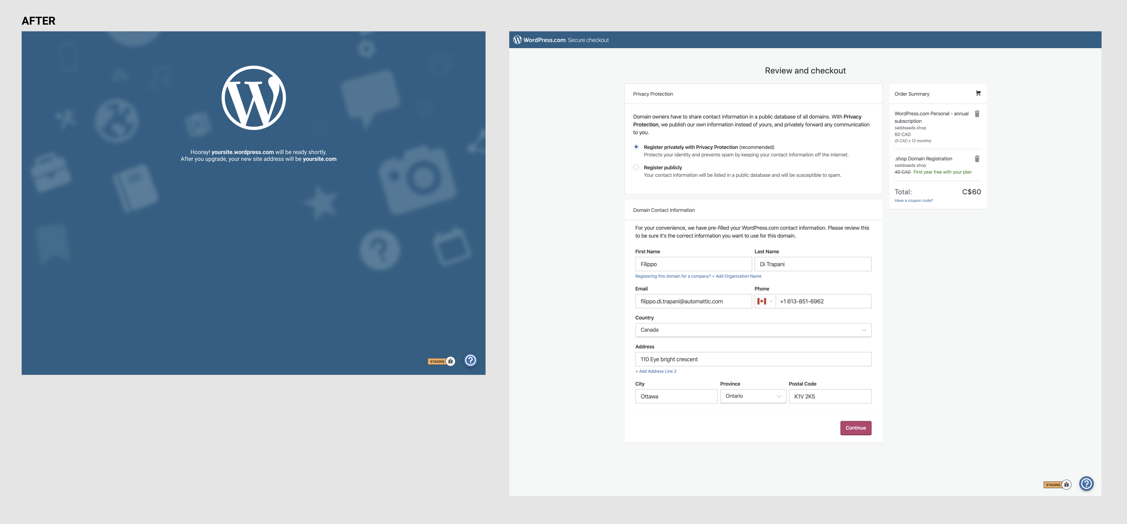
I suggested we add the messaging to the loading screen and keep things cleaner on the checkout screens since there's so much already going on, on there.
fditrapani
on 26 Nov 2019
Have a screenshot of the update?
olaolusoga
on 26 Nov 2019
Yeah sure, here's a before:
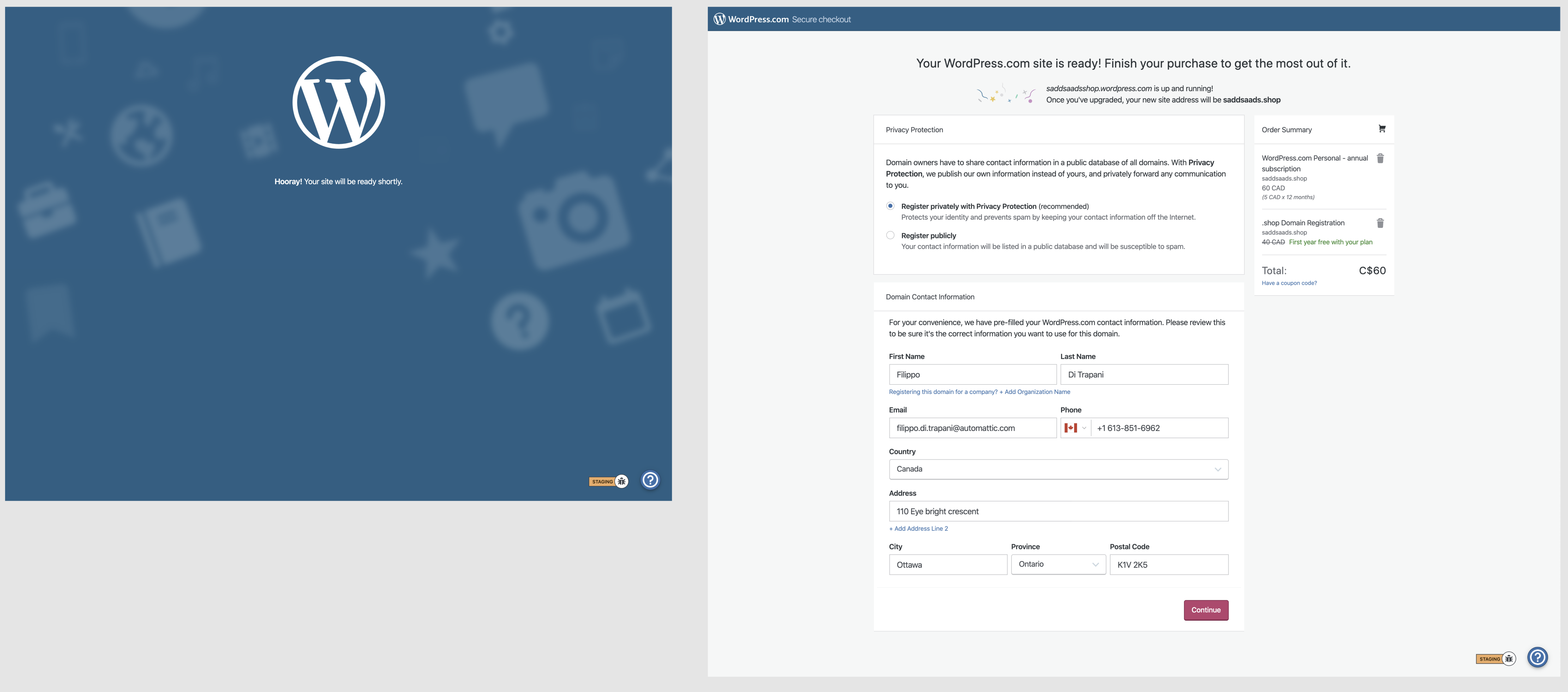
and here's an after:
fditrapani
on 26 Nov 2019
Moved to Checkout Redesign for triaging.
 davipontesblog
on 13 Mar 2020
davipontesblog
on 13 Mar 2020
I recently learned that the waiting screen is used in multiple cases, such as creating accounts for Crowdsignal, and the copy stays the same for every one. So it's probably best not to mess with it. Since this isn't an issue with the new design and we're scaling up support quickly, I'd be inclined to close this.
Feel free to open up the issue if you think otherwise.
fditrapani
on 13 Mar 2020
Related issues
 ehg
·
3Comments
ehg
·
3Comments
 rickybanister
·
3Comments
rickybanister
·
3Comments
rickybanister
·
3Comments
rickybanister
·
3Comments
 lamosty
·
3Comments
lamosty
·
3Comments
 vparkhere
·
3Comments
vparkhere
·
3Comments
Most helpful comment
D35176-code