Wp-calypso: (5P) FSE: Implement alternate template selector design
If we can't find a way to improve BlockPreview performance enough for it to be shippable (#34976), let's update the design of the template selector to mitigate that concern.
 obenland
All 14 comments
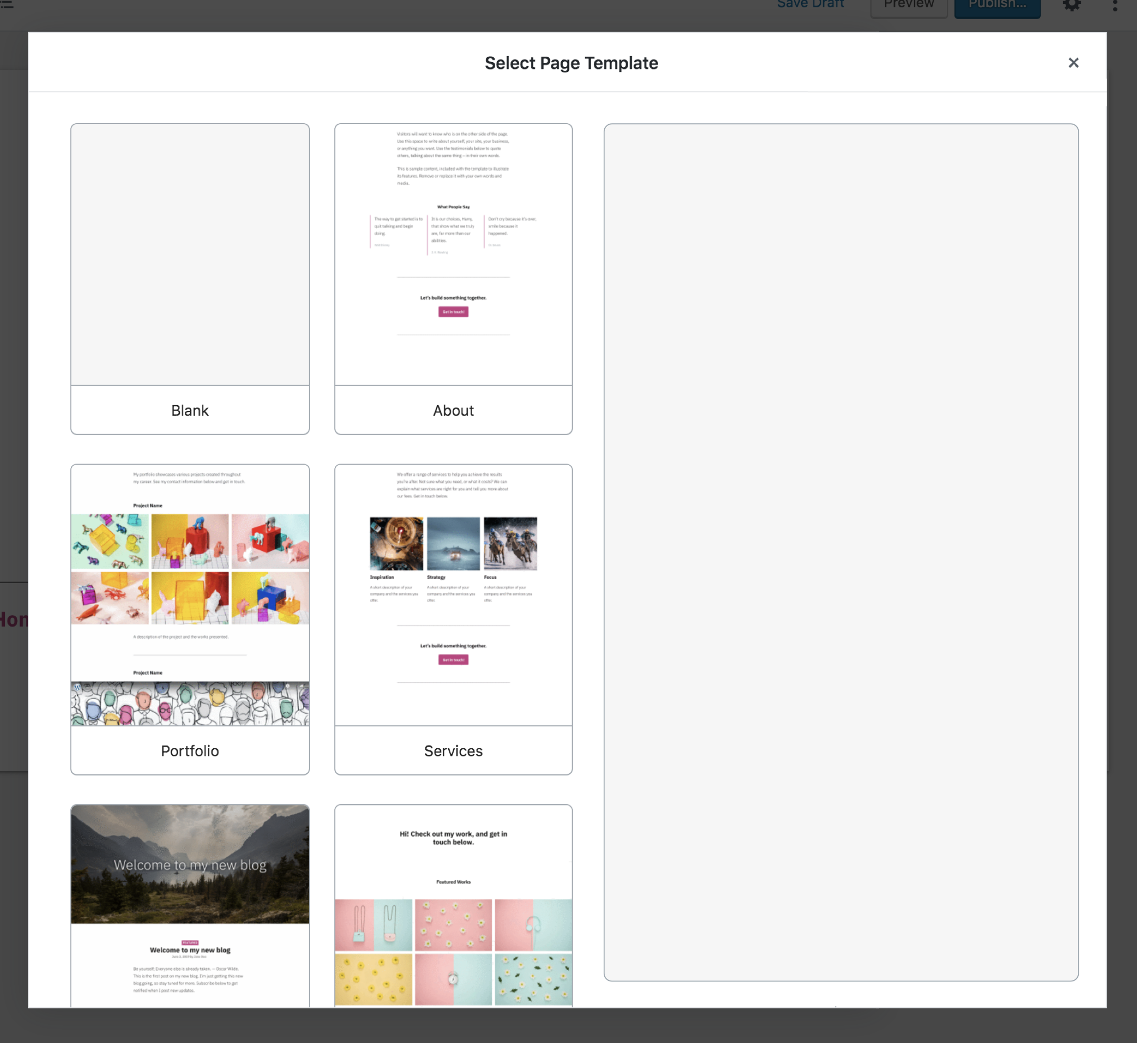
This is large dynamic single preview, with screenshots for small previews.
 apeatling
on 12 Aug 2019
apeatling
on 12 Aug 2019
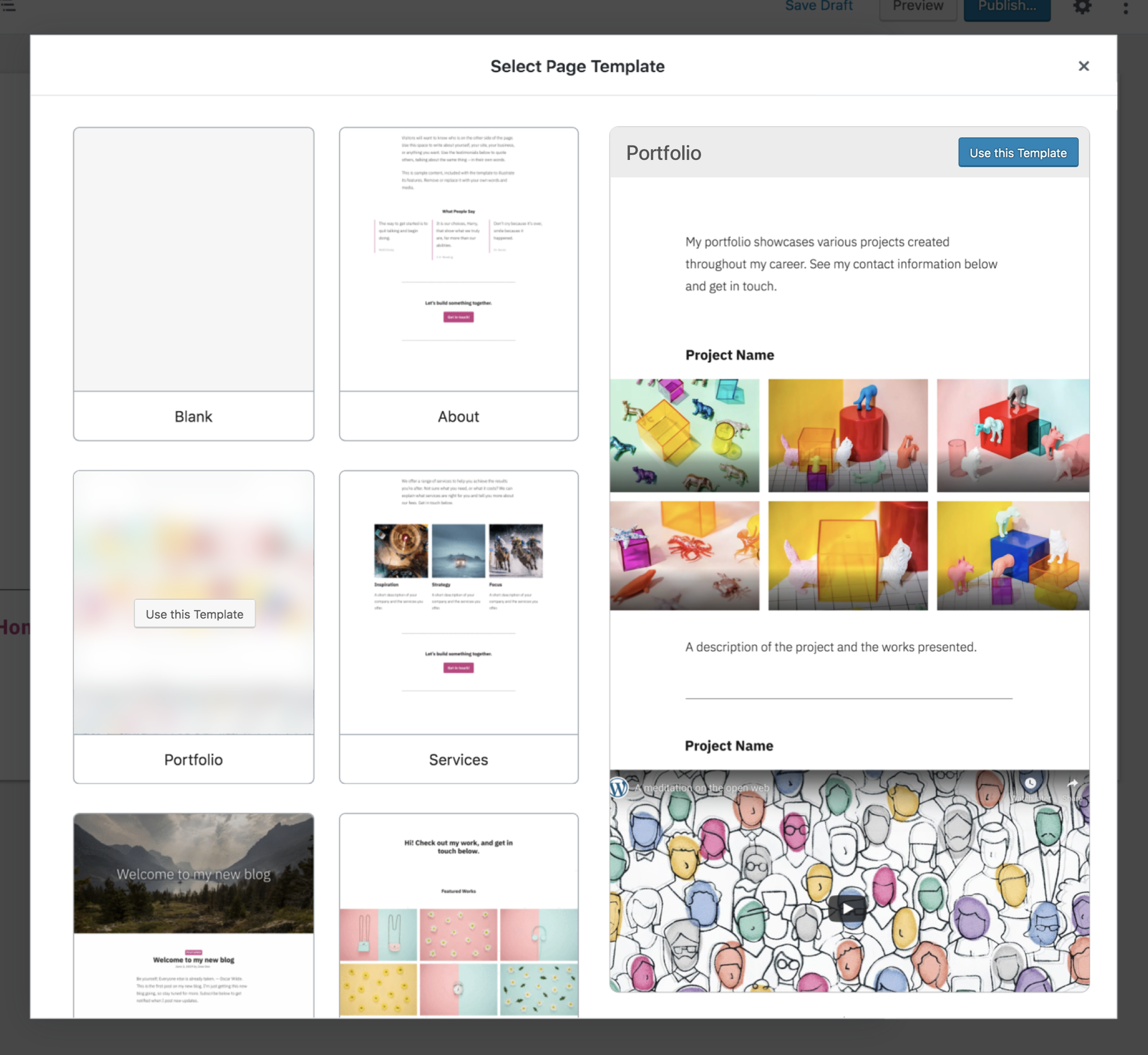
I suggest this as a rough reference mockup for this next iteration using the design that already exists in the modal:
The left smaller thumbnails scroll, the right large preview stays static.
apeatling
on 12 Aug 2019
@Automattic/ajax I'd like to flag some issues I've noticed with hover experience is here.
Issues:
- Doesn't meet a11y guidelines
- You cannot scroll the large preview because as soon as you mouseout from the thumbnail the large preview disappears.
- It takes a _noticeable_ amount of time to render/load the preview (as a user I don't care how many milliseconds, I just know it's not instant). Even subsequent returns to the same preview are slow.
 getdave
on 13 Aug 2019
getdave
on 13 Aug 2019
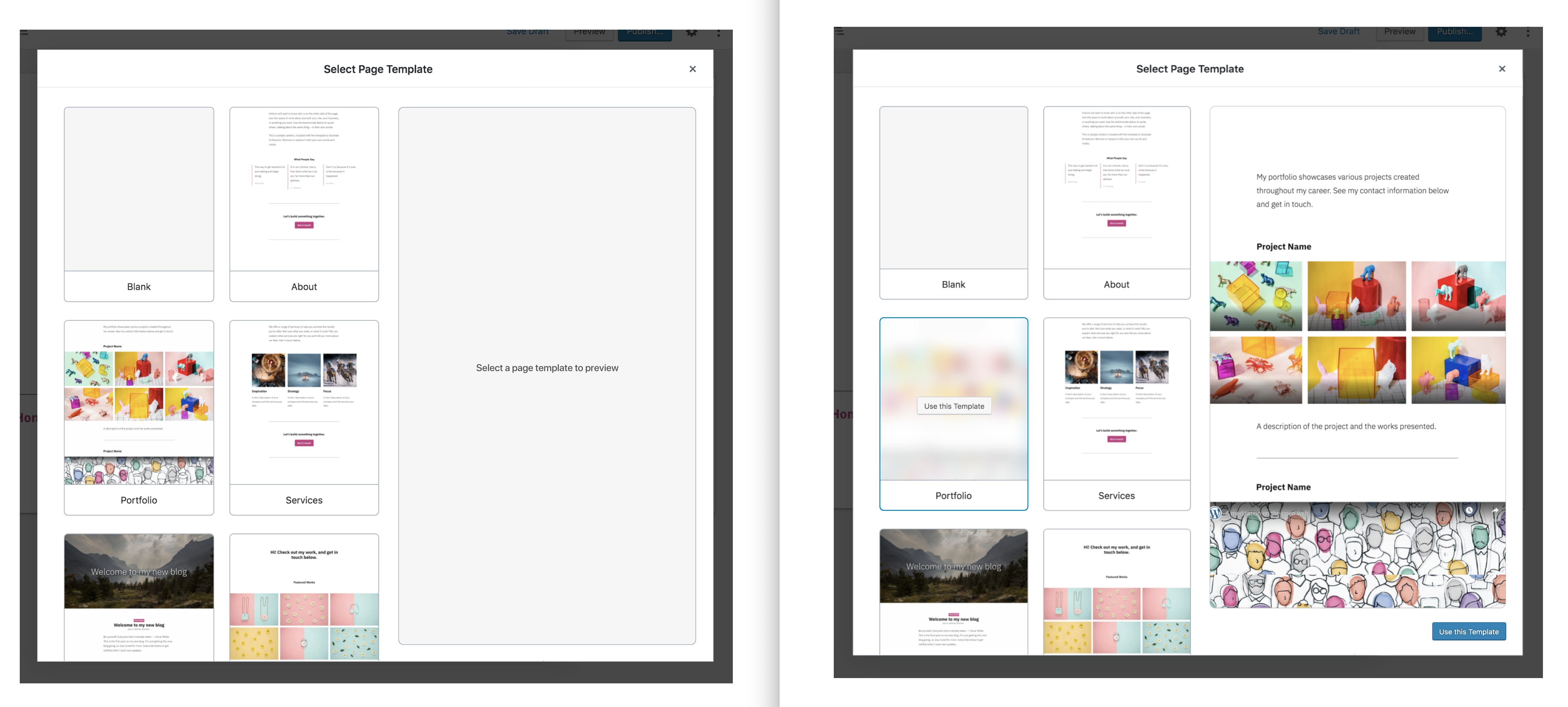
This is the next iteration designs without the modal from @shaunandrews https://github.com/Automattic/wp-calypso/issues/35248
apeatling
on 13 Aug 2019
If hovering proves to be too big of an issue, here's Shaun's option B applied to the modal, also addressing the concern about not noticing the button showing on the template thumbnail:
If you click blank, just dismiss the modal.
apeatling
on 13 Aug 2019
Small detail but I wanted to share that Modal component already has a native support for buttons which we should leverage in case we add the confirmation step (I'm all for adding it)
These are the docs that mention it and show what it looks like - it takes bottom right of the window. https://github.com/WordPress/gutenberg/tree/master/packages/components/src/modal
Our modal is a bit more complex than examples but I think we should aim to stick with standards
 marekhrabe
on 14 Aug 2019
marekhrabe
on 14 Aug 2019
Makes sense, thanks for the link. Here's an update:
apeatling
on 14 Aug 2019
If you really want to stick with standards, you might also want to remove the [x] in the top right, and add a cancel button next to the "Use template" button. Then make the buttons persistent with the "use template" button disabled until a template is selected.
apeatling
on 14 Aug 2019
Thanks for this @apeatling. I'm not completely clear on the interaction model though.
- Are we still using
hoverto show the preview? - If "yes" to above then how can you scroll the large preview?
- If "yes" to above then how can I ever reach the blue
Use this Templatebutton on the large preview?
Drawing on existing interaction models
Perhaps we could use the existing WP-Admin Themes model for guidance here?
With this approach you:
- See a selection of Theme thumbnails
- Hover to see a set of actions
- Button available to immediately activate
- Clicking on a thumbnail brings up a large preview (see below)
To be clear I'm _not_ suggesting we copy this design/UX verbatim. Rather I"m saying we can learn from the interactions. Namely:
- Hover shows more details on thumb but _does not_ activate the preview
- _Click_ is used to display the preview
- Action buttons are available for immediate selection without preview
Interested in everyone's thoughts...
We should also be mindful of this UI response time research when working on the UX for this:
https://www.nngroup.com/articles/response-times-3-important-limits/
getdave
on 14 Aug 2019
Quoting @shaunandrews:
The second one (B) is similar, but the interactions are different. Instead of hovering, you'd click on a thumbnail to populate the preview area. Then, you'd click on the newly appearing "Use this template" button to select the template.
I assume that is what Andy had in mind in terms of the interactions for the new mockups.
I would agree with @getdave that there should be some form of visual response when hovering over a thumbnail. Mainly to indicate that they can/should be clicked.
 frontdevde
on 14 Aug 2019
frontdevde
on 14 Aug 2019
If you really want to stick with standards, you might also want to remove the [x] in the top right, and add a cancel button next to the "Use template" button. Then make the buttons persistent with the "use template" button disabled until a template is selected.
@apeatling The "x" comes with the standard Gutenberg modal. If we set isDismissable to false it disappears but then the Modal also can't be dismissed with ESC or clicking outside of the modal. If we do want to remove the "x" we'd probably just want to visually hide it.
frontdevde
on 14 Aug 2019
Another thought: how much do we need to "care" about the fine details of the modal if it's going to go anyway? Just thinking...
getdave
on 14 Aug 2019
Yes, let's not overthink this. What I presented was what Shaun presented for the iteration outside of the modal (option B). It would allow us to more easily move to the non-modal iteration next.
apeatling
on 14 Aug 2019
The visuals I presented came with the caveat: "If hovering proves to be too big of an issue".
My suggestions for the above are to:
- Highlight a small preview thumb with the blue outline when hovering, do not change the large preview.
- On click show the large preview and adjust the view as shown here: https://github.com/Automattic/wp-calypso/issues/35232#issuecomment-521002451
- On click of "blank" just close the modal and select blank.
- On click of any "Use this template" button, close the modal and load the template.
apeatling
on 14 Aug 2019
Related issues
 hoverduck
·
3Comments
apeatling
·
3Comments
hoverduck
·
3Comments
apeatling
·
3Comments
 roccotripaldi
·
3Comments
roccotripaldi
·
3Comments
 aduth
·
3Comments
aduth
·
3Comments
 kellychoffman
·
3Comments
kellychoffman
·
3Comments
Most helpful comment
The visuals I presented came with the caveat: "If hovering proves to be too big of an issue".
My suggestions for the above are to: