Wp-calypso: My Plan: Feature card headings need higher contrast
Steps to reproduce
- Starting at URL: http://wordpress.com/my-plan/
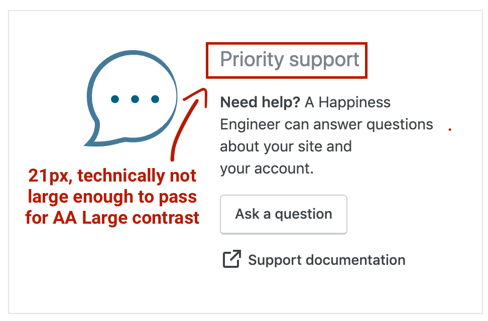
- The headings on each of the feature cards (as seen above) need more contrast to pass AA WCAG standards
- We can probably use the CSS var
--color-text-subtleinstead.
 sixhours
All 3 comments
I agree the text could be darker to be safe (the text might shrink on small viewports), but just noting here that "Large" is anything 18 or above, not 21. Or at least that's what I thought.
https://developer.paciellogroup.com/blog/2012/05/whats-large-text-in-wcag-2-0-parlance/
 davewhitley
on 2 Aug 2019
davewhitley
on 2 Aug 2019
@drw158 Large is 18pt, but that's usually computed to 24px. I was saying (this screenshot came from me) that this text is 21px, so it's not "large".
The ratio between sizes in points and CSS pixels is 1pt = 1.333px, therefore 14pt and 18pt are equivalent to approximately 18.5px and 24px.
from note 1 here
 ryelle
on 13 Sep 2019
ryelle
on 13 Sep 2019
👍2
@ryelle Wow, I never noticed that! Thank you for clarifying. I'll keep that in mind in the future.
davewhitley
on 14 Sep 2019
👍1
Was this page helpful?
0 / 5 - 0 ratings
Related issues
 lamosty
·
3Comments
lamosty
·
3Comments
 jeherve
·
3Comments
jeherve
·
3Comments
 ehg
·
3Comments
ehg
·
3Comments
 gedex
·
3Comments
gedex
·
3Comments
 kellychoffman
·
3Comments
kellychoffman
·
3Comments
Most helpful comment
@drw158 Large is
18pt, but that's usually computed to24px. I was saying (this screenshot came from me) that this text is 21px, so it's not "large".from note 1 here