Wp-calypso: Signup: Domain already taken has blue callout left border that no longer works with same-color background
Steps to reproduce
- Walk through the signup process and enter a domain that you know is already taken
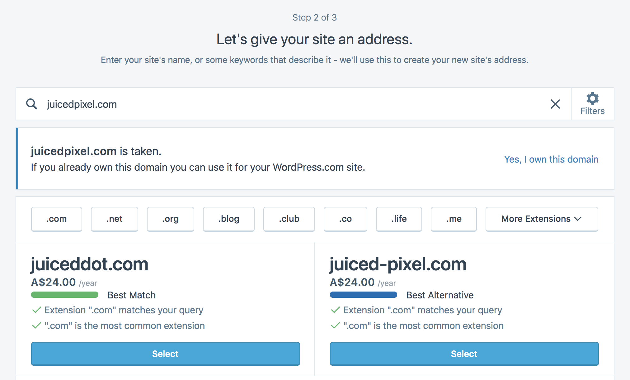
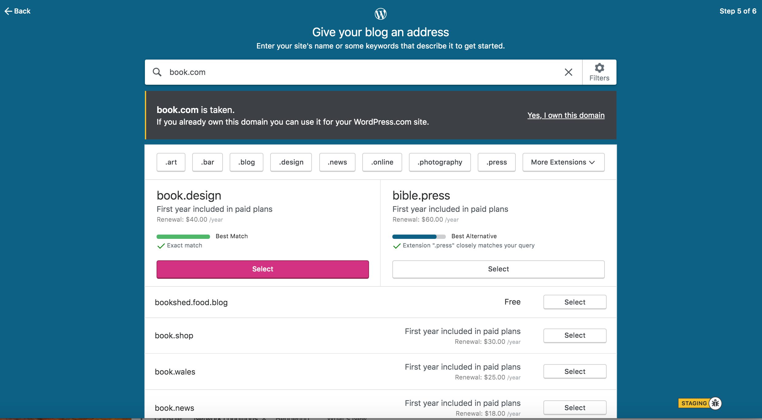
- The box telling you that the domain is already taken has a 3px wide blue left border to call the user's attention to the issue. (See images, below)
What I expected
A clear alert that the domain is already taken.
What happened instead
An unclear situation that looks more like a visual goof than a callout.
Browser / OS version
Any/All
Screenshot / Video
This is the way it USED to look (you will notice that the blue bar stands out and is quite visible):
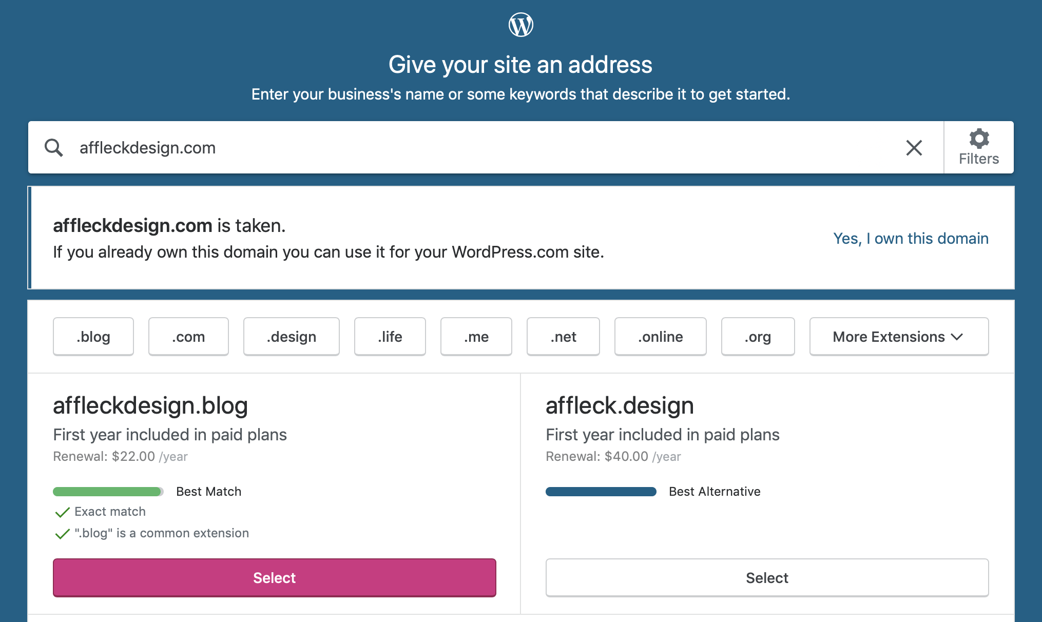
This is the way it looks today (note that the callout is the same color as the background and it looks not like a callout but a visual goof):
Context / Source
 andyaffleck
All 8 comments
One possible solution (unless red is a "bad color")
andyaffleck
on 13 Jun 2019
Another possible solution is to replicate the grey background and red border used for regular error messages, and to use white text (with the link underlined to indicate that it's a link).
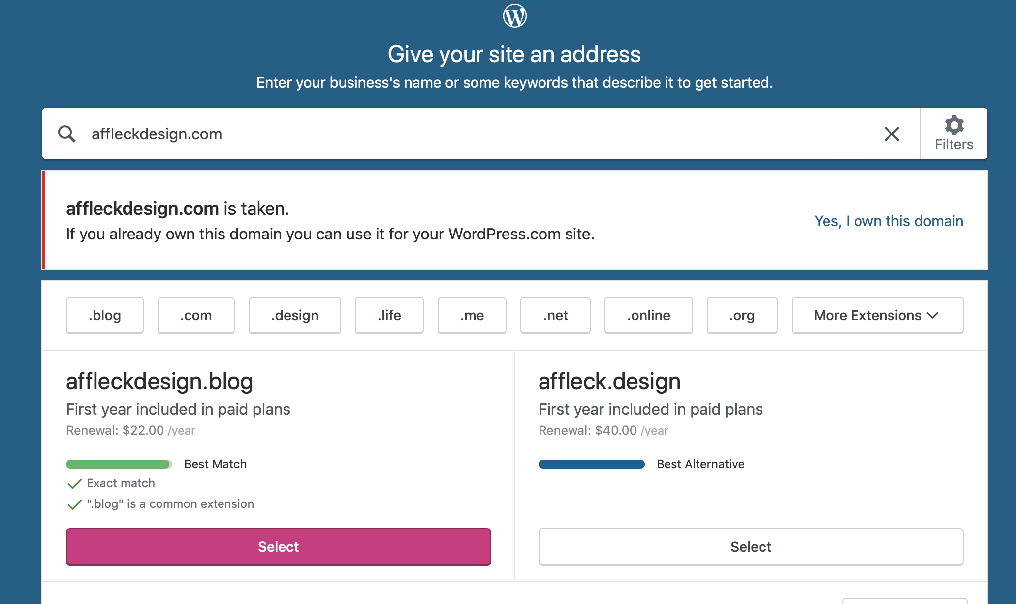
Here's another version using yellow (if we want to show that it's a warning and less of an error):
 michiecat
on 13 Jun 2019
michiecat
on 13 Jun 2019
@drw158 Can we get your thoughts on the above ideas? (Also, we are sitting right behind you :)
andyaffleck
on 13 Jun 2019
@zeldman What do you think?
andyaffleck
on 13 Jun 2019
Yellow stripe, black background is much better. Focuses my attention. Works as an alert (the traditional purpose of yellow) instead of as an error like red. Well done. This seems to be the best choice. Onward!
 zeldman
on 13 Jun 2019
zeldman
on 13 Jun 2019
Which component is being used? This seems like a good fit for the Notice component, which has a warning variant I believe. You'll also get the dark background for free.
 davewhitley
on 13 Jun 2019
davewhitley
on 13 Jun 2019
This was introduced in https://github.com/Automattic/wp-calypso/pull/19183
And the idea was that a Notice is not a good fit for it - it makes it seems like an error occurred, like this is an unexpected state. Whereas I'd say this is a flow that users are supposed to land on when they are trying to transfer in or map a domain they already own. I'd prefer to preserve that - Notice seems like a poor fit here, at least the warning variation. It's also much smaller than the current implementation.
 klimeryk
on 16 Dec 2019
klimeryk
on 16 Dec 2019
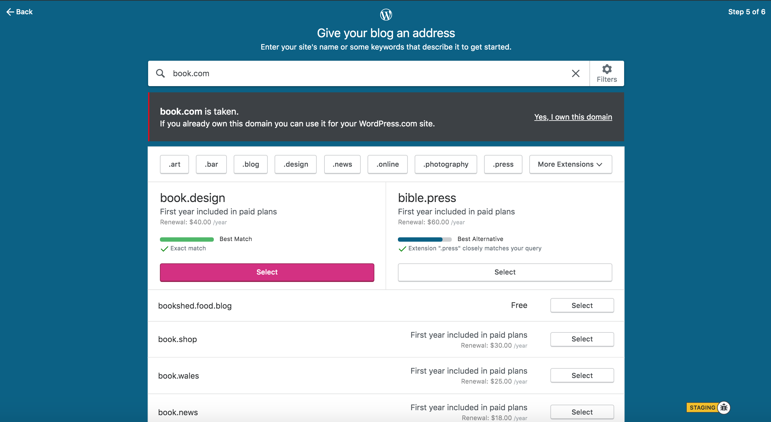
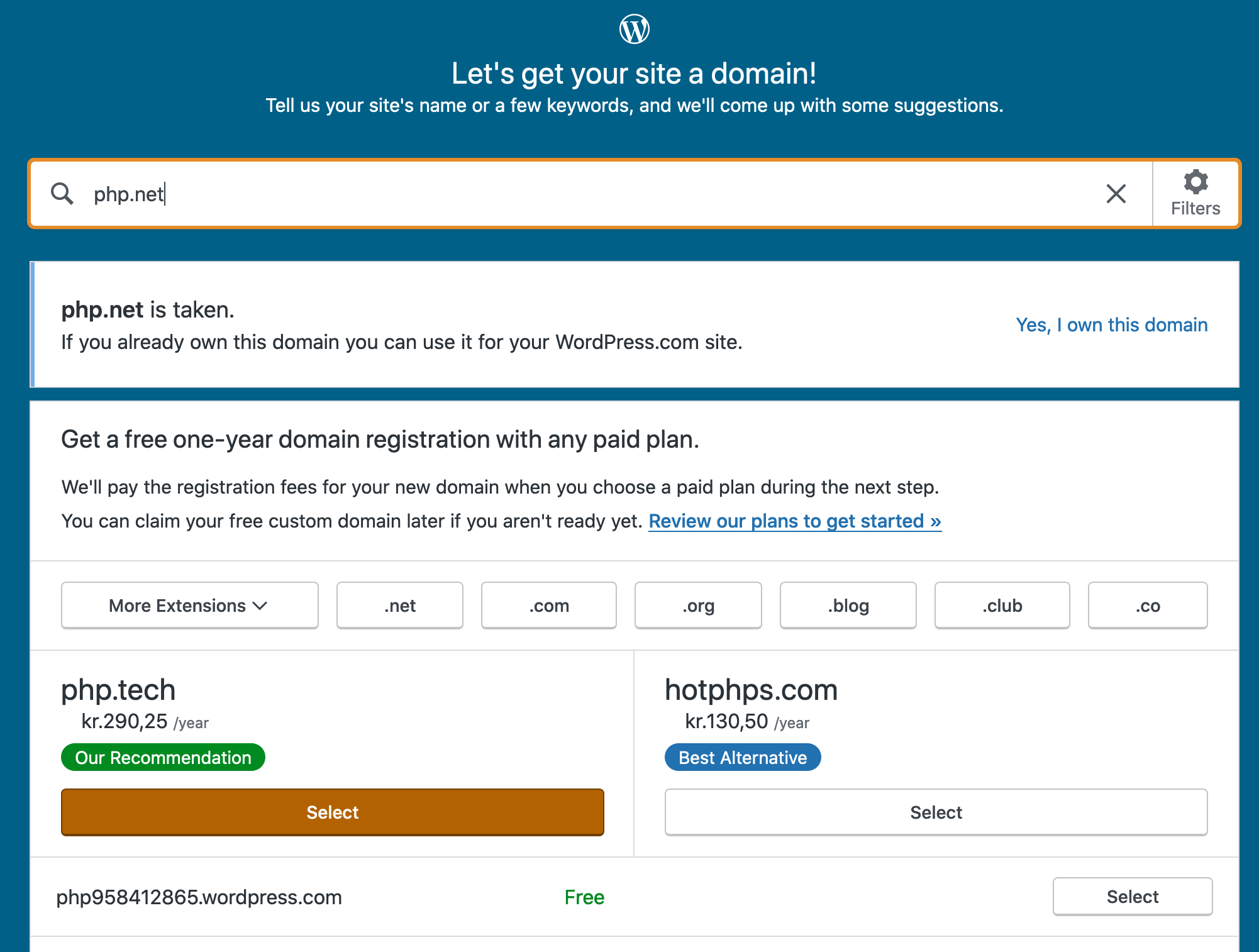
I've re-checked and looks like the border is a different shade now and does not seem like a "visual goof" anymore:
Closing the issue.
klimeryk
on 19 Dec 2019
Related issues
 spen
·
3Comments
spen
·
3Comments
 jjchrisdiehl
·
3Comments
jjchrisdiehl
·
3Comments
 aduth
·
3Comments
aduth
·
3Comments
 rickybanister
·
3Comments
rickybanister
·
3Comments
 apeatling
·
3Comments
apeatling
·
3Comments
Most helpful comment
This was introduced in https://github.com/Automattic/wp-calypso/pull/19183
And the idea was that a Notice is not a good fit for it - it makes it seems like an error occurred, like this is an unexpected state. Whereas I'd say this is a flow that users are supposed to land on when they are trying to transfer in or map a domain they already own. I'd prefer to preserve that - Notice seems like a poor fit here, at least the warning variation. It's also much smaller than the current implementation.