Wp-calypso: Plans: FAQ hard to parse/read
Steps to reproduce
- Go to https://wordpress.com/plans/[sitename]
What I expected / What happened instead
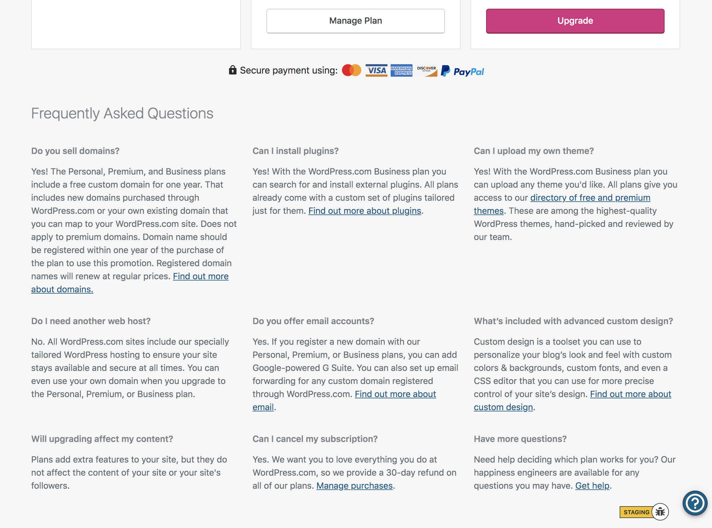
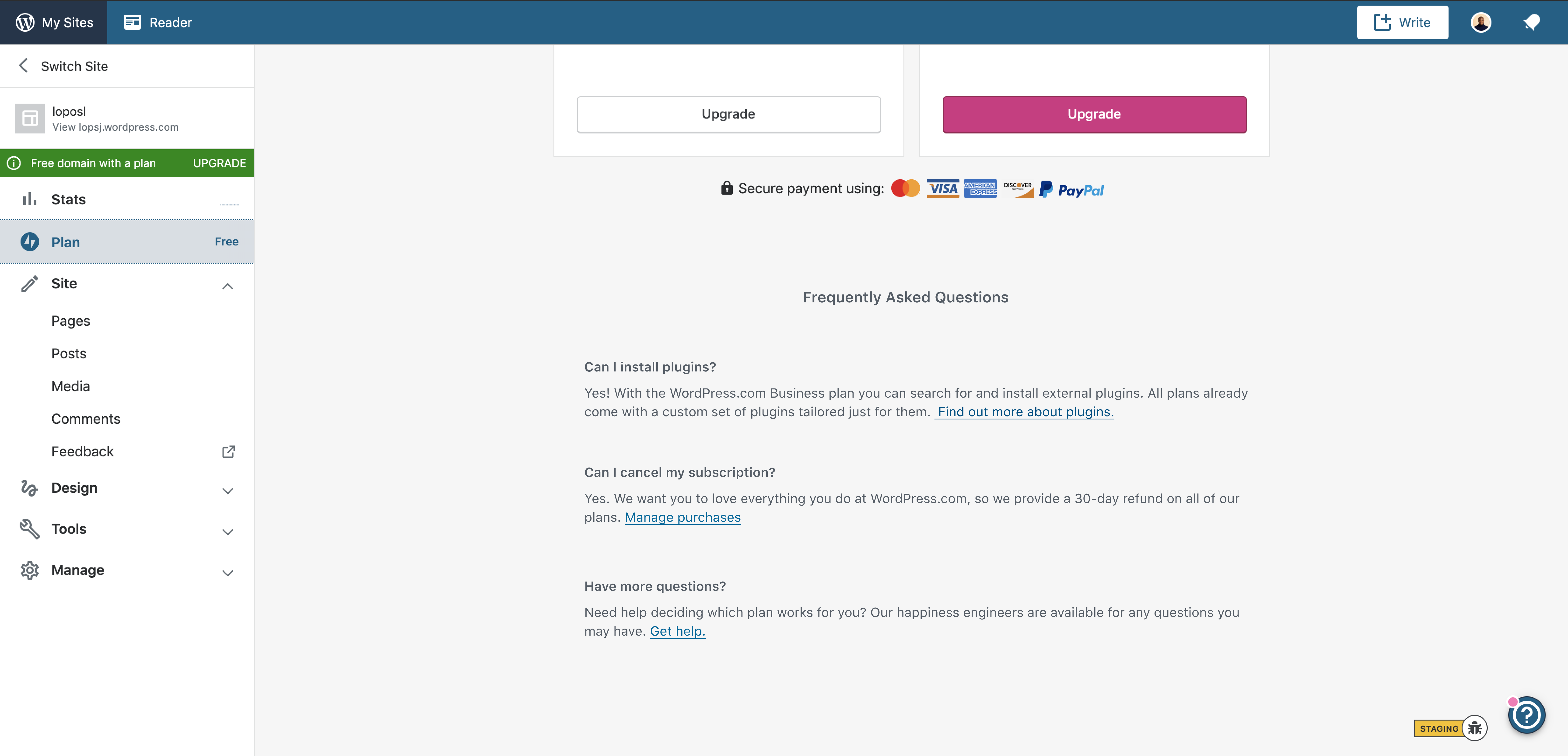
The FAQs are at the bottom of the Plans page. They can certainly be helpful but the current layout, because of type size and varying length can be hard to parse.
I wonder if there's a better place for them to live?
 mikeshelton1503
All 13 comments
I wonder if these would be better on their own view and linked to from the Help Floating Action Button. We already do something similar in other views as you can see here:

Edit: Maybe even link to a support article that would house these FAQ questions?
 MichaelArestad
on 13 Jun 2019
MichaelArestad
on 13 Jun 2019
I wonder if these FAQs being so front and center increases or decreases conversions compared to moving them into the Help FAB.
MichaelArestad
on 13 Jun 2019
CC @jeffgolenski @eeeeevon13
MichaelArestad
on 13 Jun 2019
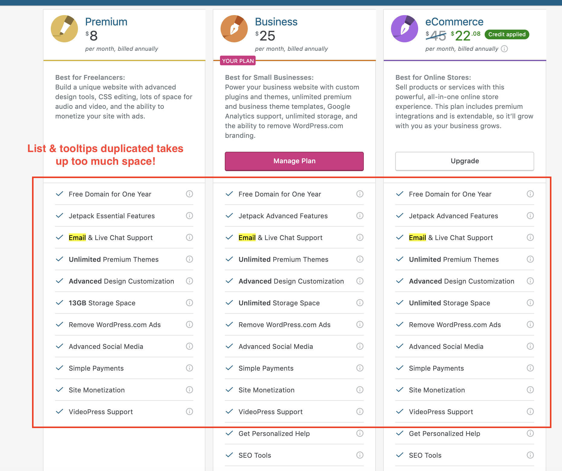
I've noted this before, too, and wondered why the information there isn't in the main table. It may seem overwhelming already, but we could substract a lot of the current content by not repeating features that are already described in lower plans. E.g.
- Feature x
- Feature y
- Feature z
- Everything from the [previous plan]
And if there are still FAQs than the tooltips might need to be reworked.
 obi2020
on 14 Jun 2019
obi2020
on 14 Jun 2019
Feature x
Feature y
Feature z
Everything from the [previous plan]
I'm currently exploring this in p2-p9jf6J-1SK
 jancavan
on 23 Jul 2019
jancavan
on 23 Jul 2019
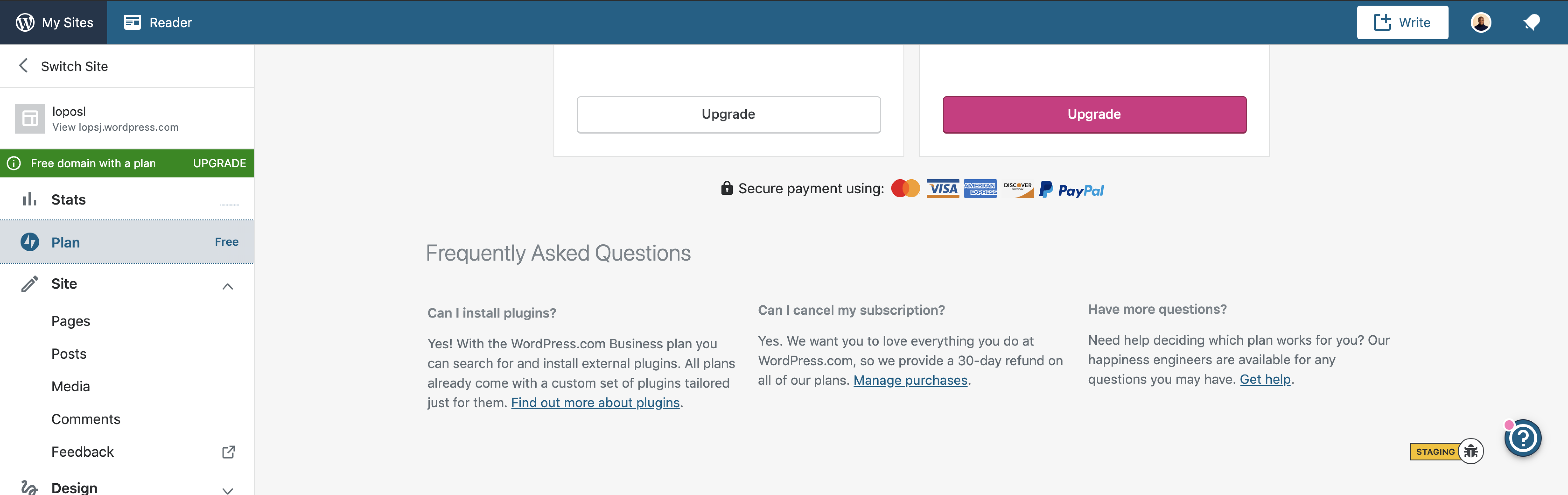
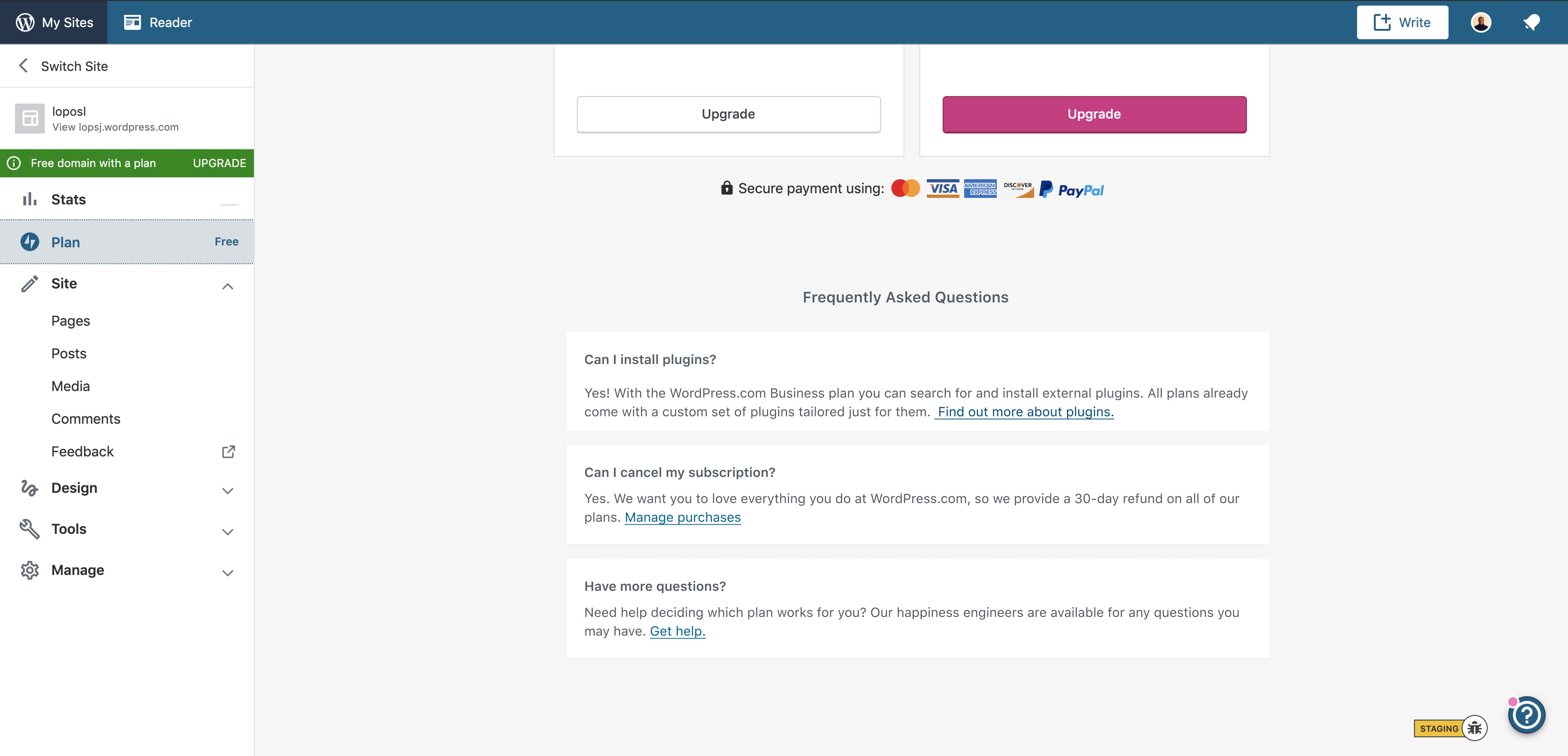
Initially, I thought it will be nice to remove the FAQ page since there all already link to support. @jancavan suggested that it would be helpful to just reduce the information instead of removing the section entirely. She ran a Hotjar heatmap on the page and it shows that less than 25% of users scroll to the FAQ page. So I concluded to reduce the information on the FAQ page, which I did here.
Let me know what you think or if there is anything to add or remove.
 scalarbane2
on 3 Aug 2019
scalarbane2
on 3 Aug 2019
I like that you've reduced the amount of content based on the heatmap findings.
If we're keeping FAQs on this page, I wonder if there's another way to present this information to users. Did you explore any alternative layouts?
What happens if one of the answers is much longer than the others?
 lcollette
on 3 Aug 2019
lcollette
on 3 Aug 2019
Thanks, @lcollette. Another way I think it's okay to present this is:
But then, I figured there might be too many boxes everywhere, that is where I also tried removing the boxes here:
With this Layout, I think it would be able to accommodate long answers if there is. Because currently, we only plan to leave those three questions on the page.
scalarbane2
on 5 Aug 2019
Good to note that the current design for the FAQ using light gray text on a light gray background doesn't pass WCAG AA standards for accessibility. If we go that route with these updates, we should also darken the text for better contrast and readability.
 sixhours
on 5 Aug 2019
sixhours
on 5 Aug 2019
Good to note that the current design for the FAQ using light gray text on a light gray background doesn't pass WCAG AA standards for accessibility. If we go that route with these updates, we should also darken the text for better contrast and readability.
In that case, do you think the first one is okay?
scalarbane2
on 5 Aug 2019
In that case, do you think the first one is okay?
I can't tell from the screenshot, but if you plug the text color and background color into the contrast checker, you'll know whether the contrast is OK or needs to be bumped up: https://webaim.org/resources/contrastchecker/
sixhours
on 5 Aug 2019
Personally, I prefer the FAQ not enclosed in cards, but yes, with darker text. I think the left-aligned heading is also better, but with darker text as well.
jancavan
on 5 Aug 2019
I like the left alignment as well, and I agree with @jancavan about the cards. Another option could be to group the FAQs together, keeping your proposed spacing, colors, and alignment, but on a white background. This could help them feel less floaty.
lcollette
on 6 Aug 2019
Related issues
 hoverduck
·
3Comments
hoverduck
·
3Comments
 rickybanister
·
3Comments
rickybanister
·
3Comments
 samouri
·
3Comments
samouri
·
3Comments
 gedex
·
3Comments
gedex
·
3Comments
 vparkhere
·
3Comments
vparkhere
·
3Comments
Most helpful comment
Good to note that the current design for the FAQ using light gray text on a light gray background doesn't pass WCAG AA standards for accessibility. If we go that route with these updates, we should also darken the text for better contrast and readability.