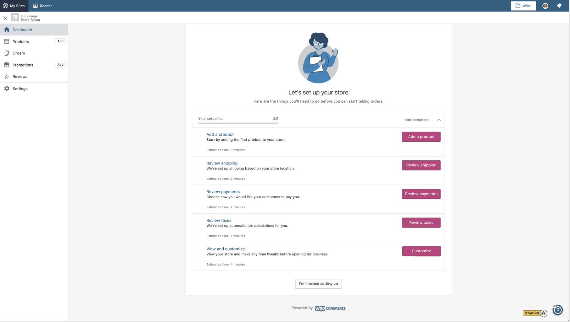
Wp-calypso: Store onboarding - Task list CTAs have different widths
Steps to reproduce
- Starting at URL: https://wordpress.com/store/test1991256687048.blog
- All CTAs ("Review Payments", "Review Taxes"...) have different sizes
What I expected
I expected all these CTAs to be the same size for a more consistent UI
Screenshot / Video
 Garance91540
All 6 comments
Here's a proposed design solution
@davemart-in @sixhours how can I validate this design change decision?
Garance91540
on 12 Jun 2019
cc @Automattic/muriel, re the sea of pink buttons!
 scruffian
on 12 Jun 2019
scruffian
on 12 Jun 2019
There's a PR in #33825 regarding the primary buttons. :)
 Aurorum
on 12 Jun 2019
Aurorum
on 12 Jun 2019
@Garance91540 I think this is an improvement, for sure. I'd be interested to see how fixed-width buttons work when the buttons get translated into other languages -- would the text wrap, making the buttons larger/taller? I don't think that's a problem, but something that should be tested during implementation.
 sixhours
on 12 Jun 2019
sixhours
on 12 Jun 2019
I'm hesitant to make the buttons the same size for a couple reasons:
- Depending on the language, the string length may change and become too long (and likely wrap)
- It's hard to determine what "the" width should be since some actions might just be "Do it!" and others longer like "Connect your social accounts."
I do think it is much better visually, but I'm not sure how feasible it is to implement.
Perhaps, by making the buttons secondary, the jagged row of buttons won't be as noticeable?
 MichaelArestad
on 12 Jun 2019
MichaelArestad
on 12 Jun 2019
I was wrongly focusing on this store set up screen only, not on all the primary CTAs. I do think it will be difficult to apply a set width to all content type!
@MichaelArestad I think your suggestion to set these CTAs as secondary will make the width inconsistency less noticeable, so will close this issue and defer to your solution!
Garance91540
on 12 Jun 2019
Related issues
 rickybanister
·
3Comments
rickybanister
·
3Comments
 kellychoffman
·
3Comments
rickybanister
·
3Comments
kellychoffman
·
3Comments
rickybanister
·
3Comments
 vparkhere
·
3Comments
vparkhere
·
3Comments
 gedex
·
3Comments
gedex
·
3Comments
Most helpful comment
I was wrongly focusing on this store set up screen only, not on all the primary CTAs. I do think it will be difficult to apply a set width to all content type!
@MichaelArestad I think your suggestion to set these CTAs as secondary will make the width inconsistency less noticeable, so will close this issue and defer to your solution!