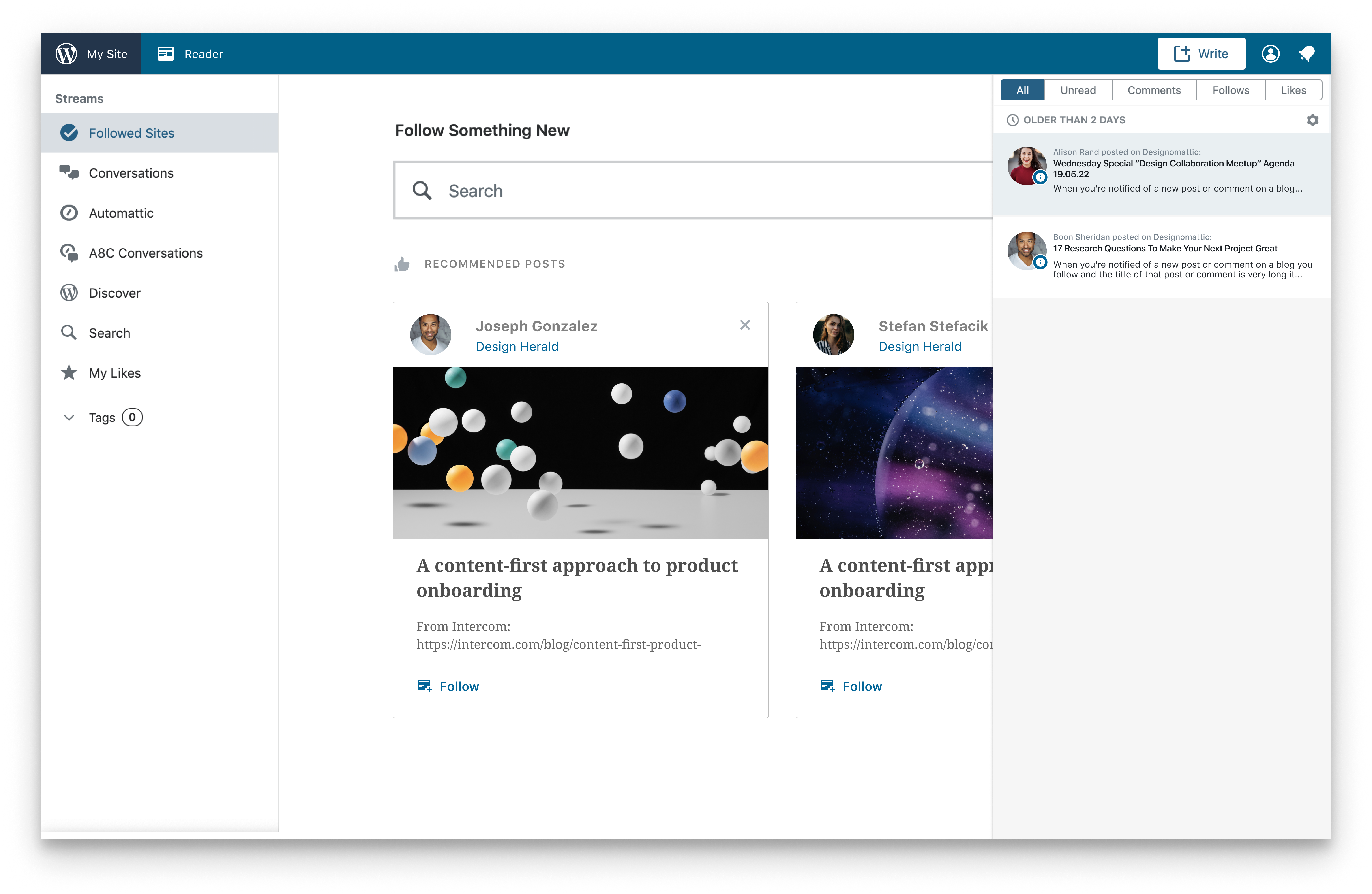
Wp-calypso: Notifications: Sometimes you can't tell which blog a notification is coming from

When you're notified of a new post or comment on a blog you follow and the title of that post or comment is very long it obscured the title of the blog where the notification is originating from.
e.g. John Doe posted "this is a very long title—it's so long that it will hide the part where It tells the user what blog this was posted on" on The Studio
The "on The Studio" part would probably be hidden. If the title is especially long it's even hidden when you click on the notification and expand the drawer. (see screenshots)
This might be a very a8c-centric problem since we really push the notification feeds functionality to its limits, but it still feels like the website that a notification is originating from should be put in a spot where it won't get easily hidden.
Originally reported by @dabowman
All 9 comments
Hello all! I looked into this and this is what I think:

I tried putting the blog where the article was posted and the author as a label at the top. This would make room for a longer title in the title section.
I tried some other options by putting the gravatar and the name of the author at the bottom left and the blog where it was posted at the bottom right, but it no longer looks like a notification after doing that.
@dabowman Let me know what you think.
@scalarbane2 looks like you mocked up the new post notification only - could you also explore the other types of notifications?
Yeah, @alaczek Other notifications won't change because none of them has a lengthy title that will overflow.
Moving this back to To Do so a CrT or dev can pick it up!
It took some digging, but I eventually found where that post subject line gets put together, like so:
$subject = __( '%1$s posted %2$s on %3$s' ); // 1: name 2: post title 3: blog name
It's fairly easy to rearrange that line and restyle it to match the proposed design:
$subject = __( '%1$s posted on %3$s %2$s ' );
... but I noticed moving the post title to the end breaks things a little if there isn't a word or phrase between each placeholder. I'm guessing there's some regex searching for a pattern that fails to match when you change the elements' orders. I can fudge it with a non-breaking space between the blog name and the post title, but that's hacky. :)
This makes me think we need to consult with someone who has notifications experience before we consider this change.
@kwight, could you take a look and let me know if I'm on the right track? Or point me in the right direction?
@sixhours Hm, I _can't_ find where that subject is assembled, so you're ahead of me 🙃 But I'd say do whatever you think is best; feel free to ping me for review if you like 👍
@scalarbane2 The more I look at this, the more I think we shouldn't change the text formatting, beyond shifting the title to its own line. Because every other notification follows the same format, with the username in bold, the title in italics, etc.
If we updated one type of note to use a different format than the rest, that would be confusing. But moving the title to its own line fixes the bug in question without disrupting the existing experience.
I've updated this in D29846-code
Deployed in r193725-wpcom
Most helpful comment
@sixhours Hm, I _can't_ find where that subject is assembled, so you're ahead of me 🙃 But I'd say do whatever you think is best; feel free to ping me for review if you like 👍