Wp-calypso: Checkout: Cart icon has no label, and there's room for one
There should be a text label alongside the icon for clarity. I believe this is a Muriel principle?
 sixhours
All 7 comments
There are a few approaches to add a button text, and I made a mockup to gather feedback before working on a PR.
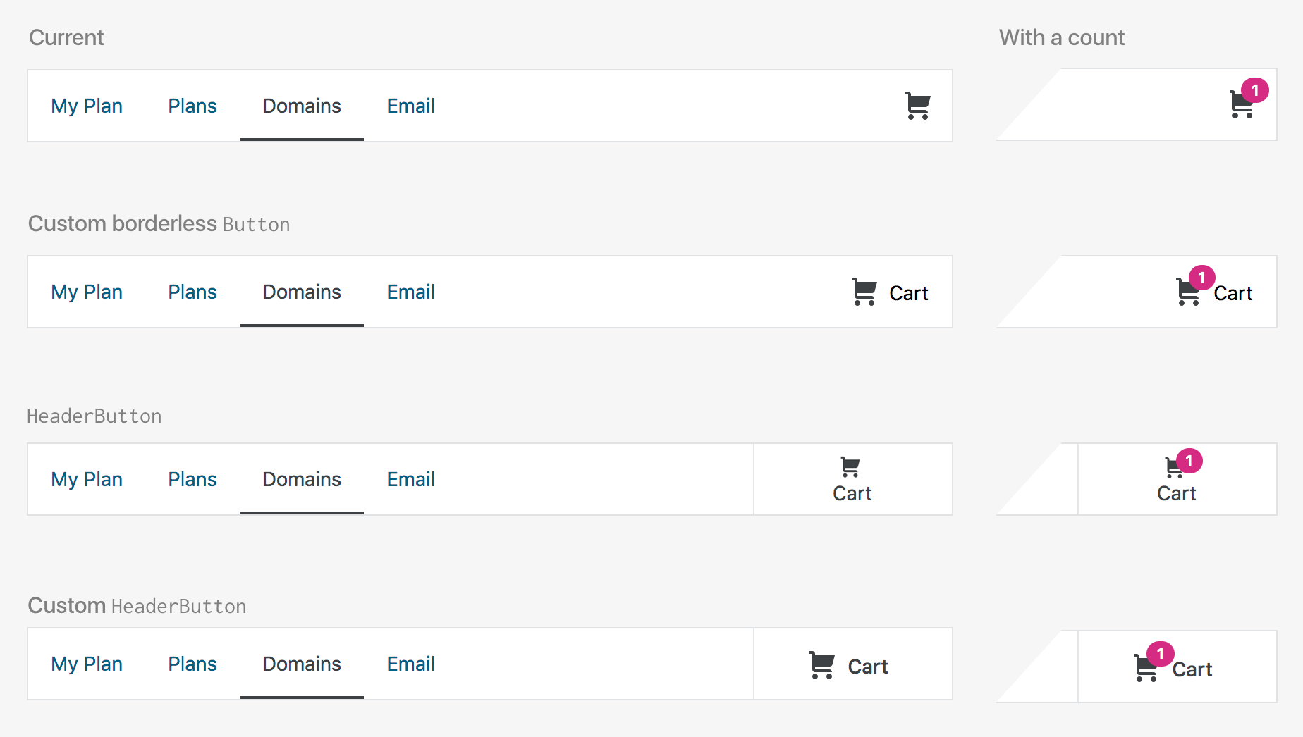
Custom Borderless Button
A borderless button uses --color-text-subtle, but with the importance of the button, it's probably better to customise it to use --color-neutral-700.
Header Button
We could use a HeaderButton, but the icon gets small, and it doesn't work well with the count badge.
Custom Header Button
We also could customise a HeaderButton to show the icon and text side-by-side to keep the icon the same size. If we think its min-width is too wide for this we could make it narrower as well.
I'm leaning towards Custom Header Button, but what do folks feel? Thanks in advance!
 iamtakashi
on 26 Apr 2019
iamtakashi
on 26 Apr 2019
I like the customized headerButton as well — the spacing feels nicer than the borderless button. A quick search shows that there's only a few uses of the headerButton component. Perhaps we can update the component itself, rather than adding some CSS to customize this instance of it?
 shaunandrews
on 29 Apr 2019
shaunandrews
on 29 Apr 2019
Agreed with the discussion above. Although I don't think there is any documentation on this in Material, I'd like to keep the icon to the left of the text. I've seen other design systems do the same thing — by default, icon buttons should have the icon on the left, unless there is implied forward/backward motion, like a pagination component.
 davewhitley
on 29 Apr 2019
davewhitley
on 29 Apr 2019
Thanks for the feedback, folks.
In today's show and tell I also heard headerButton as it currently is not working for this as well as other places (/themes and /plugins). So it makes sense to update the component.
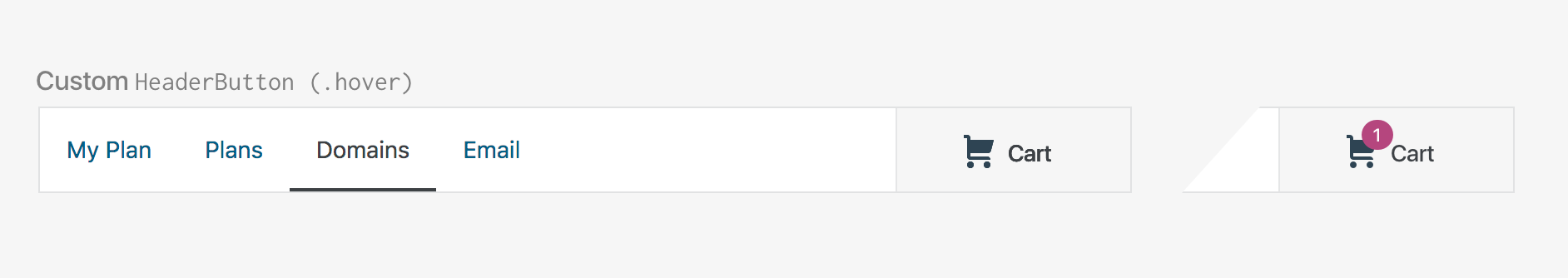
I also add that one of the advantages of the use of the customised headerButton over the customised borderless button is that headerButton will have a clear hovered state — when the customised borderless button uses --color-neutral-700, there is no obvious way to show the hovered state.
I'd like to keep the icon to the left of the text
That was exactly what I was going to ask you :) One of the feedback I received was to see how it'd look if the icon was on the right. I'll just add a mockup here because I made this before I read your comment :)
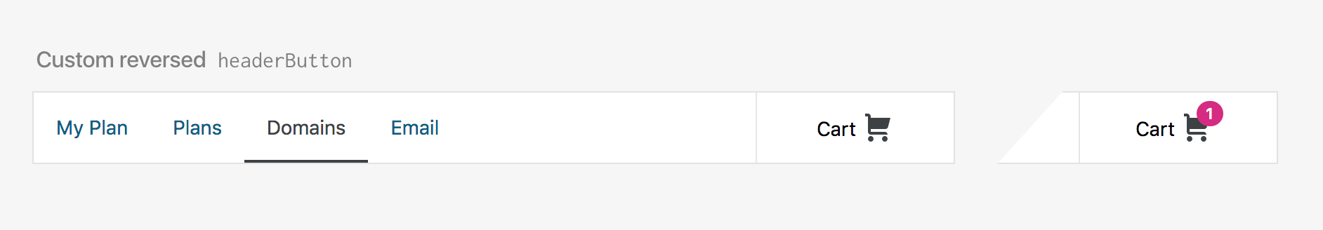
The icon on the right looks strange to me. I think it's better to stick with the pattern that Dave described above. I don't see any issue with the counter being between the icon and the text.
Would it make sense to fix this first using a headerButton, and update the component or update the component first?
iamtakashi
on 29 Apr 2019
I think I'm going to work on the headerButton first to make the icon and text being side-by-side first. I'm concerned about a possible negative impact with the small cart icon if I change this to headerButton first. I'll create a separate issue about the component.
iamtakashi
on 10 May 2019
Now that we've updated HeaderButton, someone can pick this specific issue up again. Moving to To Do.
sixhours
on 24 Jun 2019
@sixhours I'll grab this one.
 davidakennedy
on 24 Jun 2019
davidakennedy
on 24 Jun 2019
Related issues
 kellychoffman
·
3Comments
kellychoffman
·
3Comments
 spen
·
3Comments
spen
·
3Comments
spen
·
3Comments
spen
·
3Comments
 vparkhere
·
3Comments
vparkhere
·
3Comments
 rickybanister
·
3Comments
rickybanister
·
3Comments
Most helpful comment
There are a few approaches to add a button text, and I made a mockup to gather feedback before working on a PR.
Custom Borderless Button
A borderless button uses
--color-text-subtle, but with the importance of the button, it's probably better to customise it to use--color-neutral-700.Header Button
We could use a
HeaderButton, but the icon gets small, and it doesn't work well with the count badge.Custom Header Button
We also could customise a
HeaderButtonto show the icon and text side-by-side to keep the icon the same size. If we think itsmin-widthis too wide for this we could make it narrower as well.I'm leaning towards Custom Header Button, but what do folks feel? Thanks in advance!