Wp-calypso: GSuite: Skip and Yes button should be closer on G Suite view
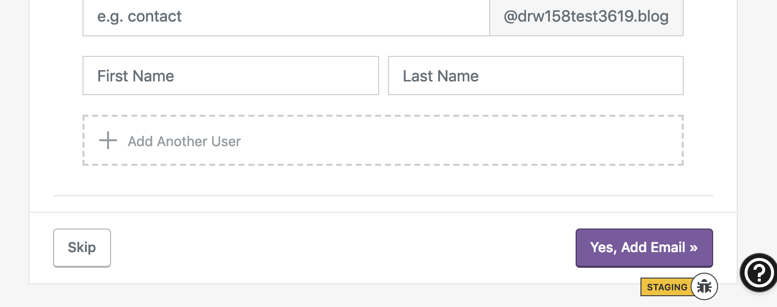
Muriel standards suggest that buttons like these should be next to one another.
(Check in with @gravityrail before working on this, please.)
 sixhours
All 4 comments
Seems fine to me :) I will ask someone from catalyst to comment.
 gravityrail
on 6 May 2019
gravityrail
on 6 May 2019
👍1
I don't see any problem with that. Thanks for letting us know though! @sixhours could you link to the Muriel page next time please? This would help for context as well as to propagate knowledge.
 stephanethomas
on 6 May 2019
stephanethomas
on 6 May 2019
👍1
@stephanethomas Sure thing! Here you go: https://murieldesignsystem.blog/components/buttons/#placement
sixhours
on 6 May 2019
Left-aligned button makes sense if it the action was Back button with left arrow but, in this case, Skip is forward secondary action so I think it make sense to move it next to the primary action without outline.
 donpark
on 10 May 2019
donpark
on 10 May 2019
👍1
Was this page helpful?
0 / 5 - 0 ratings
Related issues
 BrookeDot
·
3Comments
BrookeDot
·
3Comments
 roccotripaldi
·
3Comments
roccotripaldi
·
3Comments
 apeatling
·
3Comments
apeatling
·
3Comments
 jjchrisdiehl
·
3Comments
jjchrisdiehl
·
3Comments
 gedex
·
3Comments
gedex
·
3Comments