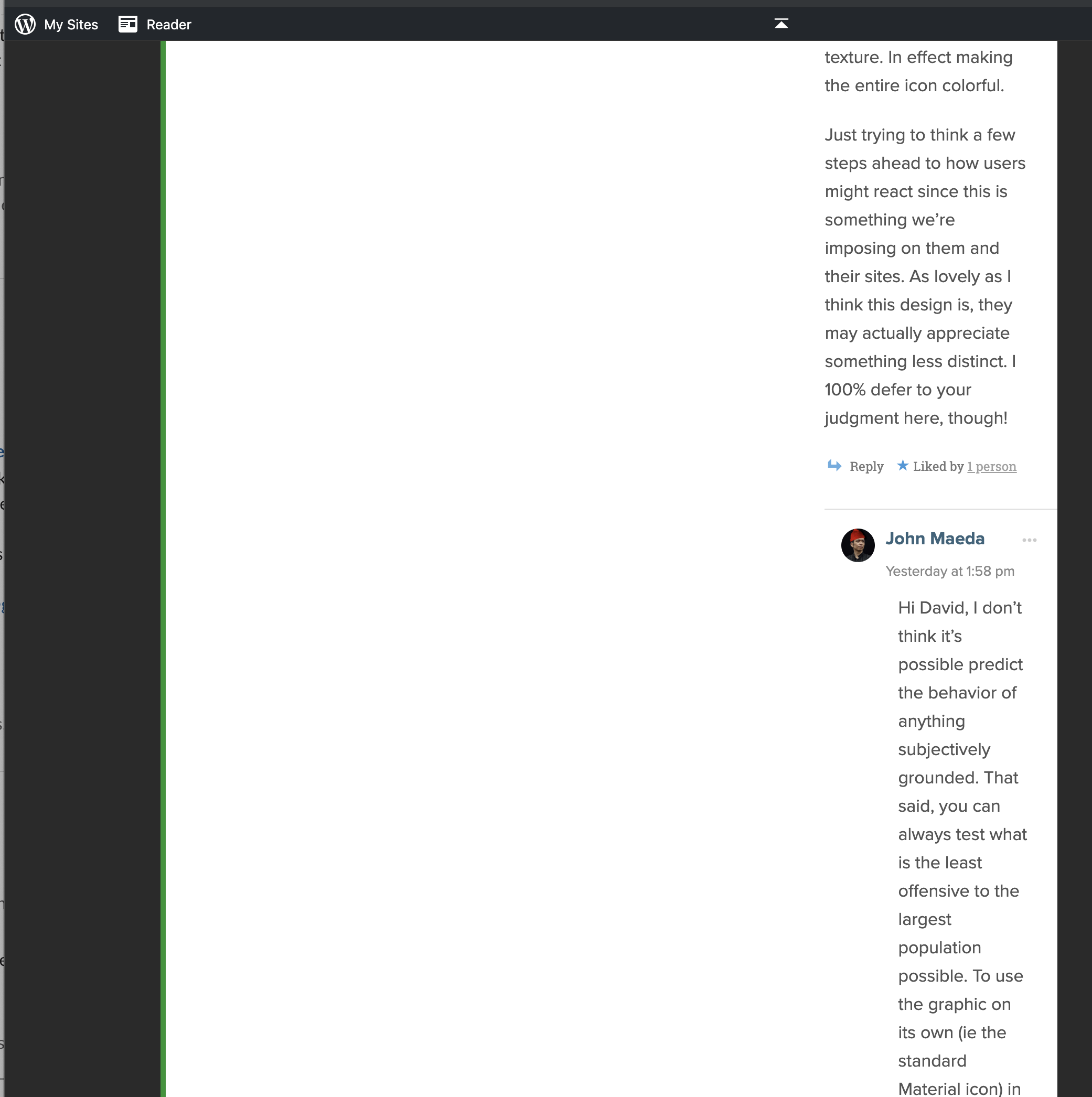
Wp-calypso: O2: Deeply nested comments make content tough to read

This has been an outstanding issue as long as I can remember, and I know we've looked at solutions before. I'd suggest, at a minimum, the styles should default to stop nesting comments earlier, and take into account narrower screens when determining when to stop nesting.
Above screenshot noted at paH86O-1b-p2
All 13 comments
In investigating this, I'm at a stalemate.
Although the CSS itself is easy enough, I hesitate to change the theme's behavior for everyone due to the large number of internal P2s. A global change could be more disruptive than the behavior we're fixing.
The theme CSS ignores the WordPress Discussion settings when the "Enable front-end editing" Theme Option is enabled. Ideally it would respect those settings, but a refactor of the theme's behavior is out of scope for this fix.
I've added some Custom CSS to the P2 where this initially came up. This curbs the threading without removing it entirely.
.o2-post-comments .o2-comment .o2-child-comments {
     padding-left: 1.5em;
}
I'm going to suggest we add this CSS to any P2 where we want to disable or reduce threaded comment nesting, in lieu of making a global change.
A global change could be more disruptive than the behaviour we're fixing.
I know this has always been a concern when working on themes, but personally I don't think this change would be disruptive. It changes the behaviour, yes, but also improves the experience.
but a refactor of the theme's behavior is out of scope for this fix.
This being out of scope is a fair point. But I still think we can make the CSS fix more permanent (i.e. commit & deploy for everyone). If this isn't well received we can always revert :)
While we're at it, I think we should also do something about the mobile styles - currently a ton of space is wasted on borders and paddings. Given the limited screen real estate I'd be ok with getting rid of them. Something like this does the trick in the Customizer:
@media (max-width: 550px) {
.o2-comment .o2-comment {
    border-left: none !important;
    padding-left: 0 !important;
}
}
I know this has always been a concern when working on themes, but personally I don't think this change would be disruptive. It changes the behaviour, yes, but also improves the experience.
True, and I think you're probably right; this is a minor change in the scheme of things, and it's something in lieu of completely refactoring the comment handling in O2. I'm being a bit paranoid, the last time I changed P2's CSS I broke it. 😆
Let's update the theme with reduced padding/margins for threaded comments on all screen sizes. That way we retain the threaded functionality some people probably like but comments are more readable when things get verbose.
Let's update the theme with reduced padding/margins for threaded comments on all screen sizes.
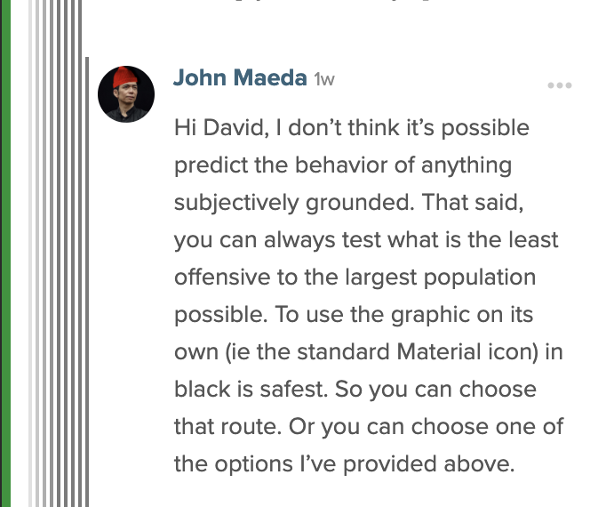
Here's how reduced padding could look like on mobile. I feel like showing the borders and decreasing the paddings on mobile doesn't provide that much useful information after certain point, so I'd be for nixing it either completely, or after max two levels deep.

Yeah those borders are 😬I guess nix them entirely, although I do worry about changing the design too drastically. But we can always add them back if people complain.
Alrighty, I have a patch ready for review in D26847-code
I'm inclined to think the failing tests aren't a problem, because Team City is only set up to run against the main repository, not /pub. I'm double-checking with DK to see if he knows for sure.
I think you're right, I just looked at a couple of old theme commits that wen through Phabricator, and the tests did fail, I just totally forgot about it. So I'll be deploying this today.
Deployed in r53449-wpcom-themes
Please reconsider the approach on mobile here.
The current solution poses 2 issues:
- It treats mobile users a second-class citizens.
- We're fixing an edge case by removing the core feature where the edge case appears.
Nesting is a core component of our commenting systems. If we remove all visual indicators of nested comments, then we'll make it impossible for a reader to accurately follow the conversation and participate.
I can sympathize with the problem we're attacking here, and removing the padding could be one way we address it. It frustrates me too when a comment is nested 9 levels deep and the padding makes it impossible to read. But removing _all_ nesting indicators does more harm than good. Can we at least put back the borders or identify another nesting indicator to replace them?
@rclations Thanks for your feedback! We're going to hold on making further changes to O2 and gather more feedback before we decide. In the meantime, if there are P2s you want to re-add the borders on, adding this to the Custom CSS will do it:
.o2-comment .o2-comment .o2-comment {
    border-left: 2px #c7c7c7 solid;
}
.o2-comment .o2-comment .o2-comment .o2-comment {
    border-left: 2px #adadad solid;
}
.o2-comment .o2-comment .o2-comment .o2-comment .o2-comment {
    border-left: 2px #949494 solid;
}
.o2-comment .o2-comment .o2-comment .o2-comment .o2-comment .o2-comment {
    border-left: 2px #7a7a7a solid;
}
@sixhours and I chatted and I decided to make an attempt at a middle ground that will prevent the ultra-nesting readability issues described above, but allow allow for some basic nesting indicators.
D27748-code reintroduces the left border for up to 3 levels of nesting and reduces the padding to 4px (from the original 10px). On the 3rd level, the nesting border is darker to indicate the limit has been reached and there won't be additional borders on any deeper nesting.
This is also an imperfect solution, but I think it could be a middle ground to allow some nesting and improve usability, while keeping the visual problems with deep nesting solved.
Deployed in r53599-wpcom-themes!
Most helpful comment
@sixhours and I chatted and I decided to make an attempt at a middle ground that will prevent the ultra-nesting readability issues described above, but allow allow for some basic nesting indicators.
D27748-code reintroduces the left border for up to 3 levels of nesting and reduces the padding to 4px (from the original 10px). On the 3rd level, the nesting border is darker to indicate the limit has been reached and there won't be additional borders on any deeper nesting.
This is also an imperfect solution, but I think it could be a middle ground to allow some nesting and improve usability, while keeping the visual problems with deep nesting solved.