Wp-calypso: Editor: Remove Distractions
Some of the feedback we've received in user interviews has indicated that folks are still writing in wp-admin because we do not have a distraction free mode.
A chunk of this distraction comes from the masterbar, and almost certainly the notifications menu:
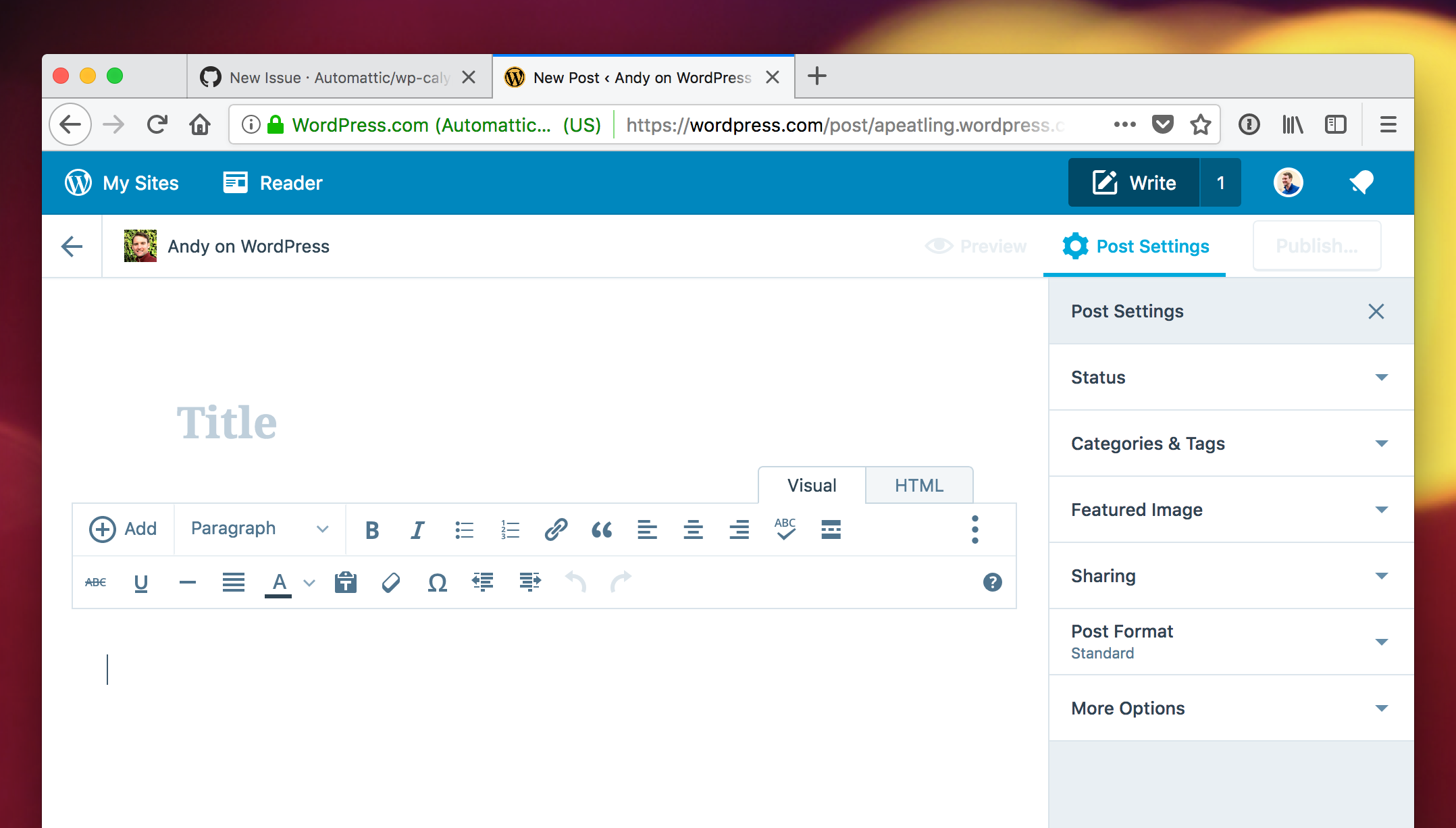
For a first iteration, I think we could actually hide the masterbar on the posting screen. We still have top level navigation in the form of the back button in the top left:
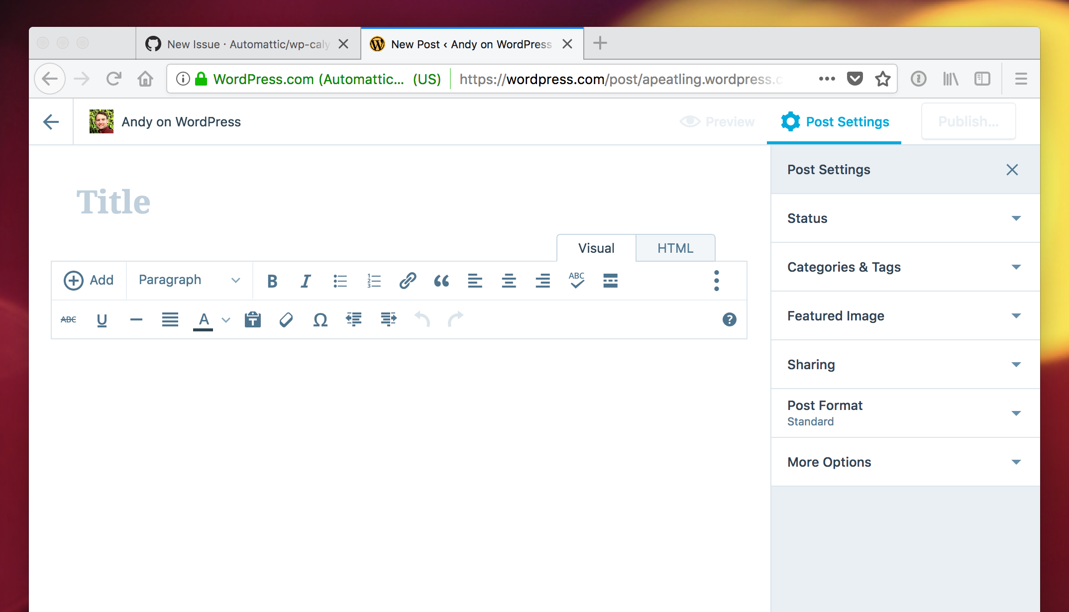
When you hit that back button you go back to the main Calypso navigation with the sidebar on the left, and the masterbar on the top.
 apeatling
All 12 comments
Some of the feedback we've received in user interviews has indicated that folks are still writing in wp-admin because we do not have a distraction free mode.
I'm curious: did they know they could close the sidebar?
A chunk of this distraction comes from the masterbar, and almost certainly the notifications menu:
Is this a hypothesis, or one of the issues mentioned?
 folletto
on 23 Nov 2017
folletto
on 23 Nov 2017
We've heard this in user tests as well. People loved it, even though it wasn't the focus of the tests. @shaunandrews has done some design work in that direction already.
 lsinger
on 23 Nov 2017
lsinger
on 23 Nov 2017
I'm curious: did they know they could close the sidebar?
I don't know, I don't think so. To be totally honest, I didn't realize you could close it either.
Is this a hypothesis, or one of the issues mentioned?
It's a hypothesis, but also based on my own usage. That orange dot is hard to resist. ;)
apeatling
on 23 Nov 2017
It's a hypothesis, but also based on my own usage. That orange dot is hard to resist. ;)
The orange dot is also likely to be less pervasive for the vast majority of users.
 mtias
on 25 Nov 2017
mtias
on 25 Nov 2017
Another big drawback for me is losing access to quick drafts from the editor.
mtias
on 25 Nov 2017
Unrelated to Andy's experiences: I think three of our recent six interviewees / user test participants mentioned that they liked how simple and distraction-free it was. We tested something else, however, and never asked them about it (we tested a few navigational ideas, e.g. changing how the "W" / "My Sites" button works). It jumped out at them (positively) so much that they told us without us asking them about it at all.
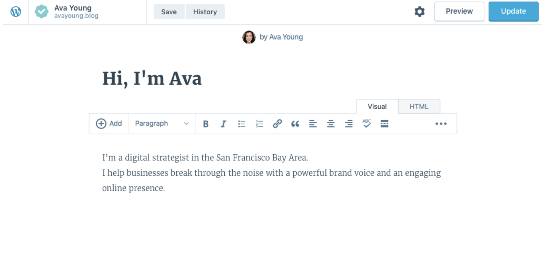
This is the editor we showed them:
lsinger
on 28 Nov 2017
For if / when we decide to reopen this, the issue that came up in #20214 was that the preview had a top: 47px to account for the masterbar being there. It looked weird because the editor behind it had removed that top and was now not hidden anymore.
lsinger
on 28 Nov 2017
For a first iteration, I think we could actually hide the masterbar on the posting screen. We still have top level navigation in the form of the back button in the top left:
For what it's worth, this idea would align Calypso with our native apps. On both iOS and Android, the editor is a full-screen modal where the top-level navigation is not visible.
 mattmiklic
on 30 Nov 2017
mattmiklic
on 30 Nov 2017
By the way; we're doing some work on how to make the native editor minimizable to balance between being distraction-free and allowing the user to switch back to another part of the app if they need to. Ref: p77Llu-9uA-p2.
mattmiklic
on 1 Dec 2017
Closed with 3401e45.
 lancewillett
on 7 Dec 2017
lancewillett
on 7 Dec 2017
Passing on a Twitter request for a minimal editor with even fewer distractions (no right sidebar).
 gemmagarner
on 25 Oct 2018
gemmagarner
on 25 Oct 2018
no right sidebar
FWIW, the cog wheel in the top right lets one hide the right sidebar.
lsinger
on 25 Oct 2018
Related issues
 spen
·
3Comments
spen
·
3Comments
 rickybanister
·
3Comments
rickybanister
·
3Comments
apeatling
·
3Comments
spen
·
3Comments
rickybanister
·
3Comments
rickybanister
·
3Comments
apeatling
·
3Comments
spen
·
3Comments
Most helpful comment
For what it's worth, this idea would align Calypso with our native apps. On both iOS and Android, the editor is a full-screen modal where the top-level navigation is not visible.