Wp-calypso: Plan label in sidebar positioned poorly in Firefox
Using Firefox (latest), go to My Sites in Calypso, for any site with a paid plan. Observe poorly positioned label for your plan level in the sidebar:
Additionally/separately, the label should probably change to white text when the Plans item is active, although that appears to be cross-browser.
 beaulebens
All 4 comments
Also happens for Free Plans (both .com and .org)

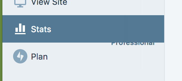
For .com Plans Stats view contains a - (?)

 AnnaMag
on 13 Nov 2017
AnnaMag
on 13 Nov 2017
Note, I can reproduce it only at these conditions:
- New fresh tab (hard reload works too)
- No scrollbar in the sidebar
UPDATE:
- It seems a Firefox bug: if I "touch" any alignment rule (i.e.
flex: 1 0 auto, even on the icon (a:first-child) which causes recalculation of the layout, it fixes it. I can't be 100% sure without trying to isolate this to submit to Mozilla possibly, but from the behaviour I'm seeing it's likely. - Why is the "Free/Premium" label using a layout different from the buttons? Why is it using absolute instead of just relying on flex that should be far more reliable alone (which, makes me surprised the browsers aren't choking generally on something that is both flex and absolutely positioned). I'd try to align the markup to have buttons and label be similar or identical, or at the very least refactor the entire CSS for the "Free/Premium" label to use only flex.
 folletto
on 15 Nov 2017
folletto
on 15 Nov 2017
I agree that this seems to be Firefox odd behavior: the issue gets fixed upon manipulation of layout- influencing properties.
Just for the record here: the layout differs, because the remaining entries/sections use the same component, which sets up the icon on the left-hand side and takes care of the positioning and responsiveness of the right-most component (e.g. button). Here, it is not used because we have no JP icon at hand to pass as a prop, so current implementation attempts to mimic that component
( not always successfully apparently 😄 ).
As we spoke, let's fix it as-is to avoid that odd visual effects https://github.com/Automattic/wp-calypso/pull/19753 , and aim for a proper fix ( using svg JP icon) as a follow-up.
Thanks @folletto!
AnnaMag
on 15 Nov 2017
For the sake of completeness:
there is an svg size-ready icon we could use to provide a more solid solution https://github.com/Automattic/gridicons/issues/240#issuecomment-316532521.
An idea would be to modify the SidebarItem component to take as a prop an icon or svg, and use it for Plans in the same way as the remaining entries do.
Let's wait a bit before going down that path to see if the JP logo gets its representation in any of the icon repos https://github.com/Automattic/gridicons/issues/261
AnnaMag
on 16 Nov 2017
Related issues
 kellychoffman
·
3Comments
kellychoffman
·
3Comments
 lamosty
·
3Comments
lamosty
·
3Comments
 spen
·
3Comments
spen
·
3Comments
 jjchrisdiehl
·
3Comments
jjchrisdiehl
·
3Comments
 vparkhere
·
3Comments
vparkhere
·
3Comments