Wp-calypso: [Activity Log] Improve coloring and placement of green icons

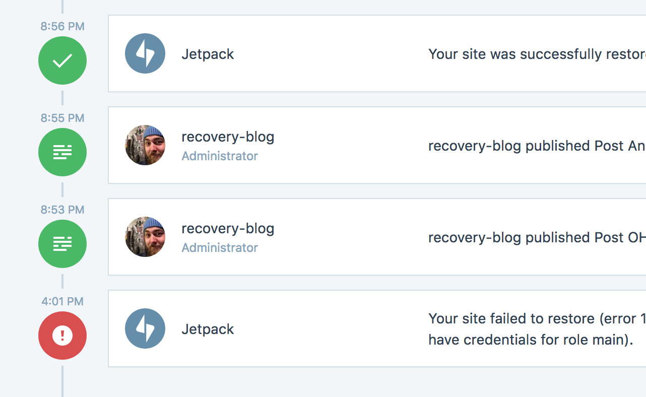
I just noticed the two greens conflict here along with the placement and size of the icons. Not sure what the best method is to improve this - will leave that to design minds :)
 annezazu
All 4 comments
@MichaelArestad let's chat and see if there's something we can do to make it easier for these to live sidebyside. There was some debate about whether 'Jetpack' should even be an actor or not. Let's debate.
 rickybanister
on 16 Oct 2017
rickybanister
on 16 Oct 2017
The simplest fix for now is to make the background of the Jetpack logo grey. I think darken( $gray, 10% ) will look good and is about the right shade.
 MichaelArestad
on 18 Oct 2017
MichaelArestad
on 18 Oct 2017
looks good to me, my only suggestion is to make sure we sync up the gray color with the one we use in the 'powered by jetpack' footer.
rickybanister
on 18 Oct 2017
@rickybanister That was the first one I tried, but it ended up looking pretty dark for the icon on white. For the footer grey, I used the text-min variable that barely meets AA requirements. When I build out the PR, I'll def try both and keep that in mind.
MichaelArestad
on 18 Oct 2017
Related issues
 ehg
·
3Comments
ehg
·
3Comments
 aduth
·
3Comments
aduth
·
3Comments
 roccotripaldi
·
3Comments
roccotripaldi
·
3Comments
 jjchrisdiehl
·
3Comments
jjchrisdiehl
·
3Comments
 jeherve
·
3Comments
jeherve
·
3Comments
Most helpful comment
The simplest fix for now is to make the background of the Jetpack logo grey. I think
darken( $gray, 10% )will look good and is about the right shade.