Wp-calypso: Store: Order Details Table on Mobile Cramped Columns

While viewing an order detail page on my Nexus5 last night I noticed a few visual oddities that I thought should be logged as an issue:
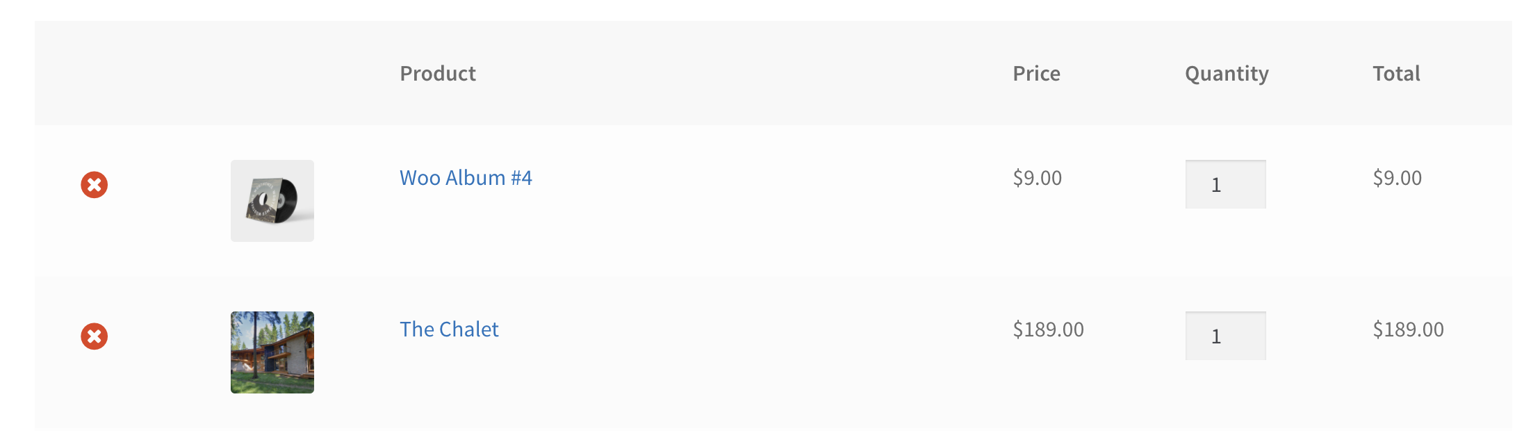
- The details table Product column gets quite cramped on smaller viewports which results in a _very tall_ Product name cell. Not sure what we can do to remedy this, a scrolling table akin to the order list isn't the best experience either but perhaps we can get creative with limiting the size of the quantity column or something.
- Button padding. This one is odd as it only happened on the mobile chrome browser... I tried to recreate using devtools emulation on mac/chrome and it looked fine. The "Save Order" and "Submit Refund" buttons appear to have more bottom padding
 timmyc
All 5 comments
@kellychoffman or @jameskoster any ideas on how to make this look better on mobile? One Idea I had was to hide the quantity and price columns on mobile, and maybe have a descriptive line below the sku with something like "Quantity x at $$$ each"
timmyc
on 21 Oct 2017
I'm going to drop these here too, since they're order-screen related.
The header is unusable unless you know what these buttons say:

This PriceInput component needs a rethink for how we handle on mobile size, this just looks odd (having prefix/input/suffix each on their own line). It doesn't get better once you change the value & get the reset icon, either.


 ryelle
on 10 Jan 2018
ryelle
on 10 Jan 2018
I'm thinking we could possibly take some inspiration of the work going into the Android app for this screen on the small viewports... but I agree it is getting pretty hard to read now :(
timmyc
on 10 Jan 2018
any ideas on how to make this look better on mobile?
What if we kept all the data and just had the product info on its own line? Was thinking it wouldn't need a label as it was obvious its a product:

The header is unusable unless you know what these buttons say:
Perhaps we could turn them into a split button? https://wpcalypso.wordpress.com/devdocs/design/t or hide the "Resend Invoice" all together.
 kellychoffman
on 11 Jan 2018
kellychoffman
on 11 Jan 2018
Split button is what I'd suggest as well.
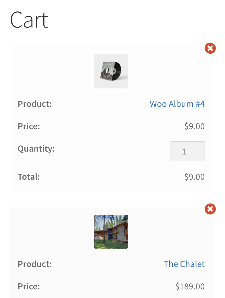
For the table we could do something like we do with the cart on the frontend in core;
 jameskoster
on 11 Jan 2018
jameskoster
on 11 Jan 2018
Related issues
 roccotripaldi
·
3Comments
roccotripaldi
·
3Comments
 aduth
·
3Comments
kellychoffman
·
3Comments
aduth
·
3Comments
kellychoffman
·
3Comments
 samouri
·
3Comments
samouri
·
3Comments
 rickybanister
·
3Comments
rickybanister
·
3Comments
Most helpful comment
Split button is what I'd suggest as well.
For the table we could do something like we do with the cart on the frontend in core;