Wp-calypso: Comments: replace X icon with `chevron-up` to collapse.
We received some feedback that the 'X' was confusing, and might be changed to a chevron. Note that the current collapsed view does not show any indication that it can be toggled. The current design was heavily inspired by google's inbox if you'd like to compare.
Also, noting that @rachelmcr expected esc to close the open card(s). So we should also add this key binding if possible.
@drw158 is on Sabbatical so we'll need some design help on this before we can start. Maybe @rickybanister to or @folletto ?
 gwwar
gwwar
All 17 comments
I'm happy to take a stab at it. Our foldable card pattern hopefully can help us here.
 rickybanister
on 15 Aug 2017
rickybanister
on 15 Aug 2017
@drw158 also noted we might want to toggle these closed whenever we click outside of the card, in which case we might not need the X at all. https://github.com/Automattic/wp-calypso/projects/32#card-3620622
We're pretty tight on space in the compact view so I'm curious to see what you come up with @rickybanister 😄
gwwar
on 15 Aug 2017
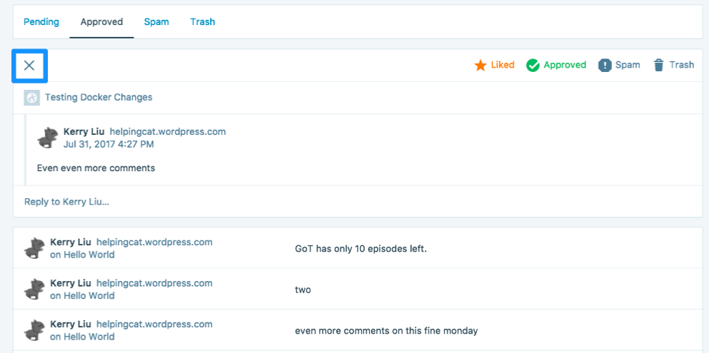
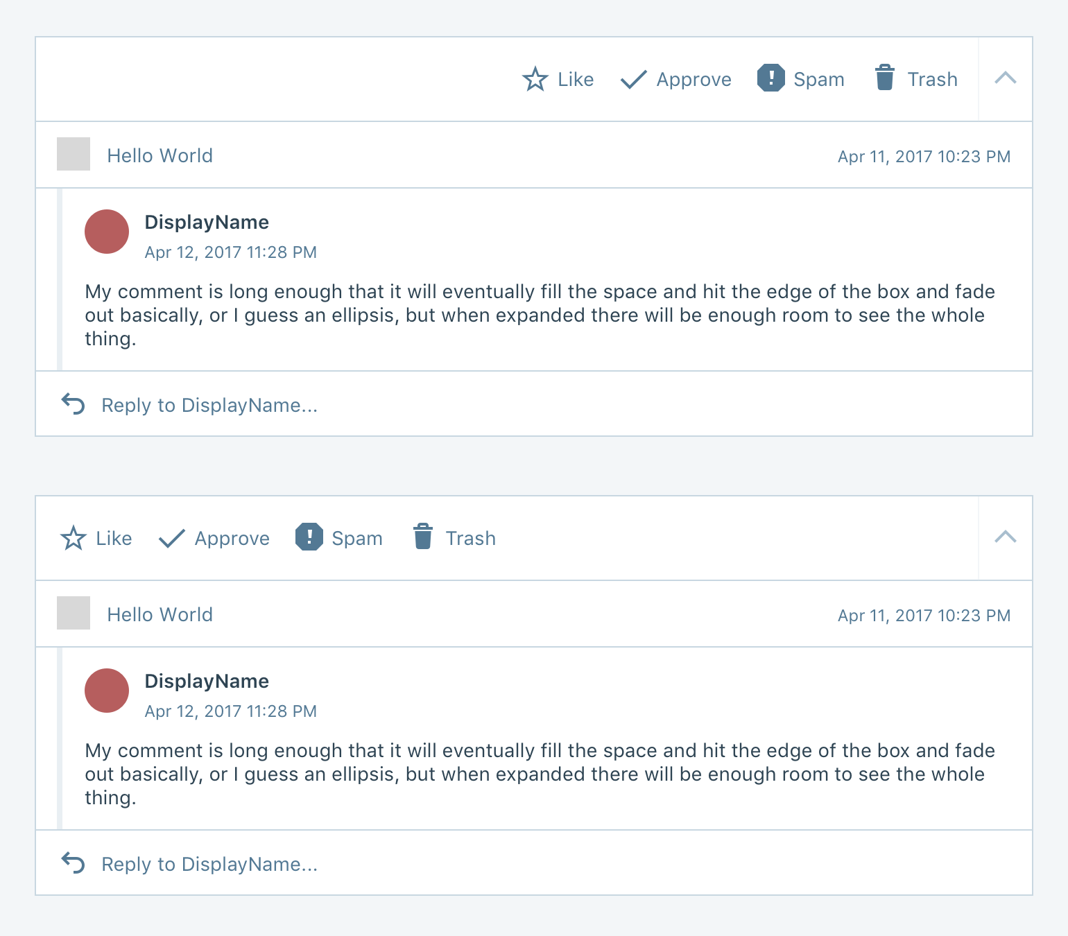
I did a quick-ish mockup that makes a few changes without doing much drastic. Curious what @folletto and @shaunandrews think.
Notable things I changed:
- Got rid of the X and instead used the foldable card.
- It still is a pretty big jump between the collapsed and expanded view due to changing the display of the comment's content so much, but I found it hard to avoid that without completely starting over.
- I aligned the actions left since that felt more scannable.
- I included the timestamp on the original post.
- I added a reply icon to the reply area, I wasn't really seeing that as a form input or something actionable before.
- I made the timestamp smaller font so it didn't feel the same as content since everything on the page is otherwise 14px.
I probably missed things though.
rickybanister
on 16 Aug 2017
also noted we might want to toggle these closed whenever we click outside of the card, in which case we might not need the X at all.
I think it's important to keep this explicit. Click outside is an "extra", and in this case I wouldn't go there as it's an in-page transformation (i.e. not a modal) so it seems could be unpredictable to me at a first look.
I did a quick-ish mockup that makes a few changes without doing much drastic.
I appreciate this approach. :)
I think your take is solid, and the use of the foldable card seems excellent here, and would solve well and within our patterns the problem raised here.
I'd just do these tweaks on it:
- I'd consider still align the icon on the right, to make the mouse movement minimal from the chevron to the icons, as well as creating a blank in where previously the user details were which it's a slight nudge to the change happening in the card.
- I wouldn't add the post date, as it feels conflicting with the comment date to me. What's the rationale of the addition? Maybe I'm not evaluating all the factors in play.
Thanks!
 folletto
on 16 Aug 2017
folletto
on 16 Aug 2017
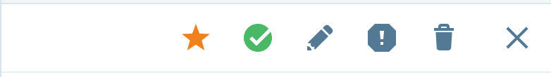
I'd be fine to move the icons back to the right.
My thought on the original post date was to help someone with a lot of content/comments decide if a comment was relevant—say the post is several years old, that could help them decide if a comment is spam or not. Basically it would just provide extra context for how far apart in time the post and comment are. It's not strictly necessary, I just was looking for more context clues.
rickybanister
on 16 Aug 2017
Solid argument — I flip my take, I agree with you 👍
folletto
on 16 Aug 2017
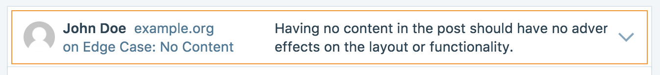
@folletto @rickybanister
I'm a bit confused on how to do the whole "everything on the right".
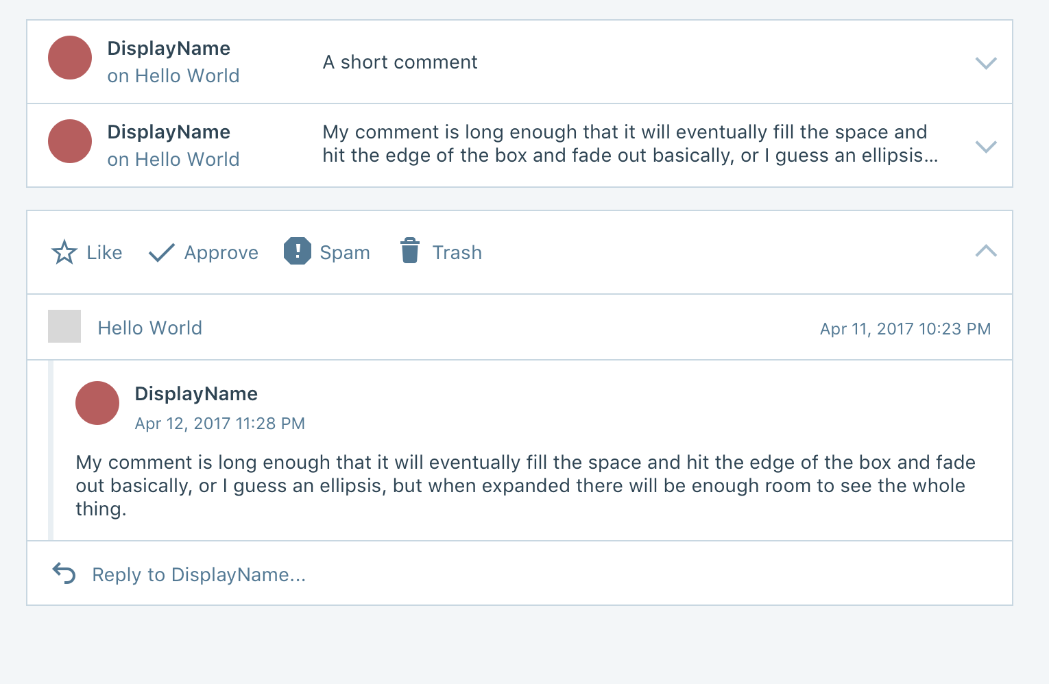
This is a quick attempt I did (don't mind the X icon):

There are 2 weirdness I'd like to point out:
Toggle button might be confused with the action buttons - especially on small screens?
Currently the whitespace between the X and the actions is part of the X button.
In other words, clicking anywhere on the action bar toggles the comment between expanded and collapsed.
On expanded view, though, this makes sense because the whitespace is adjacent to the X button.
If we put the actions between the X button and the whitespace, imho is not clear anymore that the whitespace could be used to collapse.
 Copons
on 17 Aug 2017
Copons
on 17 Aug 2017
I think we need to switch to using the actual FoldableCard pattern. It has an area for actions and only the chevron is clickable.
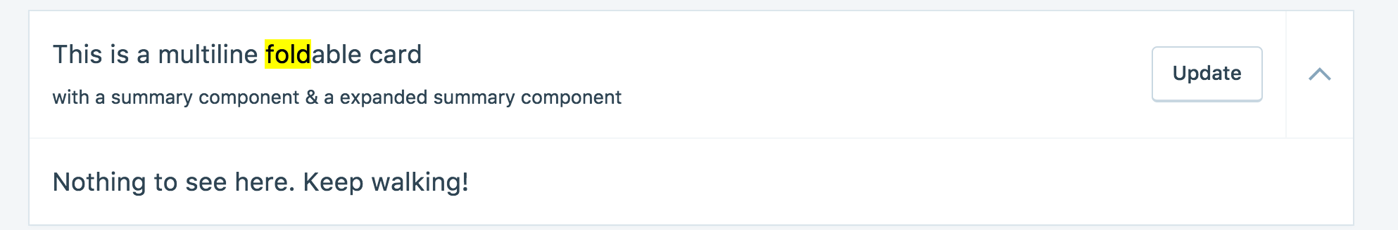
https://wpcalypso.wordpress.com/devdocs/design/foldable-card
rickybanister
on 17 Aug 2017
I agree with Rick, changing that should do — chevron semantic, plus the separator helps. :)
folletto
on 17 Aug 2017
Wait a minute though...
CommentDetail and FoldableCard are wildly different, and the former follows the design proposed by @drw158 in three iterations and a couple of user testing sessions.
I did start with FoldableCard but decided against it for the sheer amount of CSS and React overwrites I'd have needed to have a card header with that kind of content when collapsed and those kind of actions when expanded.
Also, the decision to have the entire area clickable was an actual decision made during the development.
I've got no problems rewriting this from scratch, but you guys gotta give me a full fledged mockup for this. 😄
Alternatively, I could hack in the chevron on the right as a button with the left border to separate it from the actions.
Though, I really think losing the large clickable area would worsen the UX.
Copons
on 17 Aug 2017
Noob chiming in here!
I can’t speak to the FoldableCard vs Comment detail because I’m not familiar enough with either, so I’m coming at this from a design rather than technical perspective.
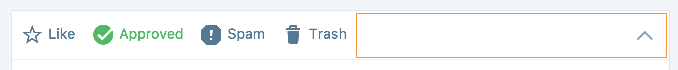
While I don’t love the idea of moving the icons around on people since the right alignment is already live and in users hands, I think I prefer having the icons left aligned because it:
1) Provides the needed separation from the chevron icon - I agree that with @Copons that the “Toggle button might be confused with the action buttons - especially on small screens.” I’m not sure the blue separator has enough contrast to be obvious to users
2) Keeps the right side from getting crowded
3) Gives the card an overall sense of balance
I quickly mocked up what the right aligned everything looks like vs the left align icons so we could compare them side by side.
Also might be worth considering this change alongside some upcoming work on comments:
1) Bulk Actions - https://github.com/Automattic/wp-calypso/issues/13896
2) Quick Actions - https://github.com/Automattic/wp-calypso/issues/14119
disappears back into Support Rotation
 megsfulton
on 17 Aug 2017
megsfulton
on 17 Aug 2017
I still prefer them on the left, whether on a desktop or mobile I think the scanning and anchoring is more convenient than the amount you have to travel from the chevron. We don't want people accidentally trashing or spamming comments anyways.
rickybanister
on 17 Aug 2017
And thanks and welcome @megsfulton !
rickybanister
on 17 Aug 2017
you have to travel from the chevron
I would ideally still prefer the entire card to still be clickable as a toggle. The chevron seems like a pretty small target if we limit it to only that. 👍
I did start with FoldableCard but decided against it for the sheer amount of CSS and React overwrites I'd have needed to have a card header with that kind of content when collapsed and those kind of actions when expanded.
I think it'd be fine to keep a separate component for this that happens to look more like FoldableCard. This allows us to avoid a big refactor, and as @Copons noted it was difficult to work with when we tried our first implementation.
Thanks for your work on this everyone. Another thing to keep in mind is bulk actions. The chevron I think cannot be on the left if it's visible from the collapsed view. In bulk action view maybe we'd hide the chevron as well?
gwwar
on 17 Aug 2017
FYI: if you want to try how the bulk edit mode currently looks like:
https://calypso.live/?branch=update/comments/bulk-actions-ui
(don't mind the incorrect position of the checkboxes on small screens)
Regarding this discussion: what about a mix and match?
(in orange the clickable area)
Collapsed:
Expanded:
Bulk Edit:
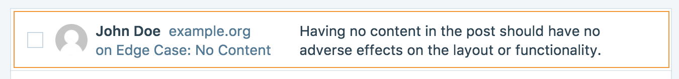
| Collapsed | Expanded | Bulk Edit |
| --- | --- | --- |
| No actions | Actions on the left | Checkbox on the left |
| Chevron down on the right | Chevron up on the right | No chevron |
| No separator on the chevron (_see note_) | No separator on the chevron | No chevron |
| Fully clickable to expand | Empty area clickable to collapse | Fully clickable to select |
Note:
On Collapsed, we might actually want the chevron border to visually separate it from the content preview.
Though, with the separator we'd convey the idea that only the chevron is clickable.
Without, instead, we can keep the current behaviour of full area clickable (of which I'm a big supporter, so you gotta do your best to making me change that 😄 ).
(Of course, hovering on the clickable area would highlight the chevron, exactly like it currently happens for the X.)
Copons
on 18 Aug 2017
@copons I dig it 👍
gwwar
on 18 Aug 2017
Sounds good to me – also the design discussion above shouldn't hold this PR as the scope here is far more limited. Let's go for it. 👍
Just a note if possible: let' make sure when hovering that there's an indication of the toggle to be triggered that isn't just the mouse cursor. For example, the chevron should darken when the mouse is on the white are as it darkens when it's hovered.
folletto
on 19 Aug 2017
Related issues
 ghost
·
3Comments
ghost
·
3Comments
 spen
·
3Comments
spen
·
3Comments
 aduth
·
3Comments
aduth
·
3Comments
 roccotripaldi
·
3Comments
roccotripaldi
·
3Comments
 BrookeDot
·
3Comments
BrookeDot
·
3Comments
Most helpful comment
Noob chiming in here!
I can’t speak to the FoldableCard vs Comment detail because I’m not familiar enough with either, so I’m coming at this from a design rather than technical perspective.
While I don’t love the idea of moving the icons around on people since the right alignment is already live and in users hands, I think I prefer having the icons left aligned because it:
1) Provides the needed separation from the chevron icon - I agree that with @Copons that the “Toggle button might be confused with the action buttons - especially on small screens.” I’m not sure the blue separator has enough contrast to be obvious to users
2) Keeps the right side from getting crowded
3) Gives the card an overall sense of balance
I quickly mocked up what the right aligned everything looks like vs the left align icons so we could compare them side by side.
Also might be worth considering this change alongside some upcoming work on comments:
1) Bulk Actions - https://github.com/Automattic/wp-calypso/issues/13896
2) Quick Actions - https://github.com/Automattic/wp-calypso/issues/14119
disappears back into Support Rotation