Wp-calypso: Stats: If Jetpack module is disabled, stats page keeps loading forever
If the Stats Jetpack module is disabled, the Stats page will keep loading forever, not indicating that the module is disabled.
Originally reported by @oskosk here: https://github.com/Automattic/wp-calypso/issues/13647#issuecomment-302059723.
if the stats module is deactivated, apart from the suggestions being made here, what should happen with the Stats page and Stats Sidebar link in Calypso?
This is how it looks when stats is deactivated. The spinners keep rolling as if something were broken.

cc @rickybanister @MichaelArestad
 tyxla
tyxla
All 29 comments
We should show something like what we show for when Manage is disabled. A Drake image (or whatever our new commensurate illustration will be) with a message saying 'To see traffic and post stats you must enable Jetpack's stats module' with an Enable call to action.
@tyxla let us know if you need an explicit mockup or if you can go find something existing that is similar enough.
@MichaelArestad can help you with a mockup if need be.
 rickybanister
on 23 May 2017
rickybanister
on 23 May 2017
@tyxla don't we have something like this in place in another view? I can't remember where? Might have to do with making JP manage active or updating Jetpack. Maybe @dereksmart remembers?
 MichaelArestad
on 23 May 2017
MichaelArestad
on 23 May 2017
I did some digging into this. Post incoming. :)
MichaelArestad
on 23 May 2017
@MichaelArestad posted about this in p6TEKc-1dT-p2, and there's some design discussion there. Marking this one as "Design" for now, and I suggest that we update it when path is clear for development here, does that make sense @MichaelArestad?
tyxla
on 24 May 2017
I think the best way forward is just to assume we're good to go trying out the use of a generic banner component at /stats encouraging folks to enable the module. Can we go forward with that for now? We'll work on a design consensus for consolidating all the other use cases of that pattern.
@MichaelArestad could you render your proposal specifically for the /stats screen and drop it here so they can proceed?
rickybanister
on 24 May 2017
@rickybanister Here's the latest. Feel free to tweak the copy.
The modal should be in the center of the stats view both vertical and horizontal (taking into consideration the sidebar).
MichaelArestad
on 24 May 2017
Awesome, thanks @MichaelArestad
I notice it doesn't exactly use the banner styles (I suppose in order to be larger?). Do you see it being possible to use the banner component with something like an 'is-primary' class or something?
rickybanister
on 25 May 2017
Maybe, but I think it would be more flexible to either make a new component that is card-like with styles applied to a few HTML heading elements inside. That way we can get super fancy with them or add illustrations to them later on if we want.
MichaelArestad
on 25 May 2017
@rickybanister @MichaelArestad thanks for the mockup! Is that a final design that's ready for coding?
tyxla
on 25 May 2017
Let's say yes @tyxla. The best way to test its efficacy is to build it and show it to folks.
Can we introduce a left-hand border property to card and just put regular content inside the card? Creating a new component could be a nice way to standardize its use though, as that's another major goal here. We can use the blue border for normal situations and perhaps a red one for more severe situations.
I'm scratching my head a little to pick a name for this thing—it's similar to our dialog component in some ways, it's more or less just a card and it shares a lot with banner, but it's really none of those.
cc @mtias for your component expertise...
rickybanister
on 25 May 2017
Well, Banner is already using a Card, so I'd probably implement this one as a new variation of Banner that allows us to input any content in it. The current implementation of Banner is nice and very multifunctional, but does not allow us to place whatever we want inside. Not sure what would be the best name for that banner variation though - BannerCard in components/banner/card? @mtias could chime in and give us a better idea about that indeed.
tyxla
on 29 May 2017
I don't think this should be a separate component, it's so close visually between banner and card that we should just extend one or the other. Thinking quickly, I think there are two options:
- Extend
bannerwith alarge(is-large) prop. - Extend
cardwith ahighlightorborder(info, warning, success, etc) prop.
 mtias
on 29 May 2017
mtias
on 29 May 2017
I'm fond of the highlight suggestion. Let's do it!
I've suggested an implementation in #14564, feel free to review @mtias @rickybanister @MichaelArestad.
tyxla
on 30 May 2017
The modal should be in the center of the stats view both vertical and horizontal (taking into consideration the sidebar).
I commented on the design thread too but... Why introducing a new pattern instead of using the EmptyContent component that we already use in these instances as @rickybanister pointed out in the first message?
 folletto
on 30 May 2017
folletto
on 30 May 2017
@folletto Well, that could also be a good option, and it doesn't exclude what I've suggested in #14564. Once it lands, we could refactor EmptyContent to use this new prop of Card and render a Card instead of what it's doing now.
tyxla
on 30 May 2017
I do like the idea of extending card to use a border, but I agree with @folletto that what is shown in the mockup above isn't anything that the empty content component can't do (heading, subtext, buttons). Doing this will create a divergence in experience with different empty states that look significantly different.
I am now caught up on p6TEKc-1dT-p2, and while I think the modal aspect of it is nice, I'm not sure it would be used in more than 1 or 2 places, and I'm not sure it warrants a whole new empty state experience. Maybe the modal idea should be a one-off thing instead of creating a new standard empty state.
Overall, I guess I'm just confused how the new component would be used. We'd need to clarify how it's used with the notices and banners.
 davewhitley
on 30 May 2017
davewhitley
on 30 May 2017
Sorry, just thinking about it more...pasting here what I said in the P2 thread.
"Jetpack view blockers" is an interesting distinction. I think we need to be really clear when we talk about this vs. a truly empty content state.
If we are talking about a _disabled_ state, then yep I think we should do some sort of opacity on the UI with a notice or banner, explaining. Usually in Calypso if you need to turn on a setting to enable the UI, then we fade out the UI with a yellow notice. Same for features in a higher plan they don't have, except with an upgrade banner.
If the view is truly an empty state, like Posts with no posts, then I think the currently existing empty content component is good.
Over the years, judging by the screenshots shown in the P2 post, it looks like the empty content component has been used inappropriately as a result of not standardizing what a disabled state looks like.
davewhitley
on 30 May 2017
I'm with @drw158 on this—we're using the left-border color in several places to make users pause while scanning cards on the screen. That seemed to work nicely as a way to standardize this pattern for Jetpack sites requiring input from the user in order to complete the action they're trying to take. The disparity of existing drake images and different implementations of messages and buttons on the gray background are very poor—moving all of those to the foreground and being able to apply a red border will help I think.
rickybanister
on 30 May 2017
I'm ok if you'd rather introduce a new design — can we just standardize tho?
Reading the P2 thread with all the variations followed by the new proposal seems like the XKCD comic about standards.
folletto
on 30 May 2017
I'll be huddling with @MichaelArestad to see if we can use the emptyContent component with new illustrations to handle this instead.
The 'highlight' prop still seems valuable to add to card as long as the definition for use is clear.
rickybanister
on 31 May 2017
@rickybanister @folletto @drw158 talking about standardization, should we add some information to the component documentation about that?
tyxla
on 31 May 2017
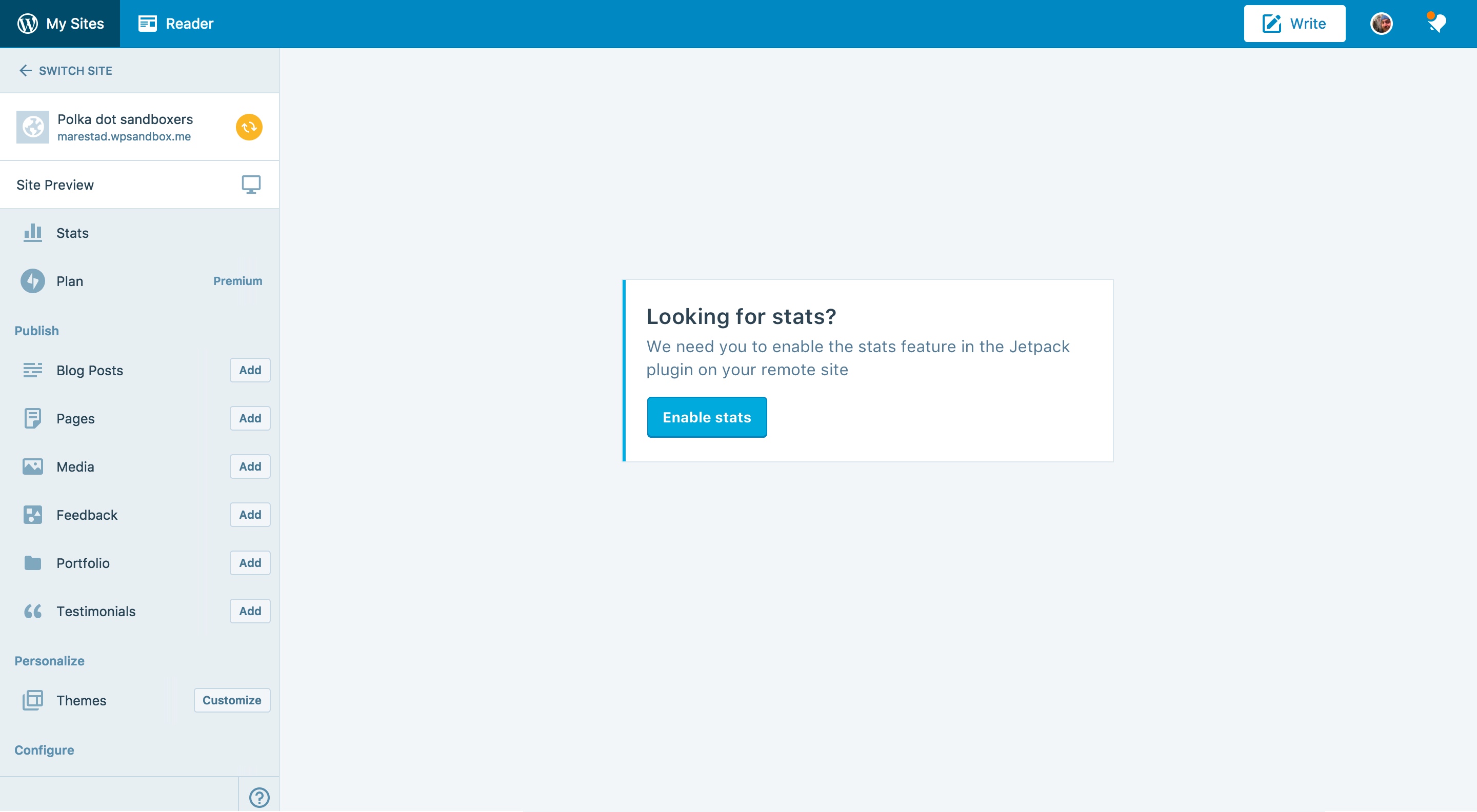
I think we're going to go the EmptyContent route instead. Can we spin up something like this?

MichaelArestad
on 2 Jun 2017
The last comment on p6TEKc-1dT explains further. There's already a default illustration until we produce them for each situation including stats. Let's use that for now. Should look like this:

MichaelArestad
on 2 Jun 2017
Nice one :+1:
I was about to start implementing that, but I had a hard time reaching the case that @oskosk described with spinners rotating infinitely. @oskosk could you help me reproduce the issue? Some step-by-step instructions would be great.
tyxla
on 5 Jun 2017
This issue has been marked as stale and will be closed in seven days. This happened because:
- It has been inactive in the past 9 months.
- It isn't a project or a milestone, and hasn’t been labeled `[Pri] Blocker`, `[Pri] High`, `[Status] Keep Open`, or `OSS Citizen`.
You can keep the issue open by adding a comment. If you do, please provide additional context and explain why you’d like it to remain open. You can also close the issue yourself — if you do, please add a brief explanation.
![stale[bot] picture](https://avatars3.githubusercontent.com/in/1724?v=4&s=40) stale[bot]
on 2 Mar 2018
stale[bot]
on 2 Mar 2018
I'm pretty sure this is still an issue. @johnHackworth this should be on your radar.
MichaelArestad
on 2 Mar 2018
it's on @tyxla radar, indeed :)
 johnHackworth
on 6 Mar 2018
johnHackworth
on 6 Mar 2018
Any chance of this being tackled during our continuation of hack week?
rickybanister
on 21 Mar 2018
Oops, this totally fall through the cracks. Would love it if anyone could address it during the continuation of the HACK week, but if not, I'll add it to my backlog.
tyxla
on 22 Mar 2018
Related issues
 ehg
·
3Comments
ehg
·
3Comments
 vparkhere
·
3Comments
rickybanister
·
3Comments
vparkhere
·
3Comments
rickybanister
·
3Comments
 ghost
·
3Comments
ghost
·
3Comments
 kellychoffman
·
3Comments
kellychoffman
·
3Comments
Most helpful comment
it's on @tyxla radar, indeed :)