Wordpress-ios: Reader doesn't process Column Blocks
Expected behavior
WordPress iOS's Reader would arrange content in columns, whenever the Columns block is used.
Actual behavior
Content is displayed in rows.
Steps to reproduce the behavior
- Add a new post (in Calypso!)
- Insert the Columns block
- Add content to each column
- Publish the post
- Open the content in the Reader
- Observe the content is rendered in rows
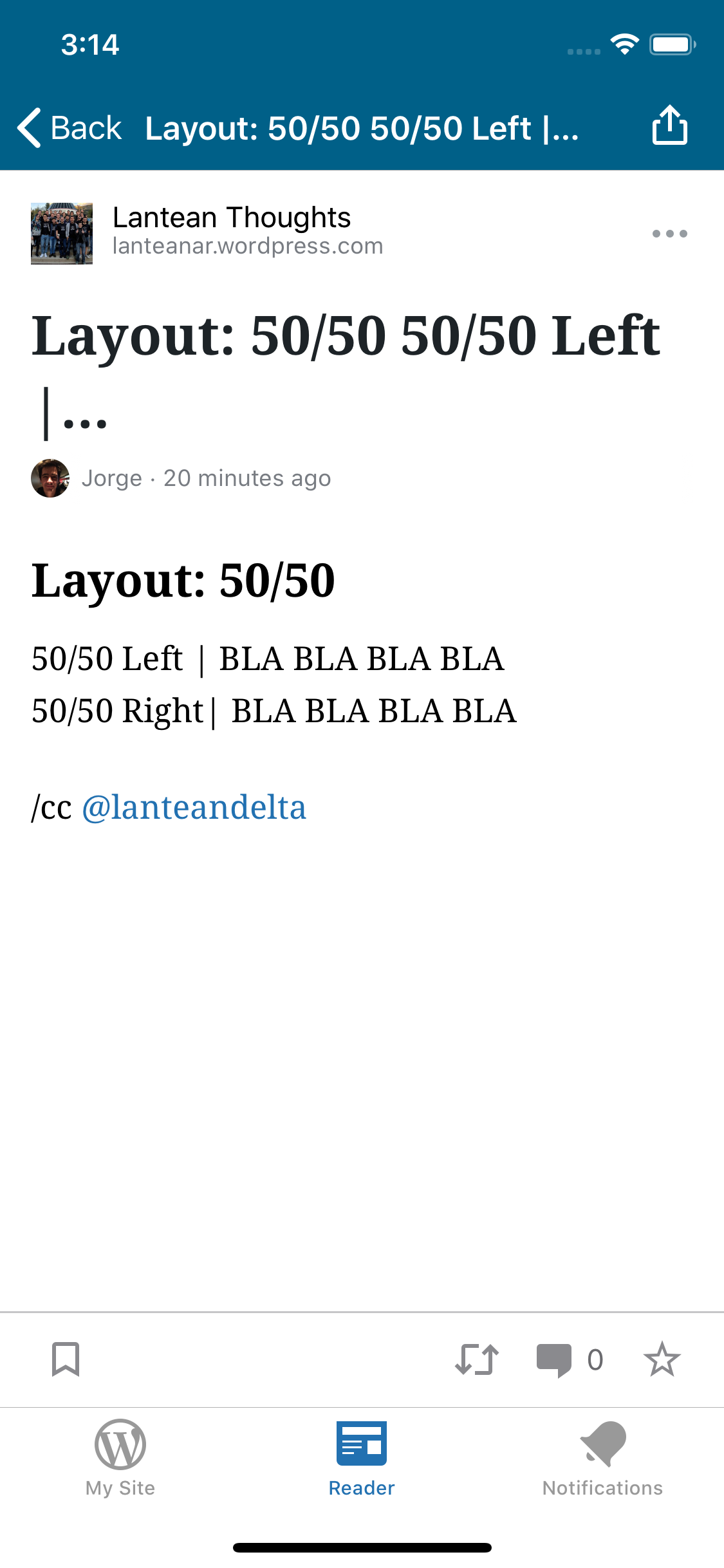
Post
<!-- wp:heading -->
<h2>Layout: 50/50</h2>
<!-- /wp:heading -->

<!-- wp:columns -->
<div class="wp-block-columns"><!-- wp:column -->
<div class="wp-block-column"><!-- wp:columns -->
<div class="wp-block-columns"><!-- wp:column -->
<div class="wp-block-column"><!-- wp:paragraph -->
<p>50/50 Left | BLA BLA BLA BLA</p>
<!-- /wp:paragraph --></div>
<!-- /wp:column -->

<!-- wp:column -->
<div class="wp-block-column"><!-- wp:paragraph -->
<p>50/50 Right| BLA BLA BLA BLA</p>
<!-- /wp:paragraph --></div>
<!-- /wp:column --></div>
<!-- /wp:columns -->

<!-- wp:paragraph -->
<p></p>
<!-- /wp:paragraph --></div>
<!-- /wp:column --></div>
<!-- /wp:columns -->
Tested on [device], iOS [version], WPiOS [version]
WordPress iOS 15.6, iOS 13
 jleandroperez
All 4 comments
This might be the intended behavior for small screens. @pinarol @iamthomasbishop I believe you discussed this when working on the columns block in Gutenberg Mobile—can you let us know what you think about how columns should be expected to display in the Reader based on how they look in the block editor?
 designsimply
on 25 Aug 2020
designsimply
on 25 Aug 2020
Noting this also came up in 15.6 beta testing.
(internal reference: p5T066-1u3-p2#comment-5647)
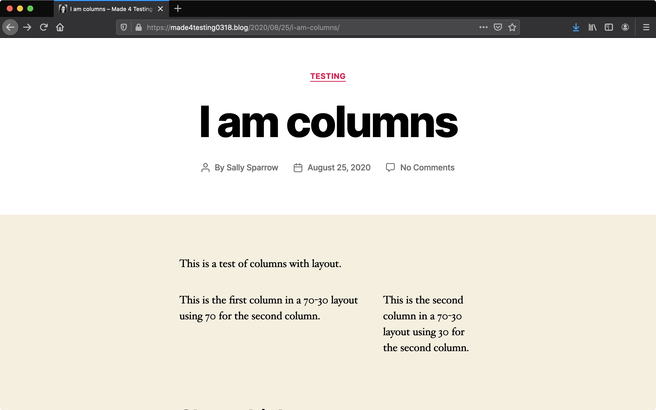
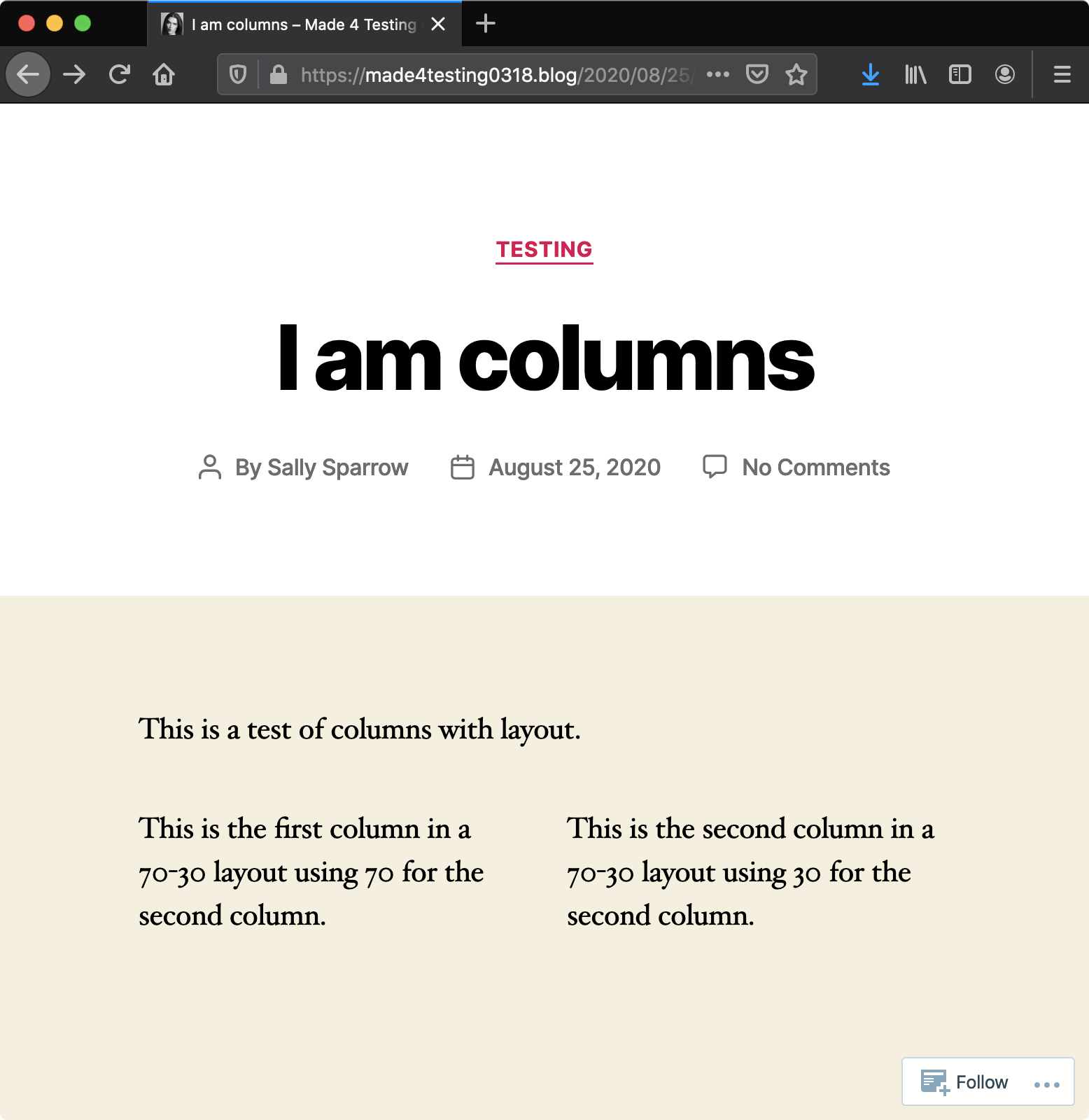
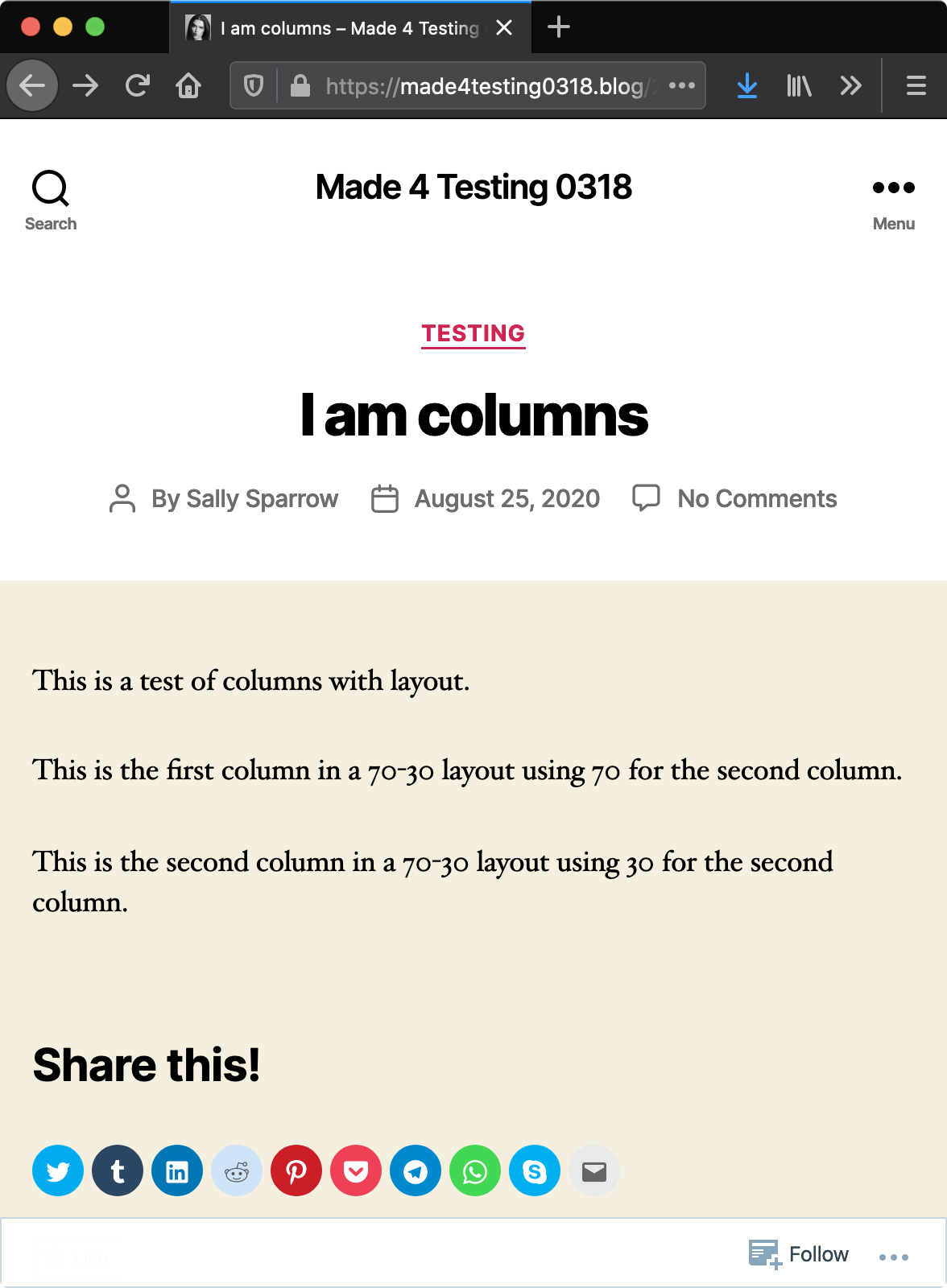
In my own testing using Pixel 3 Android 10, I found that the columns were stacked in the editor, in-app Reader, web Reader, and the mobile web (front-end of the site viewed in Chrome on Android 10) while in portrait mode. In landscape mode, I found that only the front-end view of the site showed columns and they showed as 50-50 instead of the 70-30 I had selected, although (after reading a bunch and doing a bit of research on a desktop browser to compare) I believe it is the intended behavior because it happens if I squish a desktop browser to smaller breakpoints too (i.e. at ~700px it switches to 50-50 and at ~600px they stack and that’s using the Twenty Twenty theme on a WordPress.com simple site).
Columns 70-30, as selected, at 1280px browser width|Same columns are 50-50 at ~700px browser width| And columns are 100% width and stacked at ~600px viewport
---|---|---
 |
| |
|
designsimply
on 25 Aug 2020
@designsimply I just realized my reply last night to your question didn't send, apologies! 😬
This might be the intended behavior for small screens. @pinarol @iamthomasbishop I believe you discussed this when working on the columns block in Gutenberg Mobile—can you let us know what you think about how columns should be expected to display in the Reader based on how they look in the block editor?
The short answer is "yes" -- columns should stack by default on "mobile" (forgive me if this isn't exact, but the breakpoint is something in the ballpark of ≤ 580px).
The long answer is the Columns block can differ wildly on web, especially on the front-end, but I think Reader on mobile should largely follow the logic applied inside the editor, which IIRC is:
- Mobile: each column spans 100%, resulting in "stacked" columns
- Tablet, larger: up to 3 columns per row, pushing each 3 subsequent new columns to a new row
- Note: percentages can get quite complex, but I believe we follow a similar logic in terms of applied percentages relative to breakpoints
Wide/full-width block alignments
We will be adding support for wide and full-width block alignment controls soon. We will obviously want to test in Reader on mobile to make sure we're not missing something obvious, but I think it'd be perfectly fine to treat wide/full-width blocks as if their container is the "normal" content-width.
It would be really interesting to support wide and full-width block containers for things like Image and Cover blocks, but there could be some unforeseen consequences WRT more complex layout elements like Columns, etc.
 iamthomasbishop
on 25 Aug 2020
iamthomasbishop
on 25 Aug 2020
Ace. Thank you for the update @iamthomasbishop! Based on this reply, I am closing this issue as working as intended.
In beta testing, I noticed that the spacing between stacked blocks doesn't match on web vs mobile web and I will file a separate issue for that upstream. 👍
designsimply
on 29 Aug 2020
Related issues
 mindgraffiti
·
3Comments
designsimply
·
3Comments
designsimply
·
3Comments
mindgraffiti
·
3Comments
designsimply
·
3Comments
designsimply
·
3Comments
 kurzee
·
3Comments
kurzee
·
3Comments
 wptester9845
·
3Comments
wptester9845
·
3Comments