Wordpress-ios: Notifications: Adjust Colors
Details:
The purpose of this issue is to track pending Notifications Color updates mentioned in PR #13152.
We'd need to define:
- New Section Header BG Color
- New Cell Selection color
- New Background color (Undefined!)
Should we, then, replicate the UX we've got in My Sytes?
cc'ing @osullivanchris and @mattmiklic
Gentlemen, working on this on your command! (Please bear in mind we'd need Dark + Light palletes).
 jleandroperez
All 2 comments
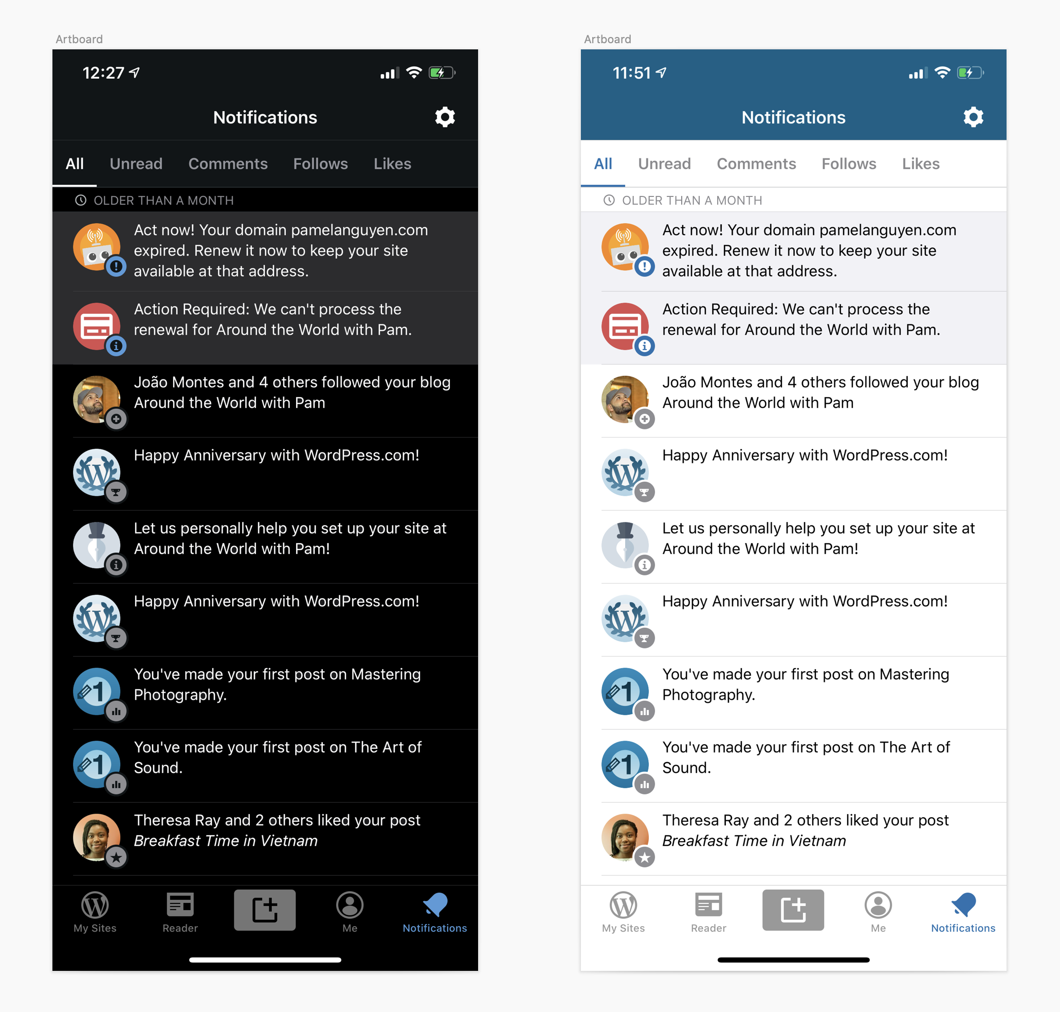
My thinking is that by using a white (black in dark mode) background rather than a grouped table view style (with an offwhite backgound behind white table cells) we could simplify the visual appearance and make unread items stand out more easily. Here's a quick mockup of what I'm thinking. The only change in light mode is to the background color of section headers. In dark mode, the section header color remains the same but the background of read notifications is now black.
 mattmiklic
on 27 Jan 2020
mattmiklic
on 27 Jan 2020
Love this, really simple solution! Thanks @mattmiklic I'm definitely happy to go this route.
Its in line with the work you're doing on Android as well moving away from grey page backgrounds.
 osullivanchris
on 28 Jan 2020
osullivanchris
on 28 Jan 2020
Related issues
 frosty
·
3Comments
frosty
·
3Comments
 designsimply
·
3Comments
designsimply
·
3Comments
 mindgraffiti
·
3Comments
mindgraffiti
·
3Comments
 wptester9845
·
3Comments
wptester9845
·
3Comments
wptester9845
·
3Comments
wptester9845
·
3Comments
Most helpful comment
My thinking is that by using a white (black in dark mode) background rather than a grouped table view style (with an offwhite backgound behind white table cells) we could simplify the visual appearance and make unread items stand out more easily. Here's a quick mockup of what I'm thinking. The only change in light mode is to the background color of section headers. In dark mode, the section header color remains the same but the background of read notifications is now black.