Wordpress-ios: Sharing: WhatsApp "Send" button difficult to read when sharing a site via Reader
Expected behavior
All text to be clear and readable when sharing a site via Reader.
Actual behavior
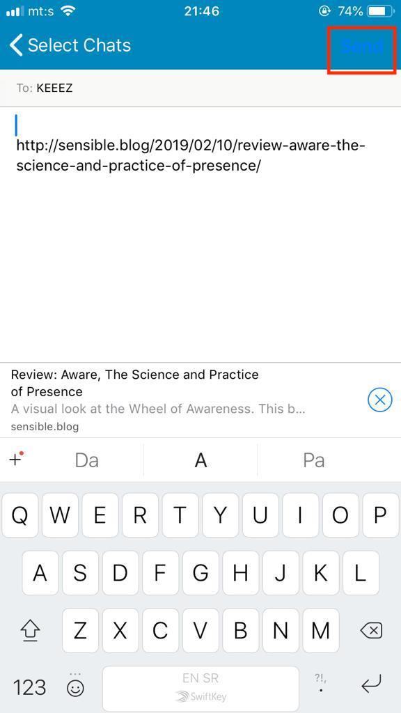
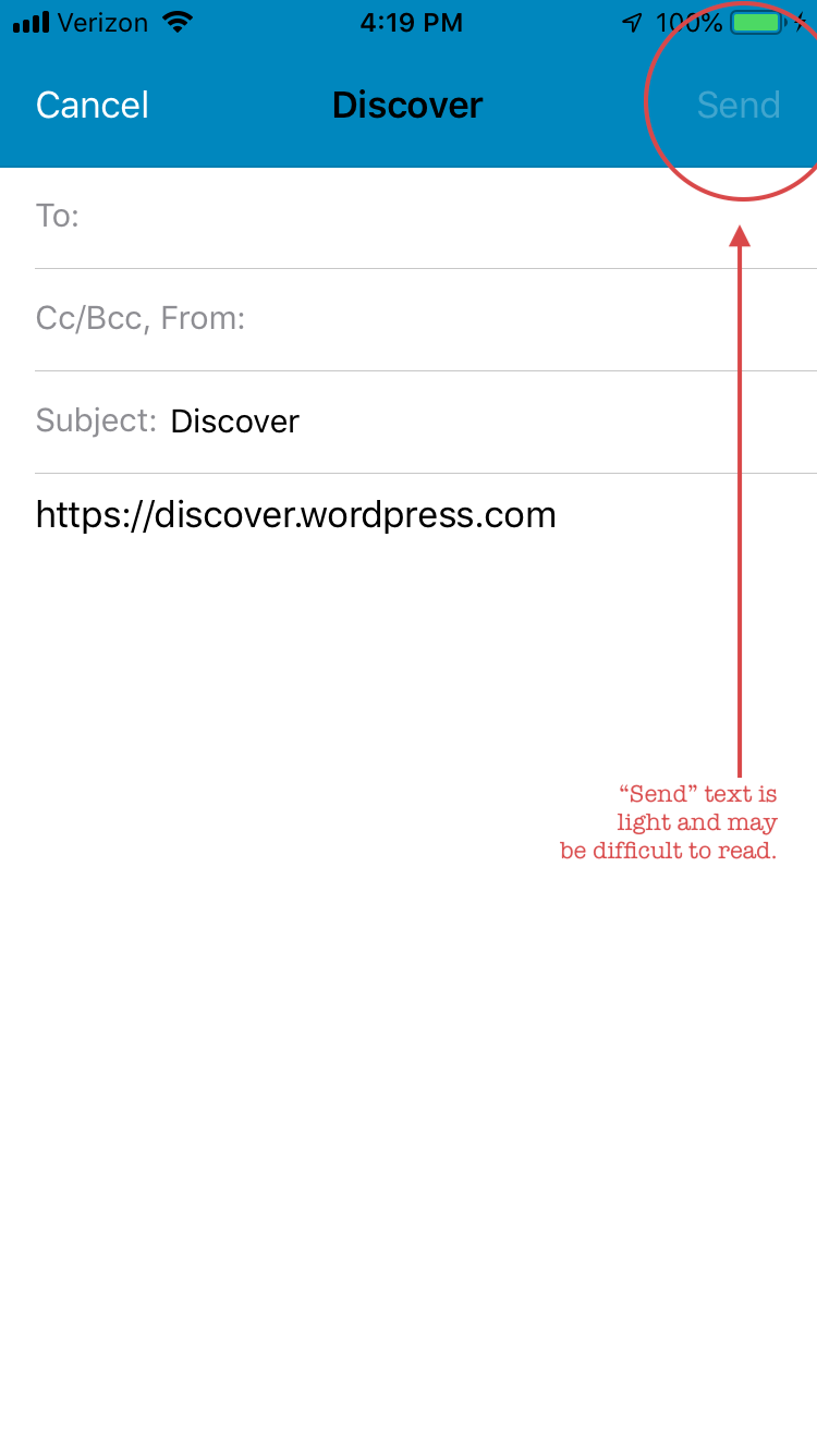
For some share targets, such as WhatsApp and Mail, the "Send" button is blue on blue and difficult to read.
Steps to reproduce the behavior
- Go to Reader > Followed and select a site.
- Tap the Share icon.
- Select WhatsApp or Mail as the target.
- Check to see whether the "Send" button is readable.
Result: the "Send" button is blue text on a blue background and difficult to read.
Tested on iPhone 8, iOS 12.1.4, WP Internal 11.8.0.20190211 by @stojdza (thank you!)
Tested on iPhone 6S, iOS 12.1.4, WP Internal 11.8.0.20190211 by me
 designsimply
All 2 comments
Thanks for reporting this, @Stojdza, and thanks for filing this @designsimply!
I'd like to share a few thoughts here. First, this report also applies to the existing _Share a Blog Post_ functionality. Next, while these issues are similar, we have varying degrees of control over appearance once we provide content to the iOS "Share Sheet" for presentation.
_WhatsApp_
The blue _Send_ button appears to match the iOS system blue that represents the default tint color for many elements of system "chrome". Unfortunately, this is very similar to our app's default blue color used in the navigation bar, leading to the low-contrast scenario you observe. Two thoughts come to mind:
- We _may_ be able to tidy that up to match the
< Select Chatsback bar button item on the left. - We might consider modify the navigation bar for these "sharing" functions (via
UIActivityViewController) to be the system "white" frosted color. Think of the system interface you see elsewhere in iOS.
Either of these approaches would require some dialogue with our design counterparts, and testing to confirm we achieve the desired result.
_Mail_
The _Send_ button is dim because a valid email address has not been entered. If you input a full email address, it transitions to an enabled state that is more legible.
If we pursue "Option 2" above for WhatsApp, that would benefit the experience you've observed here in Mail.
 ghost
on 14 Feb 2019
ghost
on 14 Feb 2019
Closed https://github.com/wordpress-mobile/WordPress-iOS/issues/8912 as a duplicate in favor of the reply/explanation from @stevebaranski on this one. ❤️
cc @charliescheer @nheagy @thehenrybyrd
designsimply
on 14 Feb 2019
Related issues
 iamthomasbishop
·
3Comments
designsimply
·
3Comments
iamthomasbishop
·
3Comments
designsimply
·
3Comments
 ScoutHarris
·
3Comments
ScoutHarris
·
3Comments
 rclations
·
3Comments
designsimply
·
3Comments
rclations
·
3Comments
designsimply
·
3Comments
Most helpful comment
Thanks for reporting this, @Stojdza, and thanks for filing this @designsimply!
I'd like to share a few thoughts here. First, this report also applies to the existing _Share a Blog Post_ functionality. Next, while these issues are similar, we have varying degrees of control over appearance once we provide content to the iOS "Share Sheet" for presentation.
_WhatsApp_
The blue _Send_ button appears to match the iOS system blue that represents the default tint color for many elements of system "chrome". Unfortunately, this is very similar to our app's default blue color used in the navigation bar, leading to the low-contrast scenario you observe. Two thoughts come to mind:
< Select Chatsback bar button item on the left.UIActivityViewController) to be the system "white" frosted color. Think of the system interface you see elsewhere in iOS.Either of these approaches would require some dialogue with our design counterparts, and testing to confirm we achieve the desired result.
_Mail_
The _Send_ button is dim because a valid email address has not been entered. If you input a full email address, it transitions to an enabled state that is more legible.
If we pursue "Option 2" above for WhatsApp, that would benefit the experience you've observed here in Mail.