Wordpress-ios: Me: "Revert Pending Change" for account email is hard to find
If there is a pending change to the email address on your account in all devices you will see an alert that informs you that your the change is there and needs to be approved.
In iOS, however, there is no way to cancel that change if you no longer want your email changed. It is possible cancel in web and in Android, but not iOS. Would it be possible to add a cancel change link to the pending change alert?
To reproduce:
- Go to Me > Account Settings
- Change your email to something new
- An alert will appear on that same page saying there is a pending change, but no way to dismiss the change.
iOS 11.4.1
WordPress 10.7
iPhone 6s
 charliescheer
All 7 comments
There is a way to cancel the pending change, but you have to tap on Email first. That brings you here:
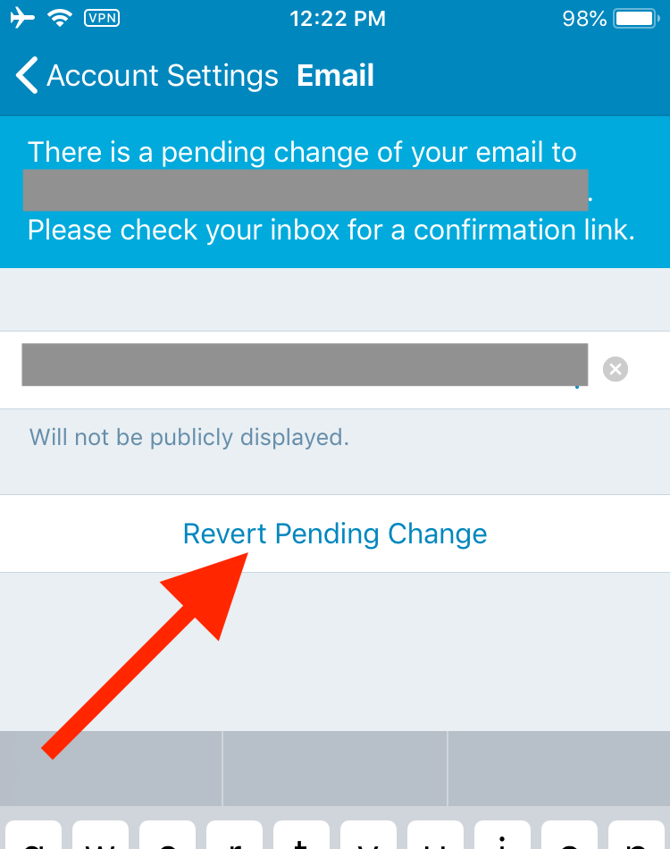
I'll tag this for design review — perhaps there's a way we can make that more obvious.
 rachelmcr
on 6 Sep 2018
rachelmcr
on 6 Sep 2018
Thanks for looking into it Rachel :)
charliescheer
on 6 Sep 2018
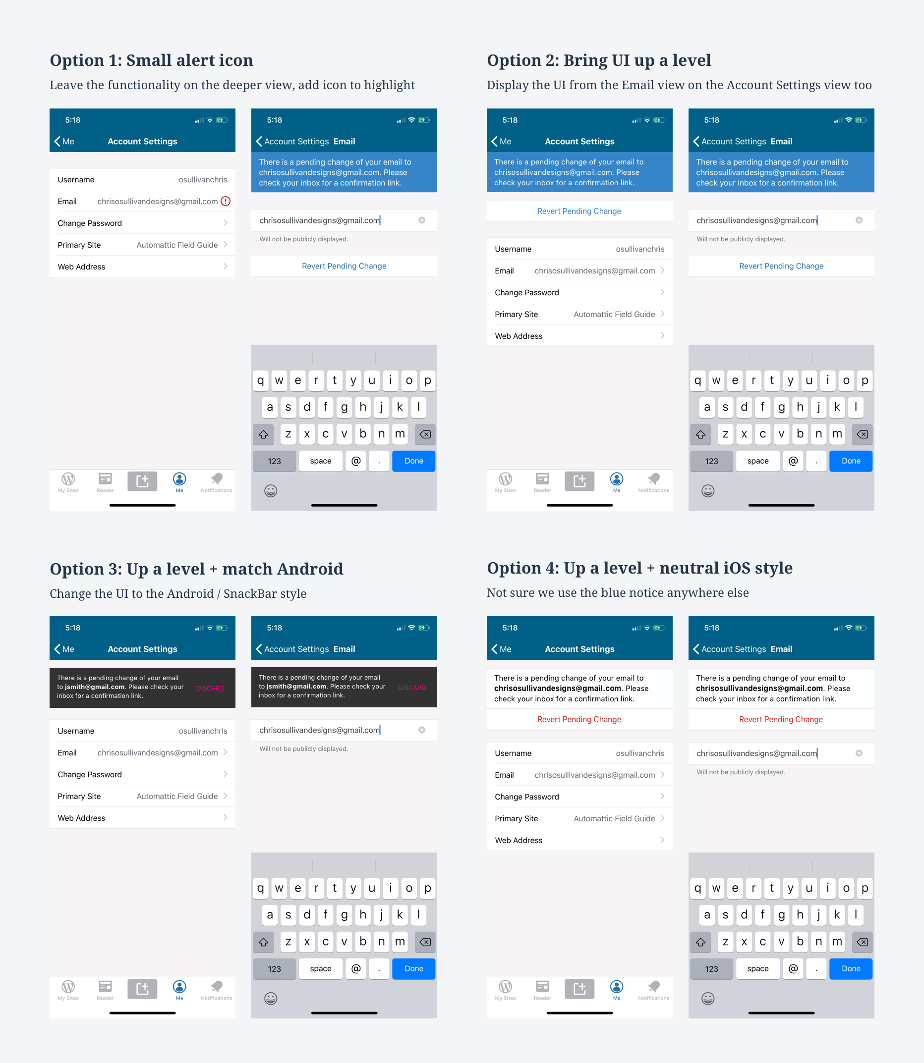
I've had a look at this issue on hack week. I went through the flow on iOS and Android and considered a number of changes which are in the image below.
Option 1:
Pros: simple, cheap
Cons: can't do the action on the upper level, no improvement to the UI or alignment with Android
Option 2:
Pros: user can see the issue and act on it one level up, and cancel if desired
Cons: Not aligned with Android
Option 3:
Pros: Same pros as 2 + aligned with Android
Cons: Not sure this is a component we use elsewhere anyway, so consistency may not be an advantage. Also looks very material and a bit out of place here.
Option 4:
Pros: Same pros as 2 + tidied up UI. The blue UI is neither ours nor something that can be consistent with Android. Thought that making it look more like the list might make things clearer, and making the aciton red.
Cons: not aligned to Android. Might be less visible
Recommendation: Option 1
- As I understand this issue was reported because @charliescheer didn't think it was possible to cancel the change request at all.
- As it turned out, @rachelmcr pointed out it is possible, maybe just not very clear as its one level deeper
- Assuming there are not lots of user reports of issues (correct me if I'm wrong) this doesn't seem like a high priority issue or a big user problem knowing what we know. Having explored it I think the slight improvement of adding an icon in option 1 would be the cheapest and make it more obvious.
Feedback welcome as always
 osullivanchris
on 29 Jul 2019
osullivanchris
on 29 Jul 2019
Assuming there are not lots of user reports of issues (correct me if I'm wrong) this doesn't seem like a high priority issue or a big user problem knowing what we know. Having explored it I think the slight improvement of adding an icon in option 1 would be the cheapest and make it more obvious.
Agreed. I'm not aware of this as a significant point of confusion or something that gets a lot of user reports, so I think the lowest friction solution (option 1) makes sense at this point.
Also, just to follow up on this point about option 4:
The blue UI is neither ours nor something that can be consistent with Android.
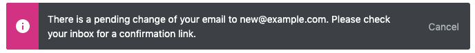
I _think_ the blue UI came from copying the Calypso UI for the pending email change banner at the time it was implemented, as seen in the screenshot on the original issue: https://github.com/wordpress-mobile/WordPress-iOS/issues/4823. The Calypso banners have a new style, so if we decide to make a bigger change I don't think there's any reason to stick with the blue UI. The current Calypso UI is most similar to the snackbar style in option 3:
rachelmcr
on 30 Jul 2019
@rachelmcr ah great. Thanks for the context that's really good to know. I'll check with the team for any feedback and make sure they agree with the proposal before I set this to done from design side
osullivanchris
on 31 Jul 2019
Out of all of the options, I prefer behavior you outlined in option 1.
Regarding the banner...we might want to evaluate how we translate that new style to the mobile apps (as a separate issue) and coordinate with the Muriel team on it. To me, the dark card inline looks out of place in the context of the mobile apps.
 megsfulton
on 31 Jul 2019
megsfulton
on 31 Jul 2019
Proposal: we go with option 1 for now, which is a minimal addition that helps users find this information if they're missing it today. If we get feedback that its more of an issue we have the others in our pocket.
Regards the banner style, agree it can be tackled as a separate issue and we could try to find other banners like that which we have in the app.
osullivanchris
on 1 Aug 2019
Related issues
 ScoutHarris
·
3Comments
ScoutHarris
·
3Comments
 designsimply
·
3Comments
designsimply
·
3Comments
 SiobhyB
·
3Comments
SiobhyB
·
3Comments
 hypest
·
3Comments
hypest
·
3Comments
 wptester9845
·
3Comments
wptester9845
·
3Comments