Wordpress-ios: Create New Site layout issue
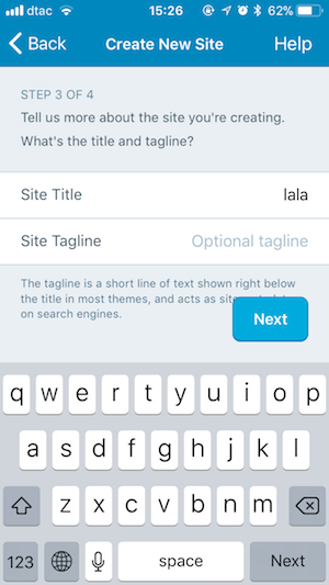
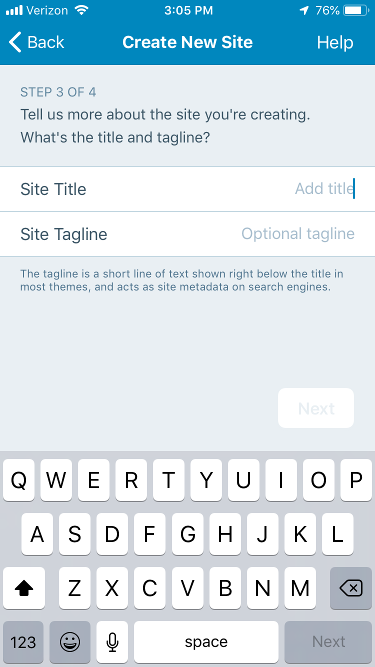
On iPhone SE “Next” Button in “Create new site” screen overlaps some of the text:
 elibud
All 12 comments
This one needs design review IMO. Adding that tag.
 nheagy
on 8 Mar 2018
nheagy
on 8 Mar 2018
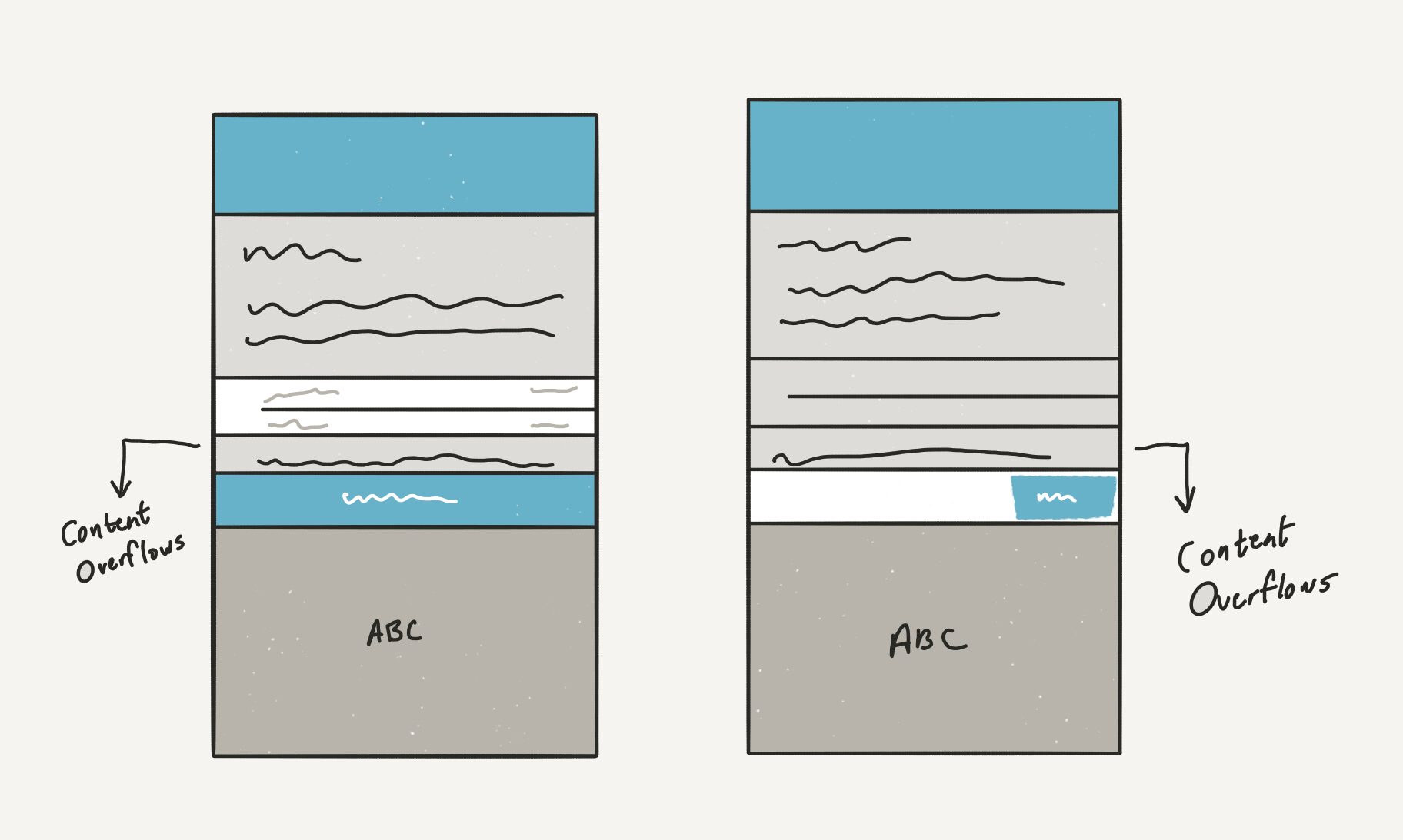
We reviewed this and we have two options, of which we'd like to consider for now the one that is more technically simple and maintainable:
- (A) When the page height is taller than the visible area (i.e. it goes below the Next button) we detach the Next button and put it "on" the page (i.e. scrolling with it)
- (B) We add a fixed background below "Next" like a toolbar. Caveat: this has to be flexible to adapt the potential text on the left of the button.
Which one is more technically feasible?
Rationale
We reviewed different options in the discussion that reached the conclusion above. We explored:
- It's like a "FAB", so it can float. It's not an issue, we keep it.
- We add a "rectangle" below the "Next" button so it cuts text.
- below a threshold (TBD) we detach "Next" and attach it to the page, as there's already a "Next" on the keyboard, and the other next would become accessible by scrolling.
- Put the "Next" button on the navigation bar at the top (by @hypest)
@mattmiklic also noted that "this resolution will continue to decline in popularity" to frame properly the extent of the issue. Also, as noted by @iamthomasbishop this is impacted not just by screen size, but also by typography size settings.
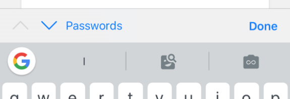
Thomas also provided a mock of an approach discussed for variable font size that matches (2) above:
And he pointed out that iOS already have "Done" on keyboard toolbars (inputAccessoryView):
The agreement is that we should find a solution that is technically simple to maintain, but at the same time solves the issue. Other solutions exist, but would require a larger refactoring of the bottom/top navigation UI.
 folletto
on 9 Mar 2018
folletto
on 9 Mar 2018
I added "Needs Code Review" as there's no specific "Needs Technical Assessment" label.
folletto
on 9 Mar 2018
This issue has been marked as stale because:
- It has been inactive for the past year.
- It isn't in a project or a milestone.
- It hasn’t been labeled
[Pri] Blocker,[Pri] High, orgood first issue.
Please comment with an update if you believe this issue is still valid or if it can be closed. This issue will also be reviewed for validity and priority (cc @designsimply).
![stale[bot] picture](https://avatars3.githubusercontent.com/in/1724?v=4&s=40) stale[bot]
on 9 Mar 2019
stale[bot]
on 9 Mar 2019
I tested this in 11.8 and 12.0-beta with iPhone 6S iOS 12.1.4 and used Settings > General > Accessibility > Larger Text to simulate a case where the button might overlap and found it appears option B has been used where the bottom right button is in a fixed position with no text wrapping.
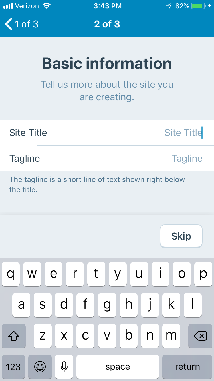
Here are some extra screenshots from WPiOS 11.8 (left) WP Internal 12.0.0.20190311 (right) on iPhone 6S iOS 12.1.4 for reference (there are no overlaps but you can see how the overall design has changed).
I am adding this issue to the Site Creation : iOS project for a quick check on iPhone SE to confirm no further action is needed. Please close this issue and remove [Status] Needs Code Review if that's the case or comment noting what still needs to be done if changes are still needed.
 designsimply
on 12 Mar 2019
designsimply
on 12 Mar 2019
@ctarda @stevebaranski can one of you please take a look at this one?
elibud
on 13 Mar 2019
@designsimply thanks for surfacing this.
The original issue was reported against the "circa 2018" Site Creation flow shortly after it was deployed last year.
The screenshots here juxtapose that experience with the new Site Creation flow rolled out in v11.9. The step depicted in the flow was implemented as Option B describes (i.e., with NUXButton).
I believe it can be closed; I will do that (& remove the label) as requested.
 ghost
on 13 Mar 2019
ghost
on 13 Mar 2019
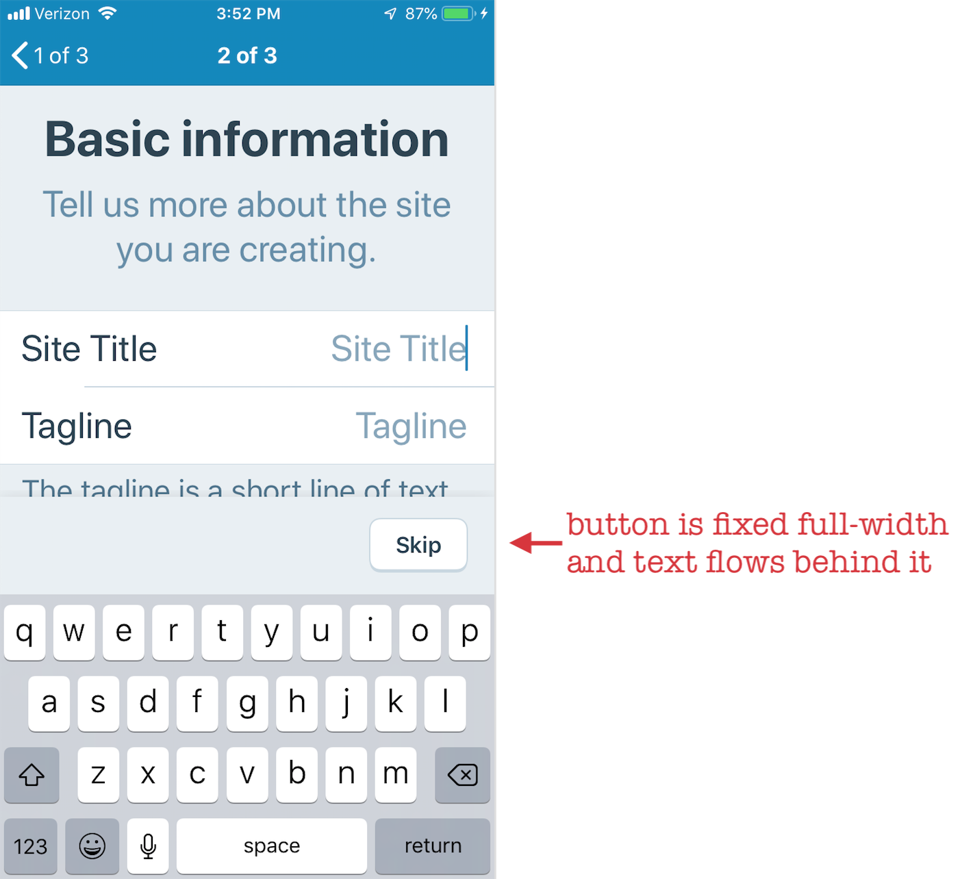
The problem still occurs on login screens:
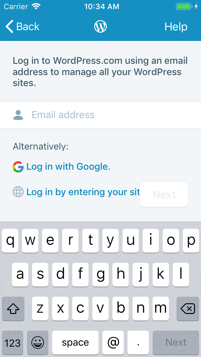
At the time this issue was made, both login and site creation used the same base UI. Now that they've diverged, the fix for this issue should be ported back to login screens as well.
@designsimply should we create a new issue to track that, or reopen this one?
nheagy
on 13 Mar 2019
@nheagy to be filed against WordPressAuthenticator, yes?
ghost
on 13 Mar 2019
@stevebaranski I prefer to log UX issues on the app(s) vs. the pods, where I feel they get lost. But I defer to @designsimply’s judgement.
nheagy
on 13 Mar 2019
@designsimply should we create a new issue to track that, or reopen this one?
A new issue about the log in screen with the designs copied over would be great since it's a different area of the app. @nheagy, I agree about filing on the app repos for the reason you mentioned.
designsimply
on 13 Mar 2019
To close the loop here, I found an earlier report of the problem with the login screen at #8790 and reopened it.
designsimply
on 18 Mar 2019
Related issues
 SiobhyB
·
3Comments
SiobhyB
·
3Comments
 wptester9845
·
3Comments
wptester9845
·
3Comments
 frosty
·
3Comments
frosty
·
3Comments
 jkmassel
·
3Comments
jkmassel
·
3Comments
 iamthomasbishop
·
3Comments
iamthomasbishop
·
3Comments