Wordpress-android: Jetpack Section: Update Activity Log Details UI and Add Backup Download Button/Flow
As per the requirements in this post (pcdRpT-cM, see Activity Log: Event Details), this issue is about:
- UI updates on this screen to match design, and
- Adding the
Backup Downloadbutton and connecting the button with the new flow.
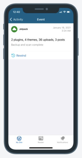
Before | After
-------|------
 |
| 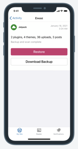
On Android, the screen looks a bit different today, comparing the before (or current) of Android with the after (or current) of iOS:
Before or Current (Android) | After or Current (iOS)
-------|------
 |
| 
@osullivanchris can you please suggest what UI changes need to happen to the UI so that Android get the appropriate after look, and still be comparable with iOS's after look?
 ParaskP7
All 3 comments
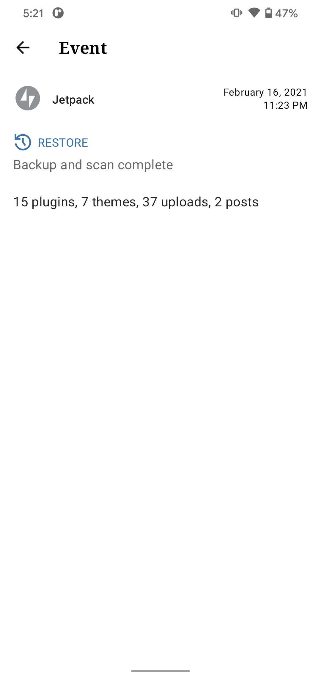
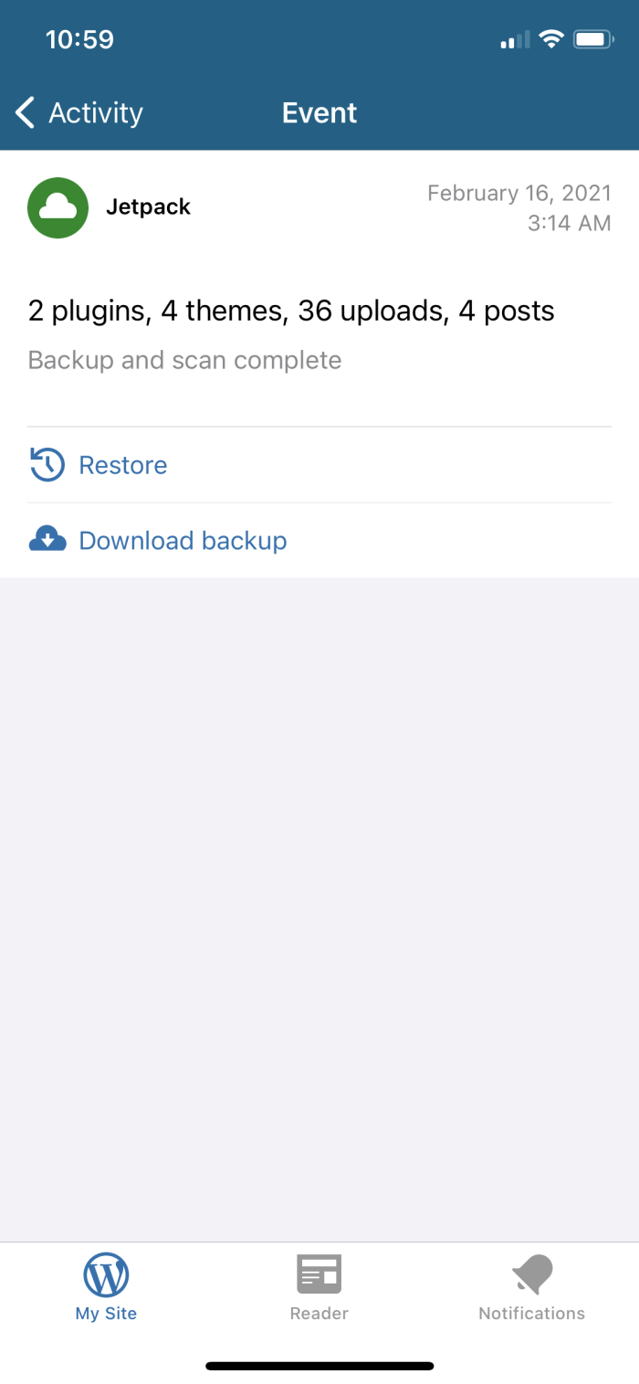
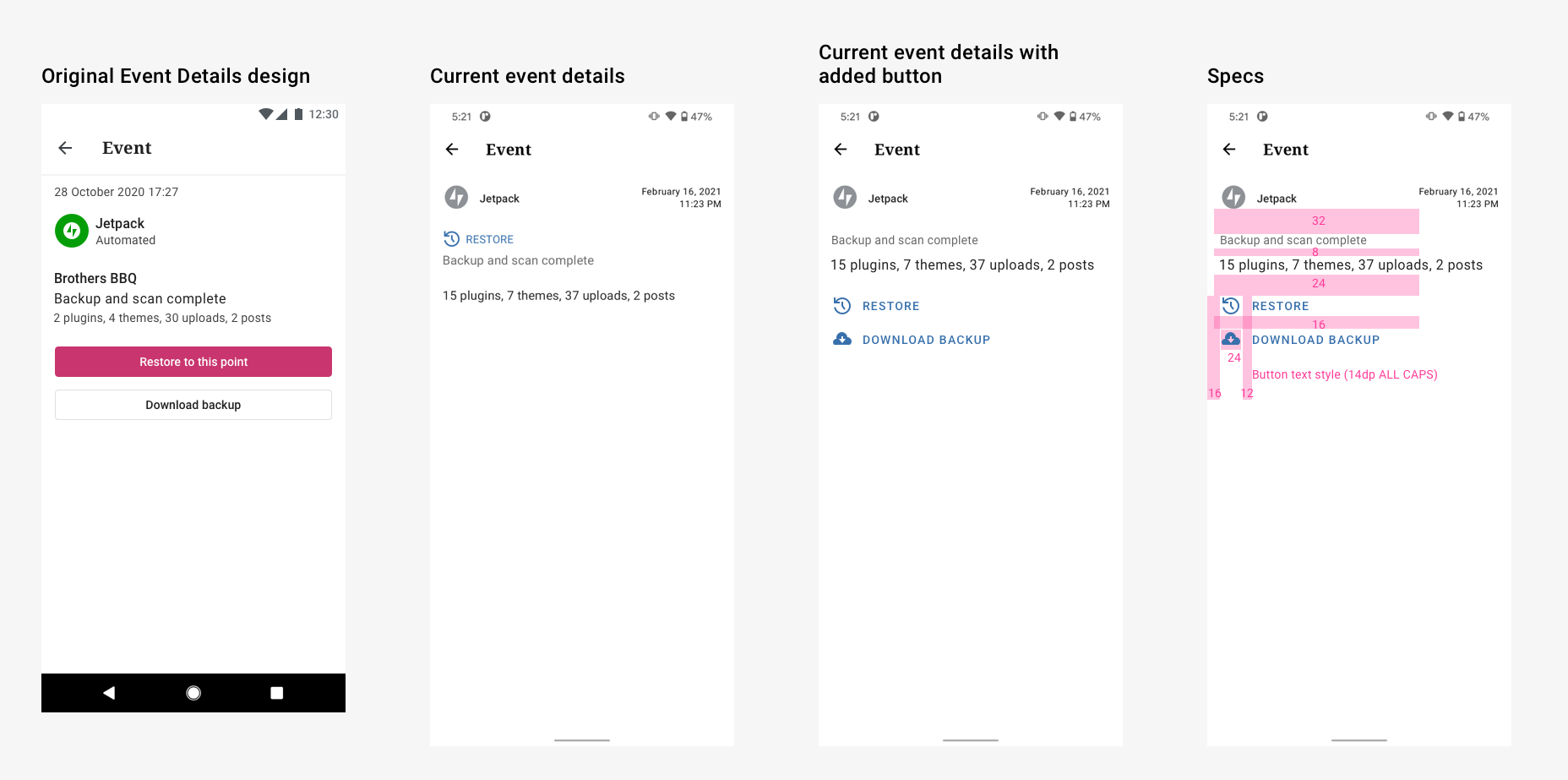
👋 Hey Petros, thanks for creating the issue. I tried to do as little as possible, just to add the extra button to this screen. I couldn't help tidying up the spacing a little bit. But only do that if its easy. I did have to move things a little bit, as it doesn't make sense to have the buttons above the information...unless you think that info could get really long?
Also - again if its quick - wondering if we are using default type styles. They looked a little off to me. I think maybe there's too much letter spacing. As a basis I used:
- 'Backup and scan complete' used 14dp body 2, medium emphasis color
- '15 plugins...' used 16dp body 1, high emphasis color
 osullivanchris
on 17 Feb 2021
osullivanchris
on 17 Feb 2021
👋 @osullivanchris !
Thank you so much for providing the updated design and specs on such a short notice. All you suggestions seem about right and I'll be doing all of them as part of this task. ❤️
I couldn't help tidying up the spacing a little bit. But only do that if its easy.
Many thanks for tidying things up. 🌟
I did have to move things a little bit, as it doesn't make sense to have the buttons above the information...unless you think that info could get really long?
I agree, it doesn't make sense to have the buttons above the information. 🌟
Also - again if its quick - wondering if we are using default type styles. They looked a little off to me. I think maybe there's too much letter spacing. As a basis I used:
- 'Backup and scan complete' used 14dp body 2, medium emphasis color
- '15 plugins...' used 16dp body 1, high emphasis color
I agree again, will update those as well. 🌟
🙏
ParaskP7
on 18 Feb 2021
@ParaskP7 Sweet! Thanks for the positivity and making all the proposed fixes. And no problem on the design work, it didn't take long and I love making a quick fix! 😄
osullivanchris
on 18 Feb 2021
Related issues
 wptester9845
·
3Comments
wptester9845
·
3Comments
 jd-alexander
·
3Comments
jd-alexander
·
3Comments
 JavonDavis
·
3Comments
JavonDavis
·
3Comments
 roundhill
·
3Comments
roundhill
·
3Comments
 hoverduck
·
3Comments
hoverduck
·
3Comments
Most helpful comment
@ParaskP7 Sweet! Thanks for the positivity and making all the proposed fixes. And no problem on the design work, it didn't take long and I love making a quick fix! 😄