Woocommerce-services: [WC 4.4 beta1] Create shipping label notice layout is a bit cramped
Description:
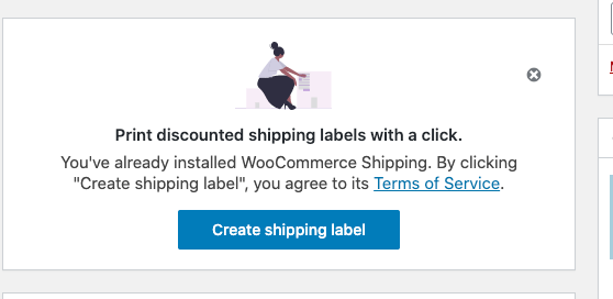
The message, the Create shipping label button and the close icon of the Create shipping label notice on the order page feel a bit cramped:
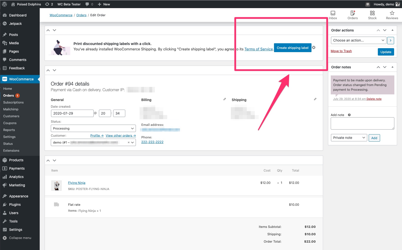
Steps to reproduce:
I tested using WooCommerce 4.4 beta1 and WordPress 5.5-RC1-48681.
- Start OBW.
- Enter the US address in the
Store detailssection during OBW. - On the
Tell us about your businesspage, select checkbox next toInstall recommended free business featuresso that WC Services could be installed. - Complete OBW.
- Place an order on the site.
- Navigate to the order page and see the notice letting you know that you can create a shipping label with the cramped layout.
Expected behavior:
I think more space (padding) between the text, button, and the exit icon will make it for a nicer experience. Alternatively, the Create shipping label button can be placed under the message and centered.
Environment:
OS: macOS Catalina 10.15.5
Browser: Chrome 84.0.4147.89 (Official Build) (64-bit)
 juliaamosova
All 11 comments
Thanks for the report! Just a note that the fix for this will be in the wc-admin repo. We'll plan on taking care of it.
 c-shultz
on 30 Jul 2020
c-shultz
on 30 Jul 2020
Sounds good, thanks @c-shultz!
juliaamosova
on 30 Jul 2020
Yeah, I noticed this in the past couple days as well, thanks for creating this issue. Not sure if something's changed since the prompt was released.🤔
We'll have to tweak the layout of the prompt a bit because there needs to be padding between the text, button, and close icon. Keeping in mind smaller screen sizes as well.
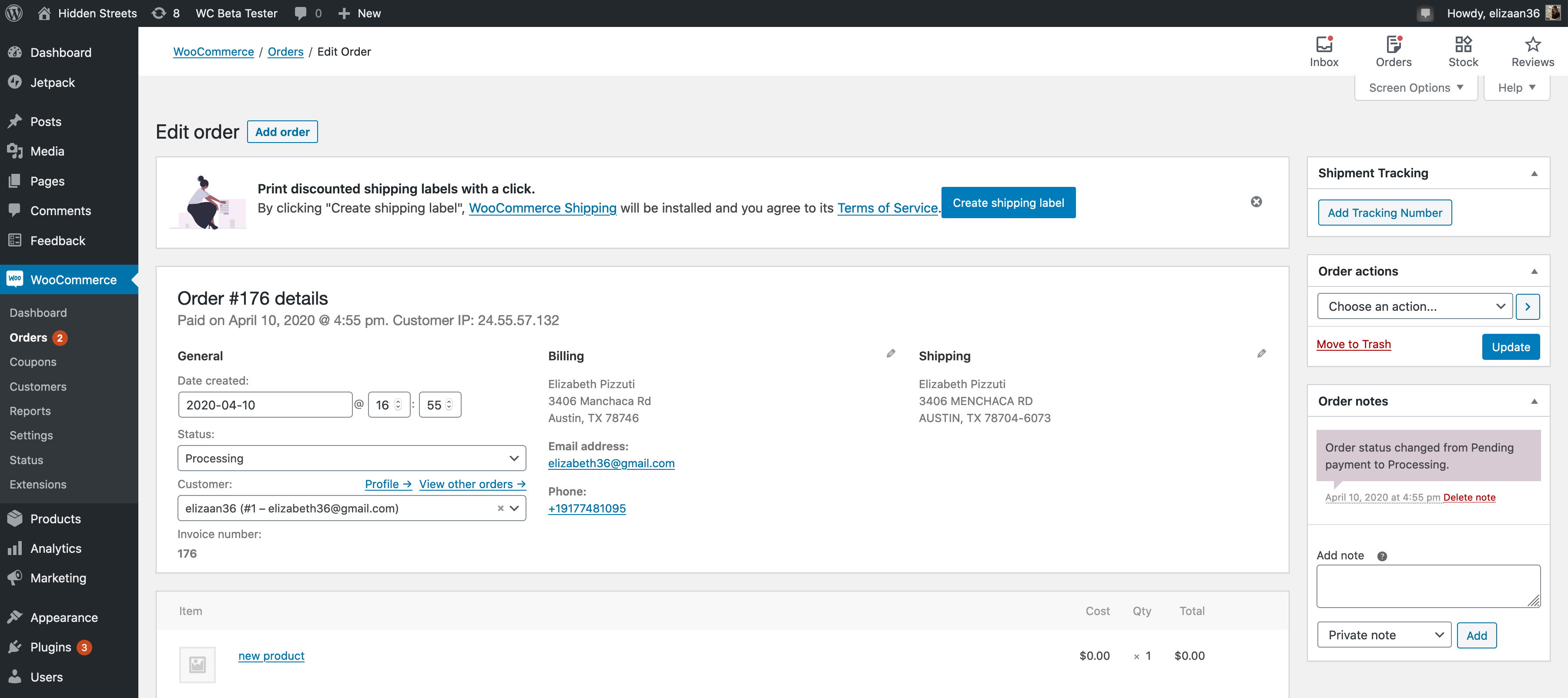
In addition to the expected behavior notes Julia shared above, here the primary action should stay fixed on the right of the card rather than moving with the text.
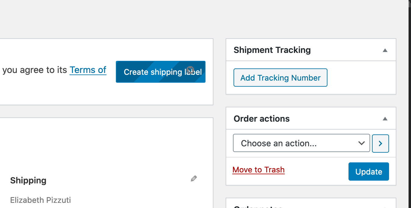
Here the close icon shouldn't overlap the button.
 elizaan36
on 30 Jul 2020
elizaan36
on 30 Jul 2020
@elizaan36 Do we also need to change the "Create shipping label" blue button to red?
 harriswong
on 4 Aug 2020
harriswong
on 4 Aug 2020
No, it's blue here because it's in the wp-admin view so the button should be consistent with WordPress elements.
elizaan36
on 4 Aug 2020
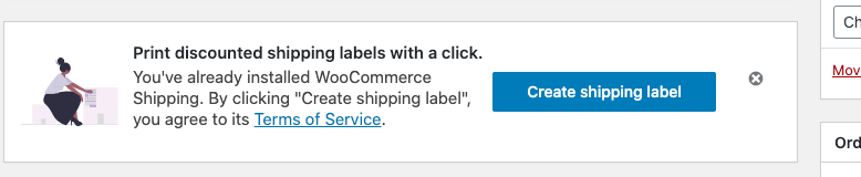
Here is how it would look like after the patch:


harriswong
on 5 Aug 2020
Mouse over the button will result:

I am going to remove this red hover as well.
harriswong
on 5 Aug 2020
Looks perfect Harris, except one small thing. Can we move the text down so the padding is equal top and bottom to make the text vertically centered in the card. Thinking about the error message if there is one, it should move the other text up so that it's always vertically centered.
This is what the padding looks like now:
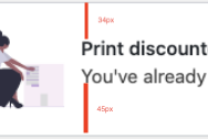
Should be equal top and bottom for all the elements in the banner, including illustration, text, and actions.
Great about removing the red hover state.
elizaan36
on 5 Aug 2020
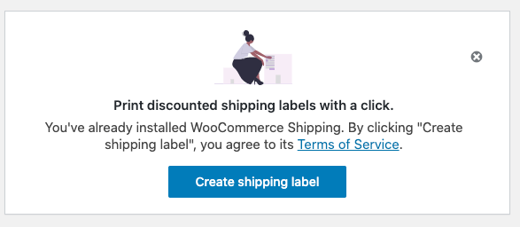
@elizaan36 I have updated the margins/paddings to make the text vertically aligned. Removed the hover red effect. Also the error message is aligned.




harriswong
on 6 Aug 2020
Created an issue(https://github.com/woocommerce/woocommerce-admin/issues/4938) in woocommerce-admin to track.
Created a PR in woocommerce-admin repository: https://github.com/woocommerce/woocommerce-admin/pull/4948.
harriswong
on 6 Aug 2020
Merged. Closing.
harriswong
on 7 Aug 2020
Related issues
c-shultz
·
5Comments
 allendav
·
6Comments
allendav
·
6Comments
 nabsul
·
3Comments
nabsul
·
3Comments
nabsul
·
3Comments
nabsul
·
3Comments
 budzanowski
·
4Comments
budzanowski
·
4Comments