Windowscommunitytoolkit: What's new and notification for each release in SampleApp
I'm submitting a...
- Sample app request
Current behavior
Currently, the users have to go to the release notes to fine changes/What's new
Expected behavior
We can have a What's new popup after an update and Push Notifications to alert for breaking changes.
 Vijay-Nirmal
All 27 comments
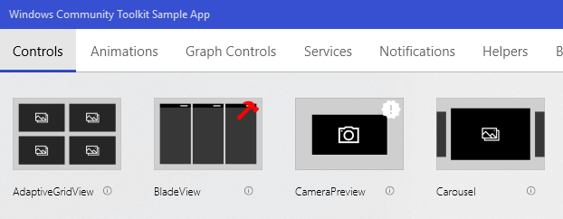
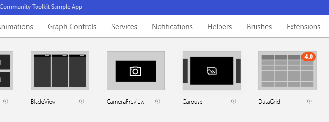
Also, controls that are new in this release should have a "new" icon on their tile.
 JustinXinLiu
on 15 Aug 2018
JustinXinLiu
on 15 Aug 2018
Why the need for a popup and push notification? I think a new icon and a breaking changes icon would be fine. We would need to be careful with this that previous tags are removed on the next release
 skendrot
on 15 Aug 2018
skendrot
on 15 Aug 2018
skendrot
on 15 Aug 2018
Maybe a version number with a background colour. Like a badge, so you know when a control was added or update
 mdtauk
on 15 Aug 2018
mdtauk
on 15 Aug 2018
@skendrot Push notification is to an alert user after an update. Popup will be similar to release note, so users can see all changes within the app. The user should not dig into the sample app just to find the breaking changes/What's new. The user should be alerted about the breaking changes as soon as possible.
Vijay-Nirmal
on 16 Aug 2018
@skendrot Yeah. It looks fine. I think the most important is the "what's new" icon. The UI should not overloaded by too many icons. To check if it is a new control/service/.. we can use the ApplicationVersion to automatically set the icon.
 Odonno
on 16 Aug 2018
Odonno
on 16 Aug 2018
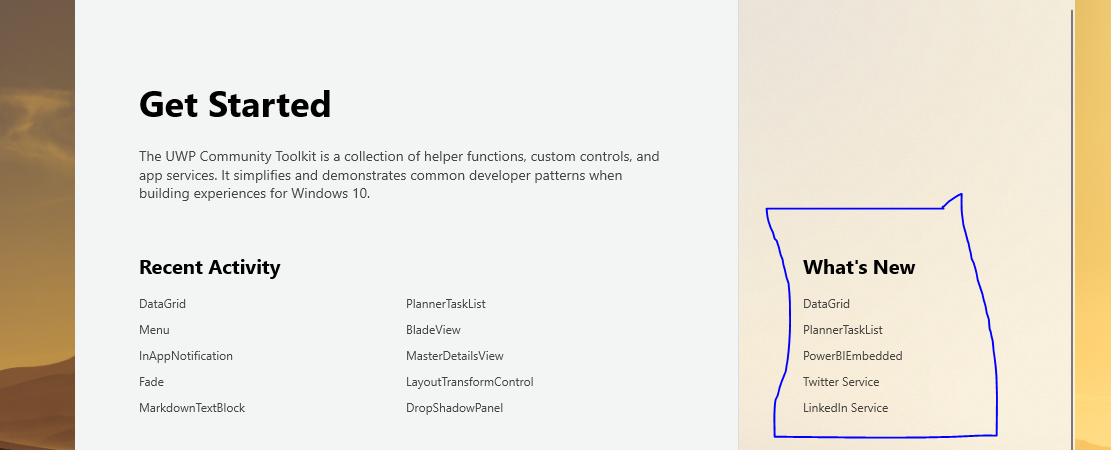
There is a "What's New" section already on the sample app. Why not use/improve this section instead of modifying the icons itself?
 avknaidu
on 16 Aug 2018
avknaidu
on 16 Aug 2018
@Vijay-Nirmal I would be so frustrated if I got a notification that the toolkit had breaking changes. Most likely I'm not even using the thing that had breaking changes! Breaking changes are noted in the release notes and in the blog that is published. Developers understand to look for these
skendrot
on 16 Aug 2018
@skendrot We can have an option to turn off the notification. If Breaking changes notification makes the user frustrated then we can simply say "New version has been released, check out What's new and changes in the toolkit"
Vijay-Nirmal
on 16 Aug 2018
I think a pop-up content dialog on the home page after an update would be good. It'd also make a good sample for the sample app to have using the SystemInformation APIs we added.
 michael-hawker
on 16 Aug 2018
michael-hawker
on 16 Aug 2018
It's OK to have a "What's New" section, but icons would make it so much easier for people to discover new things.
I am also not a huge fan of popups. I think we just need to make the release notes panel more obvious when there are breaking changes.
JustinXinLiu
on 16 Aug 2018
What's New gives you a definitive list, but doesn't go into enough detail to explain all the changes made to an updated control, along side new controls.
Some kind of indicator is good for showing new controls, but also to alert people where a control has been changed
mdtauk
on 16 Aug 2018
@JustinXinLiu Are you requesting users to open all the below tabs to find What's New?

I think a simple what's new popup will solve the problem. Also, what's new popup is common in all the Microsofts app. That said, I also like to have a "new" icon.
Vijay-Nirmal
on 16 Aug 2018
@Vijay-Nirmal There is a What's New list already, but I think you keep that, click the header to view a more detailed list of new and updated controls, and add icons on the controls that are new or updated for the current version installed.
mdtauk
on 16 Aug 2018
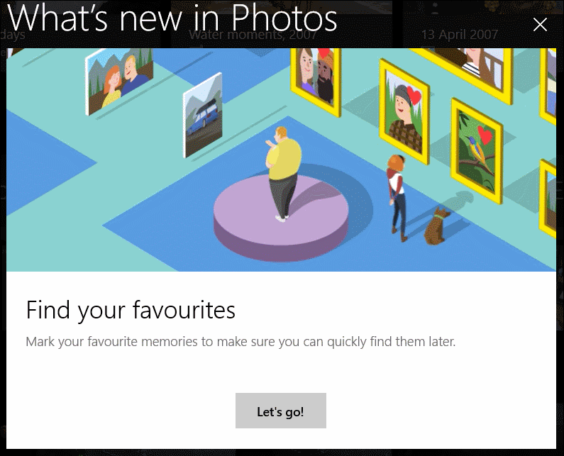
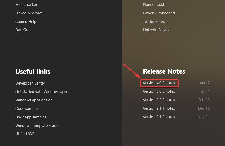
@mdtauk I know, it's just a link to the corresponding page. Do you like to have that or What's new popup like the images below?
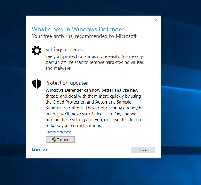
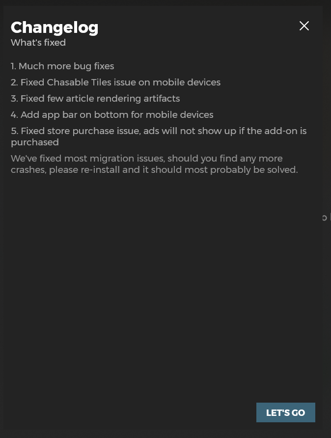
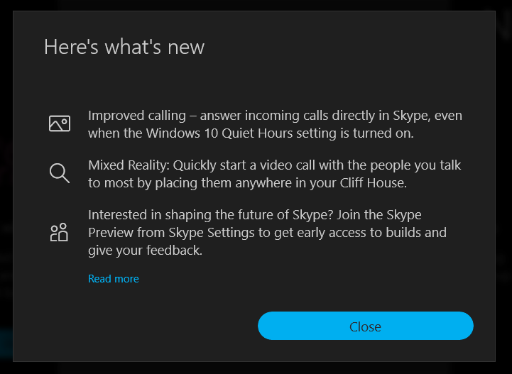
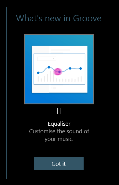
Vijay-Nirmal
on 16 Aug 2018
To me these popups offer little help when you need detailed information. When developers want to go into the details, they should go to the GitHub links and that's normally how they do it.
We just need to make sure the links on the main page are super clear. If there's breaking changes, we highlight it. Imagine this, if you accidentally closed the popup, or you closed it but wanted to go back to see it, how would you get your popup back? You would still need the links on the main page regardless.
This is a developer tool, let's not create something to get into people's way.
JustinXinLiu
on 16 Aug 2018
Yep. I think a popup is too much. Having an icon is enough. Some times ago I asked myself what was added to the Toolkit recently.. A "new icon" is fine and it will last only until the next major/minor release. Not sure about an "update icon"/"change icon", it can be useful too.
And I have the same opinion than @JustinXinLiu this sample app deserve a clean and ready-to-try workspace, adding popups feel like the opposite.
Odonno
on 16 Aug 2018
Pop-ups are good for fun consumer feature announcements.
For developers, a detailed changelog would be best.
At the moment you have a list of controls that are new, and a link to GitHub for release notes.
But identifying new and updated controls while browsing the sample app, is a good middle ground, and shows information within the same scope as the example pages where you can visually test out these changes,
mdtauk
on 16 Aug 2018
Don't see this as an addition to the app. See this in a developers perspective.
Let's say a new version of the toolkit has been released.
With the current set up:
- Now the developer has to go to blogs (or other sites) to find out this news.
- Next, they want to go to release notes in GitHub to find out What's new/Changes.
- Next, they want to go to the sample app to check out these changes.
With my proposed set up:
- The developer will get a notification. Clicking it, release notes popup will be shown in the sample app with all the link to the corresponding page.
@skendrot To reopen the What's new/Changes (release notes) popup the developer has to click the release notes hyperlink in the sample app. The popup should have connected animation so that the users will know where to click again to get the popup.
Vijay-Nirmal
on 17 Aug 2018
Just to throw in another option, we could add a non disruptive InAppNotification that points to the release notes. Or a small section in the top of the landing page that only shows up the first few times (with a hide button). Just a quick, "Hey a new version is now available, make sure to view the release notes".
 nmetulev
on 22 Aug 2018
nmetulev
on 22 Aug 2018
@nmetulev Is it just about showing what is new to the developer. Or about reminding what version includes what features/properties/events weeks or months after release?
mdtauk
on 22 Aug 2018
My suggestions is about showing what's new. I'm not against including version info in the samples/icons
nmetulev
on 22 Aug 2018
Fair enough @nmetulev 👍
mdtauk
on 22 Aug 2018
@Vijay-Nirmal What's the update on this?
 Kyaa-dost
on 6 Feb 2020
Kyaa-dost
on 6 Feb 2020
@Vijay-Nirmal I feel like we do a good job with the What's New section and Release Notes section which I think was added after this initial request.
I'm happy to close this unless someone wants to add more.
michael-hawker
on 6 Feb 2020
@michael-hawker Fair enough :)
Vijay-Nirmal
on 7 Feb 2020
Closing this issue for now.
Kyaa-dost
on 7 Feb 2020
Related issues
 deltakosh
·
3Comments
deltakosh
·
3Comments
 nolanblew
·
3Comments
nolanblew
·
3Comments
 IanStorm
·
4Comments
IanStorm
·
4Comments
 ilinkmobility
·
4Comments
Kyaa-dost
·
3Comments
ilinkmobility
·
4Comments
Kyaa-dost
·
3Comments
Most helpful comment
It's OK to have a "What's New" section, but icons would make it so much easier for people to discover new things.
I am also not a huge fan of popups. I think we just need to make the release notes panel more obvious when there are breaking changes.