wezterm displays antialiased letters in a heavier weight than Cairo
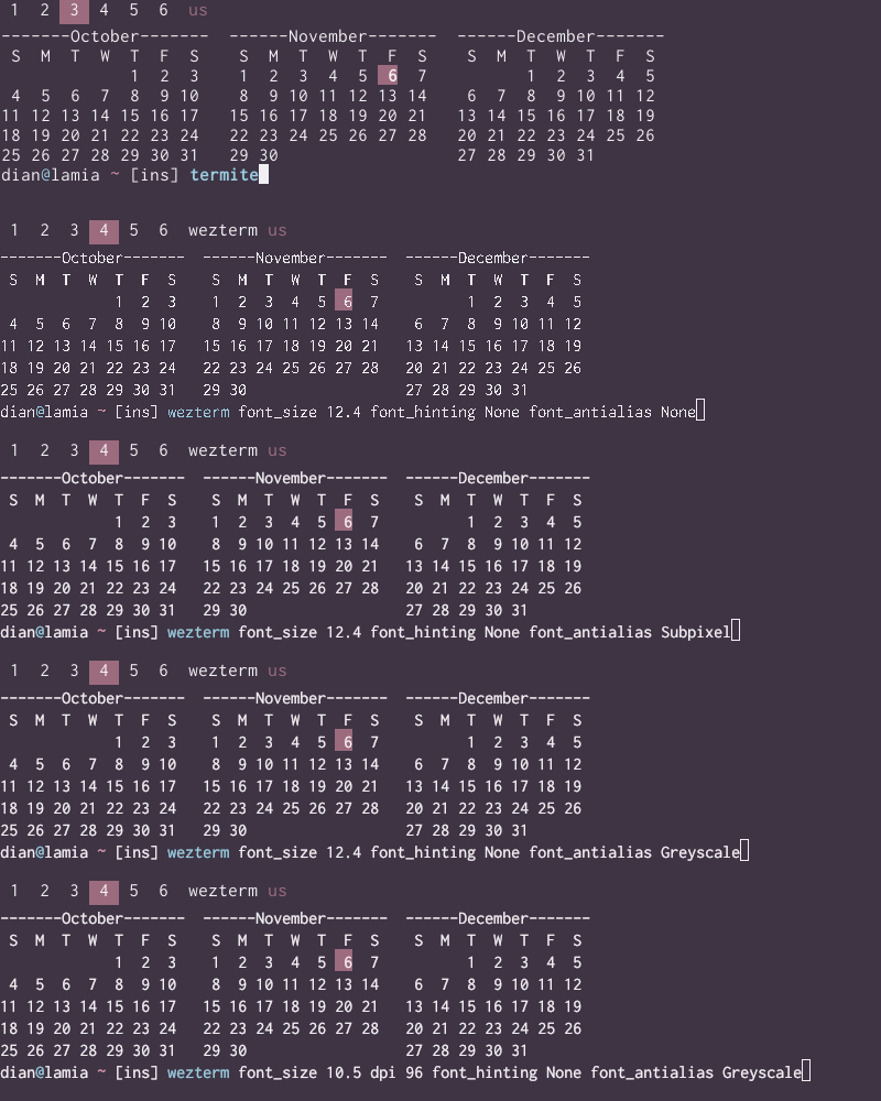
I'm comparing wezterm-git from the Arch AUR to termite (vte-based) and polybar, both using Cairo for display. I have both of those set to display text in Inconsolata-dz at pixel size 14, but can't get wezterm to match. Here's a gif showing the differences; the font on the top line from polybar stays consistently weighted throughout, and is only matched by termite. I can't detect a difference between Greyscale and Subpixel (as mentioned in #121), and font_hinting doesn't seem to change anything either.
Environment
Nvidia GeForce GTX 970, LG 34" ultrawide monitor, freshly updated Arch, i3-gaps
> xdpyinfo | grep -B 2 resolution
screen #0:
  dimensions:    2560x1080 pixels (803x343 millimeters)
  resolution:    81x80 dots per inch
wezterm.lua:
  font = wezterm.font_with_fallback({"Inconsolata-dz", "JoyPixels"}),
  -- font_size = px * 72 / dpi
  font_size = 12.4,
  font_hinting = "None",
  font_antialias = "Greyscale",
  dpi = 81.0,
Context
The log shows resize events possibly resetting dpi:
 2020-11-07T04:35:06.298Z ERROR wezterm_gui::gui::termwindow   > OpenGL initialized! GeForce GTX 970/PCIe/SSE2 OpenGL ES 3.2 NVIDIA 455.38 is_context_loss_possible=false
 2020-11-07T04:35:06.298Z TRACE wezterm_gui::gui::termwindow   > resize event, current cells: RowsAndCols { rows: 24, cols: 80 }, new dims: Dimensions { pixel_width: 1265, pixel_height: 1038, dpi: 96 }
 2020-11-07T04:35:06.350Z WARN  wezterm_font::parser           > available font: JetBrains Mono Bold

 (more font availabilities)

 2020-11-07T04:35:06.511Z WARN  wezterm_font::parser           > Using JetBrains Mono Regular from memory
 2020-11-07T04:35:06.511Z WARN  wezterm_font::parser           > Using Noto Color Emoji from memory
 2020-11-07T04:35:06.513Z TRACE wezterm_font::shaper::harfbuzz > [OnDisk { path: "/usr/share/fonts/OTF/ttf-inconsolata-dz.otf", index: 0 }, OnDisk { path: "/usr/share/fonts/joypixels/JoyPixels.ttf", index: 0 }, Memory { name: "../../assets/fonts/JetBrainsMono-Regular.ttf", data_len: 140776, index: 0 }, Memory { name: "../../assets/fonts/NotoColorEmoji.ttf", data_len: 7253060, index: 0 }]
 2020-11-07T04:35:06.513Z TRACE wezterm_font::shaper::harfbuzz > shaper wants 0 OnDisk { path: "/usr/share/fonts/OTF/ttf-inconsolata-dz.otf", index: 0 }
 2020-11-07T04:35:06.513Z TRACE wezterm_font::ftwrap           > Loading /usr/share/fonts/OTF/ttf-inconsolata-dz.otf for freetype!
 2020-11-07T04:35:06.513Z DEBUG wezterm_font::ftwrap           > set_char_size 12.4 dpi=81
 2020-11-07T04:35:06.513Z DEBUG wezterm_font::ftwrap           > set_char_size 12.4 dpi=81
 2020-11-07T04:35:06.513Z TRACE wezterm_font::shaper::harfbuzz > metrics: FontMetrics { cell_width: 8.0, cell_height: 19.12221336364746, descender: -3.0, underline_thickness: 0.696873664855957, underline_position: -2.090620994567871 }
 2020-11-07T04:35:06.514Z DEBUG wezterm_gui::gui::renderstate  > compute_vertices 158x51 1265x1038 padding=0 0
 2020-11-07T04:35:06.516Z ERROR wezterm_gui::gui::termwindow   > scale changed so resize to RowsAndCols { rows: 24, cols: 80 } Dimensions { pixel_width: 640, pixel_height: 480, dpi: 96 }
 2020-11-07T04:35:06.516Z TRACE window::os::x11::window        > PropertyNotifyEvent atom=352 xsel=600
 2020-11-07T04:35:06.516Z TRACE wezterm_gui::gui::termwindow   > resize event, current cells: RowsAndCols { rows: 24, cols: 80 }, new dims: Dimensions { pixel_width: 1265, pixel_height: 1038, dpi: 96 }
 2020-11-07T04:35:06.516Z DEBUG wezterm_gui::gui::renderstate  > compute_vertices 158x51 1265x1038 padding=0 0
 2020-11-07T04:35:06.518Z DEBUG wezterm_term::screen           > resize screen to 158x51
 2020-11-07T04:35:06.518Z DEBUG wezterm_term::screen           > resize screen to 158x51
 2020-11-07T04:35:06.518Z TRACE window::os::x11::window        > Calling focus_change(true)
 2020-11-07T04:35:06.518Z TRACE wezterm_gui::gui::termwindow   > Setting focus to true
 2020-11-07T04:35:06.518Z TRACE window::os::x11::window        > PropertyNotifyEvent atom=324 xsel=600
 2020-11-07T04:35:06.518Z TRACE window::os::x11::window        > PropertyNotifyEvent atom=337 xsel=600
 2020-11-07T04:35:06.518Z TRACE window::os::x11::window        > PropertyNotifyEvent atom=418 xsel=600
 2020-11-07T04:35:06.519Z DEBUG wezterm_font::ftwrap           > set_char_size 12.4 dpi=81
 2020-11-07T04:35:06.519Z TRACE wezterm_font::rasterizer::freetype > Rasterizier wants OnDisk { path: "/usr/share/fonts/OTF/ttf-inconsolata-dz.otf", index: 0 }
 2020-11-07T04:35:06.519Z TRACE wezterm_font::ftwrap               > Loading /usr/share/fonts/OTF/ttf-inconsolata-dz.otf for freetype!
 2020-11-07T04:35:06.519Z DEBUG wezterm_font::ftwrap               > set_char_size 12.4 dpi=81
 2020-11-07T04:35:06.523Z DEBUG wezterm_gui::gui::termwindow       > paint_pane_opengl elapsed=4.478298ms
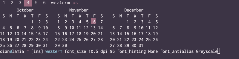
Configuring dpi = 96.0 in wezterm.lua and dropping font size to 10.5 to compensate (using the same px * 72 / dpi equation) shows no noticeable difference from dpi 81/font size 12.4. I've included a sample in the gif for completeness.
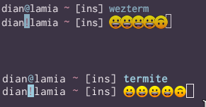
Emoji from the JoyPixels font also overlap each other and the cursor in wezterm, but not in termite (which doesn't have any special font configuration):
 dmfay
dmfay
All 15 comments
I agree that the emoji cell overlap at small font sizes is a bug, but that doesn't seem to be the meat of your issue.
Rendering parity with Cairo is a non-goal. What I'd like to focus on is whether the text is legible and exposing some of the underlying rasterization options to deal with individual subjectivity around whether it is pleasing to the eye. Some combinations of those options aren't different from each other and are honestly pretty difficult to distinguish in any case. A further factor is that the glyphs are also passed through the GL pipeline which can sample and interpolate; that may result in some of the hinting and AA affects being homogenized by the GL drivers.
I appreciate you taking the time to add a gif to show the contrast but it moves way too quickly for me to really see the differences (aside from the obviously gross one with all the options turned off!).
Would you mind making another pass over this issue to help me understand more about the problem?
 wez
on 8 Nov 2020
wez
on 8 Nov 2020
I see a similar difference, when comparing neovim-gtk with wezterm/neovim.
Font is JetBrains Mono 12
On the left neovim-gtk on the right wezterm/neovim:
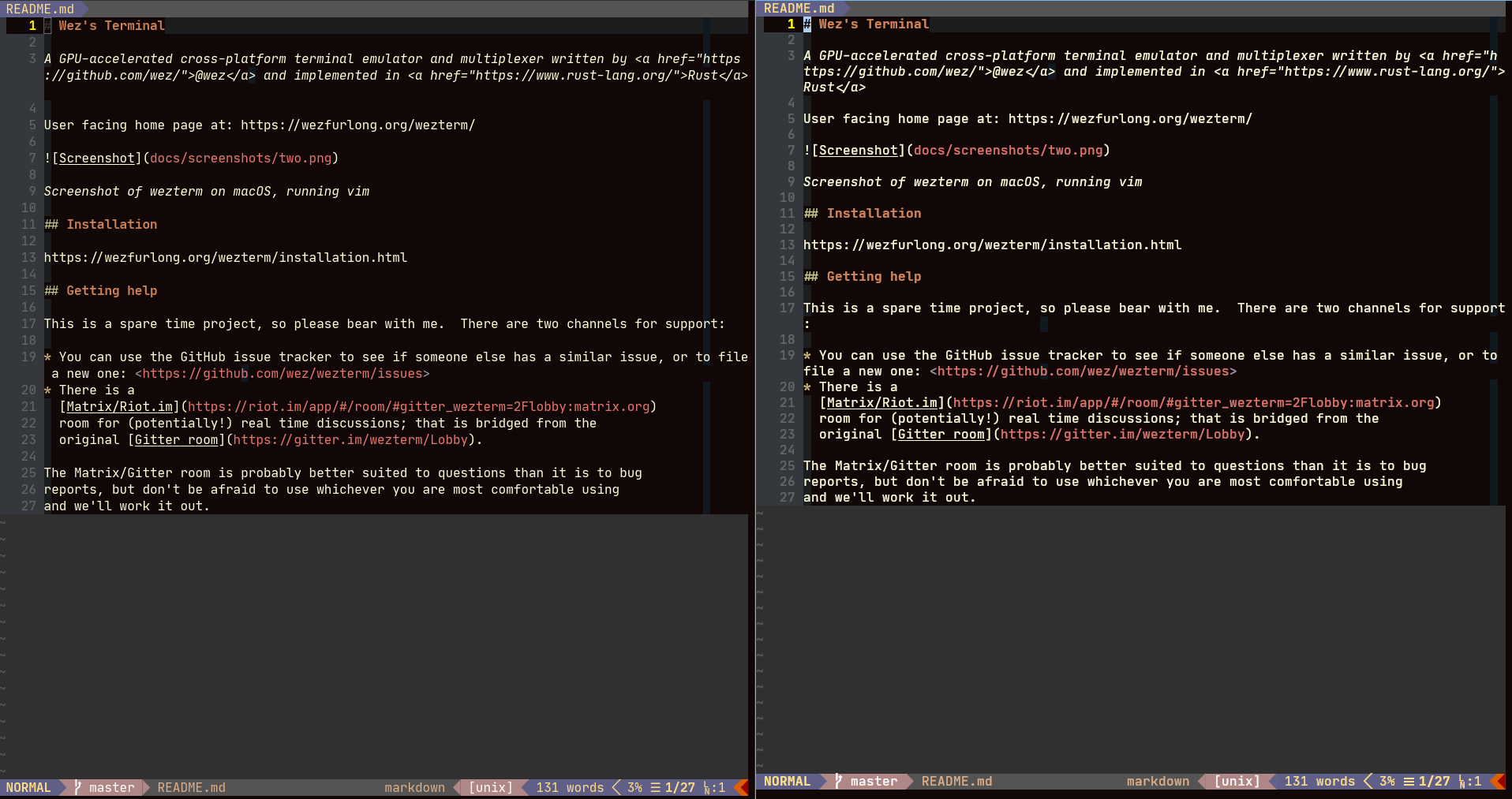
wezterm rendering is a bit more bold (see character width), which makes it a bit more unreadable.
 diefans
on 11 Nov 2020
diefans
on 11 Nov 2020
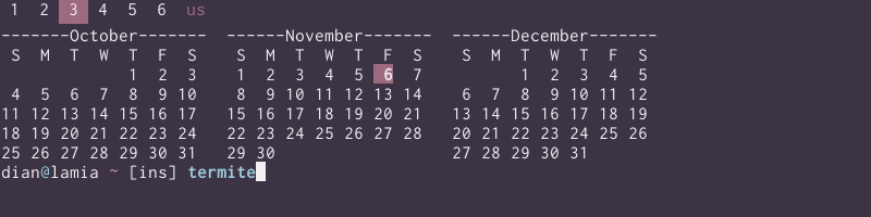
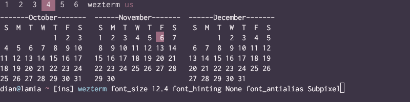
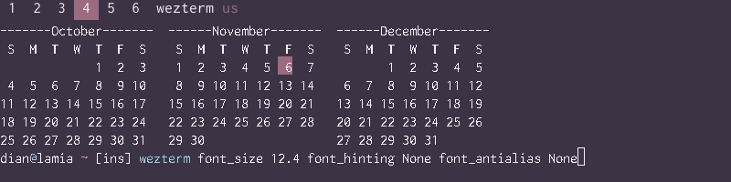
Fundamentally what I'm after is to have things that use the same font look like they're using the same font. I like wezterm's feature set a lot (modal copy _and_ sixel graphics, together at last!) but I spend a lot of time staring at text on a screen so the rendering inconsistency rankles. Obviously it isn't wrong per se, but other programs _are_ consistent: alacritty and kitty, for a couple other examples I've tried recently, add a little more vertical space between characters than termite, but the characters themselves look identical among each other, termite, polybar, and so on. It's wezterm that's the exception, with characters that are both bolder and horizontally compressed. I do think the latter applies similarly to text and emoji. Here's a blowup of the "N" in various Novembers from the calendar heading:
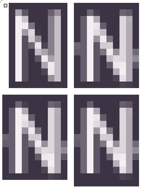
Top left is termite; upper right and lower left are wezterm with Greyscale antialiasing, and lower right is wezterm+Subpixel. Note how the termite character stands alone, while the wezterm characters include pixels on either side from the dash and the o adjacent. They don't overlap like the emoji, but those are wider. You can also see that the left stem of the N is two pixels wide in termite but three in the others (the lower right angle also has a "shadow" reaching a pixel below the bottom of the left stem not evident in termite's N), and the middle stroke is quite noticeably thicker and brighter. I do have to confess that I can detect a single pixel different between Greyscale and Subpixel at this resolution, on top of the left stem!
Here's a longer gif (3s between frames):
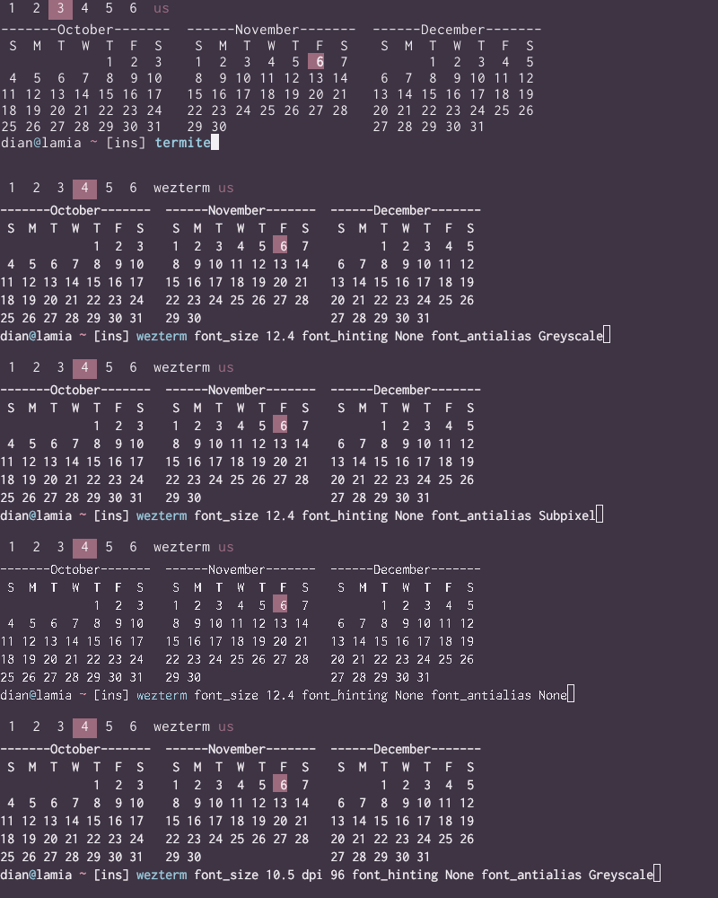
And the original frames separately, to inspect at your leisure:

dmfay
on 14 Nov 2020
Thanks for the extra detail! I've been looking over things this afternoon; I've fixed the emoji cell overflow issue, and made some adjustments to how rasterization works. It turned out that subpixel rasterization wasn't engaging properly, and that uncovered an issue with how glyphs are colorized. I've pushed these changes to master, and they should show up in a nightly build in about an hour or so.
I'm not 100% sold on the state in master, but I'm going to wait to hear you feedback before commenting on why, so that I don't influence your thinking.
wez
on 15 Nov 2020
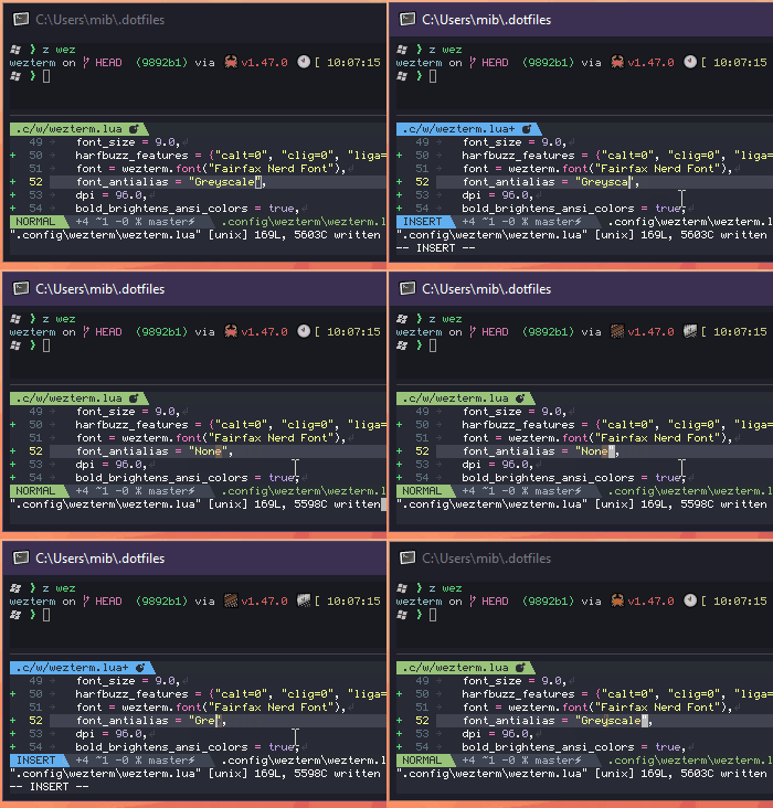
playing a bit with the latest master (9892b16d40e7db0906891b2ef96c192414bc0718), I realized, that setting `font_antialias="None" breaks the emojis. I am not sure if this is new, as I used the default AA settings until now, but the recent change made it unpleasant to my eyes, so I needed to set things up differently.
relevant config:
font_size = 9.0,
harfbuzz_features = {"calt=0", "clig=0", "liga=0"},
font = wezterm.font("Fairfax Nerd Font"),
font_antialias = "None",
dpi = 96.0,
bold_brightens_ansi_colors = true,
front_end = "OpenGL",
prefer_egl = true,
 mborejdo
on 15 Nov 2020
mborejdo
on 15 Nov 2020
setting `font_antialias="None" breaks the emojis.
Hmm, it doesn't reproduce on Linux; I'll try it out on Windows a bit later today.
wez
on 15 Nov 2020
The emoji overlap is fixed! Character rendering looks better too, although I don't think it's quite there yet.
what didn't work

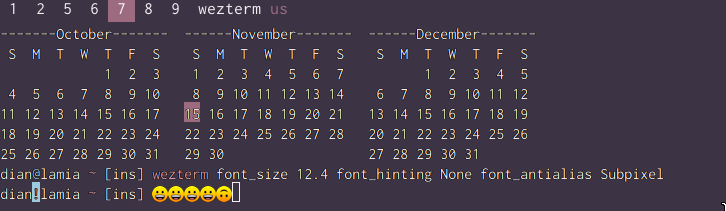
Checking pixel by pixel showed that these characters are definitely shorter than the 14px they're supposed to be from 14px * 72 / 81dpi. I bumped the size up to 13.2, which at least passes a quick check with a few characters.
fixed the size, with Greyscale
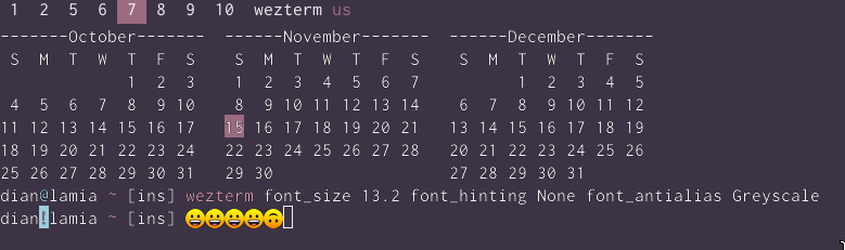
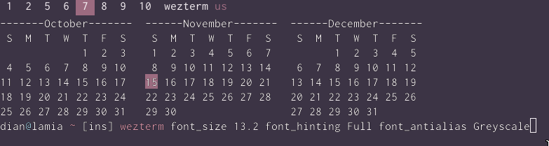
Greyscale antialiasing is looking better, although hinting doesn't seem to do anything. Characters are still noticeably darker/jaggier than they appear in polybar, and there's a border effect on light backgrounds (look at the current date in the calendar and the exclamation point against cyan in the prompt showing the emoji). Here's some zoomed-in numbers, polybar on top and wezterm below:

subpixel
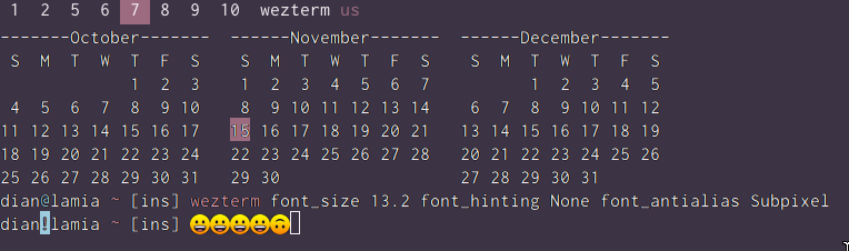

Subpixel's coloration was _really_ jarring at the smaller scale. It's much better here (full hinting doesn't appear any different even zoomed in), but still more obtrusive than Greyscale against brighter backgrounds. I know it's meant to mimic MS' ClearType; is that only meant to show up against black? That does look quite a bit better:
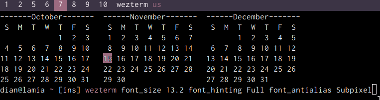
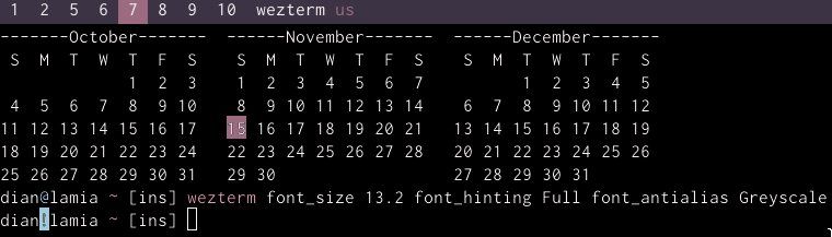
Greyscale on black, for comparison (also looks better! although arcs are visibly rougher comparing 2s, 0s, 9s, etc against Subpixel):
dmfay
on 15 Nov 2020
From my perspective wezterm is much more readable now than neovim-gtk - since I am not a font expert, but only a long term user, I cannot judge specifics, but the whole impact on my eyes is pleasant (clear and distinct) now:
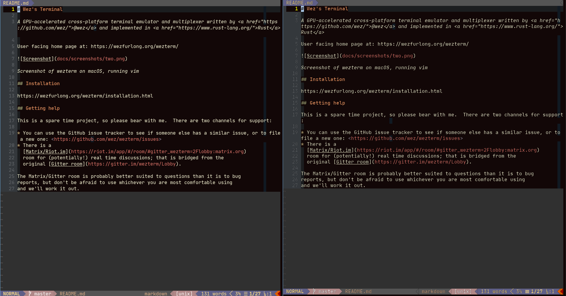
(wezterm is right)
diefans
on 15 Nov 2020
On my side, on Linux X11 I get a pretty bad rendering:
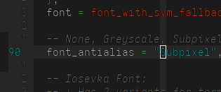
For comparison, here is the same text with urxvt:
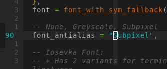
You can see that font_with_sym_fallback is not colored the same way everywhere, there are parts of the text brighter than the other.
The line numbering is unreadable
 bew
on 15 Nov 2020
bew
on 15 Nov 2020
Thanks folks; the dark edges were bothering me also. I've pushed a commit that seems to improve things to my eyes; hopefully this is it?
wez
on 16 Nov 2020
This looks like a winner!
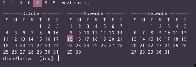
I'm using Greyscale here; Subpixel antialiasing also looks good but has a slightly yellow cast when redshift adjusts the screen color temperature, which is probably far enough out of the renderer's control not to matter.
I did notice that my bold ZSH_HIGHLIGHT_STYLES are rendering at normal weight instead, and another oddity popped up in nvim but I'll put that in a separate issue.
dmfay
on 16 Nov 2020
I did notice that my bold
ZSH_HIGHLIGHT_STYLESare rendering at normal weight instead,
Freetype requires a separate bold font variant in order to produce a bold weight; there's no automatic weight adjustment.
I'm not sure if you've got a better source for the font in your config, but all I found was this:
https://nodnod.net/posts/inconsolata-dz/
which has a single font with no bold variants.
The way that wezterm sets up the default config is to synthesize font_rules based on the primary font in your config, and I suspect that it isn't finding any actual bold, italic variants.
I manually configured font_rules to pick up those variants from the installed Inconsolata (rather than the dz variant) with this config:
  font = wezterm.font_with_fallback({"Inconsolata-dz", "JoyPixels"}),
  font_rules= {
    {
      italic = true,
      font = wezterm.font("Inconsolata", {italic=true}),
    },

    {
      italic = true,
      intensity = "Bold",
      font = wezterm.font("Inconsolata", {bold=true,italic=true}),
    },

    {
      intensity = "Bold",
      font = wezterm.font("Inconsolata", {bold=true}),
    },
  },
which does result in echo $(tput bold)hello rendering in bold text.
wez
on 16 Nov 2020
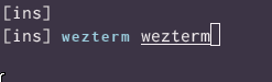
Thanks! This does look bold, although oddly small:
dmfay
on 17 Nov 2020
If you picked inconsolata-dz for the straight quotes then you might want to switch to InconsolataGo:
https://www.levien.com/type/myfonts/inconsolata.html
I also have an experimental version (tentatively titled InconsolataGo) with straight quotes in the inconsolata directory here.
https://www.levien.com/type/myfonts/inconsolata/
That has a bold variant available, so you should be able to get a more consistent experience with that.
wez
on 19 Nov 2020
I'm going to close this issue as the original aspect of it has been resolved; thanks for working through this with me!
wez
on 19 Nov 2020
Related issues
 hgkamath
·
7Comments
hgkamath
·
7Comments
 sanga
·
10Comments
sanga
·
10Comments
 katef
·
10Comments
katef
·
10Comments
 chris-morgan
·
8Comments
diefans
·
7Comments
chris-morgan
·
8Comments
diefans
·
7Comments