Web: As a new user, I want it to be explicit where I click to get started as a contributor or funder.
User Story
As a new user, I want it to be explicit on the homepage where I click to to get started as a contributor or funder.
Why Is this Needed
It should be made more clear where a new funder or new contributor "begins" their journey. This tidies up our FTUX into two available funnels (contributor or funder) that is easy to see on the homepage.
Current Behavior
- One method is to simply "Log In" and directly connect their Github account.
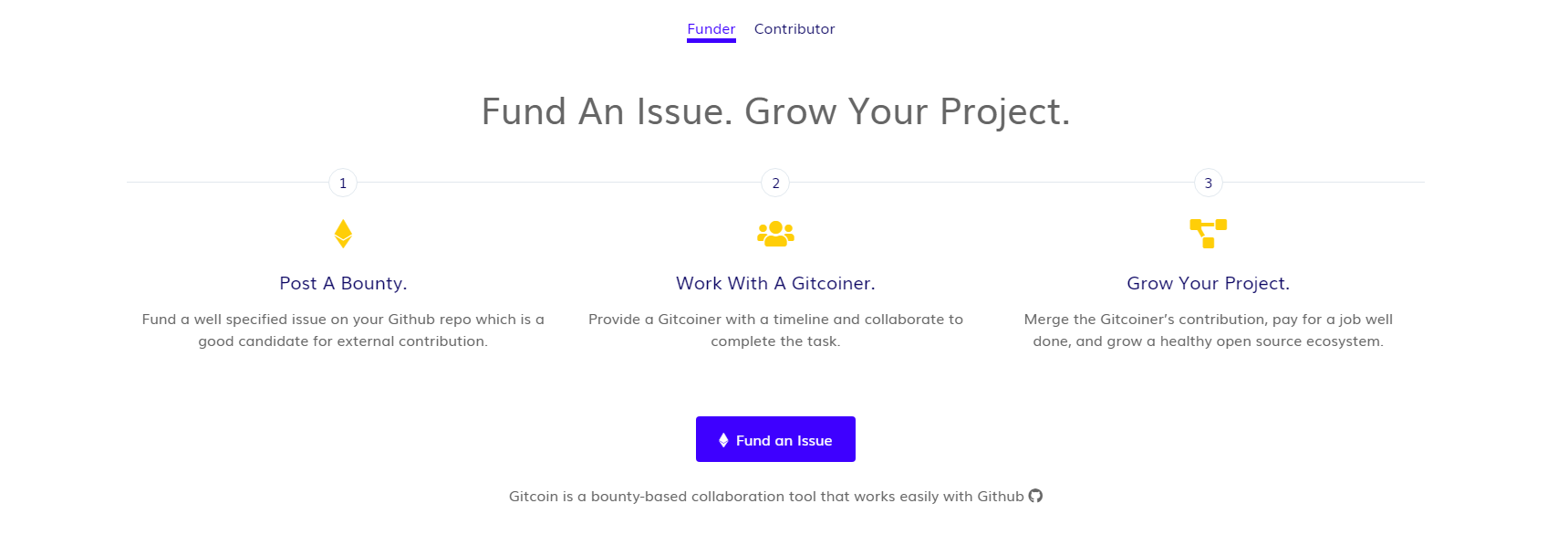
- For contributors, they can click on the "Get Started with Gitcoin" link.

- For funders, there is no CTA or link on the current homepage to the onboarding flow: https://github.com/gitcoinco/web/issues/2282
Solution
Both funder and contributor onboarding flows should have an explicit and obvious CTA on the homepage.
For mobile views, a carousel with the CTAs should be used in order to save on screen space. The carousel should have white "placement" dots at the bottom and also left or right arrow options for the user to switch from CTA to CTA (e.g like on www.rideapart.com). The switch rate should be around 5-7 seconds long.
Definition of Done
[ ] Design an intuitive CTA on the homepage that makes it clear where new contributors go to sign up and subsequently enter the onboarding flow.
[ ] for smaller screens and mobile, build the CTAs as viewed on larger screens into a rotating carousel so it doesn't suck up the mobile screen.
The contributor CTA should link to: https://gitcoin.co/onboard/contributor/
The funder counterpart to this ticket is here: https://github.com/gitcoinco/web/issues/2282
 frankchen07
All 42 comments
Issue Status: 1. Open 2. Started 3. Submitted 4. Done
__This issue now has a funding of 0.45 ETH (102.0 USD @ $226.67/ETH) attached to it__ as part of the Gitcoin fund__.__
- If you would like to work on this issue you can 'start work' on the Gitcoin Issue Details page.
- Want to chip in? Add your own contribution here.
- Questions? Checkout Gitcoin Help or the Gitcoin Slack
- $41,983.64 more funded OSS Work available on the Gitcoin Issue Explorer
 gitcoinbot
on 11 Oct 2018
gitcoinbot
on 11 Oct 2018
I'll be making some Sketch mockups first thing in the morning. I'm thinking of adding a CTA section to the landing page right above the existing iOS app CTA. That way, it's right at the end of the scroll section.
As always, let me know if you have any ideas, questions, or concerns and I'll try my best to reply immediately.
Thanks,
Anish
 Anish-Agnihotri
on 11 Oct 2018
Anish-Agnihotri
on 11 Oct 2018
hey @Anish-Agnihotri - thanks for picking up this issue!
I like the sound of path number 2 (it aligns with the way I was thinking about it). Looking forward to seeing some Sketch mockups and riffing off what you come up with!
cc @PixelantDesign
frankchen07
on 11 Oct 2018
@frankchen07 We have a task in the design phase here can we try to combine efforts? https://github.com/gitcoinco/Marketing/issues/7.
 PixelantDesign
on 12 Oct 2018
PixelantDesign
on 12 Oct 2018
@Anish-Agnihotri Hello from Gitcoin Core - are you still working on this issue? Please submit a WIP PR or comment back within the next 3 days or you will be removed from this ticket and it will be returned to an ‘Open’ status. Please let us know if you have questions!
- [x] warning (3 days)
- [ ] escalation to mods (6 days)
Funders only: Snooze warnings for 1 day | 3 days | 5 days | 10 days | 100 days
gitcoinbot
on 14 Oct 2018
@frankchen07
Seems like @PixelantDesign had something in mind with the main green landing CTA. Is this sort of something you were looking for?
If not, I'd be glad to whip up some sketch model of what I was thinking for the other CTA.
Anish-Agnihotri
on 15 Oct 2018
@Anish-Agnihotri - yep the Marketing ticket is an example of what I was thinking (it looks like it's for the contributor side), so mocking one up for the funder side sounds good! Have at it! Looking forward to seeing what you come up with.
frankchen07
on 16 Oct 2018
For sure! I'll mock up something for the funder side within the next 24 hours and post an update.
I'm just wondering though, how would we determine whether to show the user the funder or contributor CTA (since we cannot assume either/or). Would it still just make sense to have a seperate CTA for both altogther at the end of the page?
Anish-Agnihotri
on 17 Oct 2018
@Anish-Agnihotri - sounds great!
I think it makes sense to have a separate CTA for both the funder or contributor funnels on the page (similar to the bright green mockup for the contributor, but another one for the funder). I'd also add the CTA would be best at the top of the page, easily reachable to anyone who is coming to the gitcoin.co site. You make a good point that we don't know who is a funder or contributor, so it's up to the user to land themselves in the right funnel. After they sign up though (sync through Github), they basically have access to contributing and funding.
frankchen07
on 17 Oct 2018
Sure!
To expand on a few ideas (sorry if I'm pushing it with these, just want to decide on the best route before I get to work):
- One possibility continuing on the bright green mockup CTA would be to have it as a slider instead of the single item it currently is. This way, it could feature both the funder and contributor funnels at the same time (and rotate after ever few seconds). I'll CC @PixelantDesign on this for some input as well, as I don't really know Gitcoin design guidelines as well, and this may not follow those.
- In the same manner, we already seem to have a slider a bit further along the page for both funders and contributors. Maybe, a possibility would be to add a button to this:
- Another option I was thinking of was something along the lines of this:
I could certainly make some robot graphics that relate with funding and contributing to Gitcoin and we could integrate those in (or use pre-existing graphics). Something like this could be a possibility as a CTA.
Let me know if that is somewhat similar to what you were thinking of, and I'll be glad to make a few more mocks.
Anish
Anish-Agnihotri
on 18 Oct 2018
@Anish-Agnihotri - no problem about expanding on the ideas. I love the thoroughness. 😀
Although option 2 would be interesting, I would want the CTA to be immediately visible when landing on the gitcoin.co main page. To me, there are too many steps to have to scroll down and then figure out the funder/contributor slider. Although the slider has a bells and whistles component to it (like option 1), I think we'd like to keep it simple and straightforward, especially for newcomers.
Therefore, that leaves us with option 3, which is what I had in mind, but mashed together with the green bar coloring/style design on https://github.com/gitcoinco/Marketing/issues/7, if that makes sense.
Some quick comments:
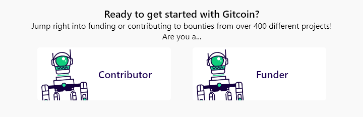
I believe there are different robots for contributors and funders (contributor robot is just a head, where as I believe funder has the body + head).
I prefer the green styling on https://github.com/gitcoinco/Marketing/issues/7.
It's up to your design expertise on how you want to stack the CTAs vertically or have the CTAs side by side, etc (mashing together https://github.com/gitcoinco/Marketing/issues/7 and your option 3).
Depending on the final mockup, the copy "Jump right into...etc" could change based on how it looks.
cc @PixelantDesign for any additional comments. Feel free to chime in if you need more specific guidance or help!
frankchen07
on 19 Oct 2018
Hey, apologies for the delay in response. Was down with a fever and am just getting caught up.
Thanks for your comments, seems like Option 3 mashed up with the styles from Marketing#7 seems to be the way to go. I'll get a mock of this out within the next few hours and we can go through some iterations.
Once that's complete, I'll begin working on the landing page and pushing out the wip PR.
As for location, did you have some place in mind as to where you'd want to put the CTA (aka where on the page, before or after which CTA). If so, please do let me know and I'll incorporate surrounding elements into my design to ensure there is consistency across the landing page (since this is the first page a user lands on, so it has to be very concise and in sync aesthetically).
Anish-Agnihotri
on 21 Oct 2018
No worries about the delay. Thanks for the heads up.
Thanks for being super open with your communication. Looking forward to seeing the mock!
As for the location, right around where the current green banner makes sense. I'm not well versed in design, but there are some tradeoffs to stacked or side-by-side CTAs. Stacked might make the green banner a bit bigger (vertically longer, unless we split it vertically) and a bit easier to read. Side by side CTAs allow the green banner to remain at it's original thickness, but it could look a little "repeaty" depending on what the CTAs look like. Also, ease of understanding and what a user would find easy to read and consume (stacked, I think?) is a consideration. Would be open to see or hear some ideas here. cc @PixelantDesign and cc @willsputra
Elements above and below the CTAs:
above:
below:
frankchen07
on 22 Oct 2018
You had exactly the same thought as I did when thinking about the stacked/horizontal CTA's. Since this is a landing page issue, and is probably going to be a focal point of the website, input from @PixelantDesign and @willsputra would certainly be appreciated. I messaged Alisa through Slack as well, and I'll take some design inspiration from there and output the design options.
Looking for an eta of completion for issue of 48-72h assuming we get a response within that time-frame. None the less, I'll get started with the designs, and take feedback from the both of them as I go.
Anish-Agnihotri
on 22 Oct 2018
@Anish-Agnihotri @frankchen07 Loving the thoughtful discussion ❤️
My thoughts:
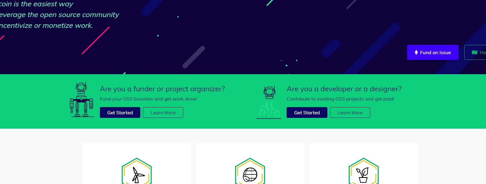
CMIIW, but I guess we're trying to put 4 different CTAs into the landing page here:
- direct New Contributors to
/onboard/contributor(_Get Started with Gitcoin_) - direct New Funders to
/onboard/funder(_no button yet_) - direct Existing Contributors to
/explorer(_View Available Bounties_) - direct Existing Funders to
/funding/new(_Fund an Issue_)
which begs the question: do we need to display all 4 CTAs on the landing page?
I personally think having 4 CTAs could be confusing, and I'd be happy to explore possible alternatives.
For example, if the landing page is optimised for only New Contributors and New Funders, the solution could be as simple as:
- making the green Contributor CTA more obvious (https://github.com/gitcoinco/Marketing/issues/7)
- changing the url of _Fund an Issue_ buttons to
/onboard/funderinstead of/funding/new.
That being said, it would be interesting to see what Existing Contributors typically do to fund an issue: do they click the Fund an Issue button on the landing page? do they click the one on the nav bar? do they go to/funding/newdirectly?
 willsputra
on 23 Oct 2018
willsputra
on 23 Oct 2018
Just putting it out there from what I've interacted with the new folks over at the community slack channel -> they say the https://gitcoin.co/how/contributor has always been super helpful
Its right there on the nav but often fails to grabs folks attention.
 thelostone-mc
on 23 Oct 2018
thelostone-mc
on 23 Oct 2018
@willsputra
Appreciate the feedback! That sounds along the lines of what I was thinking of regarding number of CTA's on landing page. Essentially, what could be done to combine both your thoughts and @frankchen07's thoughts could be something along the lines of:
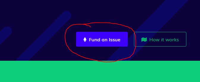
- Changing the URL of the _Fund an Issue_ button on the homepage. This seems like a great idea right off the bat. I feel as if most return-funders already use the _Fund Issue_ button in the header anyways, so it would make sense that new funders are the ones immediately directed to the onboarding from the landing page.
Button in reference:
- In addition to this, I think keeping it simple by only worrying about new contributors (
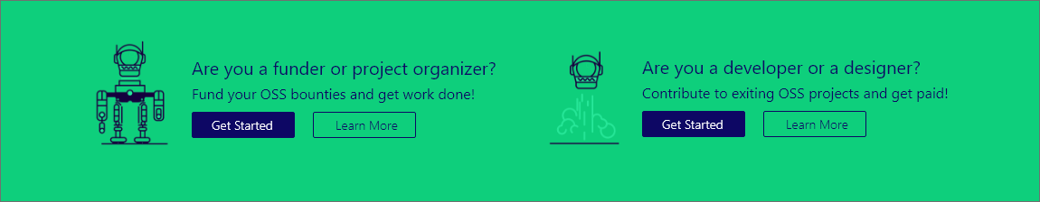
/onboard/contributor) and new funders (/onboard/funders) for the landing page is best. I feel as if existing users infrequently use the landing page, if ever. In that case, there do seem to be a few options that could be done. Here is one example with horizontal CTA's but buttons stacked underneath. I had this idea, or fully horizontal CTA's. Let me know what you have in mind as well. Thanks to feedback from @thelostone-mc 😄 as well, I've included a _Learn more _ button for both options that links to the respectivehow/contributorandhow/funderpages.
 (ofc without the additional padding that for some reason seems to have been exported, and with different icons, etc.)
That seems to be the general direction I was focusing in. As always, please do let me know what you have in mind on this, and I'd love to bounce a few ideas around before we settle on something! Look forward to getting this on the road!
Anish-Agnihotri
on 24 Oct 2018
@Anish-Agnihotri
I agree with the idea! Although I'd like to see the data before we implement this. It'd be annoying if it turns out that return-funders are using this button, and they see the onboarding flow everytime they want to fund an issue 😂 @frankchen07 @PixelantDesign thoughts?
Say, if we change this button below to
/onboard/fundertoo, and we add a Learn More button, maybe we don't need the dual two-column background CTA? Since they're basically serving the same purpose.
willsputra
on 24 Oct 2018
@willsputra
For sure :). It would certainly make most sense to do some analysis on whether or not return-funders are using the button, before making a drastic, potentially frustrating change to their flow.
As for your second idea, that sounds like a great idea as well. That would resolve the purpose of a two-column CTA altogether. I think we had thrown that idea around earlier though, so I'll cc @frankchen07 for thoughts as well.
Anish-Agnihotri
on 25 Oct 2018
Great discussion!
I guess we're trying to put 4 different CTAs into the landing page here
I would say that the CTAs we're focused on are just the contributor and funder onboarding CTAs (2 CTAs).
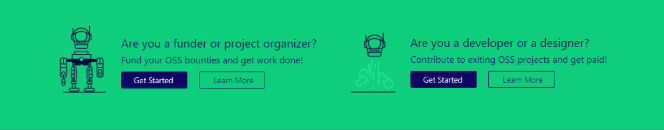
I love the design via @thelostone-mc's community feedback, @willsputra, @PixelantDesign and @Anish-Agnihotri's input. Love how the "get started" buttons leads to the onboarding, and the "learn more" leads to the explanation pages. Covers all our bases.
changing the Fund an Issue URL to
/onboard/funderinstead of/funding/new
I'd vote against doing this just because existing funders would have to go through our onboarding flow and therefore, would pollute our collected data on how the onboarding CTAs are working. If a new funder does not go through the onboarding flow and clicks the fund an issue button, they will be led to the funding page, but they won't be able to fund unless they sign in (below), which at this point, would give them the option to connect their Github account when clicking "Login". This provides a way for new funders who didn't land in the onboarding flow to still sign up, without polluting an existing user's experience.
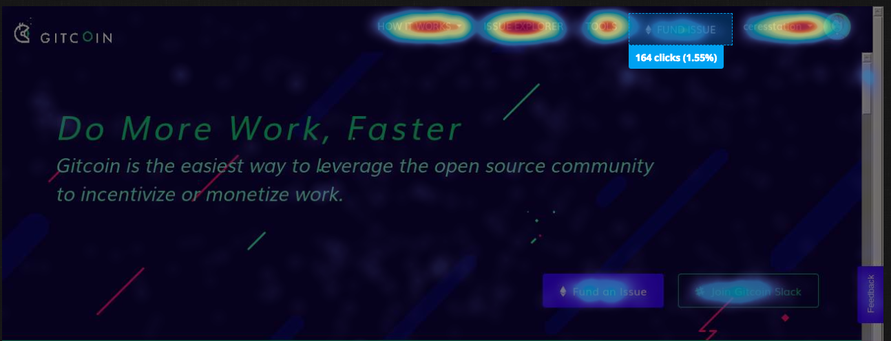
I'd almost say that the "Fund an Issue" button is repetitive, and we should just have the "Fund Issue" in the nav bar above as the one location existing users can go up to. The heatmap sample of our visitors on the homepage shows that the Fund Issue (166 clicks) vs Fund an Issue button (175 clicks) are used at approximately the same rate.
frankchen07
on 25 Oct 2018
I agree with @willsputra.
My thinking is that it’s unlikely that if a funder has funded an issue before they will use one of the lower fund issue buttons on the lamding page. All of those areas are targeted towards new funders.
@frankchen07
If existing funders have previously connected, they don’t go through the ftux again. They’d be taken to funder form.
I also wouldn’t keep a confusing experience just because we’ve already collected data on it. We ciuld do some qual testing on this @frankchen07 to understand user expectations.
We do know that the 2 fund issue buttons are repetitive up top, that was an implementation thing if I remember correctly @thelostone-mc, we ran out of time to fix.
PixelantDesign
on 27 Oct 2018
@PixelantDesign
Specifically for the Fund Issue buttons, in the case that they are repetitive, we could change it so that when a user is authenticated the Fund an Issue button is hidden. This way, the Fund Issue button in the header would be the way to go.
@frankchen07
Thanks for the great feedback! Leads me to believe that we're against the idea of changing the URL of Fund an Issue due to the onboarding and funding flows, but we're on the same page with the 2 CTA's.
If that pretty much covers the general idea of the issue, I'd be glad to make a cleaner HTML mockup of the 2 CTA's in a few different designs today and make a WIP PR containing a few of the files. That way, instead of just looking at designs, you'd be able to see the integration and see which one works best for you.
Anish-Agnihotri
on 27 Oct 2018
@Anish-Agnihotri Hello from Gitcoin Core - are you still working on this issue? Please submit a WIP PR or comment back within the next 3 days or you will be removed from this ticket and it will be returned to an ‘Open’ status. Please let us know if you have questions!
- [x] warning (3 days)
- [ ] escalation to mods (6 days)
Funders only: Snooze warnings for 1 day | 3 days | 5 days | 10 days | 100 days
gitcoinbot
on 1 Nov 2018
@gitcoinbot
Sorry gitcoinbot. Yes I am still working on this task. Just waiting for some feedback but we're all busy and running around. Let's hope we can finish this within the next few - right bot?
🥂 Cya next time bot!
Anish-Agnihotri
on 1 Nov 2018
@frankchen07 @PixelantDesign
Hey guys!
Just wondering if the above comment regarding revised CTA's is good to go, so that I can begin working on this PR. As always, do let me know if you have any comments, questions, concerns/feedback, etc!
Thanks,
Anish
Anish-Agnihotri
on 8 Nov 2018
@anish-agnihotri Hello from Gitcoin Core - are you still working on this issue? Please submit a WIP PR or comment back within the next 3 days or you will be removed from this ticket and it will be returned to an ‘Open’ status. Please let us know if you have questions!
- [x] reminder (3 days)
- [ ] escalation to mods (6 days)
Funders only: Snooze warnings for 1 day | 3 days | 5 days | 10 days | 100 days
gitcoinbot
on 13 Nov 2018
@Anish-Agnihotri
I'd say the 2 CTAs are higher priority right now, which I believe we're all on the same page with.
With regards to the lower fund issue button, and to some degree, the how it works button as well, I may open a separate ticket to remove the lower fund an issue button and how it works button (also repetitive). This cleans up the right hand side and redirects the attention tothe nav bar and the CTAs when you land on the page.
The idea end state to me is:
- having the CTAs for first time users
- configuring the nav bar so that first time users who don't click the CTAs but instead go directly to funding on the nav bar still get dropped into the FTUX
- configuring the nav bar so that returning users just go to the funder form.
^ I believe 3 is already the case, but 2 may not be - either way, the scope of the ticket is only number 1. :)
frankchen07
on 14 Nov 2018
@anish-agnihotri Hello from Gitcoin Core - are you still working on this issue? Please submit a WIP PR or comment back within the next 3 days or you will be removed from this ticket and it will be returned to an ‘Open’ status. Please let us know if you have questions!
- [x] reminder (3 days)
- [ ] escalation to mods (6 days)
Funders only: Snooze warnings for 1 day | 3 days | 5 days | 10 days | 100 days
gitcoinbot
on 16 Nov 2018
@anish-agnihotri Hello from Gitcoin Core - are you still working on this issue? Please submit a WIP PR or comment back within the next 3 days or you will be removed from this ticket and it will be returned to an ‘Open’ status. Please let us know if you have questions!
- [x] reminder (3 days)
- [ ] escalation to mods (6 days)
Funders only: Snooze warnings for 1 day | 3 days | 5 days | 10 days | 100 days
gitcoinbot
on 19 Nov 2018
Perfect, that sounds good to me. Apologies for the delay since I was away from computer this past weekend. Just putting together a WIP PR that adds the new CTA's. At the moment, it simply restructures to two vertical CTA's on smaller displays, although I feel a horizontal slider would be a better idea for this.
Here is a peek of what it looks like right now:
Looking to have it done within the next 24hrs.
Let me know your thoughts on this and I'll make appropriate revisions. Till then, I'll continue working on making this 100% responsive and fixing all issues.
Thanks,
Anish
CC @frankchen07 @PixelantDesign @willsputra.
Anish-Agnihotri
on 21 Nov 2018
I do like the design above ❤️
Can you elaborate what the horizontal slider looks like / means?
frankchen07
on 22 Nov 2018
@anish-agnihotri Hello from Gitcoin Core - are you still working on this issue? Please submit a WIP PR or comment back within the next 3 days or you will be removed from this ticket and it will be returned to an ‘Open’ status. Please let us know if you have questions!
- [x] reminder (3 days)
- [ ] escalation to mods (6 days)
Funders only: Snooze warnings for 1 day | 3 days | 5 days | 10 days | 100 days
gitcoinbot
on 22 Nov 2018
Hey!
Just pushed out a PR for this issue and #2282. This new PR includes the carousel/slider for the CTA.
Here is a video of it in action: https://streamable.com/dt9l7
The responsiveness is now 100% working across all resolutions, and everything works perfectly. There is a glitch when resizing though at the moment, where sometimes (on smaller resolutions only) both the CTA's are shown at once, until you press the next button (after which it goes to how it should be). You can see this error near 0:42 in the video.
Usually, when making a slider/carousel, it's easiest to simply import a library meant for this sort of thing. Unfortunately, I don't think importing an external library onto the platform would be allowed/recommended since it would increase external script load overheads. Instead, I've custom JQuery'd the slider in landing_page.js which is why I'm still knocking out some issues. I'll also be adding fadeIn/fadeOut animations on the CTA's on button-click soon.
I'll be fixing these within the next 24hrs as I do some more troubleshooting. Other than that, everything else should be good to. Just wondering if you still want me to put the little dots at the bottom of the CTA's (alongside the buttons)? I personally thought it doesn't make sense with only 2 items, but then again, I'm horrendous at UI/UX, haha.
Thanks,
Anish
Anish-Agnihotri
on 27 Nov 2018
Thanks @Anish-Agnihotri! Wow, it looks great!
It doesn't seem the dots are necessary (since we really only have two screens), it looks really good, and I like how you've added the nice touch of the CTAs being side by side and then coalescing as we make the screen smaller.
Once the screen is small enough for the carousel, does the CTA rotate automatically at a set time period (couple seconds)? I'm not sure I saw that in the video.
frankchen07
on 28 Nov 2018
I’m glad you like it!
And I had actually completely forgotten about carousel rotation on smaller displays. TYVM for reminding me, I’ll be pushing it out in the final PR tomorrow.
Thanks,
Anish
Anish-Agnihotri
on 29 Nov 2018
looking good!
PixelantDesign
on 29 Nov 2018
Good Afternoon!
Just finished this up. Fixed the glitch that was occurring, added an 8 second auto-rotate on smaller display sizes, and added a 2s intro animation so that the auto-rotate doesn't look choppy.
Here is a video if it in action across the resolutions: https://streamable.com/3ks86
Let me know if you've got any other suggestions, concerns, ideas, and I'd be glad to incorporate those. Moving the PR out of WIP now :).
Thank,
Anish
Anish-Agnihotri
on 1 Dec 2018
@Anish-Agnihotri looking good! just curious, would people be able to swipe left/right on mobile? if not, we might want to make the arrows a tad bigger so they're easier to touch :)
@PixelantDesign what do you think?
willsputra
on 3 Dec 2018
@willsputra
That makes sense for sure.
Ideally, we should just use a premade library for these carousel functions, since they would integrate all of this automatically, but I don’t know what Gitcoins policy on adding scripts and dependencies is.
For the time being, I’ll add in touch swipe functionality on the elements for mobile devices directly into my carousel script.
Let me know if you’ve got any other suggestions and I’d be glad to add them in :).
Thanks,
Anish
Anish-Agnihotri
on 3 Dec 2018
awesome thanks @Anish-Agnihotri !
willsputra
on 3 Dec 2018
Issue Status: 1. Open 2. Cancelled
__The funding of 0.45 ETH (63.41 USD @ $140.92/ETH) attached to this issue has been cancelled by the bounty submitter__
- Questions? Checkout Gitcoin Help or the Gitcoin Slack
- $52,311.99 more funded OSS Work available on the Gitcoin Issue Explorer
gitcoinbot
on 29 Mar 2019
⚡️ A tip worth 0.71000 ETH (100.05 USD @ $140.92/ETH) has been granted to @anish-agnihotri for this issue from @frankchen07. ⚡️
Nice work @anish-agnihotri! Your tip has automatically been deposited in the ETH address we have on file.
- $52311.99 in Funded OSS Work Available at: https://gitcoin.co/explorer
- Incentivize contributions to your repo: Send a Tip or Fund a PR
- No Email? Get help on the Gitcoin Slack
gitcoinbot
on 29 Mar 2019
Related issues
 uluhonolulu
·
3Comments
uluhonolulu
·
3Comments
 christianbundy
·
3Comments
christianbundy
·
3Comments
 kziemianek
·
3Comments
kziemianek
·
3Comments
 Makondor2
·
3Comments
Makondor2
·
3Comments
 abitrolly
·
4Comments
abitrolly
·
4Comments