Web: make gitcoinbot status indicator into an image
 owocki
All 9 comments
@owocki Where will this graphic live?
 PixelantDesign
on 24 Apr 2018
PixelantDesign
on 24 Apr 2018
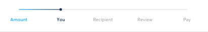
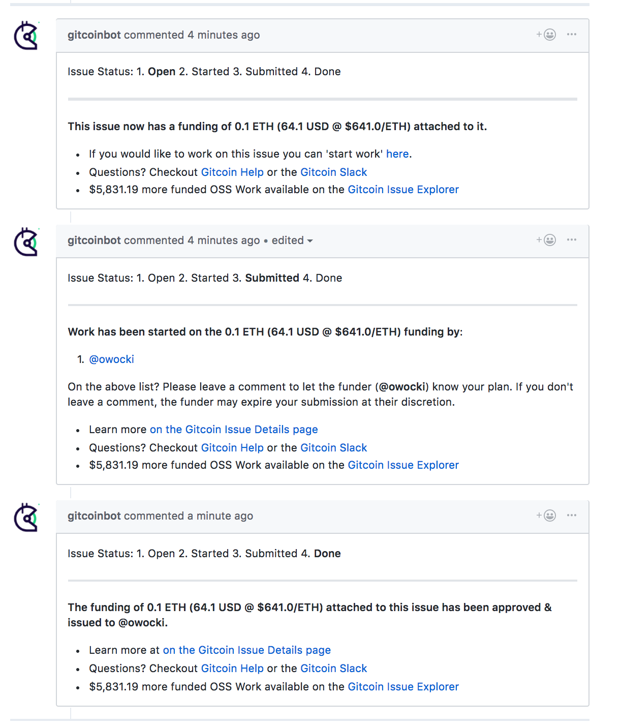
at the top of gitcoinbot comments (like in the above screenshot)
owocki
on 24 Apr 2018
It's a little confusing that we're introducing another set of terms/flows into the mix. Specifically "You" and "Recipient" seem unclear (looking at it from a funder's standpoint).

This doesn't match 100% either but follows the paradigm we've set up in the system.
Issue Funded > Open: Work Available > Started: Work Begun > Submitted: Work In Review, Done: Funds Paid
PixelantDesign
on 24 Apr 2018
The terms used are confusing. I agree with @PixelantDesign on that
Also the graphics would be a lot cleaner if it did not have the color transition. It should be either green/ blue / solid color when completed and the rest should be grey / dull solid color
 thelostone-mc
on 24 Apr 2018
thelostone-mc
on 24 Apr 2018
i dont see where the terms 'you' and 'recipient' are being introduced? on second glance, maybe its from the image at the top of the issue desc? the first image in the issue desc was just meant to show the design (and compactness) of such an image, was not meant to be taken as new copy for our explorer. sorry for not making that clear in the original ticket.
Issue Funded > Open: Work Available > Started: Work Begun > Submitted: Work In Review, Done: Funds Paid
i can update the text in the latest PR to match this if you'd like
owocki
on 24 Apr 2018
@owocki Yes, the top image is what was confusing to me. Sounds good.
What happens in the cases where a person drops off, another person joins, or the issue is cancelled?
PixelantDesign
on 24 Apr 2018
What happens in the cases where a person drops off, another person joins, or the issue is cancelled?
i was thikning that the boldness would just switch back and forth from "Started" and "Open. I dont see a need to overly complicate the UX by doing something like
Open Started Open Started Open Started Open Started Open Started Submitted Done
Do you?
owocki
on 24 Apr 2018
Sorry, probably my bad with the image confusion. That was actually a screenshot from the Transferwise payment flow, intended to be used as an example of how a visualization of the state of the workflow could be more helpful than simply copy and formatting.
 collinvine
on 25 Apr 2018
collinvine
on 25 Apr 2018
@owocki I agree sinple is best.
PixelantDesign
on 25 Apr 2018
Related issues
 abitrolly
·
4Comments
abitrolly
·
4Comments
 mbeacom
·
4Comments
mbeacom
·
4Comments
 christianbundy
·
3Comments
christianbundy
·
3Comments
 kuhnchris
·
4Comments
kuhnchris
·
4Comments
 jasonrhaas
·
4Comments
jasonrhaas
·
4Comments
Most helpful comment
i dont see where the terms 'you' and 'recipient' are being introduced? on second glance, maybe its from the image at the top of the issue desc? the first image in the issue desc was just meant to show the design (and compactness) of such an image, was not meant to be taken as new copy for our explorer. sorry for not making that clear in the original ticket.
i can update the text in the latest PR to match this if you'd like
https://github.com/gitcoinco/web/pull/948