Web: Design a testimonials module on the landing page
requirements
- assume 3-4 testimonials, each with a quote, name, image
- assume 1-2 sentence testimonial
- design needs to work for both desktop and tablet.
some sample testimonials:
- we've had 2 bounties fulfilled and we're hooked
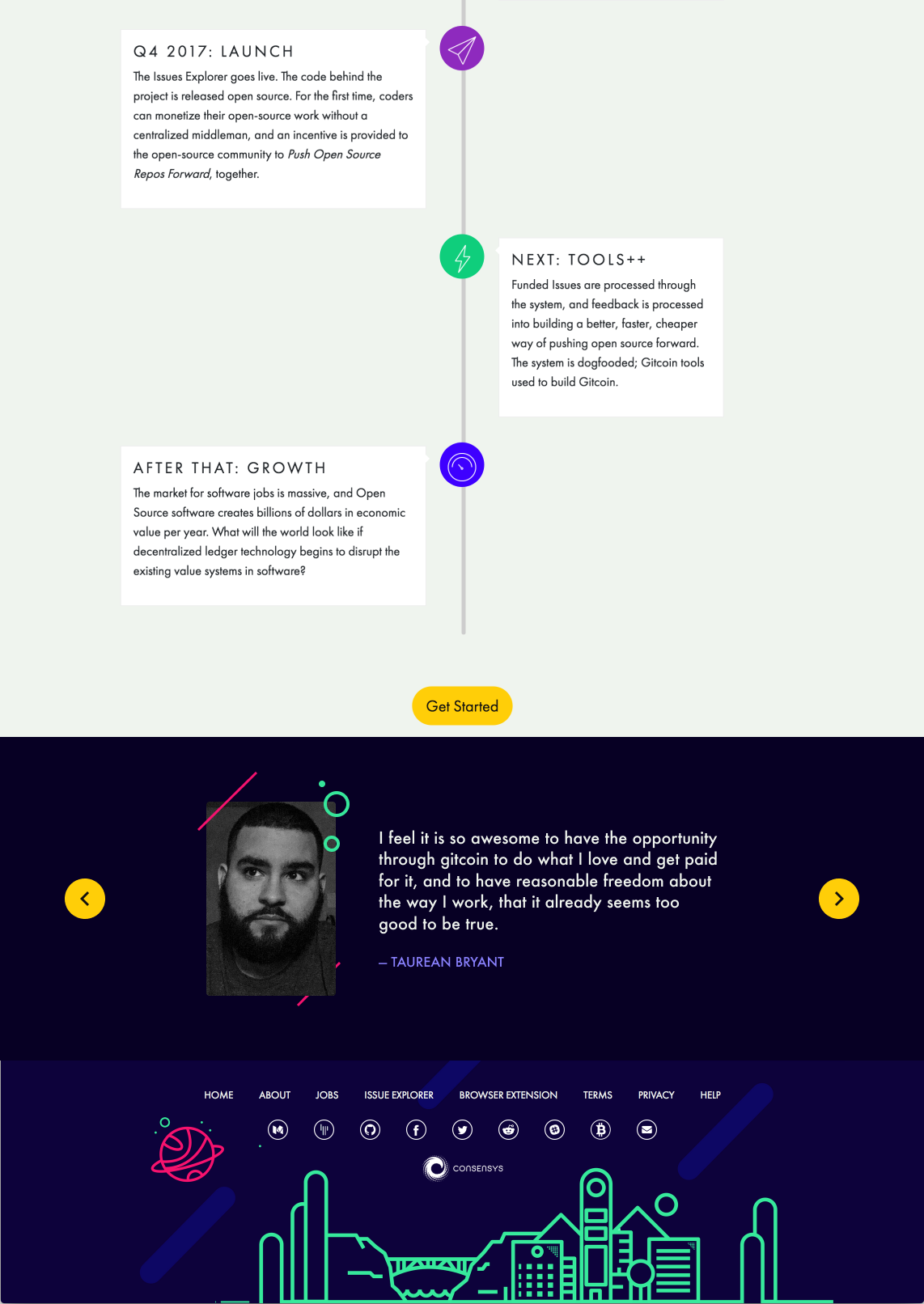
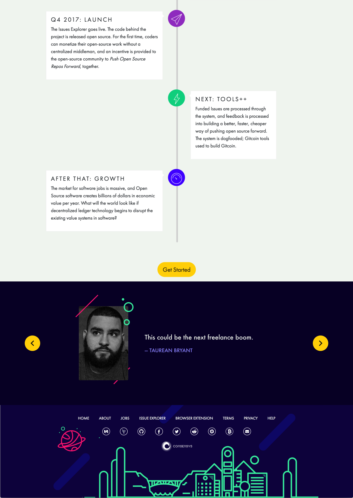
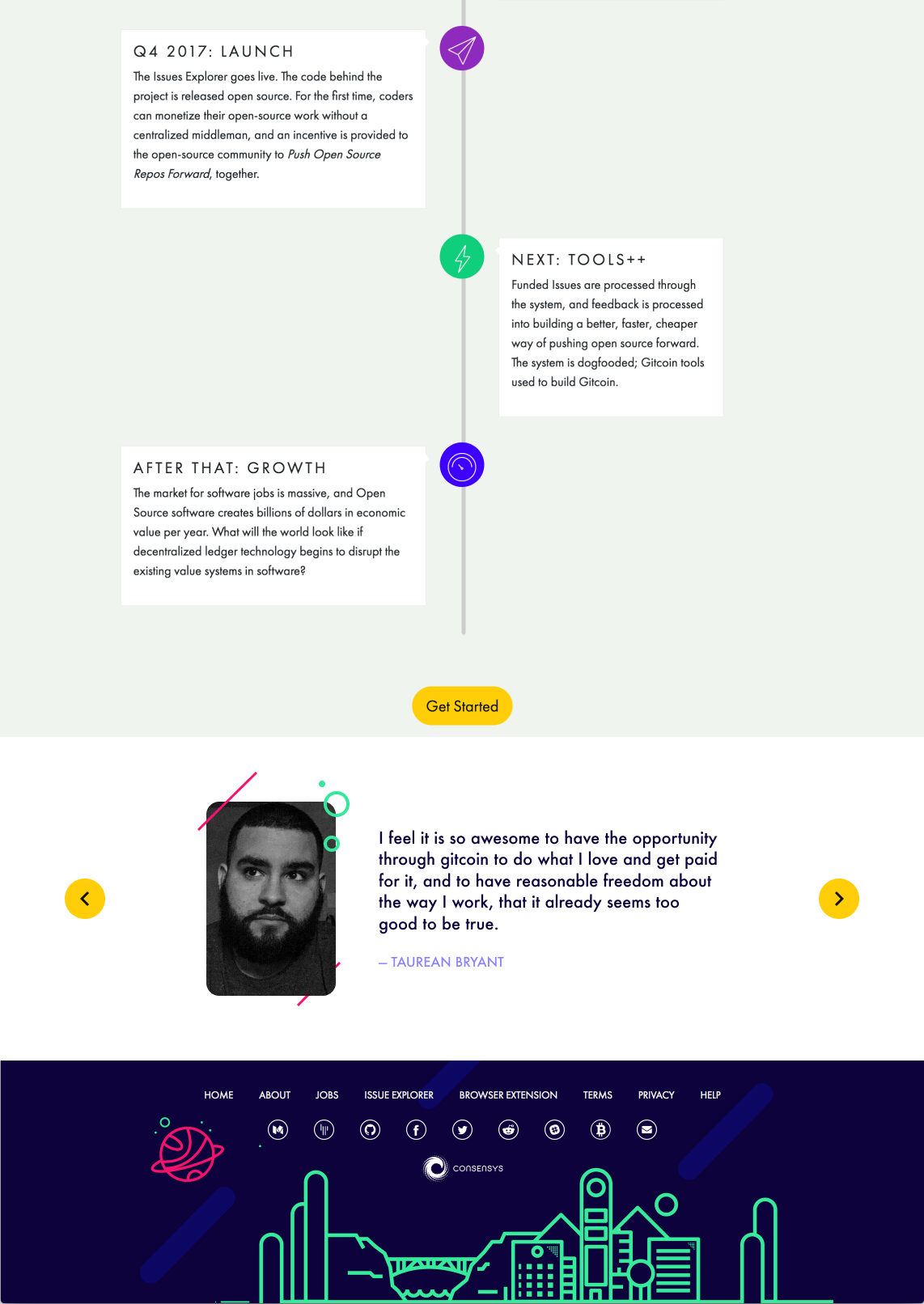
- I feel it is so awesome to have the opportunity through Gitcoin to do what I love and get paid for it, and to have reasonable freedom about the way I work, that it already seems too good to be true.
- This could be the next freelance boom.
- Staying lean, building the community, iterating... The way to go vs many projects that are just looking for the money grab immediately.
payout:
- ill pay the bounty listed for a design
- ill pay an extra 0.1 ETH if the design is coded into the repo.
 owocki
All 17 comments
__This issue now has a funding of 0.15 ETH (72.53 USDT) attached to it.__
 gitcoinbot
on 27 Nov 2017
gitcoinbot
on 27 Nov 2017
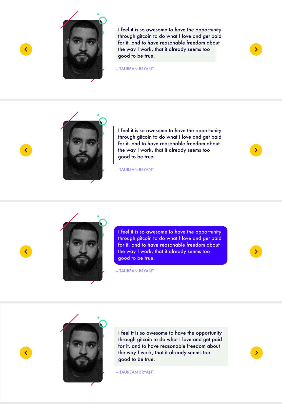
Attached two examples, one with a long quote and the other with a short quote. I can provide states for the toggles as well. May need to discuss how to animate the transitions properly.
 taurean
on 28 Nov 2017
taurean
on 28 Nov 2017
thanks @taurean -- this looks good!
a few questions / comments:
- is there a way we can put a lighter color behind the quote itself?
- what is the aspect ratio of image you posted? might be good to standardize on a square image.
- do you think these testimonials should auto-scroll? at what interval? should we put more than one testimonial on the page at one time?
- is it worth having a heading that describes the module as 'testimonials'?
owocki
on 29 Nov 2017
• Yeah, thats no problem
• the image is 160x240. We can certainly make it a standardized ratio but Ideally I would want to keep it in a portrait orientation rather than a square or circle (although I don't feel particularly strong about this)
• thats a fair point and I imagine we should. Maybe 3-5sec? I would prioritize one testimonial at a time, especially if they are transitioning from one to the other.
• We can add a heading but I'm not sure its necessary. I think people are familiar enough with testimonials on marketing pages and will recognize what it is faster than they could read a heading.
taurean
on 29 Nov 2017
@owocki Attached a preview with a white background instead. Looks like the images were already a 3:4 ratio so that worked out nicely. I also rounded the corners more for the photo, aligns a bit better with the illustrations I think.
taurean
on 29 Nov 2017
sorry i think we miscommunicated on this opint
by
is there a way we can put a lighter color behind the quote itself?
i just meant slightly lighter color, and just behind the quote itself (not the entire module). i like the dark color behind the entire module.
• the image is 160x240. We can certainly make it a standardized ratio but Ideally I would want to keep it in a portrait orientation rather than a square or circle (although I don't feel particularly strong about this)
on second thought, i agree with this. portraits are ++
owocki
on 29 Nov 2017
btw @taurean i pushed some docker updates the other day.. not sure if you want to take a pass at the HTML again.
owocki
on 29 Nov 2017
That most recent mockup (white background) looks beautiful in my opinion. Really highlights the individual and their comment, above anything else.
 mbeylin
on 29 Nov 2017
mbeylin
on 29 Nov 2017
That most recent mockup (white background) looks beautiful in my opinion. Really highlights the individual and their comment, above anything else.
ok mark convinced me. could we still visually distinguish the quote text in some way, though?
owocki
on 29 Nov 2017
Sure thing. Here are a few options on how we can do it.
taurean
on 29 Nov 2017
2 is my favourite for following visual conventions for quotes
mbeylin
on 29 Nov 2017
i also really like no 2.
lets go with that. can you give me all the assets i need to make this happen (circles, squiggley lines, fonts, etc) and ill code it up? unless you want to code it up :P
owocki
on 29 Nov 2017
@owocki I can get the layout set up with html/css in a codepen if you want. Still couldn't get it to build locally and I'd take a bit to get the slideshow + animations going well anyway.
taurean
on 29 Nov 2017
probably just easier for me to code it up. thanks though. wanna just deliver me the creative assets i requested in my most recently coment instead?
owocki
on 29 Nov 2017
Will do
On Nov 29, 2017, 1:52 PM -0800, Kevin Owocki notifications@github.com, wrote:
probably just easier for me to code it up. thanks though. wanna just deliver me the creative assets i requested in my most recently coment instead?
—
You are receiving this because you were mentioned.
Reply to this email directly, view it on GitHub, or mute the thread.
taurean
on 29 Nov 2017
@owocki Attached are the design elements in a few different sizes/formats since I'm not sure how you want to implement it. I would advise making the L/R arrow controls buttons for accessibility. I didn't include the typeface as it should be the same one already used on the website. Lastly, I didn't include the blue/purple bar to the left of the block quote as this should be achieved with border-left: …; and padding. If theres anything else you can just hit me up on slack :).
taurean
on 30 Nov 2017
__The funding of 0.15 ETH attached to this issue has been approved & issued.__
Learn more at: https://gitcoin.co/funding/details?url=https://github.com/gitcoinco/web/issues/52
gitcoinbot
on 4 Dec 2017
Related issues
 abitrolly
·
4Comments
abitrolly
·
4Comments
 pelsasser
·
4Comments
pelsasser
·
4Comments
 ghost
·
3Comments
ghost
·
3Comments
 frankchen07
·
4Comments
frankchen07
·
4Comments
 IgorPerikov
·
3Comments
IgorPerikov
·
3Comments
Most helpful comment
__The funding of 0.15 ETH attached to this issue has been approved & issued.__
Learn more at: https://gitcoin.co/funding/details?url=https://github.com/gitcoinco/web/issues/52