Web-bugs: www.wix.com - layout is messed up
URL: https://www.wix.com/support/html5/
Browser / Version: Firefox Mobile 49.0 (Tablet)
Operating System: Android 6.0.1
Problem type: Layout is messed up
Steps to Reproduce
1) Navigate to: https://www.wix.com/support/html5/
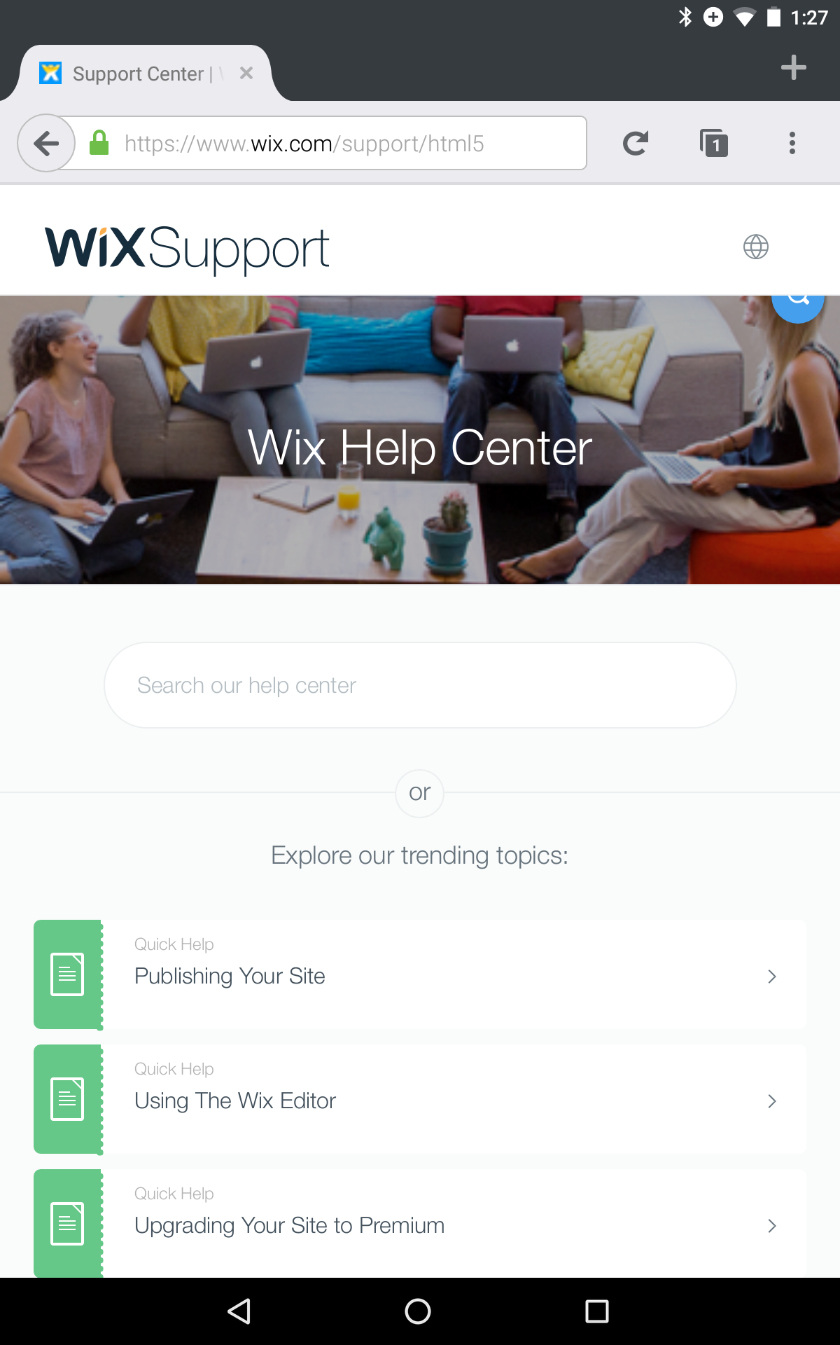
2) Look for blue "search" button (magnifying glass)
Expected Behavior:
Blue search button should be in search textfield.
Actual Behavior:
Blue search button is at upper-right, partly clipped. (Nowhere near textfield.)
Chrome gives expected results.
(I'm using a Nexus 7 android tablet.)
_From webcompat.com with ❤️_
 dholbert
All 13 comments
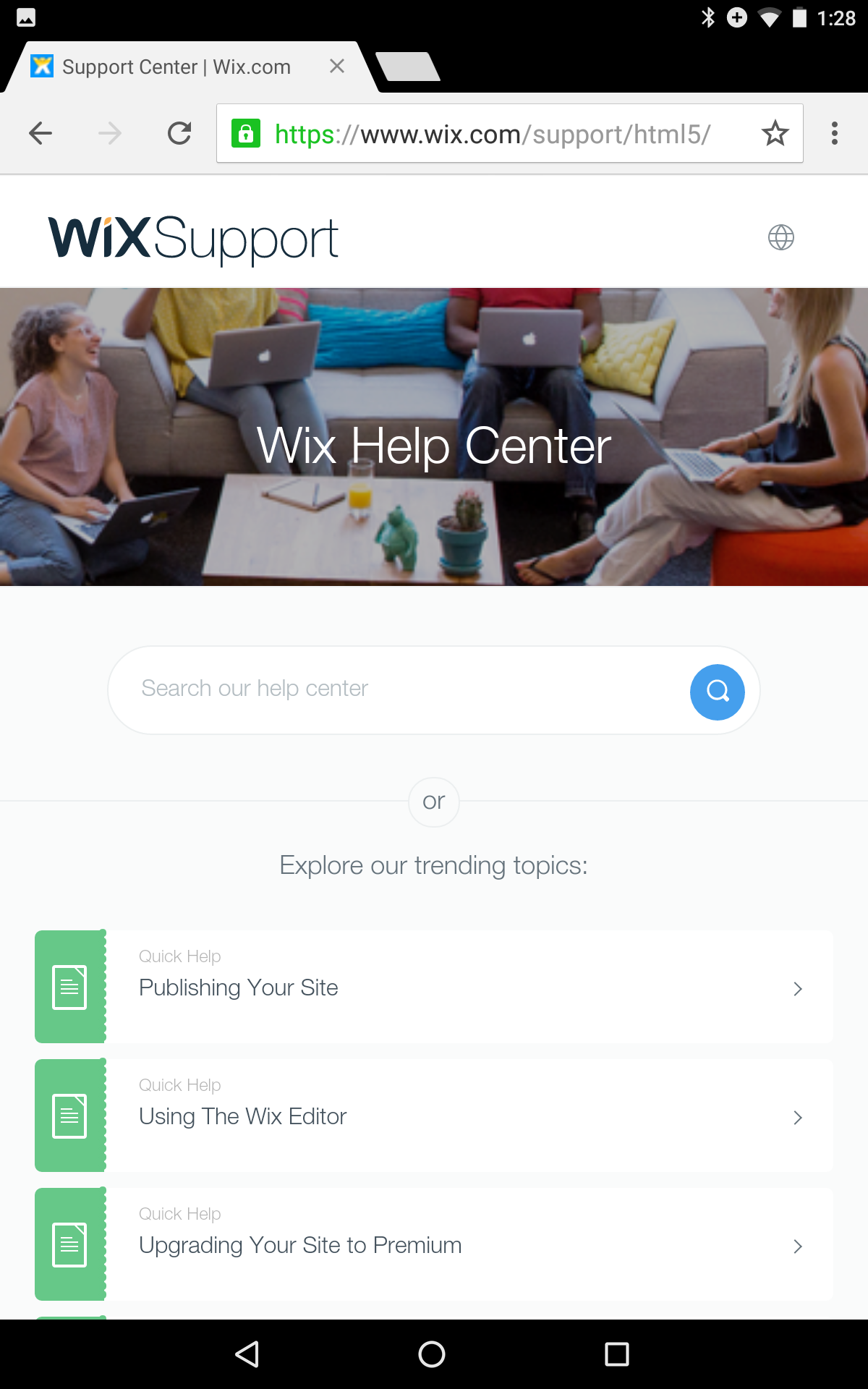
Here's a screenshot of Chrome, showing the expected renderign:
dholbert
on 1 May 2016
Actually, I suspect this might just be a gecko bug... filed https://bugzilla.mozilla.org/show_bug.cgi?id=1269202 for further investigation on the Gecko side.
dholbert
on 1 May 2016
Switching to needscontact BUT might eventually be closed as a duplicate of the gecko bug.
 karlcow
on 4 May 2016
karlcow
on 4 May 2016
We do have a suggested workaround on the gecko bug-page -- if they add this style rule to their page, it'll fix the issue:
.search-box {clear:both}
dholbert
on 4 May 2016
The good news is that @wix is on GitHub and with active employees.
Maybe @danyshaanan can help us find the right person in charge of the front-end who's able to fix this part of the site as @dholbert suggested in the previous comment.
Thanks.
karlcow
on 4 May 2016
Yes I can!
I have just written the contributors of this site's repo and will follow up on this.
Thanks for the report and the fix!
 danyshaanan
on 4 May 2016
danyshaanan
on 4 May 2016
Thanks for the report.
The issue is fixed.
 Swissa
on 5 May 2016
Swissa
on 5 May 2016
Excellent, thanks! I can confirm that this is fixed, after loading the site while in Responsive Design Mode (a mobile-sized viewport) in a Firefox desktop build.
dholbert
on 5 May 2016
Thanks @Swissa! The issue on the main page is fixed as Daniel confirmed. I found after performing a search that the button is not placed properly on the article page. But if I turn the phone's orientation (or resize the window on desktop in mobile-sized viewport), the icon goes to back nicely to the search bar.
Here's an example:
https://www.wix.com/support/html5/article/changing-your-buttons-design

 adamopenweb
on 5 May 2016
adamopenweb
on 5 May 2016
@adamopenweb: Yeah, I noticed that too -- I should've mentioned it, but didn't, because I'm more-convinced that it's just a Firefox/Gecko bug. (It happens on Desktop as well, when first switching _into_ responsive design mode, and goes away after a reload.)
I'll file a separate Gecko bug on that problem. If we come up with an easy workaround, we can suggest it here; regardless, we should just fix the gecko bug. (And in the meantime, fortunately it doesn't break their UI too much, and only after doing special extra steps beyond just loading the page.)
dholbert
on 5 May 2016
I filed https://bugzilla.mozilla.org/show_bug.cgi?id=1270579 on the issue that @adamopenweb brought up.
dholbert
on 5 May 2016
Thanks @dholbert, let's close this one.
adamopenweb
on 5 May 2016
Thanks @adamopenweb for the Firefox/Gecko bug.
I found a workaround and use negative 'top' instead of negative 'margin-top'.
Swissa
on 16 May 2016
Related issues
 vickychin
·
4Comments
vickychin
·
4Comments
 IngrownMink4
·
3Comments
karlcow
·
5Comments
IngrownMink4
·
3Comments
karlcow
·
5Comments
 christantoan
·
4Comments
christantoan
·
4Comments
 tGstep
·
3Comments
tGstep
·
3Comments
Most helpful comment
Thanks for the report.
The issue is fixed.