Wcag: Pointer Target Spacing (2.5.8): Unintentional incentive to reduce target size to pass criterion
After taking a look at this criterion, we've discovered a solution to meet this criterion that actually reduces the accessibility of a failing example. Imagine a toolbar where each button is 40px by 40px with no spacing between buttons. It is much easier for a developer or designer to reduce the size of each button to 35px and add 5px spacing between buttons than it is to modify the layout of the toolbar as a whole to accommodate larger buttons.
The problem with the criterion as written is that there are no instructions about how to count space pixels between targets, so people are free to count them more than once.
This makes the layout of 35px button + 5px space + 35px button + 5px space + etc. result in an effective 45px area for each button that includes only one button and no other targets, even though the actual target size of each button has decreased.
In UI patterns that involve multiple adjacent controls (toolbars, menus, listboxes, etc.), this will create a negative incentive to shrink the size of interactive elements and increase space between them. I've made a visual example that illustrates the problem here: https://codepen.io/smhigley/full/rNeWrOP

Potential Solution
One possible way to fix this might be to specify that space between targets may only count towards the 44px area of a single target. There's likely a better way to word it, but the intent is to prevent spacing pixels from being more useful than target pixels when trying to meet 2.5.8.
 smhigley
All 30 comments
While unfortunate, I do believe that this does gel with the intent of the SC, which is to avoid users accidentally activating the wrong control when they're close together. In the failing example, it's "easy" for users to accidentally trigger the wrong link. While in the passing example:decrease height the actual triggering may be harder, the risk of triggering the wrong one is minimised.
 patrickhlauke
on 28 Aug 2020
patrickhlauke
on 28 Aug 2020
x-ref #1362
patrickhlauke
on 28 Aug 2020
we've discussed this indeed often and the conclusion of Patrick is correct as we've also seen this: "the risk of triggering the wrong one is minimized."
 jake-abma
on 28 Aug 2020
jake-abma
on 28 Aug 2020
While "the risk of triggering the wrong one is minimized", this results in a difficulty or inability to trigger any of them. This SC is at odds with Target Size. With WCAG lacking any minimum text size requirements, the most likely solutions to meeting this success criterion will ultimately result in decreased, rather than increased accessibility.
Here's another illustration I put together of how decreasing target size is to likely be a solution to meeting this success criterion, but at the cost of decreased accessibility of the individual targets.
In my opinion, this success criterion should instead be placed at AAA so as to be on equal footing with Target Size. This would avoid having a success criterion that is prioritized in a way that would likely compromise accessibility in other ways.
 jared-w-smith
on 28 Aug 2020
jared-w-smith
on 28 Aug 2020
@jared-w-smith
I’m not sure your second example is much worse than the first - they both seem very close regarding usability. I trust that designers are unlikely to make targets very small (and thereby hard to read) with 44 pixels around them. My hunch is that they will either cram all targets more closely together (and then fail this proposed SC), or we will have something like your second example, which is workable.
But just like @smhigley indicated in her “potential solution” above, I was actually always working on the assumption that the spacing around the target would only count to that one target, so that space around couldn’t be counted twice for a row of adjacent targets. My illustrations reflect that. Such a change would take away the incentive to reduce the font size (or icon size) to get things more closely crammed together.
I am happy to amend the SC text if there is consensus that this is the way to go.
 detlevhfischer
on 28 Aug 2020
detlevhfischer
on 28 Aug 2020
Regarding arguments of how this could make things less accessible - to be fair any criteria could be misused by people to make things less accessible. For example, someone could not use color at all rather than augmenting color use with other visual clues because it's easier to just remove the colors rather than using patterns or other markers.
 mraccess77
on 28 Aug 2020
mraccess77
on 28 Aug 2020
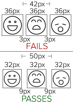
I'll first note that my example is shown at 2X size because it is otherwise much too small to properly annotate.
I’m not sure your second example is much worse than the first - they both seem very close regarding usability.
I disagree. I suspect it would be difficult to find someone with low vision that thinks making an icon that is already well below the Target Size threshold 21% smaller isn't "much worse".
While making the target spacing larger by making the target sizes smaller may arguably improve the touch/pointer interaction for some, it also quite likely makes the overall accessibility much worse for others, especially those with low vision. On mobile, where real estate is anything but plentiful and icons are already very often quite small, I fear that making them even smaller will be the most common conformance implementation.
Has any user testing been done on the potential conflict between these disability needs? When this is implemented at the expense of Target Size (as the disparity in levels would promote), it creates a formalized favoring of one disability over another. WCAG has historically taken significant consideration when disability-specific techniques might harm those with other disabilities (Bypass Blocks not specifically requiring a "skip" link comes to mind).
Unless this conflict can somehow be addressed, WebAIM advocates that this to be moved to Level AAA.
jared-w-smith
on 28 Aug 2020
@smhigley et al. I would have thought that shared inactive space would allow targets to be larger. For example 2px space 40px target 2 px inactive space 40px target 2px inactive, etc. Since the shared space on either side is counted toward 44px you could fit all of that in 86px. If you could only allow for one target per inactive space then it would need to be 4px space 37px target 4px space 37px target 4px space for the same width thus reducing potential target and visible area.
Allowing share space would seem to make calculation easier as well as you don't need to worry about what inactive space is assigned to which element.
I'd also say inactive space doesn't have to equate to visible bounds - as it is possible to keep a larger control but have internal padding that is inactive -- although this is admittedly more complicated to create.
mraccess77
on 28 Aug 2020
i'll add here something about the rationale for this, and the target size SC from 2.1, and why it would, to me, make sense to keep this at AA and target size at AAA.
both SCs work towards making it easier/less problematic to activate targets, at different levels, they provide different "escalations".
- AA: make sure that for every 44x44 area there's no more than one activatable target (avoids accidental activation at least)
- AAA: make sure that targets themselves are at least 44x44 (makes targets relatively big in themselves, making it easier to activate the right one)
patrickhlauke
on 31 Aug 2020
@jared-w-smith wrote:
While "the risk of triggering the wrong one is minimized", this results in a difficulty or inability to trigger any of them.
This difficulty is not due to a lack of separation though, but due to the decrease in text size making the items hard to read. Requiring a minimum text size is another issue, and so far there is no normative requirement in WCAG for a minimum text size. Whether this is desirable and/or doable is a separate issue.
Any decrease of size to meet pointer target spacing goes at the expense of general usability (in terms of the readability of text / icons). I believe that making sure content is still readable is an incentive that will generally prevent designers from reducing text sizes to very small values just to save horizontal space.
On mobile, where real estate is anything but plentiful and icons are already very often quite small, I fear that making them even smaller will be the most common conformance implementation.
As with small text, designers realise that reducing size makes icons generally harder to recognise / disambiguate. It is a common trade-off between icon size and spacing when working out how many icons they can put into one row. By mandating a minimum target space, a designer following these constraints and reducing target size will realise that progressively more space needs to be given over to empty spacing. I believe the SC actually nudges designers toward a tradeoff position where more of the space is given to the icon and less to the spacing.
The following graphic (sorry, not pixel-precise but it gives the idea) shows what happens if a designer increasingly reduces icon size. As icons get smaller and the space between them gets larger, the overall width gain of the icon band when reducing icon size is progressively reduced. Reducing icon surface area by 64% (from an icon width of 15px down to 9px) reduces the width of the band by only by 24% (from 166px to 126px).
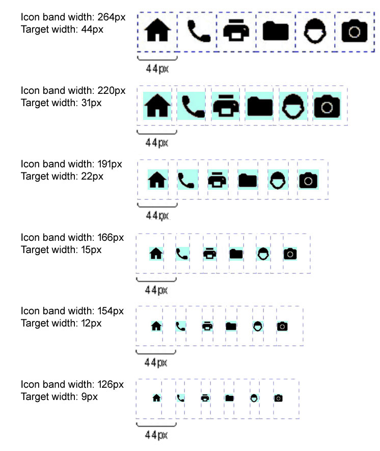
Alternative text of illustration: The graphic shows several passing implementations of a horizontal row of six common icons: home, phone, printer, etc.
- In the first row, the targets/icons are 44 x 44px. Icons are flush, there is no spacing applied. The row of six icons is 264 px wide.
- The second row shows the same icons at reduced size, target with is now 31px, spacing for clearance adds to 44 px width for target with spacing. The spacing here and in all examples below overlaps, i.e., in between spacing is counted for both adjacent icons. The row of six icons is now 220px wide.
- Target size is further reduced to 22 px, spacing for clearance again adds to 44 px. This means that the space between icons is now 11 px. The row of six icons is now 191px wide.
- Target size further reduced to 15 px, spacing and icons now have approximately the same width. The row of six icons is now 166px wide.
- Target size further reduced to 12 px, In-between spaces now wider than the icon width. The row of six icons is now 154px wide.
- Target size further reduced to a very small 9 px, which means the icons are hard to read / distinguish. In-between spaces are now a lot wider than the icon width. The row of six icons is now 126px wide.
detlevhfischer
on 2 Sep 2020
this results in a difficulty or inability to trigger any of them.
We do need to factor in the touch-screen heuristics where the device calculates which target you probably meant to hit, and activates that. I suspect that there would actually be very little difference in performance between Jared's or Detlev's examples because if you tap near a target, it will activate the closest one even if your exact tap location was in the space between.
WebAIM advocates that this to be moved to Level AAA.
As Patrick mentioned, the aim here was to put in something a bit more flexible than a minimum target size so that it can be at level AA.
Going back to the original question:
One possible way to fix this might be to specify that space between targets may only count towards the 44px area of a single target.
Not sharing the space does increase the requirement slightly, but if folks think that is reasonable we can try that. Taking a quick stab:
"Each target has a width and height of at least 44 CSS pixels including spacing that is not shared with any other target, except when"
This would bring it closer to a previous version before a long discussion with @WilcoFiers.
 alastc
on 3 Sep 2020
alastc
on 3 Sep 2020
We do need to factor in the touch-screen heuristics where the device calculates which target you probably meant to hit, and activates that.
for real-world, yes. but can't really rely on this, as browsers/OSs will do this differently, if at all. this sort of "touch target inflation" was briefly discussed in the Pointer Events WG but we had to leave it as it falls under various IPR issues ... so it's all a bit mysterious, secret, and non-documentable.
also, note that this is not about just "touch", but pointers in general (covering scenarios like mouse users with tremors that have potential issues with accuracy)
patrickhlauke
on 3 Sep 2020
Not sharing the space does increase the requirement slightly, but if folks think that is reasonable
i think this makes it even less likely to be taken into account by sites. i already have doubts that this SC will go down well in general anyway, as so many sites currently fail it. taking even just the current w3.org side navigation (where each link is only 21 CSS px high with a single pixel spacing between each)

additional example: a list with links (like a TOC). unless you bend this into a "oh, that's a case of 'inline' so it's exempt", which would sound a bit ropey.
patrickhlauke
on 3 Sep 2020
Oh blast, I've just realized that the cursor tool Jared at WebAim created doesn't account for zoom, so I've been looking at sites at 130%, but the cursor doesn't get bigger :-(
alastc
on 3 Sep 2020
@alastc Can you point to the cursor tool?
detlevhfischer
on 3 Sep 2020
Not allowing sharing inactive spacing would likely cause people to make the visible targets smaller negatively affecting people with low vision - so I would be against that unless there is proof that this would not occur.
mraccess77
on 3 Sep 2020
@mraccess77
Not allowing sharing inactive spacing would likely cause people to make the visible targets smaller
Why should that happen? When the container cannot be smaller than 44px you cannot 'save space' by decreasing target size, so the decease doesn't make sense: the incentive is gone. I think the killer argument is that not sharing space means the SC will get more pushback because it would be less flexible.
detlevhfischer
on 3 Sep 2020
@detlevhfischer I believe many folks won't want controls to visually touch and so instead of making the visual control larger there tendency will be to make the visual control smaller so there remains white space between controls.
mraccess77
on 3 Sep 2020
@mraccess77 OK, my point was only that not sharing spacing removes the incentive for decreasing target size to stack things more closely that @jared-w-smith has cautioned about. I now believe that sharing spacing is the more realistic approach, though.
detlevhfischer
on 3 Sep 2020
@detlevhfischer here's a link, note Adrian's update: https://twitter.com/aardrian/status/1298729853261357059
alastc
on 3 Sep 2020
additional example: a list with links (like a TOC). unless you bend this into a "oh, that's a case of 'inline' so it's exempt", which would sound a bit ropey.
This _really_ needs to be clarified. It's not clear if links within HTML lists or groups of checkboxes separated by line breaks are covered or not. Our team is having this debate right now as to whether these would fail or not and have come to no clear consensus based on the existing language. I'm going to post a separate issue on this topic.
jared-w-smith
on 3 Sep 2020
@jared-w-smith FWIW this is what actually makes me wary of this SC - I think it, overnight, would end up failing vast swathes of existing content and require fundamental layout changes on most sites, which seems a bit sweeping for a AA SC
patrickhlauke
on 3 Sep 2020
I've created a new Issue to consider if/how this SC applies to lists of links/controls, especially those with browser default spacing - https://github.com/w3c/wcag/issues/1384
jared-w-smith
on 3 Sep 2020
@patrickhlauke I actually agree with you that this SC is likely to go down poorly, and also that it will make most existing sites fail overnight :).
That's partly why I think this particular side effect should be re-thought, though. I think the default reaction of a lot of people to this criterion is going to be that it is unreasonable, since what it is asking is so uncommon right now. I've generally found that when people don't buy in to a criterion, they are more likely to look for the easiest possible "technically compliant" solution rather than making a good-faith effort. For those of us who will be directly dealing with that sort of pushback, it would be helpful to be backed up by a criterion that lacks obvious loopholes.
Even if designers don't actively reduce target size, right now the easiest path to compliance is to increase spacing, not size. That then messes with overall understandability, gestalt principles, and even usability on smaller screens or zoomed-in screens (where increasing whitespace has a worse effect). My own preference would be to remove the spacing incentive, and then decrease the 44px threshold to compensate, or to allow zoom as a means of compliance as mentioned in #1381.
smhigley
on 4 Sep 2020
I found the word "area" in the SC ambiguous/confusing. I only realized in these comments it's referring to something other than "target area" and meant to include non-interactive space around a target.
For each target, there is an area with a width and height of at least 44 CSS pixels that includes it, and no other targets, except when:
"Target area" is a phrase that appears in SC 2.5.5: Target Size ) and I doubt I would be the only one to (incorrectly) interpret "For each target, there is an area" to mean "a target area".
I do think it will be better for adoption if any requirements for spacing and target size are at the same level and in sync. The net effect of either is similar for designers in my view - it limits the number of targets they can place within a given screen space.
Completely agree with the importance of having SC for spacing and targets (ideally at Level AA) but think there will be too many situations where the 44x44 size is too restrictive for this to be adopted in full. Perhaps some flexibility for meeting width or height if not both may solve for that. Or setting a smaller size for Level AA and keeping 44x44 at Level AAA.
 AidanA11y
on 9 Sep 2020
AidanA11y
on 9 Sep 2020
I do think it will be better for adoption if any requirements for spacing and target size are at the same level and in sync.
noting of course that then it makes no sense to have the same values in both, as then one SC would say "target size is 44x44" and the other "there can't be two targets in the same 44x44 space" or whatever, and clearly passing the first would automatically pass the second (and failing the first while passing the second would be pointless if at same level since then you're still failing that level overall) ... i.e. it would be redundant.
patrickhlauke
on 9 Sep 2020
@patrickhlauke - yes, agreed. I suppose if there are 2 separate SC one would speak to the minimum _interactive_ target size and the other to _non-interactive_ spacing between targets. Or possibly one SC could address both.
AidanA11y
on 9 Sep 2020
Purely for the information / background: The SC started with the intent to only focus on non-interactive spacing between targets and the SC was named target spacing (minimal 8 CSS px). The difficulty of getting that one properly worded and calculated and the grey area with target between 36 CSS px and 43 CSS px morphed the SC into what we have now.
jake-abma
on 9 Sep 2020
Hi everyone, the mobile TF proposed an update which I added to this comment on 1384.
It would help to keep discussion of that in one place, so I'm just cross-linking...
alastc
on 10 Sep 2020
Hi everyone,
The text of the success criterion has been significantly updated, and the group believes it resolves the issue so this issue is being closed. There will be another review opened soon.
alastc
on 2 Mar 2021
Related issues
 yatil
·
6Comments
yatil
·
6Comments
 SuzanneTaylor
·
5Comments
smhigley
·
8Comments
smhigley
·
3Comments
SuzanneTaylor
·
5Comments
smhigley
·
8Comments
smhigley
·
3Comments
 LaurenceRLewis
·
4Comments
LaurenceRLewis
·
4Comments
Most helpful comment
@patrickhlauke I actually agree with you that this SC is likely to go down poorly, and also that it will make most existing sites fail overnight :).
That's partly why I think this particular side effect should be re-thought, though. I think the default reaction of a lot of people to this criterion is going to be that it is unreasonable, since what it is asking is so uncommon right now. I've generally found that when people don't buy in to a criterion, they are more likely to look for the easiest possible "technically compliant" solution rather than making a good-faith effort. For those of us who will be directly dealing with that sort of pushback, it would be helpful to be backed up by a criterion that lacks obvious loopholes.
Even if designers don't actively reduce target size, right now the easiest path to compliance is to increase spacing, not size. That then messes with overall understandability, gestalt principles, and even usability on smaller screens or zoomed-in screens (where increasing whitespace has a worse effect). My own preference would be to remove the spacing incentive, and then decrease the 44px threshold to compensate, or to allow zoom as a means of compliance as mentioned in #1381.