Wagtail: Improved design for Search 'filters'
The current search 'filter' feel undesigned.

- [x] New visual design
- [ ] Front end implementation
- [ ] Add this new pattern to Wagtail's UI pattern library
 tmsndrs
All 3 comments
Here is an improved quick win version of this filtering component for better usability.

 benenright
on 16 Feb 2018
benenright
on 16 Feb 2018
Hi
The design above is now agreed by the Wagtail UX/UI working group and ready for FE implementation for anyone who is keen to take this on.
Here's the Sketch file.
wagtail-search-filters.sketch.zip
Ben
benenright
on 2 Mar 2018
Hi @benenright
Whilst further implementing this during the Minsk sprint some questions came to mind which is probably essential for the bigger picture. Especially for our mobile strategy. Right now the designs reflect on the desktop state which has 2 types of filtering on the search page.
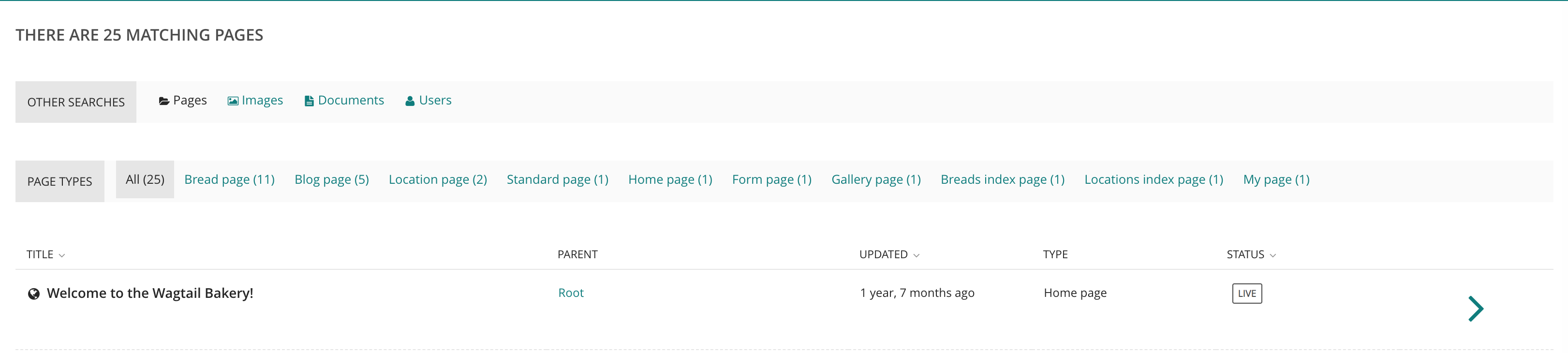
Example screenshot from the Bakery Demo:
- Will the page-type be removed or should it be an iconless adaption of the base filtering? (pages, images, documents, users)
- How should we handle a long list of these filters in smaller viewports? Should we render multiple rows or should we have a sort of inline navigation (resize to 1280px)?
- How should these filters behave on mobile?
Right now there isn't much room te play with on mobile and that's even without possible increased text labelling in other languages.
 jjanssen
on 28 Oct 2018
jjanssen
on 28 Oct 2018
Related issues
 Braintelligence
·
3Comments
Braintelligence
·
3Comments
 muhammad-saleh
·
3Comments
muhammad-saleh
·
3Comments
 alexgleason
·
3Comments
alexgleason
·
3Comments
 coredumperror
·
3Comments
coredumperror
·
3Comments
 loleg
·
3Comments
loleg
·
3Comments
Most helpful comment
Hi
The design above is now agreed by the Wagtail UX/UI working group and ready for FE implementation for anyone who is keen to take this on.
Here's the Sketch file.
wagtail-search-filters.sketch.zip
Ben