Vuetify: [Bug Report] v-tabs pagination arrow aren't displayed on desktop devices with less than 1264px viewport width
Versions and Environment
Vuetify: 1.5.9
Vue: 2.6.10
Browsers: Firefox 66.0
OS: Windows 7
Steps to reproduce
1) Create a v-tabs component with more tabs than space to display
2) If viewport is larger than 1263px, lower it below that (e.g. resizing the browser window, rendering the website in an iframe ...)
Expected Behavior
Arrows should always show up on desktop devices
Actual Behavior
Arrows only show up if the viewport is 1264px or larger
Reproduction Link
https://codepen.io/anon/pen/VNKEEz/right
Other comments
This can be remedied by using the "show-arrows" prop, but then they're also displayed on mobile devices.
No arrows on desktop devices mean that you can only scroll the topbar by repeatedly clicking the outermost tabs, since the bar can't be dragged.
This was first discussed in #1789, which was closed in favor of #2530, resulting in the PR #2838, which supposedly fixed this. I'm not sure if it used to work then and was accidentally removed later on.
Pagination arrows showing up is mentioned in the doc ("If the tab items overflow their container, pagination controls will appear"), and the Material Design guidelines (ctrl+f -> "visual indicator" -> scroll up) also note that a visual scrollability indicator should show up on desktop devices.
Also affects v2.0.0-alpha.12
All 4 comments
@Bbansjkl 我也遇到同样问题,这是我的临时解决方法
        updated() {
            this.$refs.tabs.onResize();// 解决选项卡标签溢出分页渲染不显示问题
        },
@eshun it works like a charm, thanks!
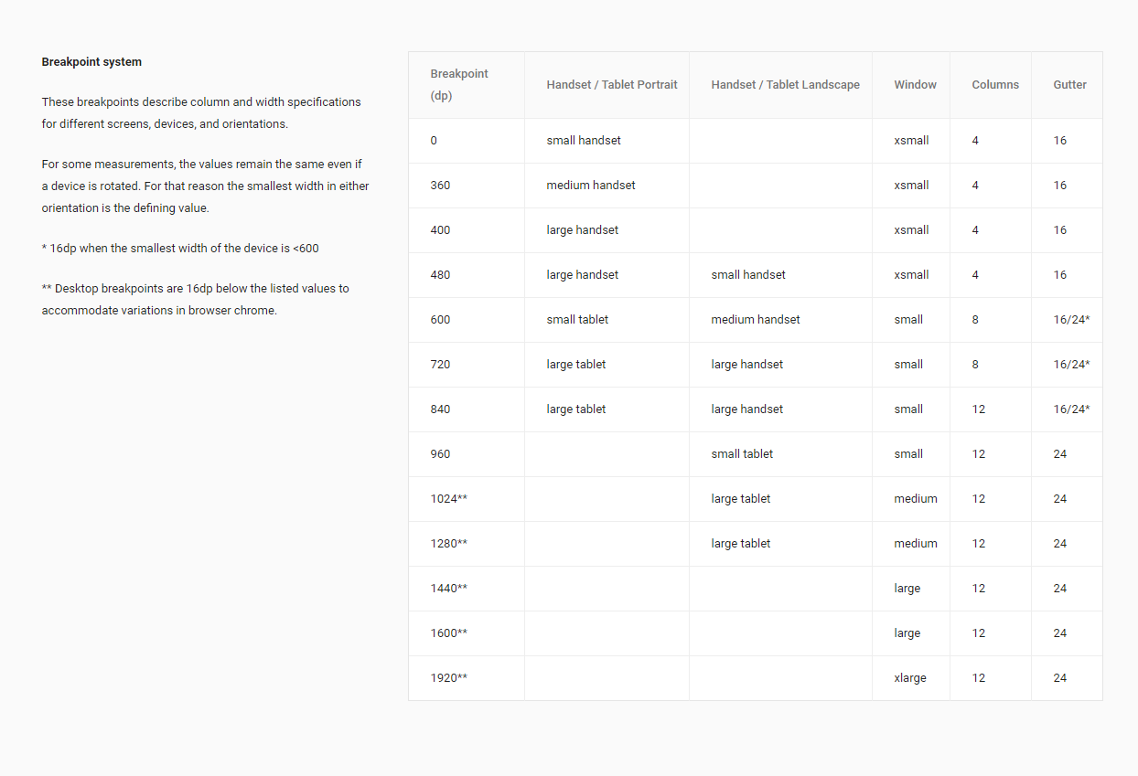
This is do to the specification for MD1:

This is something I missed in the MD2, but is not something I want to put into 2.x due to LTS coming soon. I'm going to update the Breakpoint service to allow you to globally define mobileBreakpoint to whatever you want. In v3 I'll update it to 1280, which is matching the current spec for desktop computers.
An update I will make for v2.3 is an option for show-arrows to be a string value of desktop.
resolved by #11480
If you have any additional questions, please reach out to us in our Discord community.
Most helpful comment
@Bbansjkl 我也遇到同样问题,这是我的临时解决方法
        updated() {
            this.$refs.tabs.onResize();// 解决选项卡标签溢出分页渲染不显示问题
        },