Vuetify: [Feature Request] Support a limited max-width, centered application layout (for desktops)
Problem to solve
Vuetify by default layouts the application to use the full width of the browser, placing the drawer on the far left or right. On large screens one may prefer to limit the application to lets say 1280px in width and center everything (with updated positioning for all fixed elements like drawer, toolbar, floating-action-buttons, snackbar etc.) accordingly.
Please see this stackoverflow question including pictures from @nirmal: https://stackoverflow.com/questions/49611926
Current

Desired

This can improve usability of the application quite a bit as it improves overview, shortens paths the user's mouse has to travel to reach the menu etc. It is kind of what people are used to on desktops and makes the application feel more integrated on that platform as opposed to a mobile-first, desktop-second look and feel.
Proposed solution
Add props/options to set global max-width and centered attributes to the application config or v-app element, which allow to easily achieve the look and feel described above.
I could not find an existing ticket for this, but if there is one please feel free to close this. This topic has come up a number of times on the Discord channel recently which is why I created this issue. My current workaround for this is lots of custom CSS with calculated max-widths and position offsets and they are a pain to maintain.
Todos
- [x] Add a codepen to play around with containing the above elements - This is simply the complex layout example from the docs https://codepen.io/cb109/pen/pONRBo
All 9 comments
any comments? has this been discussed/decided before? I'd be willing to implement this, but only if you guys are okay with it, also some recommended approach would be very welcome
I will explore this when I get to the application improvements slated for 2.0
That's related to https://github.com/vuetifyjs/vuetify/issues/4742 - if we implement #4742 then you could just create centered div and put your app into this div
@jacekkarczmarczyk I like that approach! Define a box, put the app in the box, it adapts as much as it possibly can.
What would the drawer look like when hidden in this layout?
I didn't get around to making some of the layout changes I had initially intended, but the above would still be a concern. In light of that, this unfortunately did not make the cut for v2.0 but I'd like to keep the conversation open.
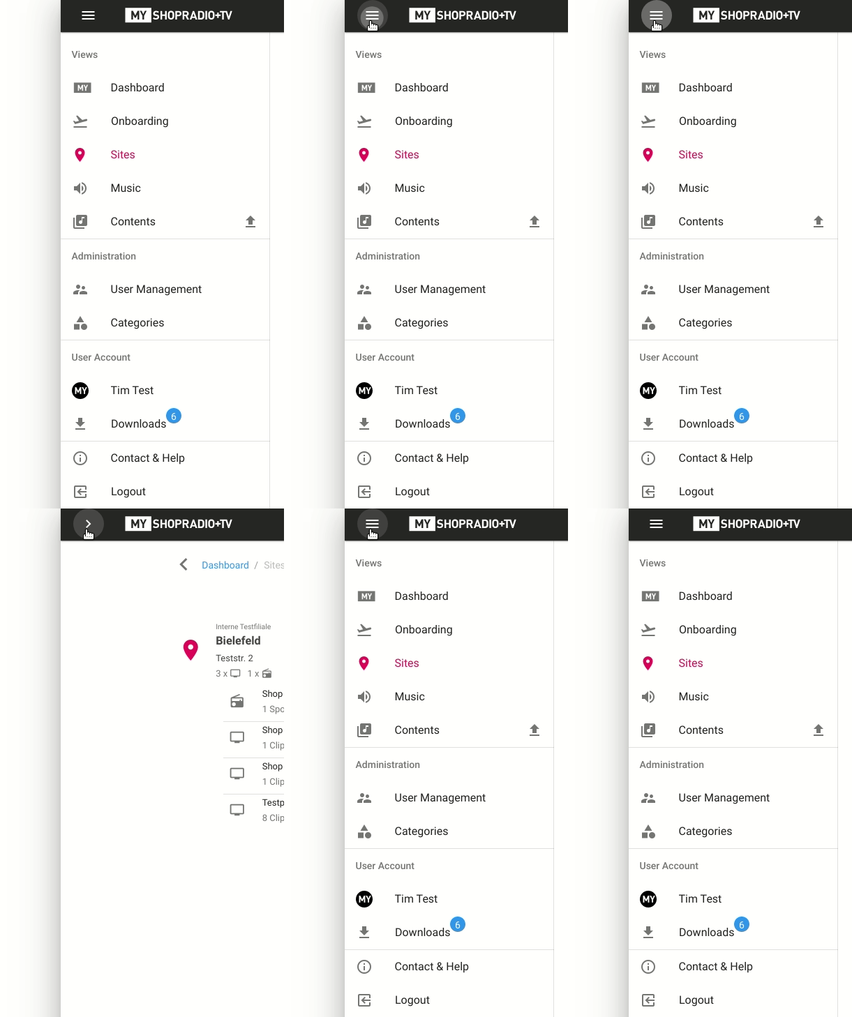
@johnleider Thanks for getting back to this. For my desktop-mode workaround I realizied that the drawer's "hide" feature basically just moves it to the left and out of screen, which of course is still in the screen when the left app border is moved like in the image above. My quickfix for that was to disable the animation and just hide the drawer, which I think is a bandaid-solution at best:
.desktop-mode
  &.v-navigation-drawer
    /* Don't animate the transition (it would look weird when coming
       back in) and make sure the drawer is hidden and unclickable. */
    transition-duration: 0s !important
    &.v-navigation-drawer--close
      z-index: -9999
      opacity: 0
Looks like this:

If possible I'd like to keep the move-to-left animation while being cut off at the app border. That may be possible with animation of a clip-path :man_shrugging:
Btw: The offsets needed for the fixed elements differ depending on OS + browser combination, seemingly due to how the scrollbar is incorporated (as either 0, 8 or 16px width).
overflow: hidden would do that.
any news ?
Recall for this. We wanna to make our ecommerce with the same layout in desktop but centered one, looking like a mobile. For sure, the main components issues are v-toolbar (and v-app-bar), v-bottom-navigation and v-drawer-navigation
Most helpful comment
any comments? has this been discussed/decided before? I'd be willing to implement this, but only if you guys are okay with it, also some recommended approach would be very welcome