Vuetify: [Feature Request] Avatars in v-Select
Versions and Environment
Vuetify: 1.0.18
Vue: 2.5.16
Browsers: Chrome 66.0.3359.181
OS: Mac OS 10.13.4
Steps to reproduce
Create a v-select with a collection of items that contain an avatar property.
Expected Behavior
Avatars are rendered with each item in the select list and the selected item.
Actual Behavior
No avatars are rendered. Though I can see from debugging that v-select knows there is an avatar property and has properly set classes, props and flags.
Reproduction Link
https://codesandbox.io/s/7n1woo2w1
Other comments
I selected Vuetify version 1.0.18, but it also occurs on all version 1.1.0-x versions. I'm not sure about previous versions.
It appears that it simply is missing the v-list markup to render the avatar:
<v-list-tile-avatar>
  <img :src="item.avatar">
</v-list-tile-avatar>
before the <v-list-tile-content>
 bitencode
All 16 comments
This is a feature request unless I'm mistaken in that this was never advertised functionality.
 johnleider
on 31 May 2018
johnleider
on 31 May 2018
Oh, sorry @johnleider - I had gathered from the API doc on v-select (item-avatar - Set property of items’s avatar value) that it would render an Avatar like v-list does.
bitencode
on 31 May 2018
Understood. Originally the prop existed as a way to apply the avatar prop to the v-list-tile component. I'm undecided on baking it in, but can explore this in the future.
johnleider
on 31 May 2018
It's pretty pointless currently now that you can put a v-list-tile straight in the slot with whatever props you want. Although I guess it does simplify the markup a bit depending on what listeners and props you'd still need to attach.
 KaelWD
on 31 May 2018
KaelWD
on 31 May 2018
That wasn't always a thing though.
johnleider
on 31 May 2018
👍 for the feature request.
Here is how we are currently doing this (there may be a better way, but it is possible):

<v-select
  class="elevation-0"
  label="Not being sorted"
  :items="employees"
  v-model="buy.sorter_id"
  item-text="full_name"
  item-value="id"
  dense
  solo
  clearable
  @input="handleSelectInput"
>
  <template slot="selection" slot-scope="data">
    <v-flex xs2>
      <v-avatar size="25px">
        <img :src="data.item.safe_avatar_url"/>
      </v-avatar>
    </v-flex>
    <v-flex class='ml-1'>
      {{ data.item.full_name }}
    </v-flex>
  </template>
  <template slot="item" slot-scope="data">
    <v-list-tile-avatar>
      <img :src="data.item.safe_avatar_url" />
    </v-list-tile-avatar>
    <v-list-tile-content>
      <v-list-tile-title v-html="data.item.full_name"></v-list-tile-title>
    </v-list-tile-content>
  </template>
</v-select>
 jaxn
on 7 Jun 2018
jaxn
on 7 Jun 2018
That is also the way I'm doing it too - using the scoped slots.
I'm actually reconsidering this: I submitted the "defect" issue because of the API documentation:

I had assumed that since item-disabled, item-text, and item-value worked that item-avatar would work too. However, as @KaelWD pointed out above, item-avatar is not really necessary when the slots are available. If it were added as a feature the first thing that's going to happen is that for someone, somewhere it won't render what they expect and there will be defects submitted and then there will need to be a bunch of props added for the avatar to be on the right, or left, the avatar size, alignment, etc... I could see all sorts of requests coming in for everyone's particular use case. Given that, it doesn't seem like such a good feature (and slots handle it already).
Having submitted this, I'd say after trying out the slots and the above comments, I would be perfectly happy if:
- This issue is closed (do I close an issue I opened? It's probably up to the Vuetify dev team?)
- The API documentation for
item-avataris removed (it doesn't do anything) - There was some guidance in the docs on rendering the
selectionslot so that it matches the normal selection. There is a good example already of using the scoped slots, but it uses chips in theselectionslot.
I suspect the text in the selection slot needs to be styled with v-select__selection, but I'm not sure if that's all or appropriate. So an example or suggestion would resolve the problem I think.
Over all, I guess I'm saying teaching devs to use the slots rather then throwing a bunch of configuration props on the component is probably better.
bitencode
on 7 Jun 2018
I want to keep this open for a few reasons:
- I believe that it is important to offer sensible easy to use functionality that someone can just grab and go.
- For more advanced implementations, we offer slots
I'll evaluate this more as we get past v1.1 and move into v1.2 dev where we have to revisit a bunch of components due to the Material Design Spec update anyways.
johnleider
on 7 Jun 2018
I'm moving this to v2.0 as it will coincide nicely with the updates already in progress for v-list in regards to the new spec.
johnleider
on 25 Aug 2018
@johnleider are there any planned updates on this for Vuetify?
Using @jaxn is working but gets me an ESLint warning regarding the vue/valid-template-root (described as the template root requiring exactly one element).
As the rule points, that is not happening in the item slot where two elements are in the template root:
  <template slot="item" slot-scope="data">
    <v-list-tile-avatar>
      <img :src="data.item.safe_avatar_url" />
    </v-list-tile-avatar>
    <v-list-tile-content>
      <v-list-tile-title v-html="data.item.full_name"></v-list-tile-title>
    </v-list-tile-content>
  </template>
Using a div around any of these elements would pass the rule but just break the desired item display.
Any other workarounds suggested?
 IvoPereira
on 26 Oct 2018
IvoPereira
on 26 Oct 2018
I could be wrong (I often am), but I'm not sure if we can resolve this without a breaking change which is why I pushed it to v2.0.
In regards to your question @IvoPereira , I'm not sure why you are getting that error, template slots can have as many elements as you want.
johnleider
on 26 Oct 2018
That should be reported on the eslint-plugin-vue repo
KaelWD
on 26 Oct 2018
@johnleider that is probably the case @KaelWD referred.
The warning should not have an exception for template slots. I will make sure I get the issue there.
Will update this thread just in case someone finds an alternative approach or if I would get a fix for this situation in eslint-plugin-vue repo.
EDIT: Anyone that might want to be updated on the eslint vue issue, you may want to check it here.
IvoPereira
on 26 Oct 2018
@johnleider , @blalan05 ,
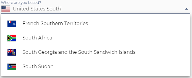
I'm also using the template 'selection' and 'item' slot approach with a v-autocomplete.
<template v-slot:selection="data">
<v-avatar tile size="32" class="mr-2">
<div
class="flag-icon country-picker-icon"
:class="{['flag-icon-' + data.item.value]: 1}"
> </div>
</v-avatar>
<span class="country-picker-text" v-text="data.item.text"></span>
</template>
<template v-slot:item="data">
<v-list-tile-avatar tile>
<div
class="flag-icon country-picker-icon"
:class="{['flag-icon-' + data.item.value]: 1}"
> </div>
</v-list-tile-avatar>
<v-list-tile-content>
<v-list-tile-title v-html="data.item.text"></v-list-tile-title>
</v-list-tile-content>
</template>
Behaviour wise the result is undesirable:
From a behaviour perspective when searching the avatar should be hidden because it's context-sensitive, and the item-text should be editable (like it currently is when not using the 'selection' slot).
This is not currently possible because the input appended to the 'selection' slot doesn't contain the item-text.
In short, it would be ideal to be able to:
- Supply options (similar to menu-props) to the avatar e.g. size
- Hide the avatar when editing (keep spacing)
- Use a scoped slot to provide avatar content
Is it perhaps possible to use item-avatar to do the same?
 shelakel
on 6 Apr 2019
shelakel
on 6 Apr 2019
@shelakel This seems like a feature request on the premise that avatars were already supported in the core of the component. The provided example is _your_ markup and would require you to make the appropriate changes to accommodate your needs.
As v-select is something I consider a trap component (there are an endless amount of features that could be useful and requested), I want to make sure that we make concise decisions when adding functionality and at the very least, provide an interface for users to implement their custom solutions.
With that being said, I have removed references to avatar properties for v2.0 but will explore this as a maybe implemented feature in the future. Thank you everyone for your responses and feedback on this issue.
johnleider
on 19 Jun 2019
Thank you for the Feature Request and interest in improving Vuetify. Unfortunately this is not functionality that we are looking to implement at this time.
If you have any additional questions, please reach out to us in our Discord community.
 nekosaur
on 11 Nov 2020
nekosaur
on 11 Nov 2020
Related issues
 KuroThing
·
3Comments
KuroThing
·
3Comments
 milleraa
·
3Comments
milleraa
·
3Comments
 gluons
·
3Comments
gluons
·
3Comments
 jofftiquez
·
3Comments
jofftiquez
·
3Comments
 ricardovanlaarhoven
·
3Comments
ricardovanlaarhoven
·
3Comments
Most helpful comment
👍 for the feature request.
Here is how we are currently doing this (there may be a better way, but it is possible):