Vuetify: [Bug Report] App Bar (v-toolbar) Height Adjusts from 56 to 48 to 64 dp
Versions and Environment
Vuetify: 1.0.17
Vue: 2.5.16
Browsers: Chrome 67.0.3396.30
OS: Windows 10
Steps to reproduce
Open Codepen on the desktop, resize the browser window width, and note:
- At widths less than 843px, the v-toolbar height is 56dp
- At widths greater than 959px, the v-toolbar height is 64dp
- At browser widths between these two, the v-toolbar height is 48dp
Expected Behavior
Google seems to intend that the app bar height metrics are either 56dp or 64dp, except for landscape mode on mobile, where it is supposed to be 48dp.
Actual Behavior
At browser window widths of 843px to 959px on desktop, the v-toolbar height is 48dp instead of 64dp.
Reproduction Link
https://codepen.io/185driver/pen/YLxmRy
Other comments
It seems odd to see browser window widths on the desktop that display the v-toolbar at 48dp high, especially in-between 56dp and 64dp heights.
 185driver
All 6 comments
I'd like to suggest that this issue isn't fixed. At least not on desktop at moderate screen sizes. I've updated my codepen to use v.1.2.0 stable. Here's my explanation revisited:
Steps to reproduce
Resize the browser window horizontally. With browser window height of 804px, note that the toolbar height is 56px < 805px wide, 64px > 960px wide, and 48px in-between.
Expected Behavior
The "mobile landscape mode" of 48px for toolbar height shouldn't trigger at these browser window sizes. Screen widths on large-ish phones screens (like iPhone 8 Plus or Pixel 2 XL) are in the 414px range, so in landscape mode would have that as a height. I would suggest preventing mobile landscape mode unless the screen height is less than 450px to 500px or so. That way, on tablets and desktop, it doesn't get used, even in moderate browser window sizes.
Actual Behavior
See Steps to Reproduce.
Reproduction Link
https://codepen.io/185driver/pen/wEzoNm (updated to v1.2.0 stable)
Additional Comments:
The attached screenshot is from my actual v1.2.0 app. Apologies for the file size; I wanted it to display smoothly.
Note the screen size numbers to the left of the dev tools window and the changing toolbar height at various widths. Note too that the browser window is 804px high, not a height that should really be triggering mobile landscape mode in the toolbar.
Thanks for considering.

185driver
on 29 Aug 2018
I experienced a similar issue with the Toolbar height: Whenever I open the keyboard in Chrome for Android, the height changes from 56px to 48px.
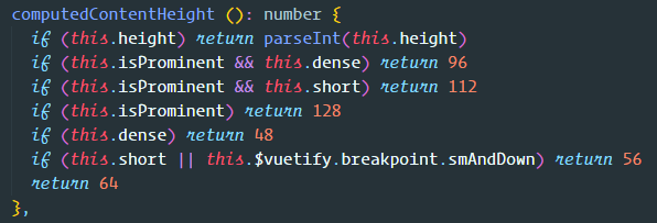
I think it is caused by this part in VToolbar.js
      if (this.$vuetify.breakpoint.width >
        this.$vuetify.breakpoint.height
      ) return this.heights.mobileLandscape
When the keyboard is opened, the height of the window is smaller than its width. Is there no better way to detect landscape mode on mobile devices than checking, if the window width is bigger than its heigt?
 WIStudent
on 6 Sep 2018
WIStudent
on 6 Sep 2018
screen.orientation.angle or matchMedia("(orientation: landscape)").matches
 KaelWD
on 6 Sep 2018
KaelWD
on 6 Sep 2018
maybe orientation could be added to the breakpoint?
 jacekkarczmarczyk
on 6 Sep 2018
jacekkarczmarczyk
on 6 Sep 2018
Reproduction using nuxt
https://codesandbox.io/s/y0pmkyxx41
I think this is the same issue?
 blowsie
on 20 Dec 2018
blowsie
on 20 Dec 2018
Orientation is no longer changes toolbar height (based upon md2 spec) and now is based off of breakpoints.
If you have any additional questions, please reach out to us in our Discord community.
 johnleider
on 29 Jun 2019
johnleider
on 29 Jun 2019
Related issues
 KuroThing
·
3Comments
KuroThing
·
3Comments
 dschreij
·
3Comments
dschreij
·
3Comments
 gluons
·
3Comments
gluons
·
3Comments
 jofftiquez
·
3Comments
jofftiquez
·
3Comments
 smousa
·
3Comments
smousa
·
3Comments
Most helpful comment
Orientation is no longer changes toolbar height (based upon md2 spec) and now is based off of breakpoints.
If you have any additional questions, please reach out to us in our Discord community.