Vuetify: [Feature Request][a11y] separate dark theme color scheme
What will it allow you to do that you can't do today?
It will allow to create different color schemes (primary/secondary/error etc) for light and dark theme
How will it make current work-arounds straightforward?
I don't see workaround for this at the moment. Dev can define his own color scheme, but it will be same for light and dark themes
What potential bugs and edge cases does it help to avoid?
It'll give possibility to create accessible (with high enough contrast) interfaces in both themes
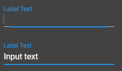
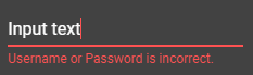
Here are examples of too low contract with default color scheme


 jacekkarczmarczyk
All 8 comments
You are referring to the ability to define a specific color on form inputs?
 johnleider
on 7 Sep 2017
johnleider
on 7 Sep 2017
No, I'm talking about having 2 colors schemes - one for light app and one for dark app, so instead of having something like this:
$theme := {
  primary: $blue.darken-2
  accent: $blue.accent-1
it could be:
$material-light := {
  $theme: {
    primary: $blue.darken-2
    ...
  },
  ...
}

$material-dark := {
  $theme: {
    primary: $blue.lighten-2
    ...
  },
  ...
}
And in styles instead of $theme.primary we can use $material.theme.primary
jacekkarczmarczyk
on 7 Sep 2017
Just a question about this feature request, if for dark and light different primary colors are defined, will these be updated throughout the app when the theme is switched? So also the color="primary lighten-2" parts?
 ThaDaVos
on 20 Jul 2018
ThaDaVos
on 20 Jul 2018
Dark and Light will have their own specified themes and would be applied depending upon color. This is also being touched up for md2 and might change a bit.
johnleider
on 20 Jul 2018
It would be nice to be able to change background colors (and basically anything) as well for each theme.
 agnjunio
on 24 Aug 2018
agnjunio
on 24 Aug 2018
That's a separate issue @agnjunio
jacekkarczmarczyk
on 24 Aug 2018
@jacekkarczmarczyk ok, then I will create a feature request for that
agnjunio
on 25 Aug 2018
this is now possible using the new bootstrap method in v2.0.0-alpha.5?
 theme: {
    dark: true,
    themes: {
      light: {
        primary: '...',
        ...
      },
      dark: {
        primary: '...',
        ...
      }
    }
  }
 DRoet
on 20 Feb 2019
DRoet
on 20 Feb 2019
Related issues
 aaronjpitts
·
3Comments
aaronjpitts
·
3Comments
 smousa
·
3Comments
smousa
·
3Comments
 ricardovanlaarhoven
·
3Comments
ricardovanlaarhoven
·
3Comments
 jofftiquez
·
3Comments
jofftiquez
·
3Comments
 dohomi
·
3Comments
dohomi
·
3Comments
Most helpful comment
No, I'm talking about having 2 colors schemes - one for light app and one for dark app, so instead of having something like this:
it could be:
And in styles instead of
$theme.primarywe can use$material.theme.primary