Vue-slider-component: Slider incorrectly resizes when orientation changes on mobile devices
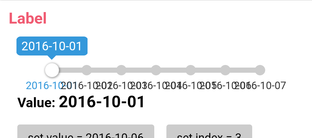
See attached screenshots of the example page in portrait and landscape orientations on mobile (ignore overlapping text). The slider component does not resize correctly as can be seen with the incorrect piecewise label gaps.
Issue is reproducible in my own project, as well as on the example page.
Thank you.

 caseyronan
All 2 comments
Sorry, so long ago to reply.
Now the component will only automatically update the component size when the resize event is triggered.
So in other cases, you need to call the refresh method to manually update.
 NightCatSama
on 3 Sep 2017
NightCatSama
on 3 Sep 2017
👍1
No problem - I got it working already. Code for anyone interested...
mounted() {
  this.$nextTick(function () {
    // Orientation event for mobile users
    window.addEventListener('orientationchange', this.getOrientationChange);

    // Init
    this.getOrientationChange()
  })
},

methods: {
  getOrientationChange(event) {
    this.$refs.slider.refresh()
  },
},
👍2
Was this page helpful?
0 / 5 - 0 ratings
Related issues
 ericdrobinson
·
4Comments
ericdrobinson
·
4Comments
 michaelpelletier
·
8Comments
michaelpelletier
·
8Comments
 aashrafu
·
3Comments
aashrafu
·
3Comments
 senner007
·
5Comments
senner007
·
5Comments
 bogdan1190
·
5Comments
bogdan1190
·
5Comments
Most helpful comment
No problem - I got it working already. Code for anyone interested...