Vue-multiselect: Allow multiselect options list to overflow the size of the input control
Whenever an option is longer than the size of the multiselect input component, a horizontal scrollbar appears. I would like the options width to overflow the width of the input associated with the multiselect so as to eliminate the need to use a horizontal scrollbar.
Steps to reproduce
Add an option with width greater than the multiselect component
Expected behaviour
The drop-down list should auto-fit to the longest option, overflowing the multiselect component if necessary
Actual behaviour
The drop-down list is of the same size of the multiselect, and a horizontal scrollbar appears.
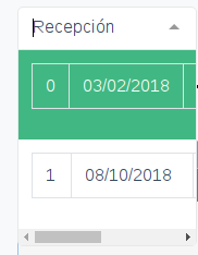
Here is a screenshot of the multiselect component. As you can see, the default is for the list to never be bigger than the component itself, where one would visualize the selected option. Edit: I am using a table row to render each option.
 el-duderino5
All 9 comments
This is up to the user to slightly modify the CSS class responsible for the dropdown container.
 shentao
on 1 Oct 2018
shentao
on 1 Oct 2018
This is up to the user to slightly modify the CSS class responsible for the dropdown container.
And exactly how would one do that? There is no documentation that I could find about the CSS classes. The guides are severely lacking in that aspect.
el-duderino5
on 1 Oct 2018
The guide should have the following format:
CSS Class Name | Components that they modify | Variables that you can modify
el-duderino5
on 1 Oct 2018
Um, can anyone please help me solve my problem and, please, can the developers write documentation about their classes? Right now it's really hard to change the style of this component. It doesn't integrate well with bootstrap, for example.
el-duderino5
on 10 Oct 2018
Sadly there are no CSS variables that you can modify. Though there is a community effort to prepare a Sass file for that.
As for the CSS classes that you can modify – look into the Multiselect.vue file.
shentao
on 11 Oct 2018
@el-duderino5 did you ever end up finding a solution to this problem?
 MichaelZhou
on 30 Jan 2020
MichaelZhou
on 30 Jan 2020
@el-duderino5 @MichaelZhou
If using the default styles, this should do it. And I'm using bootstrap 4.
Only slightly weird thing is the border when it overflows.
.multiselect .multiselect__content-wrapper {
    min-width: 100%;
    width: auto;
    border-top: 1px solid #e8e8e8;
}

.multiselect--active .multiselect__tags {
    border-bottom: none;
}
Maybe a box-shadow would make it look better than a border. So instead something like:
.multiselect .multiselect__content-wrapper {
    min-width: 100%;
    width: auto;
    border: none;
    box-shadow: 4px 4px 10px 0 rgba(0,0,0,.1);
}

.multiselect--active .multiselect__tags {
    border-bottom: none;
}
 JoshMoreno
on 21 Feb 2020
JoshMoreno
on 21 Feb 2020
@el-duderino5 @MichaelZhou
If using the default styles, this should do it. And I'm using bootstrap 4.
Only slightly weird thing is the border when it overflows..multiselect .multiselect__content-wrapper { min-width: 100%; width: auto; border-top: 1px solid #e8e8e8; } .multiselect--active .multiselect__tags { border-bottom: none; }Maybe a box-shadow would make it look better than a border. So instead something like:
.multiselect .multiselect__content-wrapper {
    min-width: 100%;
    width: auto;
    border: none;
    box-shadow: 4px 4px 10px 0 rgba(0,0,0,.1);
}

.multiselect--active .multiselect__tags {
    border-bottom: none;
}
That was helpful to me. Thanks for sharing!
 janswist
on 19 Aug 2020
janswist
on 19 Aug 2020
It would be nice to add this information to the documentation
 zaz600
on 21 Aug 2020
zaz600
on 21 Aug 2020
Related issues
 focussing
·
3Comments
focussing
·
3Comments
 yaakovp
·
3Comments
yaakovp
·
3Comments
 hskrishna29
·
3Comments
hskrishna29
·
3Comments
 dmitov
·
4Comments
dmitov
·
4Comments
 PrimozRome
·
3Comments
PrimozRome
·
3Comments
Most helpful comment
@el-duderino5 @MichaelZhou
If using the default styles, this should do it. And I'm using bootstrap 4.
Only slightly weird thing is the border when it overflows.
Maybe a box-shadow would make it look better than a border. So instead something like: