Vue-multiselect: how to add class into vue-multiselect
sorry if my title didn't seem to explain enough,
let's say i want to validate the form using other library,
any idea how to add the class?
since i use vee-validate it usually goes like this
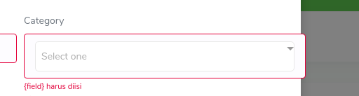
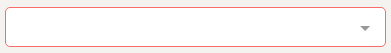
:class="{'is-danger': errors.has('ca')}"
& 1 more thing, i know its silly, but how do i add the highlight to the input when focused?
 vazh
vazh
All 7 comments
Adding a custom class to the input element isn't supported by this component, which I think is madness. At the moment you are forced to customise/override the default CSS.
This is really frustrating for me as I have a bunch of existing form styles that I want applied to this, and I'm going to need to duplicate them all.
@shentao how come this isn't in there? Seems like it would be fairly straight forward to add a "class" prop.
 assembledadam
on 28 Oct 2017
assembledadam
on 28 Oct 2017
Why would you want to add a custom class to the <input> element? You know that the input is just a very small fragment of the component. It’s actually borderless and sometimes there’s no <input> at all. It would be useless.
If you add :class="{'is-danger': errors.has('ca')}" to the <multiselect> it will add that class to the root element of the component. You can then add the needed styles to change the border or whatever you wish to do with it.
Here’s an example: https://jsfiddle.net/shentao/qj7xovms/
 shentao
on 29 Oct 2017
shentao
on 29 Oct 2017
Why this is closed?
 atrujillofalcon
on 12 May 2020
atrujillofalcon
on 12 May 2020
@atrujillofalcon because it was answered above and I don’t consider this an actual issue.
shentao
on 12 May 2020
in a specific template, we need a binding class in the input element, and if I binding in multi select it will have an issue in style
 rickyanwar
on 26 May 2020
rickyanwar
on 26 May 2020
Using the binding option you always can do something like this:
<multiselect
:class="{'myclass': true, 'myotherclass': true}"
 v-model="mymodel"
></multiselect>
What I have found is that classes used into the component could conflict with some specific styling (validation background images with multiselect__tags class, for example, because it adds background color and the root div of the component have a z-index of -1).
 qmarcos
on 1 Sep 2020
qmarcos
on 1 Sep 2020
you can override multiselect class like this
.multiselect__placeholder {
  display: inline-block !important;
  margin-bottom: 0px !important;
  padding-top: 0px !important;
}

.multiselect.invalid .multiselect__tags {
  border: 1px solid #f86c6b !important;
}
don't forget to remove scoped tag :)
 rizkhal
on 2 Dec 2020
rizkhal
on 2 Dec 2020
Related issues
 chinchang
·
19Comments
chinchang
·
19Comments
 xereda
·
20Comments
xereda
·
20Comments
 nikolaynesov
·
48Comments
nikolaynesov
·
48Comments
 yk1711
·
15Comments
shentao
·
21Comments
yk1711
·
15Comments
shentao
·
21Comments
Most helpful comment
Why would you want to add a custom class to the
<input>element? You know that the input is just a very small fragment of the component. It’s actually borderless and sometimes there’s no<input>at all. It would be useless.If you add
:class="{'is-danger': errors.has('ca')}"to the<multiselect>it will add that class to the root element of the component. You can then add the needed styles to change the border or whatever you wish to do with it.Here’s an example: https://jsfiddle.net/shentao/qj7xovms/