Vscode: Tab characters are the wrong width with proportional fonts.
VSCode uses spaces to render tab characters. To make a tab character wide enough to extend to the next tabstop, the width of the tab character is adjusted by changing the number of spaces used.

When using proportional fonts, VSCode still uses spaces to render tab characters, with the same rules to determine the size of the tabs. The tab characters no longer properly extend to the next tabstop. It becomes impossible to align text using tabs.
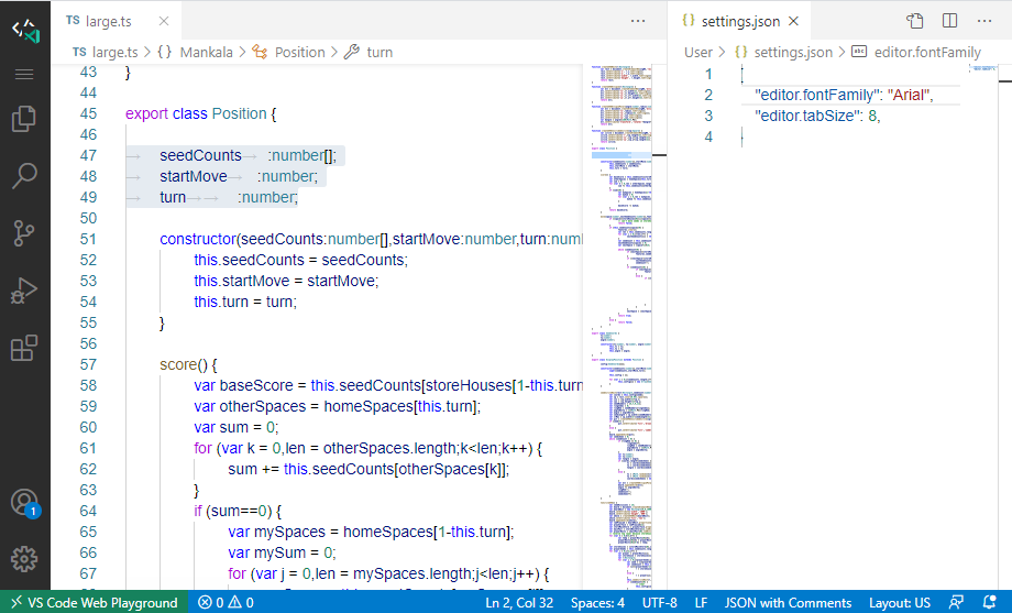
It's possible that this was an intentional design decision for the sake of efficiency, but I still think it's worth revisiting. I also wonder if a fix for this bug would make it any easier to implement other tricky formatting features such as Elastic Tabstops (#3932).
_(I'm reporting this here instead of in the Monaco repo, per the bug template there.)_
- VSCode Version: 1.51.0-insider
- OS Version: Test Playground (on Chrome 85 / Windows 10 1903)
Steps to Reproduce:
- Change editor font family to a proportional font. (e.g. Arial)
- Attempt to align text using tab characters.
Does this issue occur when all extensions are disabled?: Yes
 subhav
All 7 comments
Using intra-line tabs for alignment is always an iffy proposal to begin with, because you have no idea what the tab stops will be in another person's custom-configured editor. They could be every 2, 3, 4, 8, or whatever monospaced characters wide, they could be a number of ems, inches, or picas wide in proportional editors, etc.
The world really needs universal, or at least near-universal, support for elastic tabstops (#3932), so we can all rely on certain usage patterns producing reliably-aligned text. Putting support for them into VSCode would move a huge number of devs into a space where they work and would encourage their discovery and usage, so I'd actually recommend prioritizing #3932.
 Felice-Enellen
on 18 Oct 2020
Felice-Enellen
on 18 Oct 2020
This feature request is now a candidate for our backlog. The community has 60 days to upvote the issue. If it receives 20 upvotes we will move it to our backlog. If not, we will close it. To learn more about how we handle feature requests, please see our documentation.
Happy Coding!
 vscode-triage-bot
on 19 Oct 2020
vscode-triage-bot
on 19 Oct 2020
@alexdima I should have made this more clear in the original description, but this is a bug, not a feature request.
Tabs should always advance to the next-multiple-of-tab-size from the start of the line. Here's a more clear example of the bug (using Arial, tab size of 8):

The whitespace on each line is a single tab character. The tabs don't align the text that follows, which I would consider to be the correct behavior. Notably, the tabs are also not the same size.
subhav
on 19 Oct 2020
Rendering tabs works currently by substituting a tab character with a certain number of spaces. So, for example, on line 2 there are 6 zeros and a tab character; the tab character is rendered with 2 spaces. On line 6, there are 2 zeros and the tab character is rendered with 6 spaces. This works well for monospace fonts and leads to things aligning.
We render tabs with spaces and not by implementing pixel based tab stops because we want to delegate text layouting to Chromium. We do not implement the text layouting ourselves. This allows us to support many different kinds of non-latin scripts, including decent support for RTL and bi-di.
As an observation, most people who wish for things to be aligned are not satisfied with only the tab stops being aligned, they usually want even characters to be aligned. So most people who care about alignment use a monospace font.
 alexdima
on 20 Oct 2020
alexdima
on 20 Oct 2020
I know that to align text you need monospaced font and I never tried to write code with a proportional font.
I'm using VSC to write markdown text in which the only need for alignment is in tables. So I found this Duospace font (see #108858) a good compromise for legibility. Anyway my problem is really minor, but I understand that with proportional fonts could become annoying.
 crystalfp
on 20 Oct 2020
crystalfp
on 20 Oct 2020
Thanks for clarifying the reason, Alex!
At the very least, I think changing the number of spaces used to render a tab doesn't make much sense for proportional fonts. Even fixed-size tabs would be an improvement over the current behavior. Could we at least do that?
Not to suggest that this is a viable solution, but I feel like it's worth pointing out that Chromium's rendering of the actual tab character _is_ correct (including in RTL layouts). Here's a
<textarea style="font-family: Arial;tab-size: 8;">element. Tab characters are used after the zeroes, and slashes in Arial are the same size as spaces.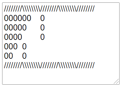
And, tab sizes don't have to be defined in terms of spaces. Here, the tab-size is changed to
7ch.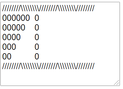
"people who care about alignment use a monospace font"
As true as that is, I think it's also something of a catch-22. Proportional fonts aren't viable, in part _because_ the proper editor support for them is missing.
It's a low-priority problem with a lot of low-priority work items; I get that. But, if I want to start using proportional fonts on my own projects where I decide the style, even that isn't really supported.
subhav
on 20 Oct 2020
There is no reason why tab stops in VS Code couldn't work the way they work in text editors but I'm not sure if that would fix the problem with indentation. We're so used to regarding indentation as 'X' spaces.
I've used a proportional font for years now (Input Sans) and readability is better than with a monospace font (plus it looks great). It would be nice if the experience with tab stops would improve but it's not like it's unusable now. If vscode were to fix it's poor auto indentation I'd hardly need to worry about this at all.
 martijn
on 2 Nov 2020
martijn
on 2 Nov 2020
Related issues
 sijad
·
3Comments
sijad
·
3Comments
 curtw
·
3Comments
curtw
·
3Comments
 omidgolparvar
·
3Comments
omidgolparvar
·
3Comments
 mrkiley
·
3Comments
mrkiley
·
3Comments
 trstringer
·
3Comments
trstringer
·
3Comments
Most helpful comment
Thanks for clarifying the reason, Alex!
At the very least, I think changing the number of spaces used to render a tab doesn't make much sense for proportional fonts. Even fixed-size tabs would be an improvement over the current behavior. Could we at least do that?
Not to suggest that this is a viable solution, but I feel like it's worth pointing out that Chromium's rendering of the actual tab character _is_ correct (including in RTL layouts). Here's a
<textarea style="font-family: Arial;tab-size: 8;">element. Tab characters are used after the zeroes, and slashes in Arial are the same size as spaces.And, tab sizes don't have to be defined in terms of spaces. Here, the tab-size is changed to
7ch.As true as that is, I think it's also something of a catch-22. Proportional fonts aren't viable, in part _because_ the proper editor support for them is missing.
It's a low-priority problem with a lot of low-priority work items; I get that. But, if I want to start using proportional fonts on my own projects where I decide the style, even that isn't really supported.