Vscode: Improve default diff view w/ metadata changes
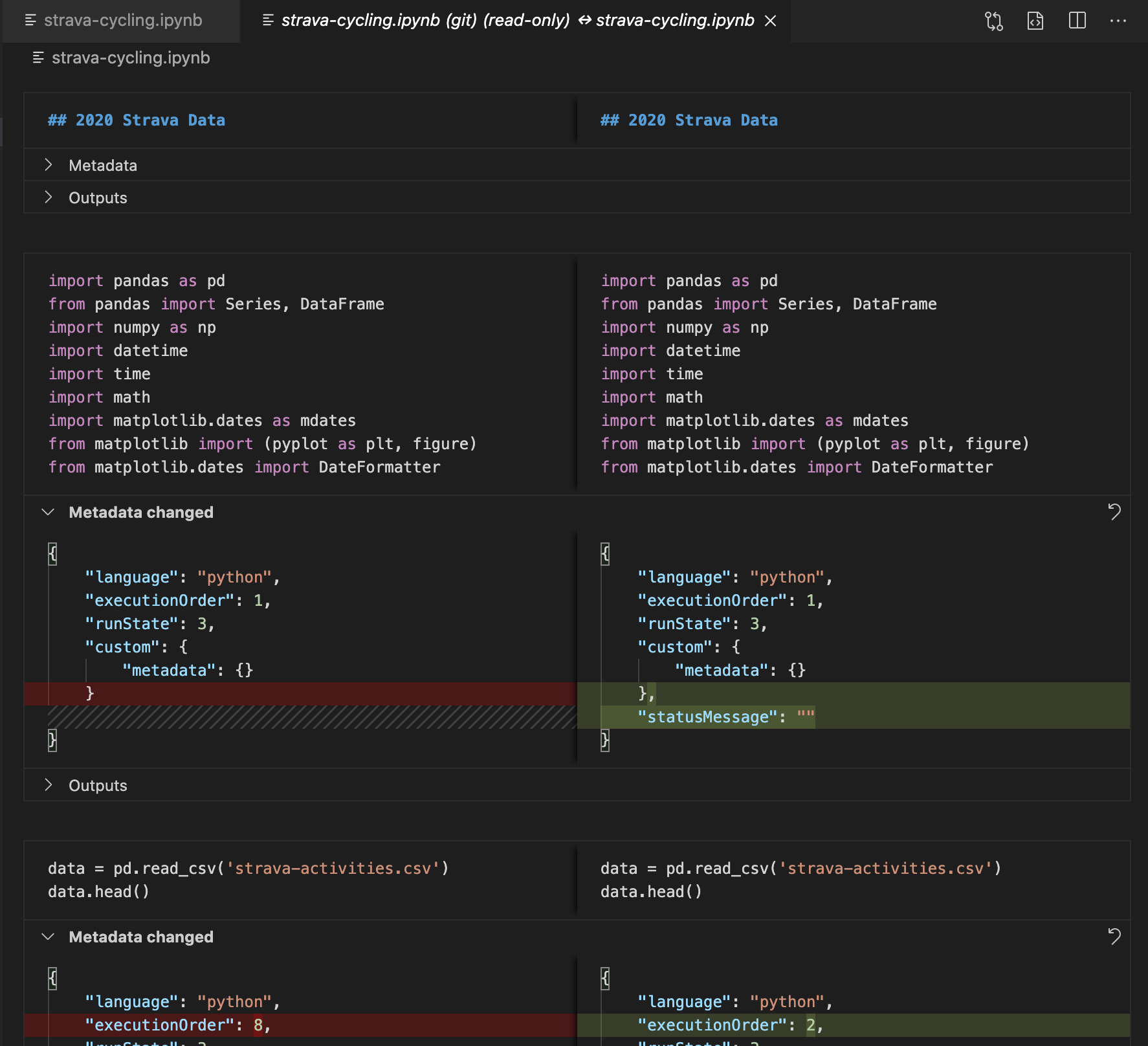
The current view when running the same notebook that has no code changes but has metadata/output change takes up quite amount of vertical real estate (related to https://github.com/microsoft/vscode/issues/105916):
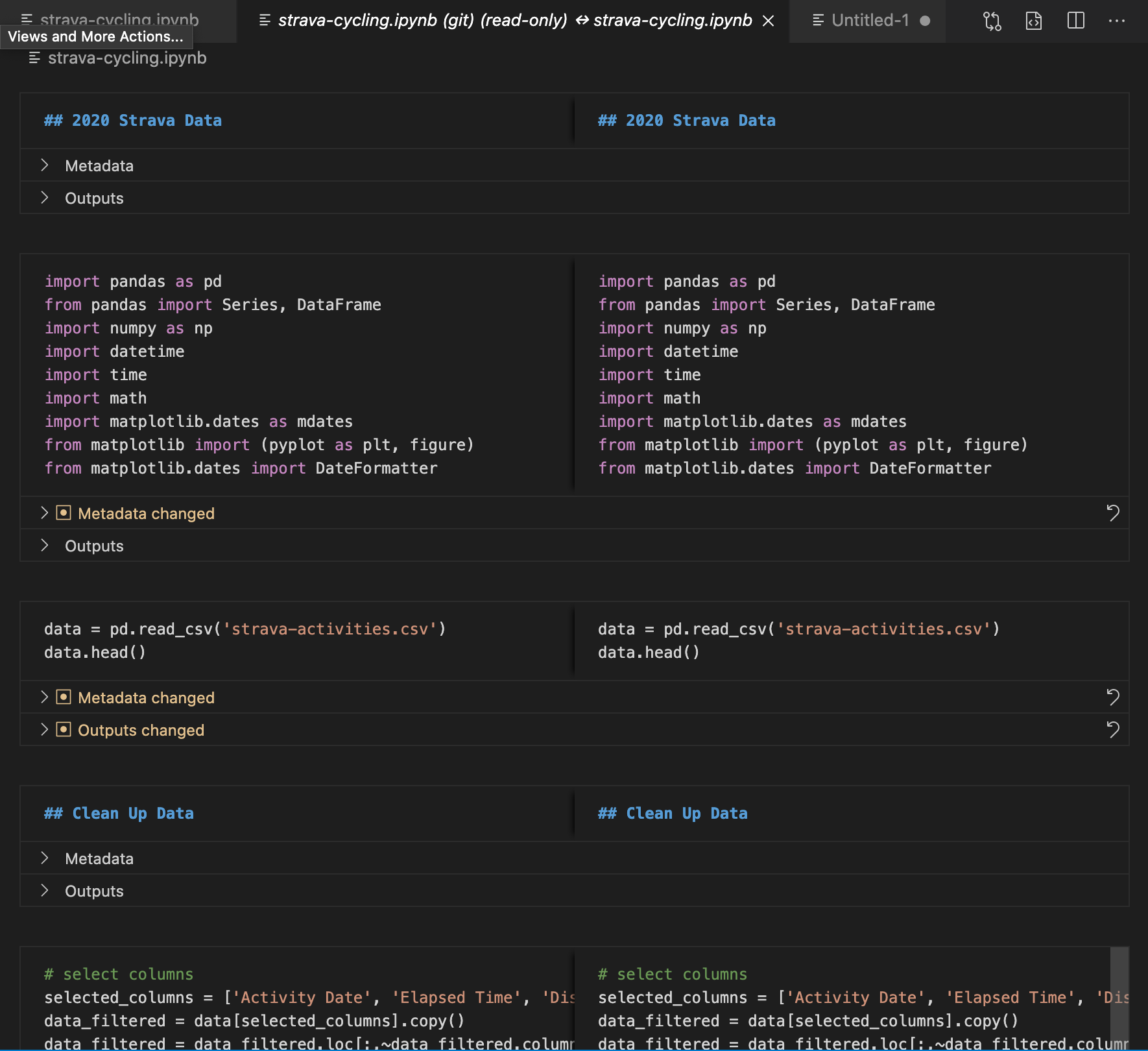
One idea about improving this is using an icon + coloring the text the same color as our modified indicator and collapsing it by default. This gives the user more real estate while still drawing attention to changes. I think we tried something similar before (bold + collapsed) but that didn't seem to provide enough of an indication.
 misolori
All 3 comments
Second this design, this looks great!
- Still keeps the notebook feel
- Prioritizes code comparisons first
- Not as code dense
- Less vertical space taken up
- Bright color + icon makes it hard to miss the indicated changes
- Easy differentiating between start and end of a cell
 claudiaregio
on 25 Sep 2020
claudiaregio
on 25 Sep 2020
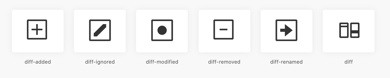
Looks great. One quick question, what is the "dot in square" icon? Confess that I don't quite get what that icon means and it almost looks like an actionable checkbox.
 IanMatthewHuff
on 29 Sep 2020
IanMatthewHuff
on 29 Sep 2020
@IanMatthewHuff it's from our diff icons, they originated from GitHub's icon system:
 misolori
on 29 Sep 2020
misolori
on 29 Sep 2020
Related issues
 trstringer
·
3Comments
trstringer
·
3Comments
 NikosEfthias
·
3Comments
NikosEfthias
·
3Comments
 lukehoban
·
3Comments
lukehoban
·
3Comments
 philipgiuliani
·
3Comments
philipgiuliani
·
3Comments
 chrisdias
·
3Comments
chrisdias
·
3Comments
Most helpful comment
@IanMatthewHuff it's from our
difficons, they originated from GitHub's icon system:Codicons

GitHub Desktop
