Vscode: Move git pull/push back to root menu level.
After latest update (1.48.0) "git push" & "git pull" was added to an extra sub menu:

This buttons is used very often (like 30+ times a day) and I would like to see it back at its original position which were on the root level, if possible.
Thank you!
 steffanhalv
All 24 comments
I need pull/push back too!
臣等复议
 ikrong
on 17 Aug 2020
ikrong
on 17 Aug 2020
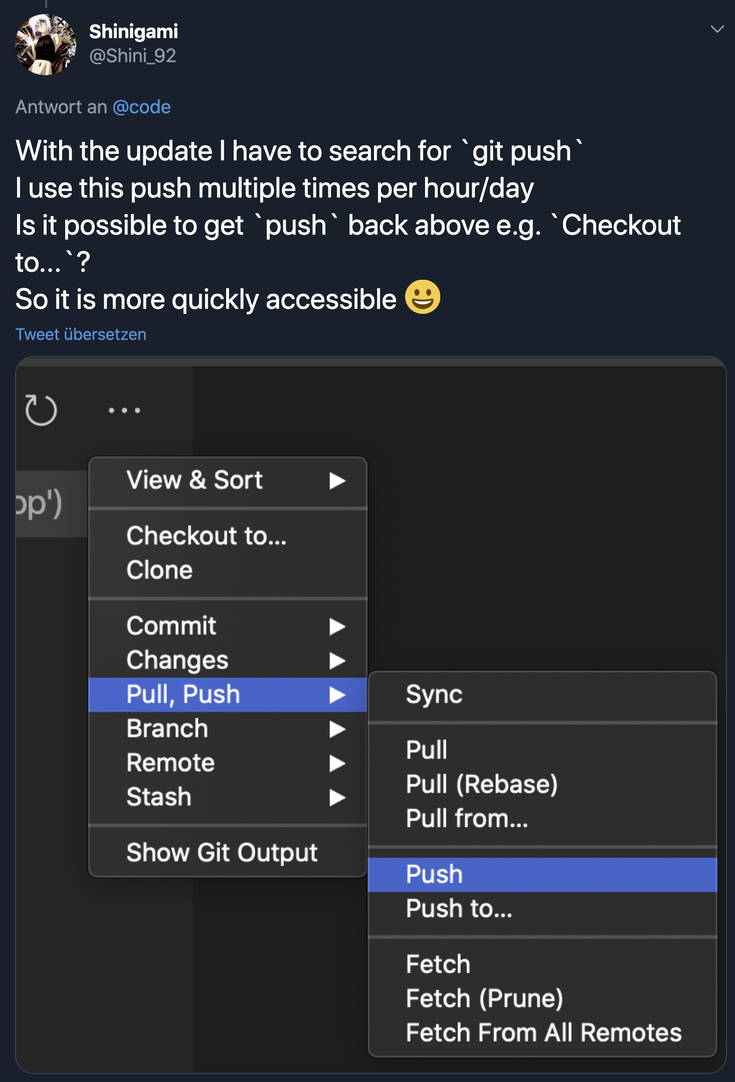
 Shinigami92
on 17 Aug 2020
Shinigami92
on 17 Aug 2020
Related - #102109, #103923
 gjsjohnmurray
on 17 Aug 2020
gjsjohnmurray
on 17 Aug 2020
Would love to see this as well 🙏
Or even moving push/pull out of the overflow menu into the main menu:

Edit: Just realised I can click this icon at the bottom of the pane to pull/push – I feel like this is want I want in 95% of cases so I'll probably just use that going forward 🙌

 wilhelmklopp
on 17 Aug 2020
wilhelmklopp
on 17 Aug 2020
As a workaround I just published a simple extension.
gjsjohnmurray
on 17 Aug 2020
This is a necessary amendment to the bad ui decision. Please make the change!
 ELI7VH
on 17 Aug 2020
ELI7VH
on 17 Aug 2020
@wilhelmklopp the only issue with the sync button is that me (and I am assuming anybody else that used this dropdown, is that we would probably do this:
- click on "Message" text area
- type message, press "ctrl+enter" to commit
- since our mouse is still right by the ... we use the dropdown to quickly push the code.
esp for people like me who have the browser on the right (because I'm weird), now i have to traverse the entire distance of the screen just to hit the sync button.
In most software, the common bottons are in the immediate dropdown menu, this is just a simple expectation in modern software, it makes zero sense to be backwards, ESPECIALLY in software that subtly influences other software by way of exposure during the creation of new software.
Revert this change, not just for us, but for the sake of all humanity.
ELI7VH
on 18 Aug 2020
Would it be possible to have a configuration option which would use either the old menu or the new menu?
 smaglio81
on 18 Aug 2020
smaglio81
on 18 Aug 2020
Would it be possible to have a configuration option which would use either the old menu or the new menu?
This would be my preference. Push is literally the only command from that menu that I even care about (commit is handled with CTRL + Enter for me), but I understand the benefits that some people would see in the new menu system. It's just for me, it's broken my muscle memory without giving me the option to stick with something I had no problem with.
 ChronSyn
on 18 Aug 2020
ChronSyn
on 18 Aug 2020
I would prefer the best of both worlds...
I like the new submenues, but only want back at least push
It seems so, some others here als like pull also
https://marketplace.visualstudio.com/items?itemName=georgejames.gitfavorites
and
https://marketplace.visualstudio.com/items?itemName=tomblind.scm-buttons-vscode
are both good solutions, but I would prefer not to need an extension
Shinigami92
on 18 Aug 2020
As a workaround I just published a simple extension.
The extension does not work, there is no option to push. Only to clone and to checkout.
 phgmacedo
on 18 Aug 2020
phgmacedo
on 18 Aug 2020
Are there any user satisfaction/usability metrics on this feature? Because it seems there's an unusual amount of hate based on the number of duplicates about this improvement @joaomoreno
phgmacedo
on 19 Aug 2020
As a workaround I just published a simple extension.
The extension does not work, there is no option to push. Only to clone and to checkout.
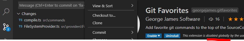
@phgmacedo here's what my menu looks like when that extension is installed and enabled:
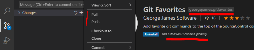
And when that extension is disabled:
gjsjohnmurray
on 19 Aug 2020
Thanks a lot for the feedback. We really appreciate it.
We do want to improve this menu, however we do not want to rush any change in before discussing it in our UX meeting. As a workaround I suggest to use @gjsjohnmurray extension, and we will most likely tackle this already in the next release.
Some feedback from @egamma
- ‘push’, ‘pull’ are bread&butter git operations. I don’t think this is a personal preference. So the minimal proposal would be to only promote ‘push’ and ‘pull’ to the top menu.
- ‘sync’ is available in the status bar and not a pure git operation and it doesn’t have to be in the top menu (it is a very useful command but probably underused action).
- in the standup there was a separate discussion what to do with the toolbar and its actions. Given the past experience I would not remove any existing actions. What would be worthwhile to discuss whether we want to show more actions like ‘sync’ in the view toolbar.
My 2cents:
- Breaking user muscle memory is something which we should stay away from as much as possible, so it would be ideal if the push / pull are brought back in the exact same position
- We should look at telemtry data to make sure there is no 3rd action which is very popular
- Some scm toolbar actions are not that useful and I believe popular, however changing that is always hard. We should check telemetry.
- Candidates to be cut from the toolbar: list / tree view toggle, my intution is that users just press this once, thus it should not be so visible. And it is already under the View & Sort menu
We will start the discussion in today's UX meeting, however I am assigning this to August so we ideally do the change this milestone.
 isidorn
on 19 Aug 2020
isidorn
on 19 Aug 2020
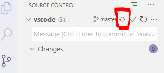
‘sync’ is available in the status bar and not a pure git operation and it doesn’t have to be in the top menu (it is a very useful command but probably underused action).
With "scm.alwaysShowRepositories": true you don't even have to go as far as the status bar to access sync:
gjsjohnmurray
on 19 Aug 2020
‘sync’ is available in the status bar and not a pure git operation and it doesn’t have to be in the top menu (it is a very useful command but probably underused action).
With
"scm.alwaysShowRepositories": trueyou don't even have to go as far as the status bar to access sync:
this is actually incredibly helpful. thank you.
ELI7VH
on 19 Aug 2020
I appreciate @isidorn's thoughtful reply earlier. It made me feel like I could share a few of my thoughts and they might become a part of the consideration process at the next UX meeting.
I actually appreciate having some of the less frequently used commands on the top level menu; not only to be able to easily see all of them, but because I use some of the less popular ones. My top 5 used commands are:
- Pull (Rebase)**
- Push
- Stash (Include untracked)
- Apply latest Stash
- Pull
** = I prefer Pull (Rebase) and would have the global option set if ... I didn't have a bad habit of checking in a change on the wrong branch and then cherry-picking it over to the right branch. A while ago, I read some git documentation that when you merge those cherry-picked updates back into master, you should use Pull instead of Pull (Rebase).
So ... here were some options I thought of:
1. Toggle for Multilevel Menu or Single Level Menu
Maybe in the User Settings there can be a checkbox that would switch the menu to either be single level or multi-level.
2. Multilevel Menu with a Top 5 Most _Recently_ Used Section
Similar to the Git Favorites (simple) extension, but the small section at the top of the menu would be a list your 5 most recently used commands.
3. Multilevel Menu with a Top 5 Most _Frequently_ Used Section
Similar to the Git Favorites (simple) extension, but the small section at the top of the menu would be list your 5 most frequently used commands.
4. Multilevel Menu with configurable Favorites Section
Similar to the Git Favorites (simple) extension, but the small section at the top of the menu would be configurable by users so they can put the commands they want (in the order they want) at the top.
HTH
smaglio81
on 19 Aug 2020
@smaglio81 thanks for the feedback. We will consider it. However that might be tackled with customisable menus which we have on our road map I believe.
The feedback from the UX meeting:
- Most commonly used commands should not be in a submenu (more details bellow)
- The sorting of the Groups in the context menu should be optimised. It is not respecting the old order, and the new order does not feel intuitive. Also maybe move views, view and sort to the bottom.
- Does the Toggle View Mode deserve an entry in the scm toolbar. There was some user backlash when we removed it @misolori might know the issue number. If we remove it, there should be a command to toggle between list and tree.
We have dag into our telemetry and the most used scm context menu actions are (number next to it are just proportions):
- Git Push 293
- Git Pull 187
- Discard All Changes 143
- Push to 80
- Clean all 70
- Stage 60
- Undo Commit 55
- Pull From 54
Due to these number I suggest that Push and Pull get moved back to the top level and that we consider also moving the Discard All Changes.
Thanks @sana-ajani for the numbers
fyi @eamodio
isidorn
on 19 Aug 2020
Here's the related issue for the list/tree toggle discussion https://github.com/microsoft/vscode/issues/102138
 misolori
on 19 Aug 2020
misolori
on 19 Aug 2020
I would like push/pull back into the main menu! At least have most common commands in the first menu.
 JPNZ4
on 20 Aug 2020
JPNZ4
on 20 Aug 2020
@misolori thanks. I am not convinced by #102138 and duplicates and would personaly remove it and add a command. But I leave that decision up to @joaomoreno
isidorn
on 20 Aug 2020
Given the frequency of using Sync, and its previous position at the top level in previous versions of Code, I'd really like the team to reconsider putting it at the top level as well. The scenarios where it is used are just as frequent as push and pull, and the extra cognitive load of hunting around in submenus to find it - and then using precision mouse control to deal with the flyouts - is really frustrating.
The team clearly thought Sync was important enough to put it at the top of the new Push/Pull menu....
As others have pointed out, "always show repositories" at least is a workaround for now to keep me from reverting back to the previous month's build of the IDE, but that's just more rationale to put Sync at the top level of the menu for folks who prefer to not use that option.
 bandrews
on 22 Aug 2020
bandrews
on 22 Aug 2020
@smaglio81 thanks for the feedback. We will consider it. However that might be tackled with customisable menus which we have on our road map I believe.
The feedback from the UX meeting:
- Most commonly used commands should not be in a submenu (more details bellow)
- The sorting of the Groups in the context menu should be optimised. It is not respecting the old order, and the new order does not feel intuitive. Also maybe move views, view and sort to the bottom.
- Does the Toggle View Mode deserve an entry in the scm toolbar. There was some user backlash when we removed it @misolori might know the issue number. If we remove it, there should be a command to toggle between list and tree.
We have dag into our telemetry and the most used scm context menu actions are (number next to it are just proportions):
- Git Push 293
- Git Pull 187
- Discard All Changes 143
- Push to 80
- Clean all 70
- Stage 60
- Undo Commit 55
- Pull From 54
Due to these number I suggest that Push and Pull get moved back to the top level and that we consider also moving the Discard All Changes.
Thanks @sana-ajani for the numbers
fyi @eamodio
Nice!
 danielehrhardt
on 23 Aug 2020
danielehrhardt
on 23 Aug 2020
This submenu is really clumsy. I often just need to "pull", now I'm stuck with windows 95-style menu diving. Sub-menus rarely add clarity or usability, all they do is hide options and make it unclear what is hidden where.
 KokoDoko
on 26 Aug 2020
KokoDoko
on 26 Aug 2020
Related issues
 NikosEfthias
·
3Comments
NikosEfthias
·
3Comments
 sirius1024
·
3Comments
sirius1024
·
3Comments
 lukehoban
·
3Comments
lukehoban
·
3Comments
 omidgolparvar
·
3Comments
omidgolparvar
·
3Comments
 curtw
·
3Comments
curtw
·
3Comments
Most helpful comment
Thanks a lot for the feedback. We really appreciate it.
We do want to improve this menu, however we do not want to rush any change in before discussing it in our UX meeting. As a workaround I suggest to use @gjsjohnmurray extension, and we will most likely tackle this already in the next release.
Some feedback from @egamma
My 2cents:
We will start the discussion in today's UX meeting, however I am assigning this to August so we ideally do the change this milestone.