Sorry for filing such a kitchen sink issue...
Some comments on the current UI:
- We're being too generous in using padding in this view. There is sooooo much whitespace for so little information.
- Indentation looks broken: text editors should be left aligned with paragraphs. I see that we're making space for that
playaction, but why isn't that action simply inside the right side action bar? At best, you could still align the editor with the paragraphs and just outdent the action, just like paragraph twisties are outdented. - There still is no text indentation inside the editors https://github.com/microsoft/vscode/issues/99363
- There is an entire page of whitespace if I scroll all the way down. This makes no sense in a non-text editor view. It feels very weird.
- _Selecting_ a row makes it appear like it _popped out_ of the screen with the eerie shadow
- Why does every cell have a status bar? This takes up so much expensive vertical space and even creates screen cheese (see below). Why not put those actions inside the action bar?


cc @lszomoru @bpasero @misolori
 joaomoreno
All 8 comments
I agree re: whitespace, it's come up in other issues too.
@rebornix do you know which editor setting messes up the editor padding? Even with "editor.glyphMargin": false it's correct for me.
editor.scrollBeyondLastLine controls scrolling past the end of the notebook
Sorry I'm not sure what screen cheese you're talking about in the second image
 roblourens
on 2 Jul 2020
roblourens
on 2 Jul 2020
We're being too generous in using padding in this view. There is sooooo much whitespace for so little information.
We keep seeing this come up and it's for a couple of different reasons:
- Each cell has
8pxof top/bottom padding for when the cell is selected/hovered - Between each cell there is a
32pxtoolbar for adding new cells
So that means that between each cell we have 48px of padding. I think the biggest gain here is to iterate on the new cell toolbar and see if there are ways to reduce that. I'll also tweak the margins on the others where I can.
Indentation looks broken: text editors should be left aligned with paragraphs. I see that we're making space for that play action, but why isn't that action simply inside the right side action bar? At best, you could still align the editor with the paragraphs and just outdent the action, just like paragraph twisties are outdented.
In the previous iterations we had issues with code and text cells being part of the same vertical path and having a hard time telling the difference between them. So in this iteration we decided to indent them to improve the visual hierarchy. We could tweak the margins so that it isn't so large but still keep the indentation.
Selecting a row makes it appear like it popped out of the screen with the eerie shadow
We've gotten mixed reactions to this, some love it and others hate it. You can turn it off by setting "notebook.focusedCellShadow": "#0000".
Why does every cell have a status bar? This takes up so much expensive vertical space and even creates screen cheese (see below). Why not put those actions inside the action bar?
This is an essential part of notebooks to determine how long a cell took to run, the results, errors, and other useful meta data. I agree that this feels a bit much when you haven't ran any cells and I wold like to see us hide this by default and then have it appear when you run a cell. Also, the language picker is only really meaningful until you have multiple languages, so I wonder if we could hide this unless we detect more than once language? @rebornix @roblourens thoughts here?
 misolori
on 2 Jul 2020
misolori
on 2 Jul 2020
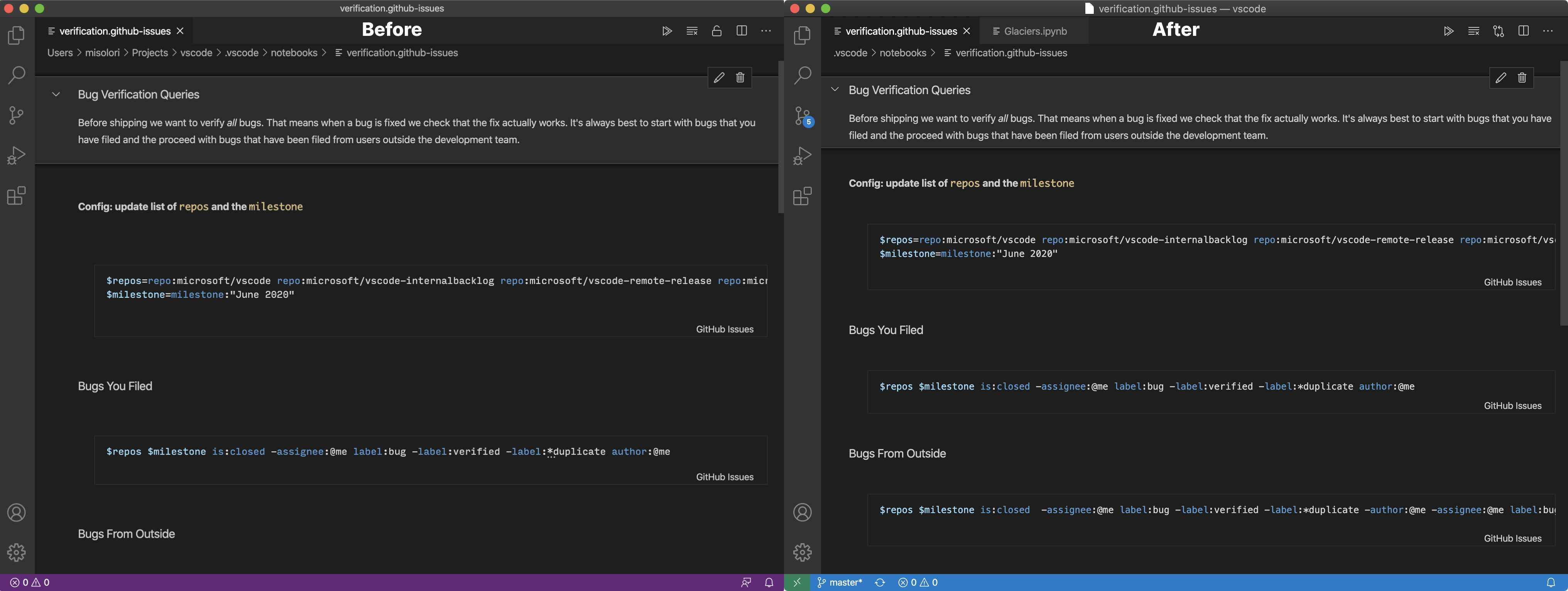
Pushing some updates to address the large amounts of whitespace:
- Reduced left/top/bottom margins and padding
- Made the new cell toolbar a little shorter

misolori
on 2 Jul 2020
Showed this during standup and the team said 👏 how 👏 low 👏 can 👏 you 👏 go 👏 so I trimmed it some more:
misolori
on 2 Jul 2020
editor.scrollBeyondLastLine controls scrolling past the end of the notebook
Again, I really don't think this makes any sense in this editor paradigm. I don't feel like I'm scrolling around the viewport of a document model: I feel like I'm scrolling an actual document, so going past its end resonates really badly in my brain. 🤔 Kind of like scrolling past the last page of a Word document. Or scrolling beyond the end of a web page.
Why does every cell have a status bar? This takes up so much expensive vertical space and even creates screen cheese (see below). Why not put those actions inside the action bar?
This is an essential part of notebooks to determine how long a cell took to run, the results, errors, and other useful meta data.
OK, let's say we need a status bar, no argument there. But let's style it differently. Why does it have to feel like it's a part of the editor? The cheese is the _floating_ horizontal scrollbar, in the animated GIF: it's just there floating around, not docked to any edge. Simply coloring the background of the status bar would do wonders. Even a top border.
I agree that this feels a bit much when you haven't ran any cells and I wold like to see us hide this by default and then have it appear when you run a cell.Also, the language picker is only really meaningful until you have multiple languages, so I wonder if we could hide this unless we detect more than once language? @rebornix @roblourens thoughts here?
👍
Between each cell there is a 32px toolbar for adding new cells
This is clearly something we should push down to under 10px. All we really need here is a 1px horizontal line and a floating action bar, appearing on hover, to the left where the left-padding is.
In the previous iterations we had issues with code and text cells being part of the same vertical path and having a hard time telling the difference between them. So in this iteration we decided to indent them to improve the visual hierarchy. We could tweak the margins so that it isn't so large but still keep the indentation.
I thought they already look so different, given the editor border and font change?
Showed this during standup and the team said
👏 how 👏 low 👏 can 👏 you 👏 go 👏so I trimmed it some more:
🔥, though with the decreased padding, the focus decoration (top and bottom border & shadow) looks even more dramatic. I'd really love to see a non-3D approach here.
joaomoreno
on 3 Jul 2020
Regarding scrolling past the last line, personally I like it, and it matches other notebooks, but it probably makes sense to add a separate setting for it.
roblourens
on 3 Jul 2020
There still is no text indentation inside the editors #99363
Already fixed in master and the root cause is "editor.folding": false ;(
There is an entire page of whitespace if I scroll all the way down. This makes no sense in a non-text editor view. It feels very weird.
We can add a new settings for it. The purposes of supporting this are
- allow you to focus the last cell right in the middle of the screen
- no up/down UI shifting when you execute the last cell or clear outputs of a cell, when the document is smaller than one viewport.
 rebornix
on 6 Jul 2020
rebornix
on 6 Jul 2020
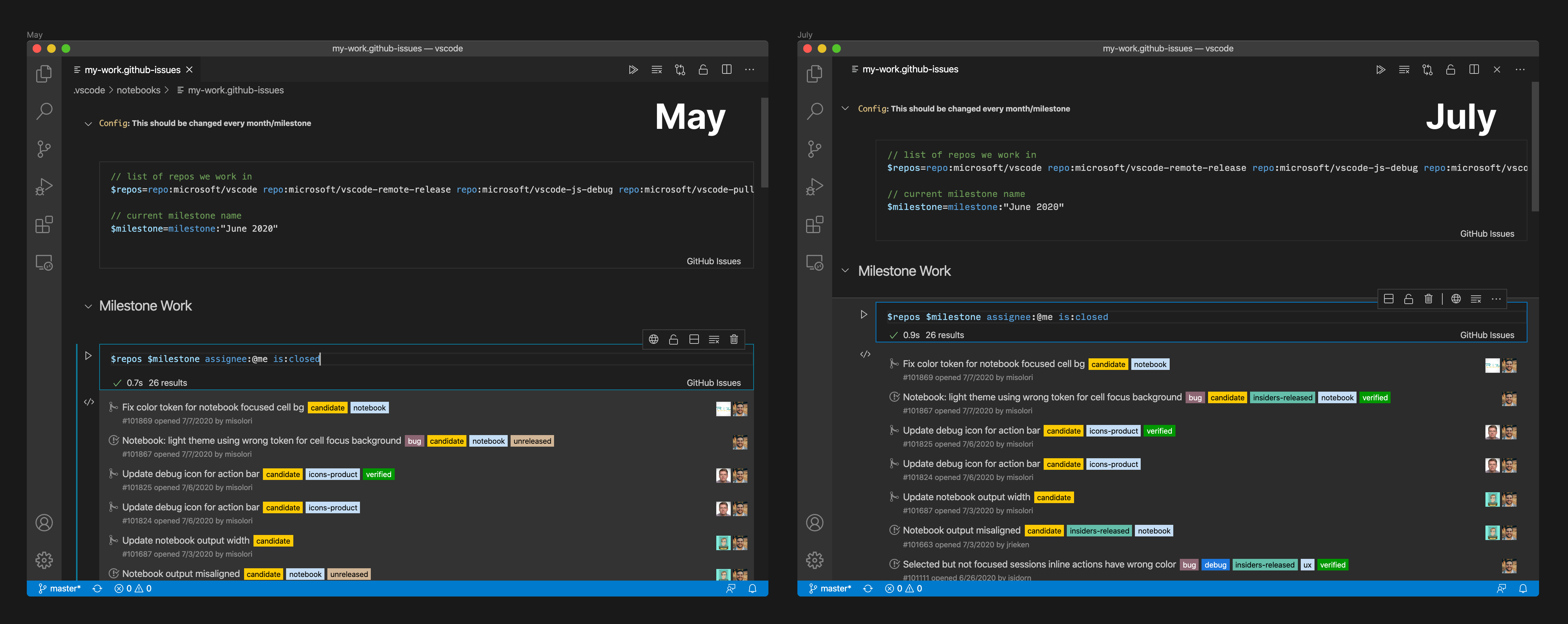
I believe we've addressed most of these issues, below is a comparison from May's release (from when you original postd this) vs July's upcoming release:
- We've removed the shadows
- We've reduced the overall padding/margin
- Adding a new cell is no longer in a 32px bar
If there are additional issues feel free to create one for each one so we can better track them all 😄
misolori
on 3 Aug 2020
Related issues
 philipgiuliani
·
3Comments
philipgiuliani
·
3Comments
 borekb
·
3Comments
borekb
·
3Comments
 DovydasNavickas
·
3Comments
DovydasNavickas
·
3Comments
 biij5698
·
3Comments
biij5698
·
3Comments
 ryan-wong
·
3Comments
ryan-wong
·
3Comments
Most helpful comment
Showed this during standup and the team said
👏 how 👏 low 👏 can 👏 you 👏 go 👏so I trimmed it some more: