Vscode: Icon change for macOS Big Sur
macOS Big Sur brings macOS' system icons all with square corners, and some 3rd party developers including Adobe are converting their app icons to match up with these system icons.
Are there any plans for VS Code?

 ardacebi
All 27 comments
I second this. It's not like all 3rd party apps will adopt the new icon style overnight, but after a while the ones that haven't will start to stick out like a sore thumb.
 jessety
on 28 Jun 2020
jessety
on 28 Jun 2020
@jessety The release of the developer betas are meant for changes like these. Until September/October, most likely most/all apps will already be using the new shape. And as you said, the ones that aren't will stick out.
Design-wise, this is a really bad practice. An example would be:

A similar situation will happen to all apps when Big Sur is released, this time with circle and freeform icons.
ardacebi
on 28 Jun 2020
The old macOS icon proposal might be well suited for this change (but in a square shape instead of the hexagon).

 ruwenhoeltge
on 6 Jul 2020
ruwenhoeltge
on 6 Jul 2020
Perhaps something like one of these?
| | | |
|:-------------------------:|:-------------------------:|:-------------------------:|
|
Light | 
Light Bordered | 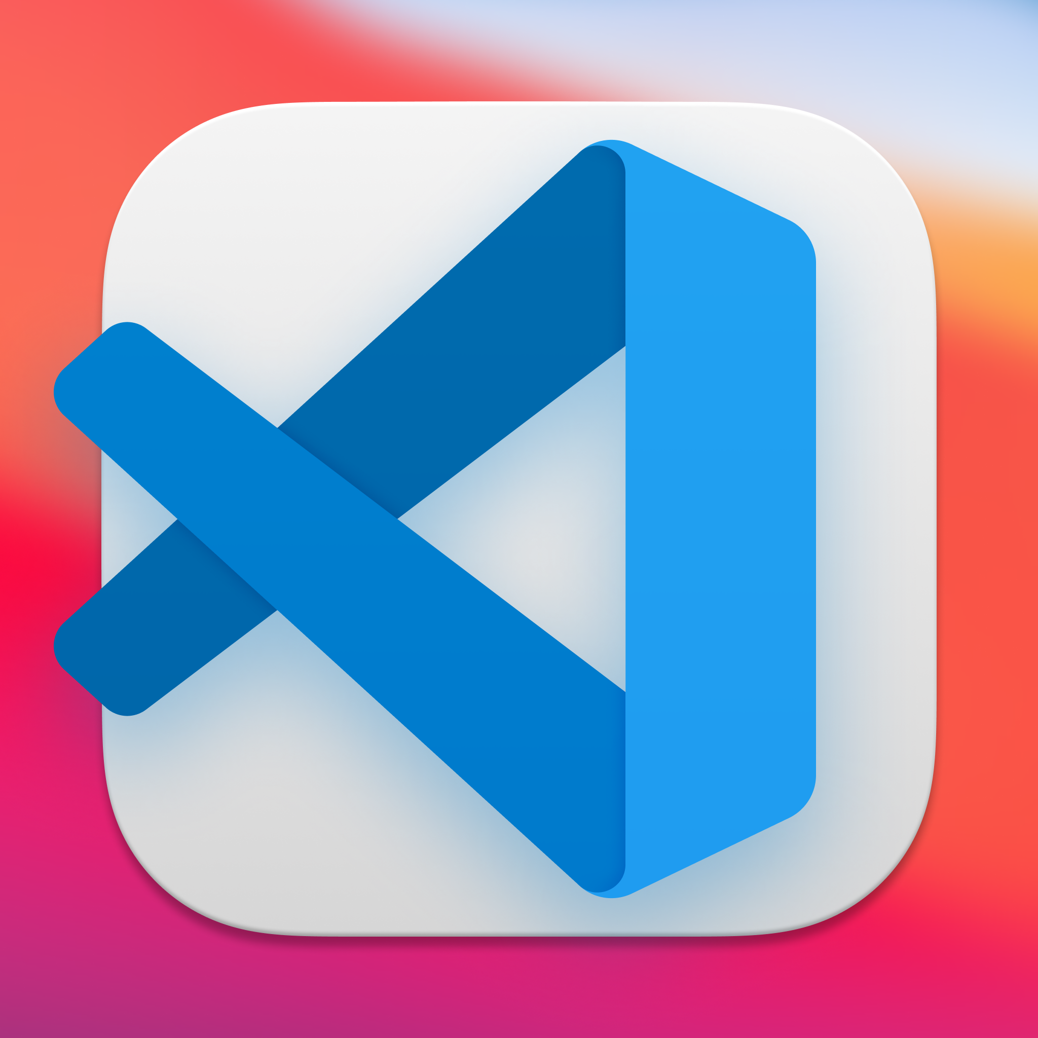
Light Overhang |
|
Dark | 
Dark Bordered | 
Dark Overhang |
This may be a separate issue but I think it might be nice to change the icon according to the theme you have installed. The light version would be used for light themes and the dark for dark themes. The color of the logo could be influenced by the primary color of the theme, and the background of the icon could be influenced by the background color of the theme.
EDIT
For those interested, I've done more icons. You can download them here.
 austincondiff
on 6 Jul 2020
austincondiff
on 6 Jul 2020
Well, I think adaption to the current theme might be way better suited for an extension. The blue logo simply is a part of VSCode’s branding and shouldn’t be changed by default. Other than that it would make it way harder to differentiate between the Stable version and the Insiders build, if you do use both with the same Theme. Also I’d say that it theoretically would make more sense to switch between the light and dark version depending on the OS setting, but even that would be unexpected behaviour as Apple’s own ions don’t do that as well.
But other than that, I sure do like the standard and the Bordered Icons. The Overhang versions seem unbalanced to me though.
ruwenhoeltge
on 7 Jul 2020
Check out this, I made some icons 2 weeks ago
https://github.com/mohouyizme/vscode-big-sur-icons

 mohouyizme
on 9 Jul 2020
mohouyizme
on 9 Jul 2020
@mohouyizme These are nice, but a shadow for the new look would be better in my opinion. See @austincondiff's icons.
ardacebi
on 9 Jul 2020
@ardacebi yes I agree, I did that on purpose, I tried to keep it simple without affecting the identity of the logo, maybe adding a shadows version will be good.
I don’t think shadows are a standard thing or I’m wrong?
mohouyizme
on 9 Jul 2020
@mohouyizme shadows are a huge part of the neumorphism technique Apple is following in their Big Sur icons. It is however debatable whether or not every third-party icon needs to adopt it. I think it is always good to be consistent while adhering to brand standards.
austincondiff
on 9 Jul 2020
Check out this, I made some icons 2 weeks ago
https://github.com/mohouyizme/vscode-big-sur-icons
This is beautiful. Thanks mate.
 imkarthikk
on 24 Jul 2020
imkarthikk
on 24 Jul 2020
With the macOS Public Beta getting out, this is getting more important. Do we have any updates regarding this?
ardacebi
on 10 Aug 2020
I agree with @ardacebi. Does someone need to submit a PR for this or can a current maintainer pull one of these options in?
austincondiff
on 10 Aug 2020
Hi @austincondiff,
Thanks mate, I love the icons!
Just 1 comment re:
change the icon according to the theme you have installed
I'd rather have an option in settings to do that. The reason is: I use dark themes everywhere and a very dark wallpaper.
If the dark icon would show up on that - the dark plate of the icon would blend with the background, e.g. like plex does currently:

So, using dark theme, I prefer the icons to have more contrast.
Same as on iOS - a lot of icons use white plate, and more apps allow you to change your icon now.
 tborychowski
on 21 Aug 2020
tborychowski
on 21 Aug 2020
@tborychowski https://macosicons.com
I completely agree though!
austincondiff
on 21 Aug 2020
Big Sur is about to come out... @sandy081 thoughts?
 jpike88
on 2 Sep 2020
jpike88
on 2 Sep 2020
Here's another choice...

austincondiff
on 11 Nov 2020
Thanks @austincondiff that looks fantastic on my dock!
Here's the icns version: vscode.icns.zip
and the script for lazy people like me 😄
sudo cp "~/Desktop/vscode.icns" "/Applications/Visual Studio Code.app/Contents/Resources/Code.icns"
sudo touch "/Applications/Visual Studio Code.app"
killall Finder && killall Dock
Love this @austincondiff!
 jdsimcoe
on 11 Nov 2020
jdsimcoe
on 11 Nov 2020
Those mockups look really fantastic @austincondiff - would love to see some form of icon update now that we're at a general release, but am sure there's a ton of stuff on the devs plate atm :)
 MiddsAU
on 14 Nov 2020
MiddsAU
on 14 Nov 2020
could even go extra fancy and do something like this https://github.com/rrroyal/AutomaticDockTile
 Stanzilla
on 14 Nov 2020
Stanzilla
on 14 Nov 2020
Perhaps something like one of these?
Light
Light Bordered
Light Overhang
Dark
Dark Bordered
Dark Overhang
This may be a separate issue but I think it might be nice to change the icon according to the theme you have installed. The light version would be used for light themes and the dark for dark themes. The color of the logo could be influenced by the primary color of the theme, and the background of the icon could be influenced by the background color of the theme.EDIT
For those interested, I've done more icons. You can download them here.
Hi!
Great work!
Is there a way to download these? Also the same icons for Visual Studio (NOT code) would be great too.
Thanks.
 kristof12345
on 16 Nov 2020
kristof12345
on 16 Nov 2020
@kristof12345 have a look here: https://macosicons.com/
tborychowski
on 16 Nov 2020
@tborychowski Thank. Already checked it, there are hundreds of great icons, but not all of the above shown are there.
kristof12345
on 16 Nov 2020
Here's another choice...
Wow, this looks great, is it available as a .icns?
 rben01
on 17 Nov 2020
rben01
on 17 Nov 2020
I agree that the icon should be updated to match. I am really liking some of the mockups. Especially:

and

 rctneil
on 17 Nov 2020
rctneil
on 17 Nov 2020
Agreed. I don’t think a light icon is a good idea because it’s too similar to many other Big Sur icons (so it’s easily confused). Additionally, I don’t tend to associate light colours with VS Code, since the default colour scheme is dark.
 arzg
on 18 Nov 2020
arzg
on 18 Nov 2020
Here's another choice...
I prefer this one. The other ones are either light or dark themed, but this one works with both light and dark macOS themes.
Only thing is it should probably have less shadow to match the other macOS icons.
 gavin310
on 18 Nov 2020
gavin310
on 18 Nov 2020
Related issues
 sirius1024
·
3Comments
sirius1024
·
3Comments
 villiv
·
3Comments
villiv
·
3Comments
 trstringer
·
3Comments
trstringer
·
3Comments
 vsccarl
·
3Comments
vsccarl
·
3Comments
 borekb
·
3Comments
borekb
·
3Comments
Most helpful comment
Perhaps something like one of these?


| | | |
|:-------------------------:|:-------------------------:|:-------------------------:|
|
Light |
Light Bordered |
Light Overhang |
|
Dark |
Dark Bordered |
Dark Overhang |
This may be a separate issue but I think it might be nice to change the icon according to the theme you have installed. The light version would be used for light themes and the dark for dark themes. The color of the logo could be influenced by the primary color of the theme, and the background of the icon could be influenced by the background color of the theme.
EDIT
For those interested, I've done more icons. You can download them here.