Vscode: Pinned tabs: add a setting to show more context
Refs: https://github.com/microsoft/vscode/issues/12622
Today pinned tabs shrink to only their icon (38px). Having many pinned tabs open it is harder to tell each apart and as such a setting could be added to either show parts of the file name or the entire tab without shrinking it or maybe show a rich hover with more details once you hover over a pinned tab.
Today we do this:

Visual Studio for example seems to always show the full tab:

//cc @misolori
 bpasero
All 58 comments
I'd like this implemented and here's why:
On average I have between 4 to 6 pinned tab open, usually of the same file type, so having only the icon displayed is not helping in navigating efficiently between them. Having only the icon for 6 cs or js open files makes it hard.
There could be an option like "tab.maxfilenamecharsize" to decide if we want to cut the name of the file if it's too long (without "..."), with a popup when you hover over the tab to display the fullname.
 yannlairdc
on 20 May 2020
yannlairdc
on 20 May 2020
This would definitely be very helpful, especially when the pinned tabs all have the same file extension, and therefore the same icon, then it's a bit of guesswork to click on the right pinned tab you're wanting to open.
 uicrafts
on 10 Jun 2020
uicrafts
on 10 Jun 2020
It would be nice to have the name of the file on a pinned tab. As the others said, files with the same extension would look the same as pinned tabs. I think this should be an option since people may like the way it is today.
Additionally, I have some suggestions:
- replace the close icon (X) by a toggable pin icon when it's pinned
- or add a togglable pin icon next to the close icon that is visible only when you have the mouse over the tab (to avoid too much cluttering)
- or add an area on the top of the tab that when clicked it lights up and toggles the pin state. Pinned tabs would have this area lit (similar to
tab.activeBorderTopcolor) - or add a click area on the tab icon to toggle pin state, but this might lead to missclickings and some users don't use icons)
 kleber-swf
on 11 Jun 2020
kleber-swf
on 11 Jun 2020
I'd love to see this, with one addition. Showing the file name should be depending on the number of pinned tabs of the same type. For instance, my projects only hold a single package.json or Makefile, but multiple ts files. Showing the name of the Makefile would be waste of space, showing the name of ts files would be required to make pinned tabs distinguishable.
 udondan
on 11 Jun 2020
udondan
on 11 Jun 2020
pined tabs related to the active branch
I like this implementation, and I would like if we can have option to show pined tabs related to the active branch, cause in daily work example, you would open a ticket or basically a branch and you need all files related to this branch to be open like the last time you edit the files, so when you switch between different branches, the pin tabs will change accordingly, which is really convenient,
Like if you agree with me 👍
 Samk13
on 11 Jun 2020
Samk13
on 11 Jun 2020
Totally agree on adding more context to the pinned tabs. Especially when you're pinning multiple files of the same file type.
I also like the second row idea too #98160
How about an additional configurable option to show a tooltip on hover displaying just the filename? It has to pop-out the tooltip immediately without lag for efficient inspection.

 Sayvai
on 11 Jun 2020
Sayvai
on 11 Jun 2020
I also would like to see more context to the tab. In Chrome I don't mind that only the icon displays, because typically each site has its own unique icon.
But for a source code project, the file icon itself doesn't provide much ID, and I'm very likely to have multiple of the same file type pinned.
I also use Visual Studio and pinned tabs, seeing the filename is essential in that workflow. I some times have so many tabs open that they span the width of the window - because I end up switching between even larger amount of files regularly. In that case the multiple-row tabs of VS really helps. So I think #98160 goes hand in hand with this issue.
In fact, I wouldn't mind if there was an option such that only pinned tab displayed in the tab bar. (Along with the active file so it too can be pinned easily.)
 thomthom
on 11 Jun 2020
thomthom
on 11 Jun 2020
Totally unusable pinning at the moment. You probably tried to copy chrome behavior but the result is total mess.
I do not see if the file is changed or not, I don't even know what file it is. It needs to be done as in the full visual studio. To see file name and also if the file is changed or not. To pin tab does not mean it should shrink. It can be even longer, it doesn't matter if it stays where it is.
 JanBN
on 11 Jun 2020
JanBN
on 11 Jun 2020
Totally unusable pinning at the moment. You probably tried to copy chrome behavior but the result is total mess.
I do not see if the file is changed or not, I don't even know what file it is. It needs to be done as in the full visual studio. To see file name and also if the file is changed or not. To pin tab does not mean it should shrink. It can be even longer, it doesn't matter if it stays where it is.
WithIn the release notes for 1.46, it states you need to set the following flag to visualise any file changes to pinned tabs.
workbench.editor.highlightModifiedTabs: true
It seems like the main issue this thread is trying to sort out is finding the right compromise between making pinned tabs narrow and informative. I think one method that could be helpful, if a bit out of left field, is using a separate custom icon for each pinned tab. Similar to how sites like GitHub and StackOverflow create simple yet distinctive icons for users without profile pictures, VSCode could create custom icons for pinned tabs based on, say, the file's absolute path. While initially these icons would provide no information to users, once you had had the tabs open for a while, you would quickly learn which icon was associated with each file. And each newly pinned file would only require learning one new icon. Coupled with @Sayvai's suggestion to implement a popup when hovering over pinned tabs (which is a good idea separate from this idea), you would have the tab's info available on demand by hovering over it, yet the tab would only take up the width of one (informative) icon.
I'm not a designer or psychologist, but I believe humans are pretty good at quickly recognizing pictures, so even though it's a bit whacky I think this idea has merit. Here's an example of what it would look like using my GitHub profile picture as a pinned tab icon:

 rben01
on 12 Jun 2020
rben01
on 12 Jun 2020
WithIn the release notes for 1.46, it states you need to set the following flag to visualise any file changes to pinned tabs.
workbench.editor.highlightModifiedTabs: true
Not true. It shows the dot in the top bar only, if the tab is active. So unusable.
JanBN
on 12 Jun 2020
Perhaps the pinned tabs could be listed in an optionally-displayed panel. The panel would indicate file name and type ( by icon ) and allow pinned tab management, including the ability to add a 'friendly' name for the tab.
 chaeronius
on 12 Jun 2020
chaeronius
on 12 Jun 2020
This is all wrong. It should be clear what pinned tab means. In my opinion it does not mean shrink-ed tab. It means that it stays there and is always visible. So start small, just add there icon of a pin to indicate that it is a pinned tab and let it have full length. Why do you mix pining tab with shrinking tabs. If you want to shrink tabs, add another feature and call it shrink tab, or whatever. I do not mind full length of pinned tabs, I do not mind if pinned tabs would be even longer because of icon of pin. If it does what is says it does and does it well.
Because now you have mixed two features that has nothing in common and the result is mess.
JanBN
on 12 Jun 2020
WithIn the release notes for 1.46, it states you need to set the following flag to visualise any file changes to pinned tabs.
workbench.editor.highlightModifiedTabs: trueNot true. It shows the dot in the top bar only, if the tab is active. So unusable.
It's working as intended. There's the additional coloured top-border to the modified tabs, on both active and inactive tabs, pinned and unpinned tabs.

Sayvai
on 12 Jun 2020
It's working as intended. There's the additional coloured top-border to the modified tabs, on both active and inactive tabs, pinned and unpinned tabs.
Oh sorry, my bad. You are right. It is just so subtle that I didn't notice it. Thank you
JanBN
on 12 Jun 2020
This is all wrong. It should be clear what pinned tab means. In my opinion it does not mean shrink-ed tab. It means that it stays there and is always visible. So start small, just add there icon of a pin to indicate that it is a pinned tab and let it have full length. Why do you mix pining tab with shrinking tabs. If you want to shrink tabs, add another feature and call it shrink tab, or whatever. I do not mind full length of pinned tabs, I do not mind if pinned tabs would be even longer because of icon of pin. If it does what is says it does and does it well.
Because now you have mixed two features that has nothing in common and the result is mess.
Based on your idea around using pin icons. I think that would be much better, while maintaining context.
See the proposed mockup solution below using pins.

UPDATED: Ah, i don't know how i missed it, but i just noticed the concept of pins was also added to the description of this issue. It's a screenshot of the current Visual Studio IDE solution which is more subtle. Nevertheless, it looks like the idea of pins is already a serious contender 🙂
Sayvai
on 12 Jun 2020
I think there a debat between size and meaning of the tab, I guess this could easilly be an option.
I usually like pinned tabs to be small but this is just my taste.
The annoying thing is to not be able to distiguish between each others and for this I would suggest the VSCode leave the choice to the user (I am a fan of this :) ) meaning that for pinned tabs the user would have the option to pick an icon or a simple color in order to easilly identify small tabs.
 sgandon
on 12 Jun 2020
sgandon
on 12 Jun 2020
Please enable that dirty dot when there's edited content. E.g. I don't like to enable tab highlights workbench.editor.highlightModifiedTabs: true. So, now I have no info if my pinned tabs have dirty edited content or not. Having the same dirty circle like the one below will go a long way.

 ahmadawais
on 15 Jun 2020
ahmadawais
on 15 Jun 2020
Having the option to show the name would make this feature considerably more useful.
Collapsing to an icon is fine for a web browser as each site is likely to have its own easily-identifiable favicon, but that context doesn't apply to the text editing domain where files are classified and assigned icons by their type.
Chances are if I'm pinning tabs in a code workspace, they're all going to be in the same language barring edge-cases like root-level configuration files. At that point, the Open Editors section of the Explorer sidebar is the only way to properly identify them, making this feature somewhat redundant outside of ensuring any pins will live at the top of that list.
 Shfty
on 16 Jun 2020
Shfty
on 16 Jun 2020
For my use case, I'm not likely to pin a large number of tabs most of the time, and those I do might be pinned across side-by-side panels, such as a file on the left and its tests on the right.
In this circumstance, it would probably work well to collapse pinned tabs if there's only one pinned of a given type, but show the name if there are multiple. If the number of pinned tabs exceeds three or four, then splitting into separate rows makes sense. By default, this could all be automatic.
 Trillinon
on 16 Jun 2020
Trillinon
on 16 Jun 2020
Love this Pinned tabs idea, but the "dot" or dirty dot should appear always by default. So the default behavior should be workbench.editor.highlightModifiedTabs: true. and not workbench.editor.highlightModifiedTabs: false.
 vicmarcal
on 18 Jun 2020
vicmarcal
on 18 Jun 2020
This is a great feature. Thanks for it. I would prefer to have an option to show the file name or not. If I pin multiple javascript or same type of files. It shows only icons but it's difficult to remember the file names.
Thanks
 sucom
on 19 Jun 2020
sucom
on 19 Jun 2020
This is also relevant for the "workbench.editor.showIcons": false, option, which results in the following when pinning:

The files here are:
- index.mdx
- index.mdx (different folder)
- package.json
- .prettierrc
If you hover long enough over the tabs (default tooltip hover duration - which is way too long), the full path to the files is shown, but maybe there's a better option.
 karlhorky
on 20 Jun 2020
karlhorky
on 20 Jun 2020
Would be great to at least be able to reduce the popover delay for pinned tabs, or even have them show up instantly on hover.
 tylerlu94
on 30 Jun 2020
tylerlu94
on 30 Jun 2020
Some of the design decisions in VSCode I find are pretty weird. The point of a 'pinned' tab is to have a tab there that's always visible that you could reliably go back to, it's buffer that you're constantly working on. Not showing the name and just showing an icon defeats the whole purpose...
 TTAliA
on 15 Jul 2020
TTAliA
on 15 Jul 2020
A while back I implemented a makeshift solution to this problem, HardPin.
HardPin is now obsolete, since pinning tabs is currently possible, but could perhaps be used as inspiration for this feature.
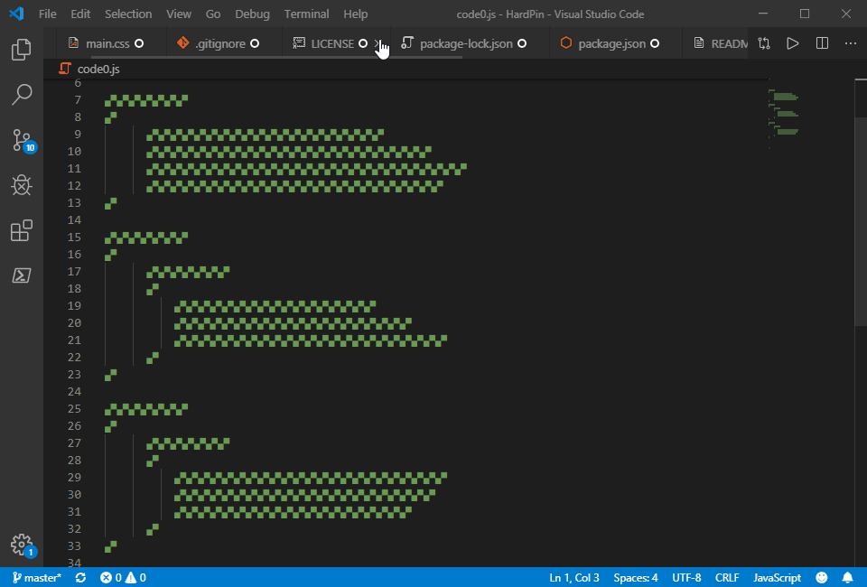
GitHub repository:
https://github.com/Acmion/HardPin
 Acmion
on 20 Jul 2020
Acmion
on 20 Jul 2020
The difference from Chrome/FF user experience in VS Code is that here we have much more information in tab info rather than just title in browsers.
Like, why do we lose our changes/preview mode info and pathes just because we want to pin tabs? Moreover, decision to show only file extension icon is pretty weird -- of course I have 5 or 6 .js files if I code in JavaScript or 10 .py files if I code in Python
Would be super happy to see this fix asap! 💙
upd. also behaviour on tabs horizontal scroll when some tabs are pinned is pretty disguisting

 Alveona
on 30 Jul 2020
Alveona
on 30 Jul 2020
@Alveona that should not happen and sounds like a bug that you can maybe report as new issue with reproducible steps (I cannot reproduce when I tried just now).
The solution presented by Acmion is a good start and if someone wants to give it a stab via PR, be my guest. However there are a couple of constraints to consider before starting:
- I (personally) am not a big fan of how pinned tabs appear with another icon next to the close button, so I would like to ask for a design proposal first that we can agree on also in the team. Ideally this proposal preserves the lightweight nature of tabs and does not add too much UI overhead.
- Implementing the scroll-under feature was quite easy for my solution that uses fixed tab widths once a tab is pinned, but will be more challenging once tabs have dynamic width (the reason is my use of
position: stickyfor pinned tabs) - ideally the solution should also work when tabs are disabled given the request in https://github.com/microsoft/vscode/issues/100211 (e.g. if we find a visual indication that works, it could be used in case tabs are disabled as well maybe)
- there is a ton of tab related settings (tab button on/off, tab button left/right) and tab related theming that needs to be tested for regressions
bpasero
on 12 Aug 2020
I would absolutely love it if there was an option to display the name on the pinned tab menu! I just discovered this feature 20 minutes ago and it is fantastic! however, I immediately started having difficulty differentiating between different files. When doing large feature work, I tend to have at least 6-7 core files open at all times and being able to keep them from closing is a huge win!
Here are some ideas that would help me differentiate:
- Show the display name (even if it's the last 10 characters or something. I would be on board with having the name not include the path like it usually does when multiple files are open with the same name)
- Add some option to color code. This wouldn't be perfect, but it would at least allow me to differentiate files by color
Here's some examples (Used the vscode dev tools to hack some stuff together):
1: (the hidden file is authActions.js)

2: (Colors with text)

3: (Just Colors)

FYI: I am not a designer. I just pulled colors from https://paletton.com and used the normal dark color to find other options. Sorry if they are a bit hard to see
 provAlexSage
on 25 Aug 2020
provAlexSage
on 25 Aug 2020
I'm very happy with the fact that we now have pinned tabs in VS Code. It's a critical feature. But reducing a pinned tab to simply its icon is not exactly taking advantage of this feature. Personally, I'd add a setting to control how many characters should be displayed in a pinned tab (first 10 for example) or a way to add a colored marker to it (colored dot).
 mihaibrana
on 26 Aug 2020
mihaibrana
on 26 Aug 2020
Oh, and one more thing, as this insight may be useful to somebody in the team: the reason I use pinned tabs is NOT to save space. I use them so that I can CLOSE OTHERS. Basically, for me, pinned tabs is a way to make sure that I have the critical files open, and regularly clean-up the other tabs :).
So, in this case, having the tabs shortened to an icon is counter-productive. The only thing necessary for pinned tabs in my personal use case is that they do NOT close when I do "close others" (which has been achieved, hooray), and that they have a visual indicator that they are pinned (like a pin icon).
mihaibrana
on 26 Aug 2020
Oh, and one more thing, as this insight may be useful to somebody in the team: the reason I use pinned tabs is NOT to save space. I use them so that I can CLOSE OTHERS. Basically, for me, pinned tabs is a way to make sure that I have the critical files open, and regularly clean-up the other tabs :).
Yeah that is good feedback. A very easy solution to this would be to simply show tabs normally but moved all the way to the left and keeping the semantics of not getting closed. However one advantage of the compact presentation of a pinned tab is the indication it has that it is pinned. If tabs simply moved to the left but show as normal, how would the user understand that the tab is pinned?
bpasero
on 26 Aug 2020
Thanks for answering :). That's why I mentioned the pinned indicator (the icon). Since VS Code already has the "changed" indicator, I guess the functionality is there to add an icon on the tab for when the tab is pinned :). It's common visual language.
I'd see this feature making the most of its bang by:
- having an option to show the full title (or restrict to a number of characters if the developers feel generous with their time)
- having an option to show the pinned indicator
Mixing these two options as developers see fit will allow a greater degree of freedom and coverage for the feature. Even so, I'm very happy it's here :D.
mihaibrana
on 26 Aug 2020
I am still searching for a design that works nicely without adding clutter (see https://github.com/microsoft/vscode/issues/98161#issuecomment-672945544). Showing both close-button and pinned-icon, possibly also dirty-icon does not really work well for me.
bpasero
on 26 Aug 2020
Pin could double as close. User went through the "effort" of pinning a tab, might as well double click to close it (one click transforms the pin icon into a close button, since the tab is not pinned anymore; another click closes it [if you even have close buttons enabled]).
And for those using hotkeys (such as myself), it's a non-issue (I autosave; pin & close with keyboard, so it would only be the pin icon).
I'd say even the cluttering aspect is sort of acceptable when we take into account that many developers are very into functionality rather than looks. If you intersect this demographic with their demands, you'd probably see that most developers that crave for functionality will gladly sacrifice it over looks. I've seen some Visual Studio extensions that add a zillion buttons and markers :). They were quite popular too! But sure, I'm aware you don't want VS Code to look like the kitchen sink ;)
mihaibrana
on 26 Aug 2020
@mihaibrana to clarify you suggest to replace the close icon with a pin icon and in order to close the tab you click the pin icon first to unpin and then click the close button to close?
And if that is your suggestion, would the pin icon go away and make room for the dirty icon (because currently the dirty icon makes the close icon hide unless you hover).
bpasero
on 26 Aug 2020
Yes, by overlapping PIN/CLOSE we'd be reducing the number of indicators to a maximum of 2 / tab, which I think strikes a balance between cluttered/functional and the elegance of the editor.
It's up to debate if the dirty indicator should hide the close button. Admittedly, nobody necessarily needs to see the close button until actually pressing it. But it would look confusing for modified/unmodified tabs; some with close buttons, some with dirty indicators. On the other hand, it could be said that if a tab is dirty, it needs to be saved, not closed, or rather that closing it will have side-effects such as a confirmation prompt. But for consistency I'd say the dirty icon should always be there for those that use it.
One other suggestion would be to move the dirty indicator at the beginning (left) of the tab. It's a non-functional visual element after all. I think this would make logical sense (to the point it would just click with people), since you'd have functional elements on the right, visual indicators on the left (where the file type icon is as well).
mihaibrana
on 26 Aug 2020
To go a bit more into detail:
- a tab only shows the close button if it is active
- a tab will show the dirty indicator if active or inactive at the place of the close button

The rationale is that dirty state comes and goes very frequently by the user typing, so the transition from non-dirty to dirty should e.g. not change the size of the tab as that would be very hectic. We have conditions where this occurs, e.g. when you have the close button disabled in settings, but that is not the default look.
I would like for pinned tabs to behave similar and not result in a too drastic visual difference compared to normal tabs.
bpasero
on 26 Aug 2020
Indeed, I have the close button disabled :). Forgot it doesn't show on every tab. I've reverted to default settings. So given this, we would have a maximum of 2 icons on any tab in any situation, which I personally think is quite fine.
But, as an alternative solution, perhaps the pinned indicator could be altering the tab aspect in some way, such as darkening it or, more theme-agnostic, having a solid border around the file icon. A modern aspect could be achieved by bordering just two sides of the file icon (left and top for example).

mihaibrana
on 26 Aug 2020
Thanks, those suggestions go into the right direction of not introducing too many new concepts. I am open to more suggestions. Color may not be the obvious thing for transporting the message that a tab is pinned though.
Another idea I had was to make the tab title bold, but then this probably means the size of the tab would change depending on being pinned or not.
bpasero
on 26 Aug 2020
As I was editing my message, I also thought of bold as a possible way. But that won't work when users choose to remove all text from their tabs (if the current behavior remains an option).
Regarding tab size change: this isn't the same case as dirty indicator right? Pinning tabs isn't nearly as frequent.
One last suggestion (hopefully :), and thank you for the generous conversation!) would be to separate pinned tabs from the other tabs by a gentle marker, or a 5 pixel difference. That would remove all need for icons/colors/markers :).

Or, more likely...

mihaibrana
on 26 Aug 2020
Yeah that is another good idea, however might not work very well if you have e.g. 20 tabs open and 10 of them are pinned and consume quite a bit of horizontal space and as such this separator might easily be missed.
One of the reasons I chose the compact form for pinned tabs is that you can see many even if you have many tabs opened in general.
VS solves this by always ensuring pinned tabs are visible, i.e. the tab-scroll-widget shows multiple rows to ensure pinned tabs are always visible. That solution would be discussed in https://github.com/microsoft/vscode/issues/98160
bpasero
on 26 Aug 2020
What can I say, this is a nice UX chess match :D.
The separator could be blinking between 0, 255, 0 and 255, 0, 0. Check-mate ;). Seriously though, the separator could be made of an inverted color from the rest of the tab bar (to make it theme-agnostic).
I like the second tab bar suggestion. I would like it even more if VS Code would offer something that JetBrains have been offering with their IDEs for ages: a vertical tab bar. That would just make me scream with joy one day (I know there's a fidgety market extension for this).
mihaibrana
on 26 Aug 2020
Not hiding the file name is a simple and common approach, maybe place pinned tabs above unpinned tabs just like VS

 Steveiwonder
on 28 Aug 2020
Steveiwonder
on 28 Aug 2020
@bpasero Maybe you can put the text of the pinned tab in bold or with a different color and not use a pin icon. To pinned or unpinned the tabs just use the context menu.
 david-minaya
on 28 Aug 2020
david-minaya
on 28 Aug 2020
A couple of changes from https://github.com/microsoft/vscode/pull/106385 make it possible to control how much context you can see from pinned tabs. The setting workbench.editor.pinnedTabSizing: 'compact' | 'shrink' | 'normal' is introduced:
compact: same as today, you only see the icon of the editorshrink: new default setting, the tab shrinks to80pxrevealing parts of the namenormal: the tab does not change in size and displays like any other tab
In both shrink and normal mode, the close action changes to a unpin action which makes it more obvious that a tab is pinned or not:

You will also notice this new icon appearing in the open editors view:

Clicking the icon will unpin the editor and clicking the close icon will then close it.
A new themable color tab.lastPinnedBorder can be used to add a border to the last pinned tab for increased separation of unpinned tabs to pinned tabs:

The new shrink default in action:

Happy for feedback once this is available. Should be starting tomorrow in our insiders build.
bpasero
on 10 Sep 2020
We now have an insiders build out (1.50.0) including these changes: https://code.visualstudio.com/insiders/
bpasero
on 11 Sep 2020
Wo-hoooo! I tested it :D. It's AAAAH-MAY-ZEENG! Thank you so much Benjamin for not letting this one slip off the radar. I love the fact that you added a way to customize border color! I put it to violent red and all is well :D. Well, except that the Insider's build is a complete separate product and I don't want to spend the time to migrate all my settings and extensions there (even if the new sync is available). Would've been nice if I could simply install Insiders over my normal one. Can I do that? Didn't try because I don't want to spend the rest of my day picking up the pieces :D.
mihaibrana
on 13 Sep 2020
@mihaibrana thanks for testing this experience and your feedback 👍
As for migrating settings and extensions: you can enable settings sync to get all your data sync'ed between stable and insiders: https://code.visualstudio.com/docs/editor/settings-sync
I am going ahead and close this issue since the experience can now be tested in insiders and bugs+suggestions can continue in separate issues as needed. Thanks for the discussion and ideas here.
bpasero
on 15 Sep 2020
The pinned tabs seem to be getting clipped for me:

 ChristopherHaws
on 15 Sep 2020
ChristopherHaws
on 15 Sep 2020
@ChristopherHaws that's the intended behavior :). From Benjamin's description of the feature:
"shrink: new default setting, the tab shrinks to 80px revealing parts of the name"
Like me, you seem to want to have the full names. Personally, I went for "normal" (no change in tab size), but I used a very visible red border color between my pinned tabs and the other tabs:
"A new themable color tab.lastPinnedBorder can be used to add a border to the last pinned tab for increased separation of unpinned tabs to pinned tabs:"
mihaibrana
on 16 Sep 2020
@mihaibrana TYVM! I didn't realize this was configurable. 🤦♂️ Normal mode seems to work perfectly. My only minor wish is that the pin was always visible, but thats super minor. :)

ChristopherHaws
on 16 Sep 2020
It's VS Code, mate :). It's more configurable than Linux on a good day :D
(not a Linux expert, don't flame me, have mercy, Interwebz!)
mihaibrana
on 16 Sep 2020
@ChristopherHaws the shrink option is a balance between having a fixed width for pinned tabs so that they appear in a fixed and stable way (e.g. do not disappear when scrolling) and the alternative which is normal where pinned tabs do not appear special, except for being in the beginning of the tab row.
My only minor wish is that the pin was always visible
You mean the pin action icon?
bpasero
on 16 Sep 2020
@bpasero Awesome, I set mine to normal and it behaves the way I would expect.
My only minor wish is that the pin was always visible
You mean the pin action icon?
Yes. I would like for a pinned tab to have the icon always visible as a way to represent that the tab is pinned. This is how it is done in VS:

ChristopherHaws
on 16 Sep 2020
Understood, we can have new feature requests for these things if you want to report it.
bpasero
on 16 Sep 2020
@bpasero Awesome, I set mine to
normaland it behaves the way I would expect.My only minor wish is that the pin was always visible
You mean the pin action icon?
Yes. I would like for a pinned tab to have the icon always visible as a way to represent that the tab is pinned. This is how it is done in VS:
@bpasero @ChristopherHaws I couldn't find a similar feature request to this suggestion. So i've created a new feature request issue (#106956) as suggested, for the pin icon to always remain visible.
Sayvai
on 17 Sep 2020
After a bit more thought I decided to make normal the default option for the pinnedTabSizing option because it makes sense to have the default be the normal choice and I feel that forcing a pinned tabs to shrink maybe unexpected for users that see this for the first time. Setting it to compact or shrink should be an explicit choice by the user and is then a lot more understandable.
bpasero
on 18 Sep 2020
Related issues
 villiv
·
3Comments
villiv
·
3Comments
 lukehoban
·
3Comments
lukehoban
·
3Comments
 DovydasNavickas
·
3Comments
DovydasNavickas
·
3Comments
 shanalikhan
·
3Comments
shanalikhan
·
3Comments
 philipgiuliani
·
3Comments
philipgiuliani
·
3Comments
Most helpful comment
I'd like this implemented and here's why:
On average I have between 4 to 6 pinned tab open, usually of the same file type, so having only the icon displayed is not helping in navigating efficiently between them. Having only the icon for 6 cs or js open files makes it hard.
There could be an option like "tab.maxfilenamecharsize" to decide if we want to cut the name of the file if it's too long (without "..."), with a popup when you hover over the tab to display the fullname.